
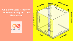
The CSS Box Model is the fundamental concept that governs how elements are sized and spaced in web layouts. Understanding this model is crucial for creating precise, predictable designs and solving common layout issues. Every HTML element is essentially a rectangular box, and the box model defines how the browser calculates the total space an element occupies.
What is the CSS Box Model?
The CSS Box Model consists of four distinct areas that surround every HTML element:
- Content Area – The innermost area containing text, images, or other content
- Padding – Transparent space between content and border
- Border – A line surrounding the padding and content
- Margin – Transparent space outside the border, separating elements
Understanding Each Component
Content Area
The content area is where your actual content lives – text, images, videos, or other HTML elements. The size of this area is controlled by the width and height properties.
.content-example {
  width: 200px;
  height: 100px;
  background-color: #e8f5e8;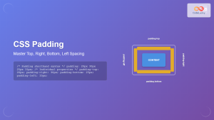
}Padding
Padding creates space between the content and the border. It’s transparent and takes on the background color of the element. Padding can be set for all sides at once or individually for each side.
/* All sides */
.padding-all { padding: 20px; }

/* Individual sides */
.padding-individual {
  padding-top: 10px;
  padding-right: 15px;
  padding-bottom: 10px;
  padding-left: 15px;
}

/* Shorthand variations */
.padding-shorthand {
  padding: 10px 15px; /* top/bottom, left/right */
  padding: 10px 15px 20px; /* top, left/right, bottom */
  padding: 10px 15px 20px 25px; /* top, right, bottom, left */
}Border
The border surrounds the padding and content. Unlike padding and margin, borders are visible and can have different styles, widths, and colors.
/* Border shorthand */
.border-example {
  border: 2px solid #333;
}

/* Individual border properties */
.border-individual {
  border-width: 2px;
  border-style: solid;
  border-color: #333;
}

/* Different borders for each side */
.border-sides {
  border-top: 3px solid red;
  border-right: 2px dashed blue;
  border-bottom: 1px dotted green;
  border-left: 4px double orange;
}Margin
Margin creates space outside the border, separating elements from each other. Margins are transparent and don’t have a background color. They can also have negative values, which can pull elements closer together or create overlapping effects.
/* All sides */
.margin-all { margin: 20px; }

/* Individual sides */
.margin-individual {
  margin-top: 10px;
  margin-right: 15px;
  margin-bottom: 10px;
  margin-left: 15px;
}

/* Auto margins for centering */
.center-element {
  margin: 0 auto;
}

/* Negative margins */
.negative-margin {
  margin-top: -10px;
}Box Model Calculation
Understanding how browsers calculate the total size of an element is crucial for precise layouts. By default, when you set a width and height, you’re only setting the content area dimensions.
Standard Box Model
In the standard box model (default behavior), the total element size is calculated as:
- Total Width = width + padding-left + padding-right + border-left + border-right + margin-left + margin-right
- Total Height = height + padding-top + padding-bottom + border-top + border-bottom + margin-top + margin-bottom
.standard-box {
  width: 200px;
  height: 100px;
  padding: 20px;
  border: 5px solid #333;
  margin: 15px;
}

/* Total width = 200 + 40 + 10 + 30 = 280px */
/* Total height = 100 + 40 + 10 + 30 = 180px */Total space: 280×180px
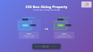
Border-Box Model
The box-sizing: border-box property changes how dimensions are calculated. With border-box, the width and height include padding and border, making layouts more predictable.
.border-box {
  box-sizing: border-box;
  width: 200px;
  height: 100px;
  padding: 20px;
  border: 5px solid #333;
  margin: 15px;
}

/* Total element size = 200px × 100px */
/* Content area = 200 - 40 - 10 = 150px wide */Content: 150×50px
Interactive Box Model Demonstration
Adjust the values below to see the box model in action:
200px
15px
3px
10px
Common Box Model Issues and Solutions
1. Unexpected Element Sizes
One of the most common issues is elements appearing larger than expected. This happens because developers often forget that padding and border add to the total size.
Problem: Setting width: 100% on an element with padding causes it to overflow its container.
/* Problem */
.problematic {
  width: 100%;
  padding: 20px;
  /* Total width = 100% + 40px, causing overflow */
}

/* Solution */
.solution {
  box-sizing: border-box;
  width: 100%;
  padding: 20px;
  /* Total width = 100%, padding included */
}
2. Margin Collapse
Vertical margins between adjacent elements collapse, meaning they combine into a single margin equal to the larger of the two. This behavior can be surprising but is part of the CSS specification.
.first-element {
  margin-bottom: 20px;
}

.second-element {
  margin-top: 30px;
}

/* Actual space between elements = 30px (not 50px) */Actual space between: 30px (margins collapsed)
3. Centering Elements
Using margin: auto is a reliable way to center block-level elements horizontally within their container.
.centered {
  width: 300px;
  margin: 0 auto; /* Centers horizontally */
}

.centered-with-spacing {
  width: 300px;
  margin: 20px auto; /* 20px top/bottom, centered horizontally */
}Best Practices for Box Model
1. Use Border-Box for Predictable Sizing
Set box-sizing: border-box on all elements to make width and height calculations more intuitive:
* {
  box-sizing: border-box;
}

/* Or more specific */
*,
*::before,
*::after {
  box-sizing: border-box;
}
2. Use Consistent Spacing Units
Stick to a consistent spacing system using rem, em, or a defined set of pixel values:
:root {
  --spacing-xs: 0.25rem;
  --spacing-sm: 0.5rem;
  --spacing-md: 1rem;
  --spacing-lg: 1.5rem;
  --spacing-xl: 2rem;
}

.card {
  padding: var(--spacing-md);
  margin: var(--spacing-lg);
}
3. Reset Default Margins and Padding
Different browsers have different default margins and paddings. Use a CSS reset or normalize stylesheet:
/* Simple reset */
* {
  margin: 0;
  padding: 0;
}

/* More comprehensive reset */
html, body, div, h1, h2, h3, h4, h5, h6, p {
  margin: 0;
  padding: 0;
}
Advanced Box Model Techniques
Negative Margins
Negative margins can be used to create overlapping effects or pull elements closer together:
.overlap {
  margin-top: -20px; /* Pulls element up by 20px */
}

.extend {
  margin-left: -10px; /* Extends element 10px to the left */
}Percentage-Based Dimensions
Using percentages for margins and padding creates responsive designs that adapt to different screen sizes:
.responsive-card {
  width: 90%;
  max-width: 600px;
  margin: 2% auto;
  padding: 5%;
}
Debugging Box Model Issues
Modern browsers provide excellent tools for debugging box model issues:
- Browser DevTools – Right-click and inspect elements to see the box model visualization
- Outline Property – Add temporary outlines to see element boundaries without affecting layout
- Background Colors – Use temporary background colors to visualize spacing
/* Debugging helpers */
.debug {
  outline: 1px solid red !important;
}

.debug-spacing {
  background-color: rgba(255, 0, 0, 0.1) !important;
}

/* View all elements */
* {
  outline: 1px solid red;
}
Box Model in Modern CSS
CSS Grid and Flexbox
Modern layout methods like CSS Grid and Flexbox still respect the box model, but they provide more sophisticated ways to handle spacing:
/* Flexbox with gap property */
.flex-container {
  display: flex;
  gap: 1rem; /* Replaces margins between items */
}

/* Grid with gap */
.grid-container {
  display: grid;
  grid-template-columns: repeat(3, 1fr);
  gap: 2rem;
}
Logical Properties
CSS logical properties provide writing-mode-aware alternatives to traditional box model properties:
/* Traditional */
.traditional {
  margin-top: 1rem;
  margin-bottom: 1rem;
  padding-left: 2rem;
  padding-right: 2rem;
}

/* Logical properties */
.logical {
  margin-block: 1rem; /* block-start and block-end */
  padding-inline: 2rem; /* inline-start and inline-end */
}
Conclusion
The CSS Box Model is fundamental to web development and understanding it thoroughly will dramatically improve your ability to create precise, predictable layouts. Remember these key points:
- Every element is a rectangular box with content, padding, border, and margin
- Use
box-sizing: border-boxfor more intuitive sizing - Be aware of margin collapse between adjacent elements
- Use browser DevTools to visualize and debug box model issues
- Consider modern CSS features like Grid, Flexbox, and logical properties for advanced layouts
Mastering the box model will give you the foundation needed to tackle any CSS layout challenge with confidence. Practice with the interactive examples above and experiment with different combinations of properties to solidify your understanding.
Related Posts

CSS Margin: Complete Guide to Element Spacing and Margin Collapse
Understanding CSS Margin: The Foundation of Element Spacing CSS margin is one of the most fundamental properties for controlling spacing...
CSS Box-Sizing Property: Master Content-Box vs Border-Box for Perfect Layouts
The CSS box-sizing property is one of the most crucial yet often misunderstood concepts in web development. It determines how...
CSS boxSizing Property: Understanding the CSS Box Model
Understanding the CSS boxSizing Property The boxSizing property in CSS is a fundamental tool for controlling how the total width...
CSS Padding: Complete Guide to Top, Right, Bottom, Left Spacing Properties
CSS padding is one of the most fundamental properties for controlling spacing in web design. It creates space between an...
CSS Style paddingRight Property: CSS Padding Right
Understanding the CSS padding-right Property The padding-right property in CSS is used to set the amount of space between the...
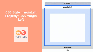
CSS Style marginLeft Property: CSS Margin Left
CSS marginLeft Property: Mastering the Left Margin The CSS marginLeft property is a fundamental tool for controlling the spacing around...
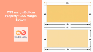
CSS marginBottom Property: CSS Margin Bottom
Understanding the CSS margin-bottom Property The margin-bottom property in CSS defines the space below an element. This margin is added...
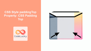
CSS Style paddingTop Property: CSS Padding Top
Understanding the CSS padding-top Property The padding-top property in CSS defines the amount of space between the top edge of...
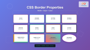
CSS Border: Complete Guide to Width, Style and Color Properties
CSS borders are fundamental styling elements that define the visual boundaries of HTML elements. Understanding how to effectively use border-width,...
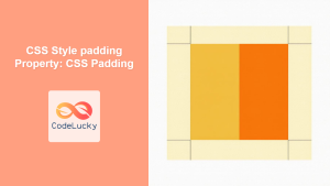
CSS Style padding Property: CSS Padding
CSS Padding Property: A Comprehensive Guide The CSS padding property is a fundamental tool in web development, allowing you to...
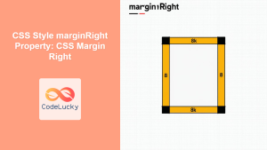
CSS Style marginRight Property: CSS Margin Right
Understanding the CSS marginRight Property The marginRight property in CSS is used to set the right margin of an element....
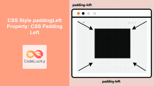
CSS Style paddingLeft Property: CSS Padding Left
CSS padding-left Property: A Comprehensive Guide The padding-left property in CSS is used to set the amount of padding space...


