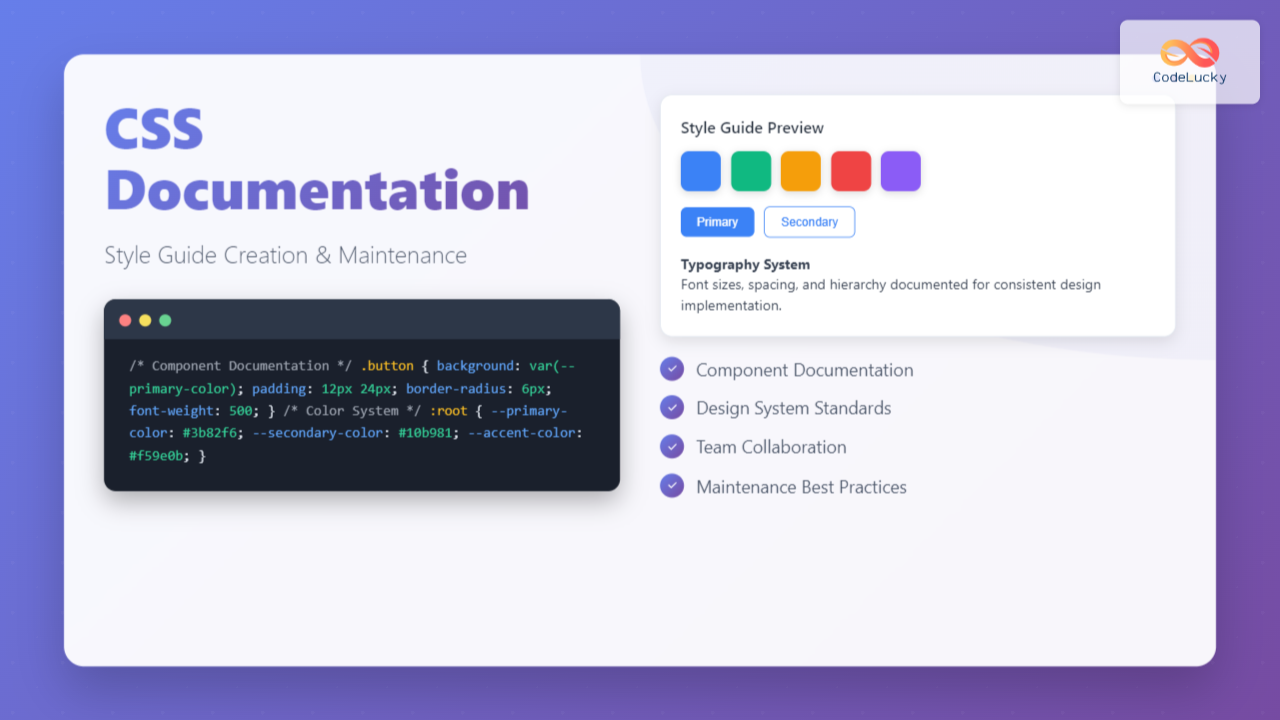
Creating comprehensive CSS documentation isn’t just about writing comments—it’s about building a living style guide that serves as the single source of truth for your project’s design system. Whether you’re working solo or with a team, proper CSS documentation dramatically improves code maintainability, reduces development time, and ensures consistent styling across your entire application.
Why CSS Documentation Matters
CSS documentation serves multiple critical purposes in modern web development. It acts as a communication bridge between designers and developers, provides onboarding materials for new team members, and creates a reference system that prevents code duplication and inconsistencies.
Without proper documentation, CSS codebases quickly become unwieldy. Developers spend countless hours deciphering cryptic class names, understanding complex selectors, and accidentally overriding existing styles. A well-documented style guide eliminates these pain points by establishing clear conventions and providing context for every styling decision.
Essential Components of CSS Documentation
Code Comments and Annotations
Effective CSS comments go beyond simple descriptions. They should explain the reasoning behind styling decisions, document browser-specific hacks, and provide context for complex calculations or positioning.
/* ==========================================================================
   HEADER COMPONENT
   ========================================================================== */

/**
 * Main site header containing navigation and branding
 *
 * 1. Fixed positioning for sticky navigation behavior
 * 2. Z-index ensures header stays above content during scroll
 * 3. Box-shadow provides visual separation from content
 */
.site-header {
  position: fixed; /* 1 */
  top: 0;
  left: 0;
  right: 0;
  z-index: 1000; /* 2 */
  background: var(--color-white);
  box-shadow: 0 2px 4px rgba(0, 0, 0, 0.1); /* 3 */
  padding: 1rem 2rem;
}

/**
 * Navigation list reset
 * Removes default list styling for cleaner appearance
 */
.nav-list {
  list-style: none;
  margin: 0;
  padding: 0;
  display: flex;
  gap: 2rem;
}

/* Hover states for interactive elements */
.nav-link:hover,
.nav-link:focus {
  color: var(--color-primary);
  text-decoration: underline;
}
CSS Custom Properties Documentation
CSS custom properties (variables) form the foundation of maintainable stylesheets. Document them with clear naming conventions, usage examples, and fallback values.
/* ==========================================================================
   CSS CUSTOM PROPERTIES (VARIABLES)
   ========================================================================== */

:root {
  /* Color System */
  --color-primary: #3b82f6;        /* Primary brand color - buttons, links */
  --color-primary-dark: #1e40af;   /* Darker variant for hover states */
  --color-primary-light: #93c5fd;  /* Lighter variant for backgrounds */

  --color-secondary: #64748b;      /* Secondary text, borders */
  --color-accent: #f59e0b;         /* Call-to-action elements, warnings */

  /* Neutral Colors */
  --color-white: #ffffff;
  --color-gray-50: #f8fafc;
  --color-gray-100: #f1f5f9;
  --color-gray-900: #0f172a;

  /* Typography Scale */
  --font-size-xs: 0.75rem;    /* 12px - Small labels, captions */
  --font-size-sm: 0.875rem;   /* 14px - Body text, form inputs */
  --font-size-base: 1rem;     /* 16px - Default body size */
  --font-size-lg: 1.125rem;   /* 18px - Larger body text */
  --font-size-xl: 1.25rem;    /* 20px - Small headings */
  --font-size-2xl: 1.5rem;    /* 24px - Medium headings */
  --font-size-3xl: 1.875rem;  /* 30px - Large headings */

  /* Spacing Scale (based on 8px grid) */
  --space-1: 0.25rem;   /* 4px */
  --space-2: 0.5rem;    /* 8px */
  --space-3: 0.75rem;   /* 12px */
  --space-4: 1rem;      /* 16px */
  --space-6: 1.5rem;    /* 24px */
  --space-8: 2rem;      /* 32px */
  --space-12: 3rem;     /* 48px */
  --space-16: 4rem;     /* 64px */

  /* Border Radius */
  --radius-sm: 0.25rem;   /* 4px - Small elements */
  --radius-md: 0.5rem;    /* 8px - Cards, buttons */
  --radius-lg: 0.75rem;   /* 12px - Large containers */
  --radius-full: 9999px;  /* Fully rounded - pills, avatars */
}
Creating Interactive Style Guide Components
Static documentation has its place, but interactive style guides provide immediate visual feedback and demonstrate real-world usage. Here’s how to create living documentation that developers actually want to use.
Component Documentation Template
Button Component
View Code
.btn {
  border: none;
  padding: var(--space-3) var(--space-6);
  border-radius: var(--radius-md);
  font-size: var(--font-size-sm);
  font-weight: 500;
  cursor: pointer;
  transition: all 0.2s ease;
}

.btn--primary {
  background: var(--color-primary);
  color: var(--color-white);
}

.btn--primary:hover {
  background: var(--color-primary-dark);
}

.btn--secondary {
  background: transparent;
  color: var(--color-primary);
  border: 1px solid var(--color-primary);
}

.btn--danger {
  background: #ef4444;
  color: var(--color-white);
}
Color Palette Documentation
Visual color documentation helps designers and developers maintain consistency across the entire project. Include accessibility information and usage guidelines for each color.
Maintenance Strategies and Best Practices
Version Control Integration
Treat your style guide as a living document that evolves with your codebase. Implement processes that ensure documentation stays current with code changes.
/* CHANGELOG EXAMPLE */
/**
 * BUTTON COMPONENT CHANGELOG
 *
 * v2.1.0 (2024-08-01)
 * - Added --btn-size-sm variant for compact layouts
 * - Improved focus indicators for better accessibility
 * - Updated hover animations for smoother transitions
 *
 * v2.0.0 (2024-07-15) - BREAKING CHANGES
 * - Removed .btn-large class (use .btn--size-lg instead)
 * - Updated spacing to use CSS custom properties
 * - Changed primary color from #007bff to #3b82f6
 *
 * v1.3.2 (2024-06-30)
 * - Fixed button alignment issues in Firefox
 * - Added disabled state styling
 */
Automated Documentation Tools
Consider integrating automated documentation tools that parse your CSS and generate living style guides. Tools like Storybook, StyleGuidist, or custom scripts can extract comments and generate interactive documentation automatically.
Team Collaboration Guidelines
Establish clear processes for updating documentation when making CSS changes:
- Pull Request Requirements: Include documentation updates in every CSS-related PR
- Code Review Checklist: Verify that new styles follow established patterns
- Regular Audits: Schedule monthly reviews to identify outdated documentation
- Naming Conventions: Maintain consistent class naming and variable conventions
Accessibility and Performance Documentation
Your style guide should include accessibility guidelines and performance considerations. Document color contrast ratios, focus management, and CSS optimization strategies.
/* ACCESSIBILITY DOCUMENTATION EXAMPLE */
/**
 * Focus Management for Interactive Elements
 *
 * All interactive elements must have visible focus indicators
 * that meet WCAG 2.1 AA standards (3:1 contrast ratio minimum)
 */
.interactive-element:focus {
  outline: 2px solid var(--color-primary);
  outline-offset: 2px;
}

/**
 * Color Contrast Documentation
 *
 * Text combinations tested for WCAG compliance:
 * - White on Primary Blue (#3b82f6): 4.5:1 ✓
 * - Primary Blue on White: 4.5:1 ✓
 * - Secondary Gray on White (#64748b): 7.0:1 ✓
 */

/**
 * Performance Considerations
 *
 * - Use CSS custom properties for better cache efficiency
 * - Minimize complex selectors (max specificity: 0,0,3,0)
 * - Avoid !important declarations except for utility classes
 */
Documentation Formats and Tools
Markdown-Based Documentation
For teams preferring text-based documentation, structured Markdown files work excellently alongside your CSS files. Create a docs folder with component-specific documentation:
project/
├── src/
│   ├── styles/
│   │   ├── components/
│   │   └── utilities/
└── docs/
    ├── style-guide.md
    ├── components/
    │   ├── buttons.md
    │   ├── forms.md
    │   └── navigation.md
    └── utilities/
        ├── spacing.md
        └── typography.md
Living Style Guide Integration
Integrate your documentation directly into your development workflow using tools like:
- Storybook: Component-driven development with interactive documentation
- Pattern Lab: Atomic design methodology with pattern libraries
- Fractal: Component library toolkit for building design systems
- Custom Solutions: Build your own using static site generators
Common Documentation Pitfalls to Avoid
Even well-intentioned documentation efforts can fail if they fall into common traps. Avoid these pitfalls to ensure your style guide remains useful and current:
- Over-Documentation: Don’t document obvious styles or self-explanatory code
- Outdated Examples: Regularly audit examples to ensure they reflect current implementation
- Inconsistent Formatting: Establish and follow consistent documentation formatting standards
- Missing Context: Always explain the “why” behind styling decisions, not just the “what”
- Isolated Documentation: Keep documentation close to the code it describes
Measuring Documentation Success
Track metrics that indicate whether your documentation is actually helping your team:
- Developer Onboarding Time: How quickly new team members become productive
- Code Review Feedback: Reduction in style-related review comments
- Bug Reports: Fewer styling inconsistencies and visual bugs
- Development Velocity: Faster implementation of new features and components
Future-Proofing Your CSS Documentation
As CSS evolves and new features become available, your documentation strategy should adapt. Stay current with modern CSS features like container queries, cascade layers, and color functions. Document browser support requirements and migration strategies for legacy code.
Consider implementing automated testing for your documented components. Tools like Chromatic, Percy, or custom visual regression tests can catch unintended changes to your documented components.
Conclusion
Effective CSS documentation is an investment in your project’s long-term success. By creating comprehensive style guides that combine clear code comments, interactive examples, and maintenance processes, you’ll build a foundation that scales with your team and project complexity.
Remember that the best documentation is documentation that gets used. Focus on creating practical, accessible guides that solve real problems for your team. Start small, iterate based on feedback, and gradually build a documentation system that becomes an indispensable part of your development workflow.
The effort you put into CSS documentation today will pay dividends in reduced bugs, faster development cycles, and improved collaboration between designers and developers. Your future self—and your teammates—will thank you for taking the time to document your styling decisions properly.

