CSS comments are essential for creating maintainable and well-documented stylesheets. Whether you’re working on a personal project or collaborating with a team, proper commenting practices can save hours of debugging and make your code more accessible to others.
In this comprehensive guide, we’ll explore everything you need to know about CSS comment syntax, from basic implementation to advanced techniques that will elevate your development workflow.
What Are CSS Comments?
CSS comments are annotations within your stylesheet that are ignored by the browser during rendering. They serve as notes for developers, providing context, explanations, or reminders about specific code sections. Unlike HTML comments, CSS uses a unique syntax that works consistently across all browsers and CSS versions.
Comments play a crucial role in:
- Documenting complex styling logic
- Providing context for future modifications
- Temporarily disabling code sections
- Creating section dividers for better organization
- Explaining browser-specific workarounds
CSS Comment Syntax: The Fundamentals
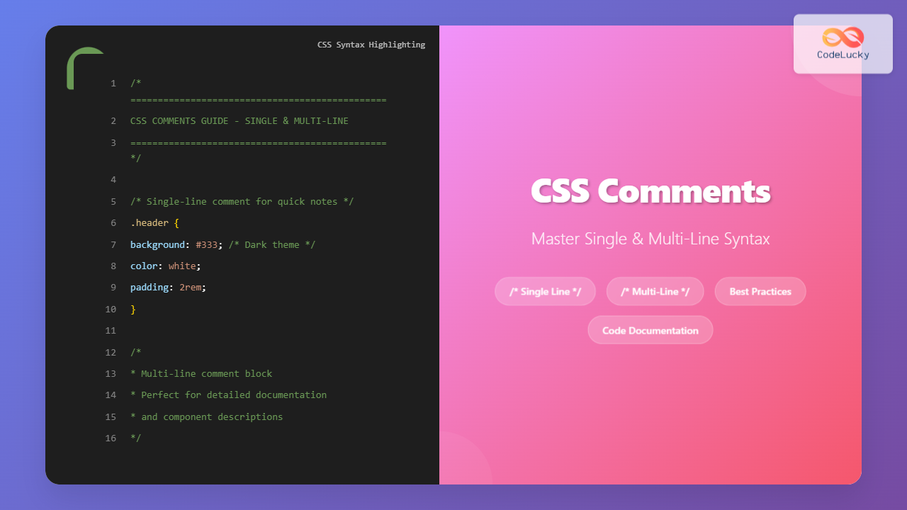
CSS uses a single comment syntax for both single-line and multi-line comments. Unlike many programming languages that have different syntaxes for different comment types, CSS keeps it simple with the /* */ format.
Basic Comment Structure
/* This is a CSS comment */
The comment begins with /* and ends with */. Everything between these delimiters is ignored by the browser’s CSS parser.
Single-Line CSS Comments
Single-line comments are perfect for brief explanations, quick notes, or inline documentation. Here’s how to implement them effectively:
/* Reset default margins */
* {
    margin: 0;
    padding: 0;
}

.header {
    background-color: #333; /* Dark background for contrast */
    color: white; /* White text for readability */
    padding: 20px; /* Add spacing inside header */
}
Single-Line Comment Best Practices
When writing single-line comments, consider these guidelines:
/* Good: Explains the purpose */
.button-primary {
    background-color: #007bff; /* Brand primary color */
}

/* Good: Provides context for unusual values */
.sidebar {
    width: calc(100% - 23px); /* Accounts for scrollbar width */
}

/* Avoid: Stating the obvious */
.red-text {
    color: red; /* Makes text red - This is redundant */
}
Multi-Line CSS Comments
Multi-line comments are ideal for detailed explanations, documentation blocks, or temporarily disabling large code sections. They use the same /* */ syntax but span multiple lines.
/*
 * Main navigation component
 *
 * This component handles the primary site navigation
 * including responsive behavior and accessibility features.
 *
 * Dependencies:
 * - Bootstrap 5.0+
 * - Custom breakpoint variables
 *
 * Last modified: 2024-01-15
 * Author: Development Team
 */
.main-nav {
    display: flex;
    justify-content: space-between;
    align-items: center;
    padding: 1rem 2rem;
}
Structured Multi-Line Comments
For complex components or sections, consider using structured comment blocks:
/*
=====================================
CARD COMPONENT STYLES
=====================================

Purpose: Reusable card component for content display
Usage: Apply .card class to container element
Variants: .card-hover, .card-shadow, .card-border

Breakpoints:
- Mobile: Full width with reduced padding
- Tablet: 50% width in grid layout
- Desktop: 33.33% width in grid layout

Notes:
- Uses CSS Grid for internal layout
- Includes hover animations
- Supports dark mode theming
=====================================
*/

.card {
    background: white;
    border-radius: 8px;
    padding: 1.5rem;
    box-shadow: 0 2px 4px rgba(0, 0, 0, 0.1);
    transition: transform 0.2s ease;
}
Interactive Comment Examples
Let’s see CSS comments in action with an interactive example that demonstrates both single-line and multi-line commenting:
Interactive CSS Comment Demo
CSS Comments in Action
This demo showcases various comment types used in real CSS code
Single-Line Comments
Used for brief explanations and inline documentation throughout the stylesheet.
Multi-Line Comments
Perfect for detailed documentation, component descriptions, and section headers.
Organization
Comments help organize code into logical sections and provide context for complex styling.
Advanced CSS Comment Techniques
Section Dividers and Organization
Use comments to create visual separations between different sections of your stylesheet:
/*
==================================================
TYPOGRAPHY STYLES
==================================================
*/

h1, h2, h3, h4, h5, h6 {
    font-family: 'Roboto', sans-serif;
    font-weight: 600;
}

/*
==================================================
LAYOUT COMPONENTS
==================================================
*/

.container {
    max-width: 1200px;
    margin: 0 auto;
    padding: 0 1rem;
}

/*
==================================================
UTILITY CLASSES
==================================================
*/

.text-center { text-align: center; }
.mb-4 { margin-bottom: 1.5rem; }
Conditional Comments and Browser Hacks
Document browser-specific workarounds and conditional styling:
/*
Internet Explorer 11 flexbox fix
IE11 has issues with flex-shrink on flex items
Reference: https://github.com/philipwalton/flexbugs#flexbug-2
*/
.flex-item {
    flex-shrink: 0;
    min-width: 0; /* IE11 flexbox fix */
}

/*
Safari-specific styling for input elements
Safari renders form inputs differently than other browsers
*/
@media not all and (min-resolution:.001dpcm) {
    @supports (-webkit-appearance:none) {
        input[type="text"] {
            -webkit-appearance: none; /* Remove Safari's default styling */
        }
    }
}
TODO and FIXME Comments
Use standardized comment keywords for better project management:
/* TODO: Implement dark mode variants for all button components */
.button {
    background: #007bff;
    color: white;
}

/* FIXME: This selector is too specific, needs refactoring */
.page-wrapper .content-area .sidebar .widget-list .widget-item a {
    text-decoration: none;
}

/* HACK: Temporary fix for Chrome rendering issue - remove when resolved */
.chrome-fix {
    transform: translateZ(0);
}

/* NOTE: This component will be deprecated in v2.0 */
.legacy-dropdown {
    position: relative;
}
CSS Comment Best Practices
When to Use Comments
Strategic commenting improves code maintainability without cluttering your stylesheet:
✅ Good commenting practices:
- Explain complex calculations or unusual values
- Document browser-specific workarounds
- Provide context for component architecture
- Note dependencies or requirements
- Explain business logic behind styling decisions
❌ Avoid these commenting mistakes:
- Stating obvious CSS properties
- Commenting every single line
- Using comments instead of proper class names
- Leaving outdated comments in production
- Writing comments that don’t add value
Comment Formatting Standards
Maintain consistency across your team with standardized comment formats:
/* * Component: Navigation Bar * Description: Main site navigation with responsive behavior * Dependencies: Bootstrap 5, FontAwesome icons * Last Updated: 2024-01-15 * Author: John Doe * * Usage: * */
CSS Comments and Performance
While comments are ignored during rendering, they do impact file size and load times. Here’s what you need to know:
Development vs Production
Comments are valuable during development but should be considered for production optimization:
💡 Pro Tip: Use build tools like PostCSS, Webpack, or Gulp to automatically strip comments from production CSS files while keeping them in your source code for development.
Comment Minification Example
/* Development CSS (with comments) */
/* Primary button styling */
.btn-primary {
    background: #007bff; /* Brand color */
    padding: 0.5rem 1rem; /* Comfortable spacing */
}

/* Production CSS (minified, no comments) */
.btn-primary{background:#007bff;padding:.5rem 1rem}
Common CSS Comment Pitfalls
Nested Comments Issue
CSS doesn’t support nested comments, which can cause unexpected behavior:
/* This is problematic */
/*
  /* This inner comment will break the outer comment */
  .broken-class {
    color: red;
  }
*/

/* Correct approach */
/*
  Inner comment removed to avoid nesting
  .working-class {
    color: blue;
  }
*/
Comment Placement Strategy
Strategic comment placement improves readability and maintainability:
/* Good: Comment before the related code block */
/* Header component with sticky positioning */
.header {
    position: sticky;
    top: 0;
    z-index: 100;
}

.header .logo {
    height: 40px; /* Matches design specs */
}

/* Avoid: Comments scattered throughout properties */
.footer {
    background: #333; /* Dark background */
    color: white;
    padding: 20px; /* Vertical padding */
    text-align: center; /* Center align text */
}
CSS Comments for Team Collaboration
Effective commenting becomes crucial when working with teams. Here are strategies for collaborative development:
Component Documentation Template
/* ================================================== COMPONENT: Modal Dialog ================================================== DESCRIPTION: Reusable modal component with backdrop, close button, and responsive behavior across all device sizes. DEPENDENCIES: - CSS Grid support - JavaScript for modal functionality - Accessibility attributes required VARIANTS: - .modal-sm (small, 400px max-width) - .modal-lg (large, 800px max-width) - .modal-fullscreen (full viewport) USAGE:ACCESSIBILITY: - Requires aria-labelledby on modal element - Requires role="dialog" - Focus management handled by JS BROWSER SUPPORT: - Modern browsers (IE11+) - Graceful degradation for older browsers LAST UPDATED: 2024-01-15 AUTHOR: Frontend Team ================================================== */
Advanced Comment Strategies
CSS Architecture Comments
Use comments to document your CSS architecture and methodology:
/*
==================================================
CSS ARCHITECTURE: ITCSS (Inverted Triangle CSS)
==================================================

This stylesheet follows ITCSS methodology:
1. Settings - Global variables and configuration
2. Tools - Mixins and functions
3. Generic - Normalize, reset, box-sizing
4. Elements - Basic HTML element styling
5. Objects - Layout patterns (OOCSS)
6. Components - UI components
7. Utilities - Helper classes

Specificity increases as we move down the triangle.
Each layer should only add CSS, never undo.
==================================================
*/

/* LAYER 1: SETTINGS */
:root {
    --primary-color: #007bff;
    --secondary-color: #6c757d;
    --spacing-unit: 1rem;
}

/* LAYER 4: ELEMENTS */
/* Base heading styles - no classes needed */
h1, h2, h3, h4, h5, h6 {
    margin-bottom: var(--spacing-unit);
    font-weight: 600;
}

/* LAYER 6: COMPONENTS */
/* Card component - specific UI element */
.card {
    background: white;
    border-radius: 8px;
    box-shadow: 0 2px 4px rgba(0, 0, 0, 0.1);
}
Performance and Optimization Comments
Document performance-related decisions and optimizations:
/*
Performance optimization: Use transform instead of changing
top/left properties for better GPU acceleration
*/
.sliding-element {
    transform: translateX(0);
    transition: transform 0.3s ease;
}

.sliding-element.active {
    transform: translateX(100px); /* GPU-accelerated animation */
}

/*
Critical CSS: Above-the-fold styles
These styles are inlined in the HTML head for faster rendering
*/
.hero-section {
    height: 100vh;
    background: linear-gradient(45deg, #007bff, #0056b3);
}

/*
Lazy-loaded styles: Below-the-fold components
These styles are loaded after initial page render
*/
.footer-newsletter {
    padding: 3rem 0;
    background: #f8f9fa;
}
CSS Comments and Build Tools
Modern development workflows often involve build tools that can enhance your commenting strategy:
Comment Preservation in Build Tools
/*!
 * Important comment - preserved in minified CSS
 * Use /*! to ensure comments survive minification
 * Useful for copyright notices or important documentation
 */

/*
 * Regular comment - removed during minification
 * Use standard /* */ for development-only comments
 */

.component {
    /* inline comment - also removed during minification */
    display: flex;
    justify-content: center;
}
Testing and Debugging with Comments
Comments can be powerful tools for testing and debugging CSS:
/* DEBUG: Temporary border to visualize layout issues */
.debug-layout * {
    /* border: 1px solid red !important; */
}

/* A/B TEST: Version A - Original button style */
.btn-test-a {
    background: #007bff;
    border-radius: 4px;
}

/* A/B TEST: Version B - Updated button style */
/*
.btn-test-b {
    background: linear-gradient(45deg, #007bff, #0056b3);
    border-radius: 8px;
    box-shadow: 0 2px 4px rgba(0, 0, 0, 0.1);
}
*/

/* FEATURE FLAG: Dark mode styles - enable when ready */
/*
@media (prefers-color-scheme: dark) {
    body {
        background: #1a1a1a;
        color: #ffffff;
    }
}
*/
Conclusion
CSS comments are far more than simple annotations—they’re essential tools for creating maintainable, scalable, and collaborative stylesheets. Whether you’re using single-line comments for quick explanations or multi-line blocks for comprehensive documentation, the key is consistency and purposeful implementation.
By following the best practices outlined in this guide, you’ll create CSS that not only works beautifully but also stands the test of time. Remember that good comments explain the “why” behind your code, not just the “what.” They bridge the gap between your current understanding and the developer who will work with your code months or years from now—including your future self.
Start implementing these CSS comment strategies in your next project, and experience the difference that well-documented code makes in your development workflow. Your team, your clients, and your future self will thank you for the extra effort invested in clear, meaningful documentation.

