
CSS Container Queries represent a revolutionary approach to responsive web design, allowing elements to respond to their container’s size rather than the viewport. This powerful feature enables truly modular and reusable components that adapt based on their available space, making responsive design more intuitive and flexible.
What Are CSS Container Queries?
Container queries enable you to apply styles to an element based on the size of its containing element, rather than the size of the viewport. This shift from viewport-based responsive design to container-based responsive design allows for more granular control over component layouts.
Traditional media queries respond to the browser window size, but container queries respond to the size of a specific container element. This makes components truly modular and reusable across different contexts within the same page.
Browser Support and Prerequisites
CSS Container Queries are supported in modern browsers including Chrome 105+, Firefox 110+, and Safari 16+. For older browsers, you’ll need to provide fallback styling or use a polyfill.
Setting Up Container Queries
To use container queries, you need two key components:
- Container Context: Define which element acts as the container using
container-typeorcontainerproperties - Container Query: Apply styles based on the container’s dimensions using the
@containerrule
The container-type Property
The container-type property establishes a container context. It accepts three values:
size– Establishes containment for both inline and block dimensionsinline-size– Establishes containment for the inline dimension onlynormal– No containment (default value)
.container {
  container-type: inline-size;
  /* or */
  container-type: size;
}
The container Property (Shorthand)
The container property is a shorthand that combines container-name and container-type:
.container {
  container: sidebar / inline-size;
  /* container-name / container-type */
}
Basic Container Query Syntax
The @container rule works similarly to media queries but queries the container instead of the viewport:
@container (min-width: 300px) {
  .card {
    display: flex;
    flex-direction: row;
  }
}

@container (max-width: 299px) {
  .card {
    display: block;
  }
}
Practical Example: Responsive Card Component
Let’s create a responsive card component that adapts based on its container size:
📝 Interactive Example
Responsive Card
This card adapts its layout based on the container width, not the viewport size. Try resizing the container!
CSS Code:
.container {
  container-type: inline-size;
}

.responsive-card {
  background: white;
  border-radius: 8px;
  box-shadow: 0 2px 8px rgba(0,0,0,0.1);
}

/* Small container - stacked layout */
.responsive-card {
  display: block;
}

/* Medium container - side-by-side layout */
@container (min-width: 400px) {
  .responsive-card {
    display: flex;
    align-items: stretch;
  }

  .card-image {
    width: 160px;
    flex-shrink: 0;
  }
}

/* Large container - enhanced styling */
@container (min-width: 600px) {
  .card-title {
    font-size: 1.5em;
  }

  .card-image {
    width: 200px;
  }
}
Named Containers
You can name containers to target specific containers when multiple container contexts exist:
.sidebar {
  container-name: sidebar;
  container-type: inline-size;
}

.main-content {
  container-name: main;
  container-type: inline-size;
}

/* Target specific container */
@container sidebar (max-width: 250px) {
  .nav-item {
    display: block;
    text-align: center;
  }
}

@container main (min-width: 800px) {
  .article {
    columns: 2;
    column-gap: 2rem;
  }
}
Container Query Units
Container queries introduce new units that are relative to the container size:
cqw– 1% of the container’s widthcqh– 1% of the container’s heightcqi– 1% of the container’s inline sizecqb– 1% of the container’s block sizecqmin– Smaller of cqi and cqbcqmax– Larger of cqi and cqb
🎯 Container Units Example
8cqw Text
.container {
  container-type: size;
}

.responsive-text {
  font-size: 8cqw; /* 8% of container width */
}

.responsive-box {
  width: 20cqw;  /* 20% of container width */
  height: 20cqh; /* 20% of container height */
}
Advanced Container Query Features
Logical Operators
Container queries support logical operators like and, or, and not:
@container (min-width: 400px) and (max-width: 800px) {
  .component {
    padding: 2rem;
  }
}

@container (min-width: 600px) or (min-height: 400px) {
  .component {
    display: grid;
    grid-template-columns: 1fr 1fr;
  }
}
Style Queries (Experimental)
Style queries allow querying container styles (currently experimental):
@container style(color: blue) {
  .child {
    font-weight: bold;
  }
}
Real-World Use Cases
1. Navigation Components
Create navigation that adapts based on available space:
.nav-container {
  container-type: inline-size;
}

.nav {
  display: flex;
  gap: 1rem;
}

@container (max-width: 500px) {
  .nav {
    flex-direction: column;
  }

  .nav-item {
    text-align: center;
    padding: 0.75rem;
  }
}
2. Grid Layouts
Adjust grid columns based on container width:
.grid-container {
  container-type: inline-size;
}

.grid {
  display: grid;
  gap: 1rem;
  grid-template-columns: 1fr;
}

@container (min-width: 400px) {
  .grid {
    grid-template-columns: repeat(2, 1fr);
  }
}

@container (min-width: 600px) {
  .grid {
    grid-template-columns: repeat(3, 1fr);
  }
}

@container (min-width: 800px) {
  .grid {
    grid-template-columns: repeat(4, 1fr);
  }
}
Container Queries vs Media Queries
| Aspect | Media Queries | Container Queries |
|---|---|---|
| Context | Viewport/device based | Container element based |
| Reusability | Global breakpoints | Component-specific breakpoints |
| Modularity | Limited | High – truly modular components |
| Use Case | Page layout, overall design | Component-level responsiveness |
Performance Considerations
Container queries are generally performant, but consider these best practices:
- Use inline-size when possible: It’s more performant than
sizecontainment - Minimize nested containers: Excessive nesting can impact performance
- Cache container contexts: Browsers optimize repeated queries on the same container
- Avoid layout thrashing: Be careful with styles that might cause layout recalculation
Common Pitfalls and Solutions
Containment Side Effects
Container containment can have side effects on layout. The size containment prevents the container from using its children’s size for layout:
/* This might cause issues if children need to influence container size */
.container {
  container-type: size; /* Can cause unexpected behavior */
}/* Use inline-size when you only need width-based queries */
.container {
container-type: inline-size; /* Safer choice */
}Fallback Strategies
Always provide fallback styles for browsers that don’t support container queries:
/* Fallback styles */
.card {
  display: block;
}

/* Enhanced styles with container queries */
@supports (container-type: inline-size) {
  .container {
    container-type: inline-size;
  }

  @container (min-width: 400px) {
    .card {
      display: flex;
    }
  }
}
Tools and Debugging
Modern browser developer tools provide support for debugging container queries:
- Chrome DevTools: Shows container query information in the Elements panel
- Firefox DevTools: Highlights container query contexts and provides inspection tools
- Container Query Inspector: Browser extensions available for enhanced debugging
Future of Container Queries
Container queries continue to evolve with upcoming features:
- Style Queries: Query container styles, not just dimensions
- Scroll-driven Animations: Integration with container scroll positions
- Enhanced Units: More container-relative units for precise control
- Performance Optimizations: Better caching and computation strategies
Conclusion
CSS Container Queries represent a paradigm shift in responsive web design, enabling truly modular and reusable components. By responding to container dimensions rather than viewport size, they provide the granular control needed for modern component-based development.
Key takeaways for implementing container queries:
- Use
container-type: inline-sizefor width-based responsiveness - Combine container queries with traditional media queries for comprehensive responsive design
- Leverage container query units (cqw, cqh, etc.) for proportional sizing
- Always provide fallback styles for browser compatibility
- Test thoroughly across different container contexts and sizes
As browser support continues to improve and the specification evolves, container queries will become an essential tool for creating flexible, maintainable, and truly responsive web components. Start experimenting with container queries today to build more adaptive and modular web interfaces.
Related Posts

CSS Future: Complete Guide to Upcoming CSS Features and Specifications 2025
The future of CSS is incredibly exciting, with numerous groundbreaking features and specifications currently in development that promise to revolutionize...
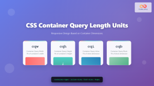
CSS Container Query Length Units: Complete Guide to cqw, cqh, cqi, cqb for Responsive Design
CSS Container Query Length Units represent a revolutionary approach to responsive web design, allowing developers to create components that adapt...
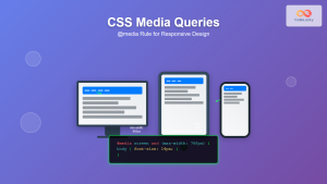
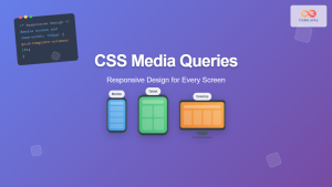
CSS Media Queries: Complete Guide to @media Rule for Responsive Web Design
What Are CSS Media Queries? CSS Media Queries are a fundamental feature of modern web development that allow you to...
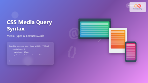
CSS Media Query Syntax: Complete Guide to Media Types and Features
CSS media queries are the cornerstone of responsive web design, allowing developers to apply different styles based on device characteristics...
CSS Screen Media Queries: Complete Guide to Responsive Monitor and Device Targeting
CSS screen media queries are the cornerstone of responsive web design, enabling developers to create websites that adapt seamlessly across...
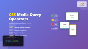
CSS Media Query Operators: Complete Guide to and, or, not, only Keywords
CSS media query operators are essential tools for creating responsive web designs that adapt to different devices and screen conditions....
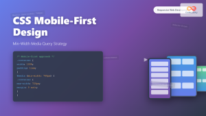
CSS Mobile-First Design: Complete Min-Width Media Query Guide for Responsive Web Development
What is Mobile-First Design? Mobile-first design is a progressive enhancement approach where you start designing and coding for the smallest...

CSS Containment: Mastering the contain Property for Optimal Web Performance
CSS containment is a powerful performance optimization technique that allows developers to isolate parts of the DOM tree, preventing unnecessary...

CSS Resolution Media Queries: Complete Guide to High-DPI Display Targeting
Understanding CSS Resolution Media Queries CSS resolution media queries allow developers to target specific display densities and create optimized experiences...

CSS Style maxWidth Property: CSS Max Width
Understanding the CSS maxWidth Property The CSS maxWidth property is a fundamental tool in web development for controlling the maximum...
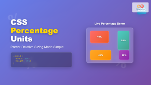
CSS Percentage Units: Complete Guide to Parent-Relative Sizing
CSS percentage units are fundamental building blocks for creating responsive, flexible layouts that adapt to different screen sizes and container...
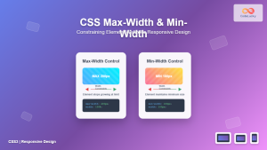
CSS Max-Width and Min-Width: Complete Guide to Responsive Width Constraints
When building responsive websites, controlling element widths is crucial for creating layouts that work across all devices. CSS provides two...


