
The CSS clip property was once a powerful tool for creating rectangular clipping regions on absolutely positioned elements. While now deprecated in favor of the more versatile clip-path property, understanding clip remains valuable for maintaining legacy code and comprehending the evolution of CSS clipping techniques.
What is the CSS Clip Property?
The clip property defines a rectangular clipping region that determines which portion of an absolutely positioned element is visible. Only the content within the specified rectangle is displayed, while everything outside is hidden from view.
clip property is deprecated as of CSS3 and has been replaced by clip-path. However, it still has browser support for backward compatibility.
CSS Clip Property Syntax
The basic syntax for the clip property follows this pattern:
clip: rect(top, right, bottom, left);
clip: auto;
clip: inherit;
Syntax Breakdown
- rect(top, right, bottom, left): Defines a rectangular clipping region using four offset values
- auto: No clipping is applied (default value)
- inherit: Inherits the clip value from the parent element
Understanding the rect() Function
The rect() function accepts four comma-separated values that define the clipping rectangle:
- top: Distance from the top edge of the element
- right: Distance from the left edge of the element to the right clipping edge
- bottom: Distance from the top edge of the element to the bottom clipping edge
- left: Distance from the left edge of the element
position: absolute or position: fixed).
Basic CSS Clip Examples
Let’s explore practical examples to understand how the clip property works:
Example 1: Basic Rectangular Clipping
Clipped Content
Original (Unclipped)
.clipped-element {
  position: absolute;
  width: 200px;
  height: 150px;
  background: linear-gradient(45deg, #ff6b6b, #4ecdc4);
  clip: rect(30px, 150px, 120px, 50px);
}
Example 2: Creating a Window Effect
.window-effect {
  position: absolute;
  width: 100%;
  height: 100%;
  background: url('pattern.png') repeat;
  clip: rect(50px, 300px, 150px, 100px);
}
Advanced Clipping Techniques
Dynamic Clipping with CSS Variables
You can create dynamic clipping effects by combining CSS variables with the clip property:
Interactive Clipping
Hover to see the clipping change!
:root {
  --clip-top: 20px;
  --clip-right: 200px;
  --clip-bottom: 120px;
  --clip-left: 30px;
}

.dynamic-clip {
  position: absolute;
  clip: rect(var(--clip-top), var(--clip-right), var(--clip-bottom), var(--clip-left));
  transition: clip 0.3s ease;
}

.dynamic-clip:hover {
  --clip-top: 10px;
  --clip-right: 230px;
  --clip-bottom: 140px;
  --clip-left: 10px;
}
Common Use Cases for CSS Clip
1. Image Cropping Effects
2. Progress Bar Masking
Progress: 60%
.progress-bar {
  position: absolute;
  width: 100%;
  height: 100%;
  background: linear-gradient(90deg, #4CAF50, #8BC34A);
  clip: rect(0px, 60%, 20px, 0px); /* 60% progress */
}
Browser Support and Compatibility
The CSS clip property has extensive browser support, though it’s deprecated:
Browser Support
Why CSS Clip is Deprecated
The CSS clip property was deprecated for several important reasons:
Limitations of the Clip Property
- Rectangular Only: Limited to rectangular clipping shapes
- Positioning Requirement: Only works with absolutely positioned elements
- Limited Flexibility: Cannot create complex shapes or paths
- No Animation Support: Difficult to animate smoothly
Modern Alternative: CSS clip-path
The clip-path property is the modern replacement for clip, offering significantly more flexibility:
/* Modern clip-path alternatives */
.circle-clip {
  clip-path: circle(50% at 50% 50%);
}

.triangle-clip {
  clip-path: polygon(50% 0%, 0% 100%, 100% 100%);
}

.ellipse-clip {
  clip-path: ellipse(40% 50% at 50% 50%);
}
Migration Guide: From clip to clip-path
Here’s how to convert common clip patterns to modern clip-path:
Performance Considerations
When working with clipping (whether using the deprecated clip or modern clip-path), consider these performance factors:
Optimization Tips
- Hardware Acceleration: Clipped elements may trigger hardware acceleration
- Repainting: Frequent clip changes can cause expensive repaints
- Complex Shapes: Intricate clip-path shapes are more performance-intensive
- Animation: Use
transforminstead of changing clip values for animations
Debugging Clipped Elements
Debugging clipped elements can be challenging. Here are some helpful techniques:
Debugging Tips
- Temporarily remove the clip property to see the full element
- Use browser developer tools to inspect clipping regions
- Add visible borders to understand element boundaries
- Test with different clip values to fine-tune positioning
Real-World Example: Photo Gallery Reveal
.gallery-item {
  position: absolute;
  width: 120px;
  height: 160px;
  background-size: cover;
  clip: rect(0px, 120px, 60px, 0px);
  transition: clip 0.5s ease;
}

.gallery-item:hover {
  clip: rect(0px, 120px, 160px, 0px);
}
Accessibility Considerations
When using clipping techniques, it’s important to consider accessibility:
- Screen Readers: Clipped content may still be read by screen readers
- Keyboard Navigation: Hidden elements should be truly inaccessible via keyboard
- Focus Management: Ensure focus doesn’t move to clipped content
- Alternative Text: Provide appropriate alt text for clipped images
Conclusion
While the CSS clip property is deprecated, understanding its functionality remains valuable for maintaining legacy codebases and appreciating the evolution of CSS clipping capabilities. The property’s rectangular limitations led to the development of the more powerful clip-path property, which offers unlimited creative possibilities with various shapes and complex paths.
For new projects, always use clip-path instead of the deprecated clip property. However, if you’re working with older browsers or maintaining existing code, the clip property still provides reliable rectangular clipping functionality.
Remember that modern web development favors the flexible and powerful clip-path property, which not only replaces clip but extends clipping capabilities far beyond rectangular regions, enabling creative and complex visual effects that were previously impossible.
Related Posts

CSS Clip-Path Property: Create Stunning Visual Effects with Modern Shape Clipping
The CSS clip-path property is a powerful tool that allows you to create visually stunning effects by clipping elements into...

CSS Style clip-path Property: CSS Clip
CSS clip-path Property: A Comprehensive Guide The clip-path property in CSS allows you to define a specific region of an...

CSS Style backgroundClip Property: CSS Background Clip
CSS background-clip Property: A Comprehensive Guide The CSS background-clip property determines how far the background extends within an element. It...

HTML Canvas clip() Method: Defining a Clipping Region
HTML Canvas clip() Method: Defining a Clipping Region The HTML Canvas clip() method is a powerful tool that allows you...
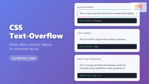
CSS Text-Overflow: Complete Guide to Ellipsis and Text Clipping Techniques
Long text content can break your carefully crafted layouts and create poor user experiences. The CSS text-overflow property provides elegant...

CSS Backdrop-Filter: Complete Guide to Background Blur and Visual Effects
What is CSS Backdrop-Filter? The backdrop-filter property in CSS allows you to apply graphical effects like blur, brightness, contrast, and...
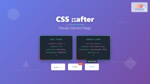
CSS ::after Pseudo-Element: Complete Guide to Adding Dynamic Content After Elements
The CSS ::after pseudo-element is one of the most powerful tools in modern web development, allowing you to insert content...

CSS Visibility Property: Complete Guide to Showing and Hiding Elements
The CSS visibility property is a fundamental tool for controlling element visibility on web pages. Unlike other hiding methods, it...

CSS Style opacity Property: CSS Opacity
CSS Opacity Property: A Comprehensive Guide The CSS opacity property is a fundamental tool for controlling the transparency of elements...

CSS overflowX Property: CSS Overflow X Explained with Examples
Understanding the CSS overflowX Property The overflowX property in CSS dictates how the browser handles content that overflows the horizontal...

CSS Style background Property: CSS Background
CSS background Property: A Comprehensive Guide to Styling Web Page Backgrounds The CSS background property is a versatile shorthand property...

CSS ::before Pseudo-Element: Master Adding Content Before Elements
The CSS ::before pseudo-element is one of the most powerful tools in a developer's arsenal for adding decorative content, icons,...


