
What is CSS Backdrop-Filter?
The backdrop-filter property in CSS allows you to apply graphical effects like blur, brightness, contrast, and color adjustments to the area behind an element. Unlike the regular filter property that affects the element itself, backdrop-filter specifically targets the background content visible through semi-transparent elements.
This powerful property has revolutionized modern web design by enabling popular visual effects like glassmorphism, frosted glass interfaces, and sophisticated overlay designs without requiring additional markup or JavaScript.
Browser Support and Compatibility
Before diving into implementation, it’s crucial to understand browser support for backdrop-filter:
- Chrome/Edge: Supported since version 76 (2019)
- Firefox: Supported since version 103 (2022)
- Safari: Supported since version 9 with
-webkit-prefix - Mobile browsers: Generally well-supported on modern devices
Always include vendor prefixes and fallback styles for broader compatibility.
Basic Syntax and Usage
The backdrop-filter property accepts the same filter functions as the standard filter property:
.element {
  backdrop-filter: blur(10px);
  -webkit-backdrop-filter: blur(10px); /* Safari support */
}
Available Filter Functions
blur()
Creates a gaussian blur effect on the background. Values are specified in pixels (px) or other length units.
backdrop-filter: blur(5px);   /* Light blur */
backdrop-filter: blur(20px);  /* Heavy blur */
brightness()
Adjusts the brightness of the background. Values are percentages or decimal numbers.
backdrop-filter: brightness(150%); /* Brighter */
backdrop-filter: brightness(0.5);   /* Darker */
contrast()
Modifies the contrast of the background content.
backdrop-filter: contrast(200%); /* High contrast */
backdrop-filter: contrast(50%);  /* Low contrast */
saturate()
Controls color saturation levels.
backdrop-filter: saturate(200%); /* Vivid colors */
backdrop-filter: saturate(0%);   /* Grayscale */
hue-rotate()
Rotates the hue of background colors.
backdrop-filter: hue-rotate(90deg);  /* Color shift */
backdrop-filter: hue-rotate(180deg); /* Opposite colors */
Practical Examples and Demonstrations
Example 1: Basic Blur Effect
.blur-card {
  background: rgba(255, 255, 255, 0.2);
  backdrop-filter: blur(10px);
  -webkit-backdrop-filter: blur(10px);
  border: 1px solid rgba(255, 255, 255, 0.3);
  border-radius: 15px;
  padding: 30px;
}
Example 2: Glassmorphism Design
.glassmorphism-card {
  background: rgba(255, 255, 255, 0.15);
  backdrop-filter: blur(20px) saturate(180%);
  -webkit-backdrop-filter: blur(20px) saturate(180%);
  border: 1px solid rgba(255, 255, 255, 0.2);
  border-radius: 20px;
  box-shadow: 0 8px 32px rgba(0, 0, 0, 0.1);
}
Example 3: Interactive Navigation Bar
Frosted glass navigation bar
Hover over navigation items
.frosted-nav {
  background: rgba(255, 255, 255, 0.1);
  backdrop-filter: blur(15px) brightness(110%);
  -webkit-backdrop-filter: blur(15px) brightness(110%);
  border-bottom: 1px solid rgba(255, 255, 255, 0.2);
}

.nav-item {
  transition: opacity 0.3s ease;
}

.nav-item:hover {
  opacity: 1;
}
Combining Multiple Filter Functions
You can combine multiple filter functions to create complex visual effects:
/* Multiple filter combination */
.complex-backdrop {
  backdrop-filter: blur(8px) contrast(120%) brightness(110%);
}

/* Color manipulation */
.color-backdrop {
  backdrop-filter: blur(12px) saturate(200%) hue-rotate(90deg);
}
Performance Considerations
While backdrop-filter creates stunning effects, it’s important to consider performance implications:
Optimization Tips
- Use moderate blur values: Higher blur values (>20px) can impact performance on lower-end devices
- Limit the number of backdrop-filtered elements: Too many can cause frame rate drops
- Consider
will-changeproperty: Use sparingly for elements that will animate - Test on various devices: Performance varies significantly across different hardware
/* Performance optimization */
.optimized-backdrop {
  backdrop-filter: blur(10px);
  will-change: backdrop-filter; /* Only for animating elements */
}
Fallback Strategies
Always provide fallbacks for browsers that don’t support backdrop-filter:
/* Fallback approach */
.modal-backdrop {
  background: rgba(0, 0, 0, 0.8); /* Fallback */
  backdrop-filter: blur(10px);
}

/* Feature detection with CSS */
@supports (backdrop-filter: blur(10px)) {
  .modal-backdrop {
    background: rgba(0, 0, 0, 0.4);
  }
}

@supports not (backdrop-filter: blur(10px)) {
  .modal-backdrop {
    background: rgba(0, 0, 0, 0.8);
  }
}
Real-World Use Cases
Modal Overlays
Create sophisticated modal dialogs with blurred backgrounds that maintain visual context while focusing attention on the modal content.
Navigation Bars
Implement frosted glass navigation bars that remain readable over varying background content while maintaining visual hierarchy.
Card Interfaces
Design modern card layouts with subtle transparency effects that create depth without overwhelming the content.
Image Overlays
Add text overlays to images with backdrop filters that ensure readability without completely obscuring the background image.
Common Pitfalls and Solutions
Issue: Effect Not Visible
Solution: Ensure the element has a semi-transparent background. Backdrop-filter only works on elements with some transparency.
/* Wrong - no transparency */
.no-effect {
  background: #ffffff;
  backdrop-filter: blur(10px);
}

/* Correct - with transparency */
.with-effect {
  background: rgba(255, 255, 255, 0.8);
  backdrop-filter: blur(10px);
}
Issue: Poor Performance
Solution: Reduce blur intensity and limit the number of backdrop-filtered elements on the page.
Issue: Browser Compatibility
Solution: Always include webkit prefix and provide visual fallbacks.
Advanced Techniques
Animated Backdrop Effects
.animated-backdrop {
  backdrop-filter: blur(5px);
  transition: backdrop-filter 0.3s ease;
}

.animated-backdrop:hover {
  backdrop-filter: blur(20px);
}
CSS Custom Properties with Backdrop-Filter
:root {
  --backdrop-blur: 10px;
  --backdrop-brightness: 110%;
}

.dynamic-backdrop {
  backdrop-filter: blur(var(--backdrop-blur)) brightness(var(--backdrop-brightness));
}

/* Media queries for responsive effects */
@media (max-width: 768px) {
  :root {
    --backdrop-blur: 5px; /* Reduce blur on mobile for performance */
  }
}
Accessibility Considerations
When implementing backdrop effects, consider accessibility implications:
- Respect reduced motion preferences: Disable animations for users who prefer reduced motion
- Maintain sufficient contrast: Ensure text remains readable over blurred backgrounds
- Provide alternatives: Consider users with visual impairments who may not perceive subtle effects
/* Respect user preferences */
@media (prefers-reduced-motion: reduce) {
  .animated-backdrop {
    transition: none;
  }
}

/* Ensure accessibility */
.accessible-backdrop {
  backdrop-filter: blur(8px);
  color: #ffffff;
  text-shadow: 0 1px 2px rgba(0, 0, 0, 0.8);
}
Future of Backdrop-Filter
The backdrop-filter property continues to evolve with new filter functions and improved browser support. Stay updated with the latest CSS specifications and browser implementations to leverage new capabilities as they become available.
As web design trends continue to embrace glassmorphism and sophisticated visual effects, mastering backdrop-filter becomes increasingly valuable for creating modern, engaging user interfaces that stand out while maintaining performance and accessibility standards.
Conclusion
The CSS backdrop-filter property is a powerful tool for creating stunning visual effects that enhance user experience without compromising performance. By understanding its capabilities, limitations, and best practices, you can implement sophisticated backdrop effects that work across different browsers and devices.
Remember to always test your implementations across various browsers and devices, provide appropriate fallbacks, and consider the performance impact on your users. With these considerations in mind, backdrop-filter can significantly elevate your web design projects and create memorable user experiences.
Related Posts
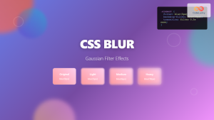
CSS Blur Filter: Complete Guide to Gaussian Blur Effects and Visual Applications
The CSS blur filter is one of the most versatile and visually appealing effects in modern web design. This powerful...

CSS Style filter Property: CSS Filter
CSS filter Property: Enhance Your Web Graphics The CSS filter property provides powerful visual effects to elements like images, backgrounds,...
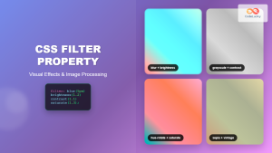
CSS Filter Property: Complete Guide to Visual Effects and Image Processing
The CSS filter property is a powerful tool that allows developers to apply visual effects and image processing techniques directly...
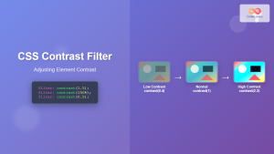
CSS Contrast Filter: Complete Guide to Adjusting Element Contrast for Better Visual Impact
The CSS contrast() filter function is a powerful tool that allows web developers to dynamically adjust the contrast of HTML...
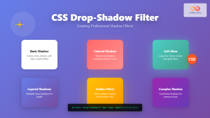
CSS Drop-Shadow Filter: Complete Guide to Creating Professional Shadow Effects
The CSS drop-shadow() filter function is a powerful tool that allows developers to create realistic shadow effects for any HTML...

CSS Style backgroundAttachment Property: CSS Background Attachment
Understanding the background-attachment Property in CSS The background-attachment property in CSS determines whether a background image scrolls with the containing...
CSS Background-Image: Complete Guide to Adding Images to Element Backgrounds
The CSS background-image property is one of the most powerful tools for creating visually appealing web designs. It allows you...
CSS Style backgroundImage Property: CSS Background Image
CSS backgroundImage Property: A Comprehensive Guide The backgroundImage property in CSS is used to set one or more background images...
CSS Style boxShadow Property: CSS Box Shadow
Understanding the CSS box-shadow Property The box-shadow property in CSS allows you to add shadow effects around an element's frame....
CSS Opacity: Complete Guide to Controlling Element Transparency Levels
Understanding CSS Opacity Property The CSS opacity property is a fundamental styling tool that controls the transparency level of HTML...
CSS Background-Attachment: Master Fixed vs Scroll Background Effects
The CSS background-attachment property controls how background images behave when users scroll through your webpage. Understanding the difference between fixed...

CSS Style background Property: CSS Background
CSS background Property: A Comprehensive Guide to Styling Web Page Backgrounds The CSS background property is a versatile shorthand property...


