
Long text content can break your carefully crafted layouts and create poor user experiences. The CSS text-overflow property provides elegant solutions for handling overflowing text, allowing you to clip content gracefully or add ellipsis indicators when text exceeds its container boundaries.
Understanding CSS Text-Overflow Property
The text-overflow property specifies how overflowed content that is not displayed should be signaled to users. It’s particularly useful in responsive designs where text length varies and container sizes are constrained.
Basic Syntax and Values
text-overflow: clip | ellipsis | string | initial | inherit;The property accepts several values:
- clip: Truncates text at the content area limit (default behavior)
- ellipsis: Displays an ellipsis (“…”) to represent clipped text
- string: Uses a custom string to represent clipped text (limited browser support)
- initial: Sets the property to its default value
- inherit: Inherits the property from its parent element
Essential Requirements for Text-Overflow
For text-overflow to work effectively, three CSS properties must be applied together:
white-space: nowrap;– Prevents text from wrapping to new linesoverflow: hidden;– Hides content that exceeds the containertext-overflow: ellipsis;– Specifies how to handle the overflow
Basic Text-Overflow Examples
Simple Ellipsis Implementation
Example: Basic Ellipsis
.basic-ellipsis {
    width: 200px;
    white-space: nowrap;
    overflow: hidden;
    text-overflow: ellipsis;
    border: 2px solid #007bff;
    padding: 10px;
}
Text Clipping Without Ellipsis
Example: Text Clipping
.text-clip {
    width: 200px;
    white-space: nowrap;
    overflow: hidden;
    text-overflow: clip;
}
Advanced Text-Overflow Techniques
Responsive Ellipsis with Flexbox
Combining text-overflow with Flexbox creates responsive layouts that handle varying text lengths elegantly:
Example: Responsive Flexbox Layout
.flex-container {
    display: flex;
    align-items: center;
    gap: 15px;
}

.flex-text {
    flex: 1;
    white-space: nowrap;
    overflow: hidden;
    text-overflow: ellipsis;
    min-width: 0; /* Important for flex items */
}
Multi-line Text Truncation
While text-overflow only works with single lines, you can achieve multi-line truncation using the -webkit-line-clamp property:
Example: Multi-line Truncation
.multiline-ellipsis {
    display: -webkit-box;
    -webkit-line-clamp: 3;
    -webkit-box-orient: vertical;
    overflow: hidden;
    line-height: 1.5;
}
Interactive Text-Overflow Examples
Dynamic Text-Overflow Control
Interactive Example: Toggle Text-Overflow
<script>
function setTextOverflow(type) {
    const element = document.getElementById('demoText');
    element.className = 'demo-text demo-' + type;
}
</script>
Common Use Cases and Best Practices
Navigation Menus
Text-overflow is essential for responsive navigation menus where menu items might have varying lengths:
Example: Responsive Navigation
Product Cards and Lists
E-commerce sites and product listings benefit greatly from consistent text truncation:
Example: Product Card Layout
Browser Compatibility and Fallbacks
The text-overflow property has excellent browser support across all modern browsers. However, some advanced features like multi-line truncation using -webkit-line-clamp have more limited support:
- text-overflow: ellipsis – Supported in all modern browsers including IE 6+
- -webkit-line-clamp – Supported in webkit browsers and Firefox 68+
- text-overflow: string – Limited support, mainly Firefox
Fallback Strategies
For maximum compatibility, always provide fallbacks:
/* Fallback for older browsers */
.text-truncate {
    width: 200px;
    white-space: nowrap;
    overflow: hidden;
    /* Fallback: just hide overflow */
}

/* Enhanced for modern browsers */
.text-truncate {
    text-overflow: ellipsis;
}
Performance Considerations
Text-overflow is a CSS property that doesn’t significantly impact performance, but consider these optimization tips:
- Use
will-change: autosparingly and only when necessary - Avoid excessive DOM manipulations when toggling text-overflow states
- Consider using CSS custom properties for dynamic text-overflow controls
- Test performance on mobile devices where rendering might be slower
Accessibility Considerations
When implementing text-overflow, ensure your content remains accessible:
- Provide
titleattributes for truncated text to show full content on hover - Consider implementing “Show More” buttons for important truncated content
- Ensure sufficient color contrast for ellipsis indicators
- Test with screen readers to verify content accessibility
Example: Accessible Text Truncation
<div class="accessible-truncate"
     title="This is the complete text that was truncated for layout purposes">
    This is the complete text that was truncated for layout purposes
</div>
Advanced CSS Text-Overflow Patterns
Fade-out Effect
Create a gradient fade-out effect instead of abrupt clipping:
Example: Gradient Fade-out
.fade-out-container {
    position: relative;
    width: 200px;
    overflow: hidden;
}

.fade-out-container::after {
    content: '';
    position: absolute;
    top: 0;
    right: 0;
    width: 40px;
    height: 100%;
    background: linear-gradient(to right, transparent, white);
}
Troubleshooting Common Issues
Ellipsis Not Appearing
The most common issue is forgetting one of the required properties. Ensure you have all three:
/* All three properties are required */
.element {
    white-space: nowrap;    /* Prevents line wrapping */
    overflow: hidden;       /* Hides overflow content */
    text-overflow: ellipsis; /* Shows ellipsis */
}
Flexbox and Text-Overflow
In flexbox layouts, add min-width: 0 to flex items to allow text truncation:
.flex-item {
    flex: 1;
    min-width: 0; /* Important for text-overflow to work in flex items */
    white-space: nowrap;
    overflow: hidden;
    text-overflow: ellipsis;
}
Conclusion
CSS text-overflow is a powerful tool for creating clean, responsive layouts that handle varying text lengths gracefully. By combining it with modern CSS techniques like Flexbox and Grid, you can create robust designs that maintain visual consistency across different screen sizes and content lengths.
Remember to always consider accessibility when implementing text truncation, provide appropriate fallbacks for older browsers, and test your implementations across different devices and screen sizes. With these techniques in your toolkit, you can confidently handle text overflow challenges in any web project.
Related Posts

CSS Style textOverflow Property: CSS Text Overflow
CSS text-overflow Property: Managing Overflowing Text The CSS text-overflow property specifies how overflowed content that is not displayed should be...
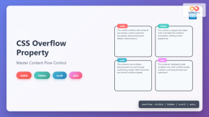
CSS Overflow Property: Complete Guide to Visible, Hidden, Scroll & Auto Values
The CSS overflow property is a fundamental tool for controlling how content behaves when it exceeds the boundaries of its...
CSS Style overflowY Property: CSS Overflow Y
CSS overflowY Property: Controlling Vertical Content Overflow The CSS overflowY property specifies what happens when content overflows an element's block-level...

CSS Style overflow Property: CSS Overflow
CSS overflow Property: Controlling Content Overflow The CSS overflow property specifies how to handle content that overflows a container element....

CSS overflowX Property: CSS Overflow X Explained with Examples
Understanding the CSS overflowX Property The overflowX property in CSS dictates how the browser handles content that overflows the horizontal...
CSS Style wordBreak Property: CSS Word Break
CSS word-break Property: Comprehensive Guide The word-break property in CSS is used to specify how words should break when reaching...

CSS Overflow-X and Overflow-Y: Complete Guide to Horizontal and Vertical Overflow Control
When building web layouts, content doesn't always fit perfectly within its container. CSS overflow properties provide precise control over how...

CSS Style clip-path Property: CSS Clip
CSS clip-path Property: A Comprehensive Guide The clip-path property in CSS allows you to define a specific region of an...

CSS Clip Property: Complete Guide to Rectangular Element Clipping (Deprecated)
The CSS clip property was once a powerful tool for creating rectangular clipping regions on absolutely positioned elements. While now...
CSS Style wordWrap Property: CSS Word Wrap
CSS word-wrap Property: Controlling Word Breaking in CSS The CSS word-wrap property (now standardized as overflow-wrap) is used to specify...

CSS Clip-Path Property: Create Stunning Visual Effects with Modern Shape Clipping
The CSS clip-path property is a powerful tool that allows you to create visually stunning effects by clipping elements into...

CSS White-Space: Complete Guide to Controlling Whitespace and Line Breaks
The CSS white-space property is a powerful tool that controls how browsers handle whitespace characters, line breaks, and text wrapping...


