
The CSS background-position property is a fundamental tool for controlling exactly where background images appear within their containers. Whether you’re creating hero sections, card designs, or complex layouts, understanding how to position background images precisely can transform your web designs from basic to professional.
Understanding CSS Background-Position Basics
The background-position property determines the initial position of a background image relative to its background positioning area. By default, background images start at the top-left corner (0% 0%) of their container, but this property gives you complete control over their placement.
Basic Syntax
/* Basic syntax */
background-position: x-position y-position;

/* Examples */
background-position: center top;
background-position: 50% 25%;
background-position: 10px 20px;
background-position: left bottom;
Keyword Values for Background Positioning
CSS provides intuitive keyword values that make background positioning straightforward. These keywords offer precise control while remaining readable and maintainable.
Horizontal Keywords
- left: Positions the image at the left edge
- center: Centers the image horizontally
- right: Positions the image at the right edge
Vertical Keywords
- top: Positions the image at the top edge
- center: Centers the image vertically
- bottom: Positions the image at the bottom edge
Percentage Values for Precise Control
Percentage values provide mathematical precision for background positioning. They work by aligning the specified percentage point of the image with the same percentage point of the container.
Key Concept: When you use background-position: 25% 75%, you’re aligning the point that’s 25% across and 75% down the image with the point that’s 25% across and 75% down the container.
Interactive Percentage Demo
50%
50%
Length Values: Pixel-Perfect Positioning
Length values using units like pixels (px), ems (em), or rems (rem) provide absolute positioning control. These values represent the distance from the top-left corner of the container to the top-left corner of the background image.
Length Unit Examples
/* Pixel values */
background-position: 20px 30px;

/* Em values (relative to font size) */
background-position: 2em 1.5em;

/* Rem values (relative to root font size) */
background-position: 1rem 2rem;

/* Mixed units */
background-position: 10px 25%;
Length Values Comparison
10px 10px
50px 20px
-10px 10px
Advanced Four-Value Syntax
The four-value syntax provides the most precise control by allowing you to specify positioning relative to any edge of the container. This syntax is particularly useful for responsive designs where you need consistent spacing from specific edges.
Four-Value Syntax Structure
/* Four-value syntax */
background-position: edge1 offset1 edge2 offset2;

/* Examples */
background-position: right 20px bottom 10px;
background-position: left 5% top 30px;
background-position: right 2em bottom 1rem;
Four-Value Positioning Examples
right 20px bottom 15px
15px from bottom
left 10px top 25px
25px from top
Multiple Background Images
When working with multiple background images, you can specify different positions for each image by separating the values with commas. The first position value applies to the first background image, the second to the second image, and so on.
Multiple Background Syntax
/* Multiple backgrounds with different positions */
background-image: url('image1.jpg'), url('image2.png'), url('image3.gif');
background-position: top left, center center, bottom right;

/* Different position types for each background */
background-position: 0% 0%, 50% 50%, 100% 100%;
Multiple Background Demo
1. Pink gradient (top left)
2. Teal radial (center)
3. Blue gradient (bottom right)
Responsive Background Positioning
Modern web design requires background images that adapt to different screen sizes. Using relative units and media queries ensures your background positioning remains effective across all devices.
Responsive Positioning Example
/* Mobile-first approach */
.hero-section {
    background-position: center top;
}

/* Tablet screens */
@media (min-width: 768px) {
    .hero-section {
        background-position: center center;
    }
}

/* Desktop screens */
@media (min-width: 1024px) {
    .hero-section {
        background-position: right center;
    }
}
Common Use Cases and Best Practices
Hero Section Optimization
For hero sections, positioning the focal point of your image at the center ensures it remains visible across different screen sizes:
Perfect Hero Positioning
Center positioning keeps focal point visible
Card Design Patterns
For card layouts, consider using corner positioning to create visual interest while maintaining content readability:
Performance Considerations
Background positioning itself doesn’t significantly impact performance, but the images you’re positioning do. Consider these optimization strategies:
- Image Size: Use appropriately sized images for your containers
- Format Selection: Choose modern formats like WebP for better compression
- Critical Positioning: Ensure important visual elements are positioned within the initial viewport
- Lazy Loading: Consider lazy loading for background images below the fold
Browser Compatibility and Fallbacks
The background-position property has excellent browser support, but the four-value syntax requires more careful consideration for older browsers:
Compatibility Tip: Always provide fallback positioning for older browsers when using advanced syntax:
/* Fallback for older browsers */
background-position: right bottom;
/* Modern four-value syntax */
background-position: right 20px bottom 10px;
Debugging Background Position
When background positioning isn’t working as expected, use browser developer tools to inspect the computed values and container dimensions. Common issues include:
- Container dimensions not being what you expect
- Background-size affecting apparent positioning
- Z-index conflicts with other elements
- Background-repeat creating unwanted repetition
Debugging Pro Tip
Add a temporary border to your container to visualize its exact dimensions:
/* Temporary debugging border */
.container {
    border: 2px solid red !important;
}
Conclusion
Mastering CSS background-position opens up endless possibilities for creating visually stunning web designs. From simple keyword positioning to advanced four-value syntax, each method serves specific design needs. Remember to consider responsive design principles, performance implications, and browser compatibility when implementing background positioning in your projects.
The key to effective background positioning lies in understanding your design goals and choosing the appropriate positioning method. Whether you’re creating hero sections, card layouts, or complex multi-layered backgrounds, the techniques covered in this guide will help you achieve pixel-perfect results that enhance your user experience.
Experiment with different positioning values, combine them with other background properties, and always test across various devices and screen sizes to ensure your designs look great everywhere.
Related Posts
CSS Style backgroundPosition Property: CSS Background Position
CSS background-position Property: Mastering Background Image Placement The CSS background-position property allows you to precisely control the initial position of...
CSS Style backgroundOrigin Property: CSS Background Origin
Understanding the background-origin Property in CSS The background-origin property in CSS specifies where the background image should be positioned within...
CSS Background-Size: Master Cover, Contain and Custom Sizing Techniques
The CSS background-size property is a powerful tool that controls how background images are sized within their containers. Whether you're...
CSS Background-Image: Complete Guide to Adding Images to Element Backgrounds
The CSS background-image property is one of the most powerful tools for creating visually appealing web designs. It allows you...
CSS Object-Position Property: Complete Guide to Precise Image and Video Positioning
The CSS object-position property is a powerful tool that allows developers to precisely control how images, videos, and other replaced...
CSS Style backgroundImage Property: CSS Background Image
CSS backgroundImage Property: A Comprehensive Guide The backgroundImage property in CSS is used to set one or more background images...
CSS Style backgroundSize Property: CSS Background Size
CSS background-size Property: Mastering Background Image Scaling The CSS background-size property specifies the size of background images. Controlling the size...
CSS Background-Repeat: Master Image Repetition Patterns and Control
The CSS background-repeat property is a fundamental tool for controlling how background images behave within their containers. Whether you want...
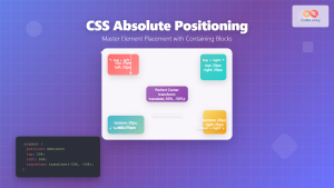
CSS Absolute Positioning: Master Element Placement with Containing Blocks
CSS absolute positioning is one of the most powerful tools for creating precise layouts and complex designs. Understanding how absolutely...
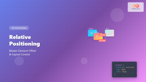
CSS Relative Positioning: Master Element Offset and Layout Control
Understanding CSS Relative Positioning CSS relative positioning is a fundamental layout technique that allows you to move elements from their...
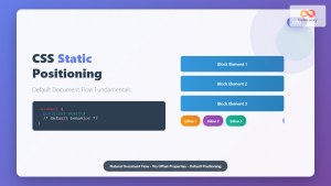
CSS Static Positioning: Understanding Default Document Flow and Layout Fundamentals
CSS positioning is one of the fundamental concepts every web developer must master. Among the various positioning methods available, static...
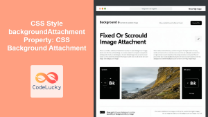
CSS Style backgroundAttachment Property: CSS Background Attachment
Understanding the background-attachment Property in CSS The background-attachment property in CSS determines whether a background image scrolls with the containing...


