Understanding CSS Opacity Property
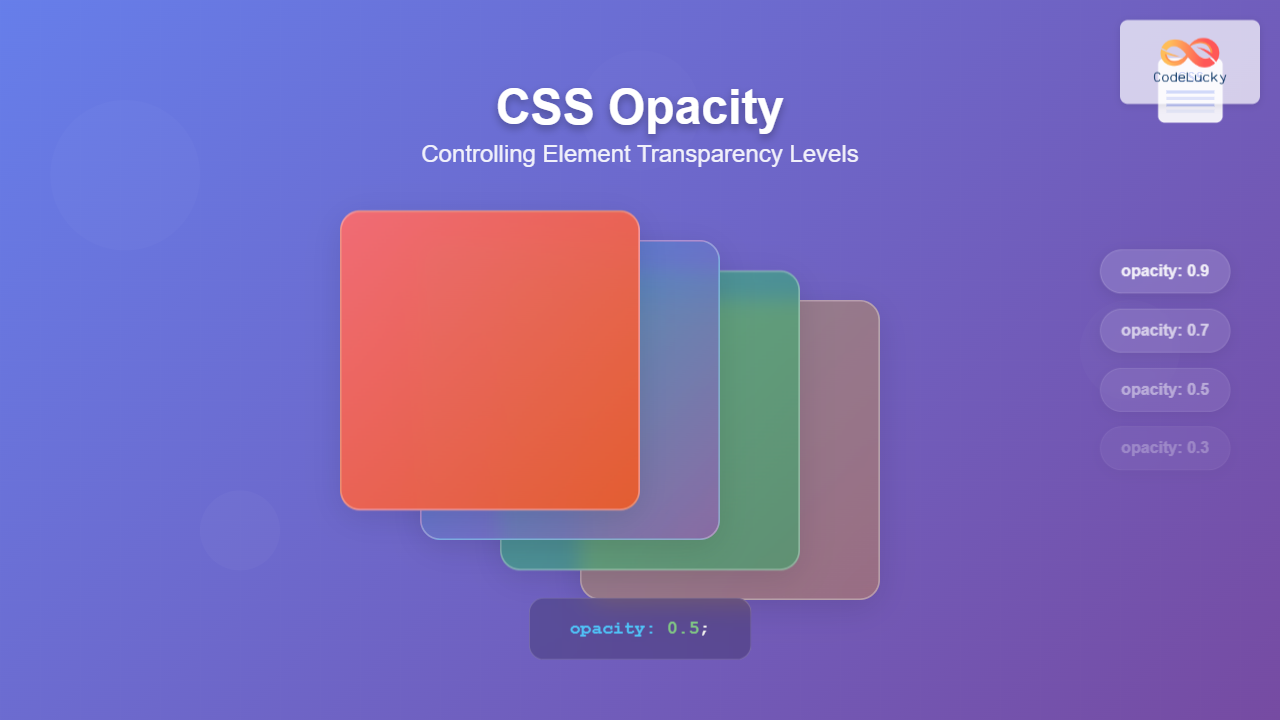
The CSS opacity property is a fundamental styling tool that controls the transparency level of HTML elements. It allows developers to create visually appealing effects by making elements partially or completely transparent, enabling content layering and sophisticated visual designs.
Unlike other CSS properties that affect specific aspects of an element, opacity affects the entire element including its content, background, borders, and all child elements. This makes it particularly powerful for creating overlay effects, fade animations, and interactive user interfaces.
CSS Opacity Syntax and Values
The opacity property accepts numeric values between 0 and 1, where:
- 0 – Completely transparent (invisible)
- 1 – Completely opaque (fully visible)
- 0.5 – 50% transparent
- 0.25 – 75% transparent
- 0.75 – 25% transparent
/* Basic syntax */
.element {
    opacity: value;
}

/* Examples */
.transparent {
    opacity: 0;        /* Invisible */
}

.semi-transparent {
    opacity: 0.5;      /* 50% visible */
}

.almost-opaque {
    opacity: 0.9;      /* 90% visible */
}

.fully-opaque {
    opacity: 1;        /* Default - fully visible */
}
Visual Examples of CSS Opacity Levels
Here’s a practical demonstration showing different opacity values applied to identical elements:
Opacity: 1
Fully Opaque
Opacity: 0.8
80% Visible
Opacity: 0.6
60% Visible
Opacity: 0.4
40% Visible
Opacity: 0.2
20% Visible
Interactive Opacity Control Demo
Use the slider below to see how opacity changes affect element visibility in real-time:
Interactive Element
Adjust the slider to see opacity changes
Opacity vs RGBA: Key Differences
While both opacity and RGBA can create transparency effects, they work differently and serve distinct purposes:
CSS Opacity
Parent Element
Child Element (Also Affected)
Affects entire element including children
RGBA Background
Parent Element
Child Element (Not Affected)
Only affects background color
💡 Pro Tip
Use opacity when you want to fade entire elements with their children. Use rgba() or hsla() when you only want to make specific properties (like background color) transparent while keeping child elements fully opaque.
Opacity Inheritance and Child Elements
Understanding how opacity affects child elements is crucial for proper implementation. Unlike most CSS properties, opacity creates a stacking context and affects all descendant elements:
Parent Container (opacity: 0.7)
Child Element (opacity: 1)
Still affected by parent’s opacity!
Child Element (opacity: 0.5)
Effective opacity: 0.7 × 0.5 = 0.35
/* Parent opacity affects all children */
.parent {
    opacity: 0.7;
}

.child {
    opacity: 1;    /* Still appears at 70% opacity */
}

.nested-child {
    opacity: 0.5;  /* Effective opacity: 0.7 × 0.5 = 0.35 */
}
Common Use Cases and Practical Applications
1. Hover Effects and Interactive Elements
Opacity is perfect for creating smooth hover transitions that enhance user experience:
Hover Effect
Hover to see opacity change
Reveal Effect
Hover to reveal content
.hover-fade {
    opacity: 1;
    transition: opacity 0.3s ease;
}

.hover-fade:hover {
    opacity: 0.8;
}

.reveal-on-hover {
    opacity: 0.7;
    transition: opacity 0.5s ease;
}

.reveal-on-hover:hover {
    opacity: 1;
}
2. Loading States and Disabled Elements
Opacity effectively communicates element states to users:
Loading Content…
3. Overlay and Modal Effects
Create professional overlay effects for modals, image galleries, and content layers:
Overlay Content
Hover to see the overlay effect
Browser Compatibility and Support
The CSS opacity property enjoys excellent browser support across all modern browsers and has been stable since the early 2000s:
✅ Full Browser Support
- Chrome: All versions
- Firefox: All versions
- Safari: All versions
- Edge: All versions
- Internet Explorer: 9+ (IE8 requires filter property)
For legacy Internet Explorer 8 support, you can use the filter property as a fallback:
/* Modern browsers */
.transparent-element {
    opacity: 0.5;
}

/* IE8 fallback */
.transparent-element {
    filter: alpha(opacity=50);
    opacity: 0.5;
}
Performance Considerations
While opacity is generally performant, understanding its impact on rendering can help optimize your applications:
🚀 Performance Tips
- Hardware Acceleration: Opacity changes can trigger GPU acceleration for smoother animations
- Stacking Context: Elements with opacity create new stacking contexts, affecting z-index behavior
- Paint Optimization: Use
will-change: opacityfor elements that will animate opacity - Avoid Layout Thrashing: Opacity changes don’t trigger layout recalculation, making them efficient for animations
Advanced Techniques and Best Practices
Combining Opacity with Transforms
Create sophisticated animations by combining opacity with CSS transforms:
Lift Effect
Hover me!
Scale Effect
Hover me!
Creating Fade Animations
Use CSS keyframes with opacity for smooth fade effects:
@keyframes fadeIn {
    from {
        opacity: 0;
        transform: translateY(20px);
    }
    to {
        opacity: 1;
        transform: translateY(0);
    }
}

.fade-in-element {
    animation: fadeIn 0.6s ease-out forwards;
}

@keyframes pulse {
    0%, 100% {
        opacity: 1;
    }
    50% {
        opacity: 0.5;
    }
}

.pulse-element {
    animation: pulse 2s infinite;
}
Pulsing Element
Accessibility and User Experience
When using opacity, consider accessibility and user experience implications:
♿ Accessibility Guidelines
- Color Contrast: Ensure sufficient contrast ratios even with reduced opacity
- Focus Indicators: Don’t hide focus outlines with opacity
- Animation Preferences: Respect
prefers-reduced-motionfor opacity animations - Content Visibility: Avoid making essential content too transparent
Troubleshooting Common Issues
Issue 1: Child Elements Inheriting Opacity
Problem: Child elements become transparent when you only want the parent background to be transparent.
Solution: Use RGBA background colors instead of opacity:
/* Instead of this */
.parent {
    background-color: blue;
    opacity: 0.5; /* Affects children too */
}

/* Use this */
.parent {
    background-color: rgba(0, 0, 255, 0.5); /* Only background transparent */
}
Issue 2: Z-index Problems with Opacity
Problem: Elements with opacity create stacking contexts, affecting layering.
Solution: Understand stacking context rules and adjust z-index accordingly:
/* Opacity creates stacking context */
.modal-overlay {
    opacity: 0.9;
    z-index: 1000; /* May not work as expected */
}

/* Better approach */
.modal-overlay {
    background-color: rgba(0, 0, 0, 0.9);
    z-index: 1000; /* Works as expected */
}
Conclusion
CSS opacity is a versatile and powerful property that enables developers to create sophisticated visual effects and improve user interactions. By understanding its behavior, inheritance patterns, and best practices, you can leverage opacity to enhance your web designs while maintaining accessibility and performance.
Remember these key takeaways when working with CSS opacity:
- Opacity affects entire elements including all children
- Values range from 0 (transparent) to 1 (opaque)
- Use RGBA/HSLA when you only want background transparency
- Consider accessibility and performance implications
- Combine with transforms and animations for enhanced effects
With proper implementation, CSS opacity becomes an invaluable tool in your frontend development toolkit, enabling you to create engaging, interactive, and visually appealing web experiences.

