
The CSS contrast() filter function is a powerful tool that allows web developers to dynamically adjust the contrast of HTML elements, including images, backgrounds, and any visual content. This comprehensive guide will walk you through everything you need to know about implementing contrast filters effectively in your web projects.
What is CSS Contrast Filter?
The contrast() filter function modifies the contrast of an element by adjusting the difference between the lightest and darkest parts of the content. It’s part of the CSS filter property and can dramatically improve the visual impact of images and other elements on your webpage.
Basic Syntax
filter: contrast(value);

/* Examples */
filter: contrast(50%);    /* Reduces contrast by 50% */
filter: contrast(1.5);    /* Increases contrast by 50% */
filter: contrast(200%);   /* Doubles the contrast */
Understanding Contrast Values
The contrast function accepts different value formats, each serving specific use cases:
Percentage Values
- 0% – Completely removes contrast (creates a solid gray)
- 50% – Reduces contrast by half
- 100% – Normal contrast (default)
- 150% – Increases contrast by 50%
- 200% – Doubles the contrast
Decimal Values
- 0 – No contrast (equivalent to 0%)
- 0.5 – Half contrast (equivalent to 50%)
- 1 – Normal contrast (equivalent to 100%)
- 1.5 – 1.5x contrast (equivalent to 150%)
Visual Examples and Demonstrations
Interactive Contrast Demonstration
contrast(0.5) – Low Contrast
contrast(1) – Normal
contrast(2) – High Contrast
Interactive Slider Control
1.0
Practical Implementation Examples
Basic Image Contrast Enhancement
/* CSS */
.enhanced-image {
    filter: contrast(1.3);
    transition: filter 0.3s ease;
}

.enhanced-image:hover {
    filter: contrast(1.1);
}
<!-- HTML -->
<img src="landscape.jpg" alt="Enhanced landscape" class="enhanced-image">Dynamic Contrast Control with JavaScript
/* CSS */
.adjustable-contrast {
    filter: contrast(var(--contrast-value, 1));
    transition: filter 0.2s ease;
}

/* JavaScript */
function adjustContrast(element, value) {
    element.style.setProperty('--contrast-value', value);
}
Responsive Contrast Adjustments
/* CSS */
@media (max-width: 768px) {
    .mobile-optimized {
        filter: contrast(1.2); /* Higher contrast for mobile */
    }
}

@media (prefers-contrast: high) {
    .accessibility-friendly {
        filter: contrast(1.5); /* Enhanced for accessibility */
    }
}
Advanced Techniques and Use Cases
Combining Multiple Filters
The contrast filter works exceptionally well when combined with other CSS filters to create sophisticated visual effects:
/* Multiple filter combination */
.artistic-effect {
    filter: contrast(1.4) brightness(1.1) saturate(1.2);
}

.dramatic-black-white {
    filter: contrast(2) grayscale(1) brightness(0.9);
}

.vintage-look {
    filter: contrast(0.8) sepia(0.3) hue-rotate(20deg);
}
Artistic Effect
Dramatic B&W
Vintage Look
Animation and Transitions
Create engaging user experiences by animating contrast changes:
/* Smooth contrast animations */
@keyframes contrast-pulse {
    0%, 100% { filter: contrast(1); }
    50% { filter: contrast(1.3); }
}

.pulsing-contrast {
    animation: contrast-pulse 2s ease-in-out infinite;
}

/* Hover effects */
.hover-enhance {
    filter: contrast(0.9);
    transition: filter 0.4s cubic-bezier(0.4, 0, 0.2, 1);
}

.hover-enhance:hover {
    filter: contrast(1.2);
}
Performance Considerations
While CSS filters are hardware-accelerated in modern browsers, it’s important to consider performance implications:
Best Practices for Performance
- Use transforms wisely: Apply filters to elements that don’t change frequently
- Optimize for mobile: Test filter performance on lower-end devices
- Combine filters efficiently: Use single filter declarations rather than multiple separate ones
- Consider will-change: Use
will-change: filterfor elements that will be animated
/* Performance-optimized approach */
.optimized-filter {
    will-change: filter;
    filter: contrast(1.2);
    transform: translateZ(0); /* Creates new layer */
}
Accessibility and User Experience
When implementing contrast filters, always consider accessibility and user preferences:
Respecting User Preferences
/* Respect user's contrast preferences */
@media (prefers-contrast: high) {
    .adaptive-contrast {
        filter: contrast(1.5);
    }
}

@media (prefers-contrast: low) {
    .adaptive-contrast {
        filter: contrast(0.8);
    }
}

/* Reduce motion for sensitive users */
@media (prefers-reduced-motion: reduce) {
    .animated-contrast {
        animation: none;
        transition: none;
    }
}
Browser Support and Fallbacks
CSS contrast filter enjoys excellent browser support across modern browsers:
Supported Browsers:
- Chrome 18+
- Firefox 35+
- Safari 6+
- Edge 12+
- iOS Safari 6+
- Android Browser 4.4+
Providing Fallbacks
/* Feature detection and fallback */
@supports (filter: contrast(1)) {
    .modern-contrast {
        filter: contrast(1.3);
    }
}

@supports not (filter: contrast(1)) {
    .modern-contrast {
        /* Fallback styles for older browsers */
        opacity: 0.9;
    }
}
Real-World Applications
Image Gallery Enhancement
Interactive Gallery Example
Hover over the images to see contrast enhancement in action
Logo and Brand Enhancement
/* Brand logo with adaptive contrast */
.brand-logo {
    filter: contrast(1.1);
    transition: filter 0.3s ease;
}

.brand-logo:hover {
    filter: contrast(1.3) brightness(1.05);
}

/* Dark mode adaptation */
@media (prefers-color-scheme: dark) {
    .brand-logo {
        filter: contrast(1.4) brightness(1.2);
    }
}
Troubleshooting Common Issues
Filter Stacking Problems
When multiple elements have filters, they can interact unexpectedly:
Common Issue:
Nested elements with filters can compound effects, creating overly contrasted results.
/* Problem: Compounding filters */
.parent { filter: contrast(1.2); }
.child { filter: contrast(1.3); } /* Results in 1.56x contrast */

/* Solution: Use CSS custom properties */
:root {
    --base-contrast: 1.2;
}

.controlled-contrast {
    filter: contrast(var(--base-contrast));
}
Performance Optimization
Performance Tips:
- Use
transform3d(0,0,0)orwill-change: filterfor animated elements - Avoid applying filters to large background images
- Test on mobile devices regularly
- Consider using CSS Grid/Flexbox instead of filters for layout effects
Conclusion
The CSS contrast filter is a versatile and powerful tool for enhancing visual design on the web. From subtle image improvements to dramatic artistic effects, understanding how to properly implement contrast adjustments can significantly elevate your web projects.
Remember to always consider accessibility, performance, and user experience when implementing contrast filters. Test across different devices and user preferences to ensure your designs work well for everyone.
Key Takeaways:
- Use percentage or decimal values to control contrast intensity
- Combine with other filters for advanced visual effects
- Always test for accessibility and performance
- Provide appropriate fallbacks for older browsers
- Consider user preferences and system settings
Start experimenting with contrast filters in your next project and discover how this simple yet powerful CSS property can transform your visual designs.
Related Posts
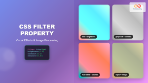
CSS Filter Property: Complete Guide to Visual Effects and Image Processing
The CSS filter property is a powerful tool that allows developers to apply visual effects and image processing techniques directly...
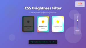
CSS Brightness Filter: Complete Guide to Adjusting Element Brightness
The CSS brightness() filter function is a powerful tool that allows developers to adjust the brightness of HTML elements dynamically....

CSS Style filter Property: CSS Filter
CSS filter Property: Enhance Your Web Graphics The CSS filter property provides powerful visual effects to elements like images, backgrounds,...

CSS Backdrop-Filter: Complete Guide to Background Blur and Visual Effects
What is CSS Backdrop-Filter? The backdrop-filter property in CSS allows you to apply graphical effects like blur, brightness, contrast, and...

CSS Background-Image: Complete Guide to Adding Images to Element Backgrounds
The CSS background-image property is one of the most powerful tools for creating visually appealing web designs. It allows you...
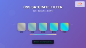
CSS Saturate Filter: Complete Guide to Color Saturation Control
The CSS saturate() filter function is a powerful tool that allows you to control the color saturation of HTML elements....

CSS Grayscale Filter: Master Black and White Image Effects with Complete Guide
The CSS grayscale filter is a powerful tool that transforms colorful images into elegant black and white versions. This filter...
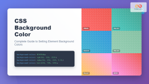
CSS Background-Color: Complete Guide to Setting Element Background Colors
The CSS background-color property is one of the most fundamental styling tools in web development, allowing you to set the...

CSS Style backgroundImage Property: CSS Background Image
CSS backgroundImage Property: A Comprehensive Guide The backgroundImage property in CSS is used to set one or more background images...
CSS Blur Filter: Complete Guide to Gaussian Blur Effects and Visual Applications
The CSS blur filter is one of the most versatile and visually appealing effects in modern web design. This powerful...

CSS Invert Filter: Complete Guide to Inverting Element Colors and Visual Effects
The CSS invert() filter is a powerful visual effect that reverses the colors of HTML elements, creating striking contrast and...
CSS Color Property: Complete Guide to Text Colors with Hex, RGB, HSL Values
The CSS color property is one of the most fundamental styling properties in web development, allowing you to control the...


