
CSS viewport units revolutionize how we approach responsive web design by providing a direct relationship between element sizes and the browser’s viewport dimensions. Unlike traditional units like pixels or percentages, viewport units create truly scalable interfaces that adapt seamlessly across all device sizes.
Understanding CSS Viewport Units
Viewport units are relative length units that represent a percentage of the viewport’s dimensions. The viewport is the visible area of a web page within the browser window, excluding toolbars, address bars, and other browser UI elements.
The Four Viewport Units Explained
- vw (Viewport Width): 1vw equals 1% of the viewport’s width
- vh (Viewport Height): 1vh equals 1% of the viewport’s height
- vmin (Viewport Minimum): 1vmin equals 1% of the viewport’s smaller dimension
- vmax (Viewport Maximum): 1vmax equals 1% of the viewport’s larger dimension
Quick Example
If your viewport is 1000px wide and 800px tall:
- 10vw = 100px (10% of 1000px)
- 10vh = 80px (10% of 800px)
- 10vmin = 80px (10% of 800px, the smaller dimension)
- 10vmax = 100px (10% of 1000px, the larger dimension)
Practical Examples and Visual Demonstrations
1. Full-Screen Hero Sections with vh
Creating hero sections that perfectly fill the viewport height is one of the most common use cases for viewport units:
.hero-section {
  height: 100vh;
  display: flex;
  align-items: center;
  justify-content: center;
  background: linear-gradient(135deg, #667eea 0%, #764ba2 100%);
}

.hero-content {
  text-align: center;
  font-size: 3vw;
  max-width: 80vw;
}
Hero Section Demo
This section always fills the viewport height
2. Responsive Typography with vw
Viewport width units create text that scales smoothly with the browser width, eliminating the need for multiple media queries:
.responsive-heading {
  font-size: 5vw;
  line-height: 1.2;
  text-align: center;
}

.responsive-paragraph {
  font-size: 2vw;
  max-width: 70vw;
  margin: 0 auto;
}
Scaling Headline
This paragraph text scales proportionally with the viewport width, maintaining readability across all screen sizes without media queries.
3. Perfect Squares and Circles with vmin
Using vmin ensures elements maintain their proportions regardless of viewport orientation:
.perfect-square {
  width: 20vmin;
  height: 20vmin;
  background: #4299e1;
  margin: 2vmin auto;
}

.perfect-circle {
  width: 15vmin;
  height: 15vmin;
  background: #ed8936;
  border-radius: 50%;
  margin: 2vmin auto;
}
4. Fluid Spacing with Viewport Units
Create spacing that adapts to screen size for consistent visual hierarchy:
.fluid-section {
  padding: 5vh 5vw;
  margin-bottom: 3vh;
}

.fluid-gap {
  margin-top: 4vh;
  margin-bottom: 4vh;
}
Interactive Viewport Unit Calculator
Live Viewport Calculator
Advanced Techniques and Best Practices
Combining Viewport Units with calc()
Mixing viewport units with other units using CSS calc() creates more flexible designs:
/* Responsive font with minimum size */
.smart-text {
  font-size: calc(16px + 2vw);
}

/* Full height minus fixed header */
.content-area {
  height: calc(100vh - 80px);
}

/* Responsive padding with boundaries */
.flexible-container {
  padding: calc(2rem + 2vh) calc(1rem + 3vw);
}
Viewport Units for CSS Grid and Flexbox
Create truly responsive layouts by combining viewport units with modern CSS layout methods:
.grid-container {
  display: grid;
  grid-template-columns: repeat(auto-fit, minmax(30vw, 1fr));
  gap: 3vw 2vw;
  padding: 5vh 5vw;
}

.flex-items {
  display: flex;
  gap: 4vw;
  padding: 3vh 0;
}

.flex-item {
  flex: 1;
  min-height: 25vh;
  padding: 2vh 2vw;
}
Browser Support and Compatibility
Excellent Browser Support
Viewport units enjoy excellent browser support across all modern browsers:
- Chrome/Edge: Full support since version 20+
- Firefox: Full support since version 19+
- Safari: Full support since version 6+
- Mobile browsers: Widely supported on iOS Safari 6+ and Android Browser 4.4+
Mobile Browser Considerations
Mobile browsers handle viewport units differently due to dynamic UI elements. Consider these strategies:
/* Using CSS custom properties for mobile fixes */
:root {
  --vh: 1vh;
}

@media screen and (max-width: 768px) {
  :root {
    --vh: calc(1vh * 0.01);
  }
}

.mobile-safe-height {
  height: calc(var(--vh, 1vh) * 100);
}
Common Pitfalls and Solutions
1. Text Scaling Issues
Prevent text from becoming too small or large by setting reasonable boundaries:
/* Poor approach */
.bad-text {
  font-size: 5vw; /* Can become too small or huge */
}

/* Better approach */
.good-text {
  font-size: clamp(1.2rem, 4vw, 3rem);
}
2. Accessibility Considerations
Ensure your viewport unit usage doesn’t interfere with user accessibility preferences:
/* Respect user's motion preferences */
@media (prefers-reduced-motion: reduce) {
  .viewport-animated {
    font-size: 1.5rem; /* Fixed size instead of vw */
  }
}

/* Ensure minimum touch targets */
.interactive-element {
  min-height: max(44px, 6vh);
  min-width: max(44px, 8vw);
}
Real-World Use Cases
Landing Page Hero Section
.hero {
  height: 100vh;
  background: linear-gradient(rgba(0,0,0,0.4), rgba(0,0,0,0.4)),
              url('hero-bg.jpg') center/cover;
  display: flex;
  align-items: center;
  justify-content: center;
}

.hero-content {
  text-align: center;
  color: white;
  max-width: 80vw;
}

.hero-title {
  font-size: clamp(2rem, 8vw, 6rem);
  margin-bottom: 2vh;
}

.hero-subtitle {
  font-size: clamp(1rem, 3vw, 2rem);
  margin-bottom: 4vh;
}
Responsive Card Layout
.card-grid {
  display: grid;
  grid-template-columns: repeat(auto-fit, minmax(min(300px, 90vw), 1fr));
  gap: 3vw;
  padding: 5vh 5vw;
}

.card {
  background: white;
  border-radius: 1vw;
  padding: 3vh 2vw;
  box-shadow: 0 2px 20px rgba(0,0,0,0.1);
  min-height: 30vh;
}
Performance and Optimization Tips
Performance Considerations
- Minimize repaints: Viewport units can trigger repaints during resize events
- Use transform over changing dimensions: For animations, prefer transform: scale() over changing vw/vh values
- Debounce resize events: When using JavaScript with viewport units, debounce resize handlers
- Test on real devices: Mobile browsers may handle viewport units differently than desktop
Conclusion
CSS viewport units provide powerful tools for creating truly responsive designs that adapt seamlessly across all device sizes. By understanding how vw, vh, vmin, and vmax work together, you can build interfaces that scale naturally without relying heavily on media queries.
The key to success with viewport units lies in thoughtful implementation—combining them with other CSS techniques like clamp(), calc(), and modern layout methods. Remember to test thoroughly across different devices and browsers, especially mobile platforms where viewport behavior can vary.
Start experimenting with viewport units in your next project, beginning with simple use cases like hero sections and typography scaling. As you become more comfortable, explore advanced techniques like combining viewport units with CSS Grid and custom properties for even more flexible, responsive designs.
Related Posts
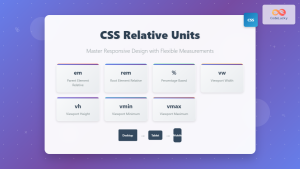
CSS Units: Complete Guide to Relative Units – em, rem, %, vw, vh, vmin, vmax
CSS relative units are the foundation of responsive web design, enabling websites to adapt seamlessly across different devices and screen...

CSS Percentage Units: Complete Guide to Parent-Relative Sizing
CSS percentage units are fundamental building blocks for creating responsive, flexible layouts that adapt to different screen sizes and container...

CSS Width and Height: Complete Guide to Element Dimensions
Understanding how to control element dimensions is fundamental to creating well-structured web layouts. CSS width and height properties give you...
JavaScript Screen availWidth Property: Available Width
JavaScript Screen availWidth Property: Available Width The availWidth property of the JavaScript Screen object returns the available horizontal space (in...

JavaScript screen.width Property: Screen Width
JavaScript screen.width Property: Screen Width The screen.width property in JavaScript is a read-only property that returns the total width of...

JavaScript Screen availHeight Property: Available Height
JavaScript screen.availHeight Property: Understanding Available Screen Height The screen.availHeight property in JavaScript is a read-only property that returns the height...

CSS Container Query Length Units: Complete Guide to cqw, cqh, cqi, cqb for Responsive Design
CSS Container Query Length Units represent a revolutionary approach to responsive web design, allowing developers to create components that adapt...

CSS Aspect-Ratio Property: Complete Guide to Maintaining Perfect Width/Height Ratios
The CSS aspect-ratio property revolutionizes how we maintain consistent width-to-height ratios in responsive web design. Instead of relying on complex...

JavaScript Screen height Property: Screen Height
JavaScript screen.height Property: Understanding Screen Height The screen.height property in JavaScript is a read-only property that returns the total height...

CSS Style maxWidth Property: CSS Max Width
Understanding the CSS maxWidth Property The CSS maxWidth property is a fundamental tool in web development for controlling the maximum...
JavaScript Window outerHeight Property: Window Outer Height
JavaScript Window outerHeight Property: A Comprehensive Guide The JavaScript window.outerHeight property returns the height of the entire browser window, including...

CSS Resolution Media Queries: Complete Guide to High-DPI Display Targeting
Understanding CSS Resolution Media Queries CSS resolution media queries allow developers to target specific display densities and create optimized experiences...


