The CSS transform property is one of the most powerful tools in modern web development, allowing developers to manipulate HTML elements in both 2D and 3D space without affecting the document flow. This comprehensive guide explores every aspect of CSS transforms, from basic 2D transformations to advanced 3D effects.
What is the CSS Transform Property?
The CSS transform property applies geometric transformations to elements, including translation, rotation, scaling, and skewing. Unlike changing position properties, transforms don’t affect the layout of surrounding elements, making them perfect for animations and visual effects.
Basic Syntax
transform: transform-function(value) transform-function(value);
transform-origin: x-axis y-axis z-axis;
transform-style: flat | preserve-3d;
2D Transform Functions
1. Translate – Moving Elements
The translate functions move elements along the X and Y axes without affecting other elements in the document flow.
translate(x, y)
/* Move 50px right, 30px down */
transform: translate(50px, 30px);

/* Individual axes */
transform: translateX(50px);
transform: translateY(30px);2. Rotate – Spinning Elements
The rotate function spins elements around their center point (or transform-origin) by a specified angle.
rotate(angle)
/* Rotate 45 degrees clockwise */
transform: rotate(45deg);

/* Rotate counter-clockwise */
transform: rotate(-30deg);

/* Using turns instead of degrees */
transform: rotate(0.25turn);3. Scale – Resizing Elements
The scale functions change the size of elements along the X and Y axes. Values greater than 1 increase size, while values less than 1 decrease size.
scale(x, y)
/* Scale uniformly */
transform: scale(1.5);

/* Scale differently on each axis */
transform: scale(2, 0.5);

/* Individual axes */
transform: scaleX(2);
transform: scaleY(0.5);4. Skew – Distorting Elements
The skew functions distort elements by tilting them along the X and Y axes, creating parallelogram-like shapes.
skew(x-angle, y-angle)
/* Skew on both axes */
transform: skew(20deg, 10deg);

/* Individual axes */
transform: skewX(20deg);
transform: skewY(10deg);Combining 2D Transforms
Multiple transform functions can be combined in a single transform property. The order matters as transforms are applied from right to left.
/* Multiple transforms applied together */
transform: translate(100px, 50px) rotate(45deg) scale(1.2);

/* This creates a different result than: */
transform: scale(1.2) rotate(45deg) translate(100px, 50px);
Original
Combined
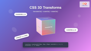
3D Transform Functions
3D transforms add depth to your transformations, allowing elements to move and rotate in three-dimensional space. These require the transform-style: preserve-3d property on the parent element.
1. 3D Translation
3D translation includes movement along the Z-axis (depth), creating the illusion of elements moving closer or farther from the viewer.
/* 3D translation */
transform: translate3d(x, y, z);
transform: translateZ(50px);

/* Enable 3D context */
transform-style: preserve-3d;
perspective: 1000px;
2. 3D Rotation
3D rotation allows elements to spin around the X, Y, and Z axes, creating sophisticated three-dimensional effects.
3D Rotation Functions
/* Individual axis rotation */
transform: rotateX(45deg);
transform: rotateY(45deg);
transform: rotateZ(45deg);

/* Combined 3D rotation */
transform: rotate3d(1, 1, 0, 45deg);Transform Origin
The transform-origin property defines the point around which transformations are applied. By default, it’s the center of the element (50% 50%).
Transform Origin Values
/* Center (default) */
transform-origin: center center;
transform-origin: 50% 50%;

/* Top-left corner */
transform-origin: top left;
transform-origin: 0 0;

/* Custom position */
transform-origin: 20px 30px;Perspective and 3D Context
For 3D transforms to appear realistic, you need to establish perspective and 3D context using specific CSS properties.
Setting Up 3D Context
/* Container setup for 3D */
.container {
  perspective: 1000px;
  perspective-origin: center center;
}

/* Element with 3D transforms */
.element {
  transform-style: preserve-3d;
  transform: rotateX(45deg) rotateY(45deg);
}
Advanced Transform Techniques
1. Matrix Transformations
The matrix() function provides complete control over 2D transformations using a 6-value matrix, while matrix3d() uses 16 values for 3D.
/* 2D matrix: matrix(a, b, c, d, tx, ty) */
transform: matrix(1, 0.5, -0.5, 1, 100, 50);

/* This is equivalent to: */
transform: translate(100px, 50px) skew(-26.57deg, 26.57deg);
2. Creating Card Flip Effects
A popular use case for 3D transforms is creating card flip animations that reveal content on hover or click.
.flip-card {
  perspective: 1000px;
  width: 200px;
  height: 120px;
}

.flip-card-inner {
  position: relative;
  width: 100%;
  height: 100%;
  text-align: center;
  transition: transform 0.6s;
  transform-style: preserve-3d;
}

.flip-card:hover .flip-card-inner {
  transform: rotateY(180deg);
}

.flip-card-front, .flip-card-back {
  position: absolute;
  width: 100%;
  height: 100%;
  backface-visibility: hidden;
}

.flip-card-back {
  transform: rotateY(180deg);
}Performance Considerations
CSS transforms are hardware-accelerated in modern browsers, making them more performant than changing layout properties. However, there are best practices to follow:
Performance Tips
- Use transforms instead of changing position properties – transforms don’t trigger layout recalculation
- Enable hardware acceleration – 3D transforms or translateZ(0) can trigger GPU acceleration
- Avoid transforming many elements simultaneously – this can overwhelm the GPU
- Use will-change property – hints to the browser that an element will be transformed
/* Enable hardware acceleration */
.accelerated {
  transform: translateZ(0);
  /* or */
  will-change: transform;
}
Browser Support and Fallbacks
CSS transforms have excellent browser support across modern browsers. However, for older browsers, you might need vendor prefixes or fallbacks.
/* Vendor prefixes for older browsers */
.element {
  -webkit-transform: rotate(45deg);
  -moz-transform: rotate(45deg);
  -ms-transform: rotate(45deg);
  -o-transform: rotate(45deg);
  transform: rotate(45deg);
}

/* Feature detection with @supports */
@supports (transform: rotate(45deg)) {
  .modern-transform {
    transform: rotate(45deg) scale(1.2);
  }
}
Real-World Examples and Use Cases
1. Image Hover Effects
.image-hover {
  transition: transform 0.3s ease;
  overflow: hidden;
}

.image-hover:hover {
  transform: scale(1.1) rotate(2deg);
}

.image-hover img {
  transition: transform 0.3s ease;
}

.image-hover:hover img {
  transform: scale(1.05);
}2. Loading Spinner
@keyframes spin {
  from {
    transform: rotate(0deg);
  }
  to {
    transform: rotate(360deg);
  }
}

.spinner {
  animation: spin 1s linear infinite;
  border: 3px solid #f3f3f3;
  border-top: 3px solid #3498db;
  border-radius: 50%;
  width: 40px;
  height: 40px;
}
Common Pitfalls and Solutions
Avoiding Common Mistakes
- Transform order matters –
rotate(45deg) translate(100px, 0)produces different results thantranslate(100px, 0) rotate(45deg) - Z-index issues with 3D transforms – Use
transform-style: preserve-3don parent containers - Blurry text after transforms – Use
backface-visibility: hiddenor avoid fractional pixel values - Performance issues – Don’t animate too many elements simultaneously
Conclusion
CSS transforms provide powerful capabilities for creating engaging, interactive web experiences. From simple 2D effects like rotation and scaling to complex 3D animations, transforms offer hardware-accelerated performance that makes smooth animations possible. By understanding the various transform functions, origin points, and 3D context properties, you can create sophisticated visual effects that enhance user experience without compromising performance.
Whether you’re building hover effects, loading animations, or complex 3D interfaces, CSS transforms are an essential tool in modern web development. Practice combining different transform functions and experiment with 3D effects to unlock the full potential of this versatile CSS property.
Related Posts
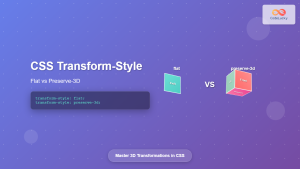
CSS Transform-Style: Complete Guide to Flat vs Preserve-3d for 3D Transformations
The CSS transform-style property is a powerful tool that controls how child elements are rendered in 3D space when their...
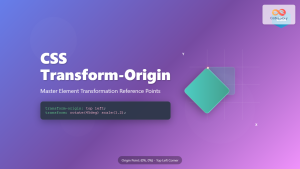
CSS Transform-Origin: Master Element Transformation Reference Points
The transform-origin property is a powerful CSS feature that determines the reference point for element transformations. Whether you're rotating, scaling,...
CSS Style transform Property: CSS Transform
CSS transform Property: A Comprehensive Guide The CSS transform property is a powerful tool that allows you to modify the...
CSS Style transformOrigin Property: CSS Transform Origin
CSS transformOrigin Property: Mastering Element Transformation Origins The transformOrigin property in CSS is a fundamental tool for controlling how transformations...

CSS Scale: Master Element Resizing with Transform Property
The CSS scale() function is a powerful transformation tool that allows you to resize elements proportionally without affecting the document...
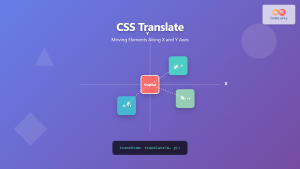
CSS Translate: Complete Guide to Moving Elements Along X and Y Axes
The CSS translate() function is one of the most powerful and versatile tools for moving elements on a webpage. Unlike...
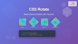
CSS Rotate: Complete Guide to Rotating Elements with Transform
CSS rotation is one of the most powerful and visually striking transformation effects available to web developers. The transform: rotate()...
CSS 3D Transforms: Complete Guide to Translate3d, Scale3d, and Rotate3d Functions
CSS 3D transforms revolutionize how we create interactive and visually stunning web interfaces. By utilizing the power of translate3d(), scale3d(),...

CSS Skew: Distorting Elements Along Axes for Dynamic Visual Effects
CSS skew transforms allow you to distort elements by slanting them along the X and Y axes, creating dynamic visual...
CSS Text-Transform: Complete Guide to Uppercase, Lowercase and Capitalize Text Styling
The CSS text-transform property is a powerful tool that allows developers to control the capitalization of text elements without modifying...

CSS perspective Property: CSS Perspective
Understanding the CSS perspective Property The CSS perspective property allows you to give a 3D-positioned element some perspective. It defines...
CSS Transition Property: Complete Guide to Smooth Animation Effects
CSS transitions enable smooth, visually appealing animations when element properties change, transforming abrupt state changes into fluid motion. This powerful...


