
Web animations can enhance user experience, but they can also cause serious problems for users with vestibular disorders, motion sensitivity, or those who simply prefer reduced motion. The CSS prefers-reduced-motion media query provides a powerful solution to create inclusive web experiences that respect user preferences.
Understanding Prefers-Reduced-Motion
The prefers-reduced-motion CSS media query detects whether users have requested reduced motion through their operating system settings. This feature helps developers create accessible animations that don’t trigger motion sickness, seizures, or other adverse reactions in sensitive users.
When users enable “Reduce motion” in their system preferences, this media query allows your CSS to respond accordingly by reducing or eliminating animations, transitions, and other motion effects.
Browser Support and Compatibility
The prefers-reduced-motion media query enjoys excellent browser support across modern browsers:
- Chrome 74+
- Firefox 63+
- Safari 10.1+
- Edge 79+
- iOS Safari 10.3+
- Android Chrome 74+
Basic Syntax and Usage
The media query accepts two values:
no-preference– User hasn’t set a preference (default)reduce– User prefers reduced motion
Here’s the basic syntax:
/* Default animations */
.animated-element {
  animation: slideIn 0.5s ease-in-out;
  transition: transform 0.3s;
}

/* Reduced motion preferences */
@media (prefers-reduced-motion: reduce) {
  .animated-element {
    animation: none;
    transition: none;
  }
}
Practical Implementation Examples
Example 1: Button Hover Animation
Let’s create a button with hover effects that respects motion preferences:
CSS Code:
.demo-button {
  background: linear-gradient(45deg, #007bff, #0056b3);
  color: white;
  border: none;
  padding: 12px 24px;
  border-radius: 6px;
  cursor: pointer;
  transition: all 0.3s ease;
  transform: translateY(0);
  box-shadow: 0 4px 8px rgba(0,123,255,0.3);
}

.demo-button:hover {
  transform: translateY(-2px);
  box-shadow: 0 6px 16px rgba(0,123,255,0.4);
}

@media (prefers-reduced-motion: reduce) {
  .demo-button {
    transition: background-color 0.1s ease;
  }

  .demo-button:hover {
    transform: none;
    box-shadow: 0 4px 8px rgba(0,123,255,0.3);
    background: #0056b3;
  }
}
Example 2: Loading Spinner
Loading animations are common but can be problematic for motion-sensitive users. Here’s how to create an accessible loading indicator:
Loading…
CSS Code:
.spinner {
  width: 40px;
  height: 40px;
  border: 4px solid #f3f3f3;
  border-top: 4px solid #007bff;
  border-radius: 50%;
  animation: spin 1s linear infinite;
}

@keyframes spin {
  0% { transform: rotate(0deg); }
  100% { transform: rotate(360deg); }
}

@media (prefers-reduced-motion: reduce) {
  .spinner {
    animation: none;
    border: 4px solid #007bff;
    position: relative;
  }

  .spinner::after {
    content: "⏳";
    position: absolute;
    top: 50%;
    left: 50%;
    transform: translate(-50%, -50%);
    font-size: 20px;
  }
}
Example 3: Card Reveal Animation
Here’s an example of content cards with reveal animations that gracefully degrade for users who prefer reduced motion:
Accessibility First
Design with all users in mind from the start, ensuring your animations don’t exclude anyone.
Progressive Enhancement
Start with a functional base experience and add animations as enhancements.
User Control
Respect user preferences and provide options to control motion and animations.
CSS Code:
.reveal-card {
  background: white;
  border-radius: 8px;
  padding: 20px;
  box-shadow: 0 2px 10px rgba(0,0,0,0.1);
  opacity: 0;
  transform: translateY(20px);
  transition: opacity 0.6s ease, transform 0.6s ease;
}

.reveal-card.visible {
  opacity: 1;
  transform: translateY(0);
}

@media (prefers-reduced-motion: reduce) {
  .reveal-card {
    opacity: 1;
    transform: none;
    transition: none;
  }
}
Advanced Techniques and Best Practices
Conditional Animation with CSS Custom Properties
You can use CSS custom properties to create more maintainable reduced-motion implementations:
:root {
  --animation-duration: 0.3s;
  --animation-easing: ease-in-out;
}

@media (prefers-reduced-motion: reduce) {
  :root {
    --animation-duration: 0.01s;
    --animation-easing: linear;
  }
}

.element {
  transition: transform var(--animation-duration) var(--animation-easing);
}
JavaScript Integration
For more complex animations, you can detect the user’s preference in JavaScript:
// Check user's motion preference
const prefersReducedMotion = window.matchMedia('(prefers-reduced-motion: reduce)');

function handleMotionPreference(mediaQuery) {
  if (mediaQuery.matches) {
    // User prefers reduced motion
    document.body.classList.add('reduce-motion');
  } else {
    // User is okay with motion
    document.body.classList.remove('reduce-motion');
  }
}

// Initial check
handleMotionPreference(prefersReducedMotion);

// Listen for changes
prefersReducedMotion.addEventListener('change', handleMotionPreference);
Safe Animation Alternatives
When users prefer reduced motion, consider these alternative visual feedback methods:
- Color changes – Modify background or text colors
- Opacity transitions – Gentle fade effects are usually well-tolerated
- Static visual cues – Icons, borders, or shadows
- Text-based feedback – Status messages or labels
- Scale without rotation – Simple size changes can work
Common Implementation Patterns
Pattern 1: Animation Utility Classes
/* Animation utilities */
.fade-in {
  opacity: 0;
  animation: fadeIn 0.5s ease-in-out forwards;
}

.slide-up {
  transform: translateY(20px);
  animation: slideUp 0.6s ease-out forwards;
}

@keyframes fadeIn {
  to { opacity: 1; }
}

@keyframes slideUp {
  to { transform: translateY(0); }
}

/* Reduced motion overrides */
@media (prefers-reduced-motion: reduce) {
  .fade-in,
  .slide-up {
    animation: none;
    opacity: 1;
    transform: none;
  }
}
Pattern 2: Conditional Transitions
/* Safe transitions for all users */
.safe-transition {
  transition: opacity 0.2s ease;
}

/* Enhanced transitions for users who don't mind motion */
@media (prefers-reduced-motion: no-preference) {
  .enhanced-transition {
    transition: all 0.3s ease;
  }

  .enhanced-transition:hover {
    transform: scale(1.05);
  }
}
Testing Your Implementation
To test your reduced motion implementations:
Operating System Settings
- macOS: System Preferences → Accessibility → Display → Reduce motion
- Windows: Settings → Ease of Access → Display → Show animations
- iOS: Settings → Accessibility → Motion → Reduce Motion
- Android: Settings → Accessibility → Remove animations
Browser Developer Tools
Most modern browsers allow you to simulate reduced motion preferences:
- Chrome: DevTools → Rendering tab → Emulate CSS media feature prefers-reduced-motion
- Firefox: DevTools → Settings → Simulate prefers-reduced-motion
- Safari: Develop menu → Experimental Features → prefers-reduced-motion
Performance Considerations
Implementing reduced motion can also improve performance:
- Reduced CPU usage – Fewer calculations for complex animations
- Better battery life – Less processing power required
- Improved perceived performance – Instant feedback instead of waiting for animations
- Smoother experience on low-end devices – Eliminates animation-related lag
SEO and Accessibility Benefits
Respecting motion preferences provides several advantages:
- Improved Core Web Vitals – Reduced layout shifts and better performance metrics
- Enhanced user experience – Inclusive design benefits all users
- WCAG compliance – Helps meet accessibility guidelines
- Reduced bounce rates – Users are less likely to leave due to motion discomfort
Common Mistakes to Avoid
Don’t Disable All Feedback
/* Bad - removes all visual feedback */
@media (prefers-reduced-motion: reduce) {
  * {
    animation: none !important;
    transition: none !important;
  }
}

/* Good - preserves essential feedback */
@media (prefers-reduced-motion: reduce) {
  .decorative-animation {
    animation: none;
  }

  .interactive-element {
    transition: background-color 0.1s ease;
  }
}
Don’t Forget Focus Indicators
Ensure that focus indicators remain visible even with reduced motion:
/* Always maintain focus visibility */
.button:focus {
  outline: 2px solid #007bff;
  outline-offset: 2px;
}

@media (prefers-reduced-motion: reduce) {
  .button:focus {
    /* Focus should still be clearly visible */
    outline: 2px solid #007bff;
    outline-offset: 2px;
  }
}
Future Considerations
The web platform continues to evolve with new accessibility features:
- prefers-color-scheme – Dark/light mode preferences
- prefers-contrast – High contrast preferences
- prefers-transparency – Transparency preferences (proposed)
- forced-colors – High contrast mode detection
Conclusion
The prefers-reduced-motion CSS media query is an essential tool for creating inclusive web experiences. By respecting user preferences for motion, you ensure that your website is accessible to everyone, including users with vestibular disorders, motion sensitivity, or those who simply prefer less visual distraction.
Remember that accessibility is not about removing features—it’s about providing equivalent experiences for all users. Start with a solid, functional foundation and enhance with animations for users who can enjoy them. This progressive enhancement approach ensures that your content remains accessible while still providing rich interactions for those who want them.
Implementing reduced motion support is not just good practice—it’s becoming a requirement for modern web development. As awareness of motion sensitivity grows and accessibility standards evolve, websites that respect user preferences will provide better experiences and reach wider audiences.
Related Posts
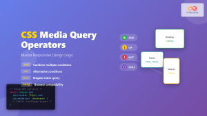
CSS Media Query Operators: Complete Guide to and, or, not, only Keywords
CSS media query operators are essential tools for creating responsive web designs that adapt to different devices and screen conditions....
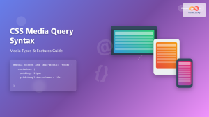
CSS Media Query Syntax: Complete Guide to Media Types and Features
CSS media queries are the cornerstone of responsive web design, allowing developers to apply different styles based on device characteristics...
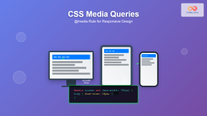
CSS Media Queries: Complete Guide to @media Rule for Responsive Web Design
What Are CSS Media Queries? CSS Media Queries are a fundamental feature of modern web development that allow you to...
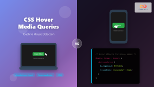
CSS Hover Media Queries: Detecting Touch vs Mouse Input for Better UX
Modern web development requires creating interfaces that work seamlessly across devices with different input methods. While desktop users navigate with...
CSS Animation-Play-State: Complete Guide to Pausing and Resuming Animations
What is CSS Animation-Play-State? The animation-play-state property is a powerful CSS feature that allows developers to control whether an animation...
CSS Prefers-Color-Scheme: Complete Guide to Dark Mode and Light Mode Detection
The CSS prefers-color-scheme media query has revolutionized how we implement dark mode and light mode themes on websites. This powerful...

CSS Graceful Degradation: Essential Fallback Strategies for Modern Web Development
CSS graceful degradation is a fundamental web development strategy that ensures your website remains functional and accessible across all browsers,...
CSS Transition Property: Complete Guide to Smooth Animation Effects
CSS transitions enable smooth, visually appealing animations when element properties change, transforming abrupt state changes into fluid motion. This powerful...
CSS Screen Media Queries: Complete Guide to Responsive Monitor and Device Targeting
CSS screen media queries are the cornerstone of responsive web design, enabling developers to create websites that adapt seamlessly across...

JavaScript Window matchMedia() Method: Matching Media Queries
JavaScript Window matchMedia() Method: Matching Media Queries The window.matchMedia() method in JavaScript is a powerful tool that enables developers to...

JavaScript MediaQueryList API: Responsive Design
JavaScript MediaQueryList API: Crafting Dynamic Responsive Designs The JavaScript MediaQueryList API provides a powerful mechanism for web developers to dynamically...
CSS Transition-Property: Complete Guide to Controlling Animated Properties
Understanding CSS Transition-Property The CSS transition-property is a fundamental property that controls which CSS properties will animate when their values...


