
CSS padding is one of the most fundamental properties for controlling spacing in web design. It creates space between an element’s content and its border, giving your designs breathing room and improving visual hierarchy. Understanding how to use padding effectively is essential for creating professional, well-structured layouts.
What is CSS Padding?
Padding is the transparent space that surrounds an element’s content, sitting between the content and the element’s border. Unlike margins, which create space outside the element, padding is part of the element itself and affects the element’s total size.
Key Padding Characteristics:
- Internal spacing: Creates space inside the element
- Inherits background: Padding area shows the element’s background color/image
- Affects total size: Adds to the element’s width and height (unless using box-sizing: border-box)
- Non-collapsing: Unlike margins, padding values don’t collapse
CSS Padding Syntax and Properties
CSS provides several ways to set padding, from individual side properties to convenient shorthand notation.
Individual Padding Properties
You can control each side’s padding individually using these properties:
/* Individual padding properties */
padding-top: 10px;
padding-right: 15px;
padding-bottom: 20px;
padding-left: 25px;
Shorthand Padding Property
The padding shorthand property allows you to set all four sides in one declaration:
/* Four values: top right bottom left */
padding: 10px 15px 20px 25px;

/* Three values: top horizontal bottom */
padding: 10px 15px 20px;

/* Two values: vertical horizontal */
padding: 10px 15px;

/* One value: all sides */
padding: 10px;
Padding Value Units
CSS padding accepts various unit types, each with specific use cases:
Common Padding Units:
- px (pixels): Fixed units, precise control
- em: Relative to parent element’s font size
- rem: Relative to root element’s font size
- % (percentage): Relative to parent element’s width
- vw/vh: Viewport width/height units
Practical Padding Examples
Basic Padding Implementation
Here’s a practical example showing different padding configurations:
.card {
  background-color: #ffffff;
  border: 2px solid #e2e8f0;
  border-radius: 8px;
  padding: 24px;
  margin-bottom: 20px;
}

.button {
  background-color: #3182ce;
  color: white;
  border: none;
  border-radius: 6px;
  padding: 12px 24px;
  cursor: pointer;
}

.text-content {
  padding-top: 16px;
  padding-bottom: 16px;
  padding-left: 20px;
  padding-right: 20px;
}
Visual Output:
Card with 24px padding
This card demonstrates uniform padding on all sides, creating comfortable spacing between the content and the border.
Asymmetric Padding Design
Different padding values can create visual hierarchy and improve design flow:
.article-header {
  padding: 40px 20px 20px 20px; /* More top padding */
  background: linear-gradient(135deg, #667eea 0%, #764ba2 100%);
  color: white;
}

.sidebar {
  padding: 20px 16px 20px 24px; /* More left padding */
  background-color: #f7fafc;
  border-left: 4px solid #4299e1;
}

.footer {
  padding: 32px 20px 48px 20px; /* More bottom padding */
  background-color: #2d3748;
  color: #e2e8f0;
}
Visual Output:
Article Header
Extra top padding creates visual emphasis
Sidebar Content
Increased left padding aligns with design system
Footer Section
Extra bottom padding provides closure
Responsive Padding Techniques
Modern web design requires padding that adapts to different screen sizes. Here are effective responsive strategies:
/* Mobile-first approach */
.container {
  padding: 16px;
}

/* Tablet */
@media (min-width: 768px) {
  .container {
    padding: 24px;
  }
}

/* Desktop */
@media (min-width: 1024px) {
  .container {
    padding: 32px 48px;
  }
}

/* Using clamp() for fluid padding */
.hero-section {
  padding: clamp(24px, 5vw, 80px) clamp(16px, 4vw, 64px);
}
Interactive Padding Demonstration
Try adjusting the padding values below to see how they affect the element’s appearance:
Interactive Padding Controls:
20px
20px
20px
20px
Preview:
Padding vs Margin: Understanding the Difference
Many developers confuse padding and margin. Here’s a clear comparison:
Padding
- Space inside the element
- Inherits background color/image
- Affects element’s total size
- Cannot have negative values
- Doesn’t collapse
Margin
- Space outside the element
- Always transparent
- Doesn’t affect element size
- Can have negative values
- Can collapse vertically
Advanced Padding Techniques
Percentage-Based Padding
Percentage padding creates responsive designs that scale with the parent element:
.aspect-ratio-box {
  width: 100%;
  padding-bottom: 56.25%; /* 16:9 aspect ratio */
  position: relative;
  background-color: #f0f0f0;
}

.responsive-card {
  padding: 5% 8%; /* Scales with container width */
  background-color: white;
  border-radius: 8px;
}
Combining Padding with CSS Grid and Flexbox
.grid-container {
  display: grid;
  grid-template-columns: repeat(auto-fit, minmax(250px, 1fr));
  gap: 20px;
  padding: 20px;
}

.grid-item {
  padding: 24px;
  background-color: #ffffff;
  border-radius: 12px;
  box-shadow: 0 2px 8px rgba(0, 0, 0, 0.1);
}

.flex-container {
  display: flex;
  gap: 16px;
  padding: 16px 20px;
  align-items: center;
}

.flex-item {
  padding: 12px 16px;
  background-color: #e2e8f0;
  border-radius: 6px;
  flex: 1;
}
Common Padding Patterns and Best Practices
Component-Based Padding System
Establish consistent padding scales for maintainable designs:
:root {
  --padding-xs: 4px;
  --padding-sm: 8px;
  --padding-md: 16px;
  --padding-lg: 24px;
  --padding-xl: 32px;
  --padding-2xl: 48px;
}

.btn-sm { padding: var(--padding-sm) var(--padding-md); }
.btn-md { padding: var(--padding-md) var(--padding-lg); }
.btn-lg { padding: var(--padding-lg) var(--padding-xl); }

.card-sm { padding: var(--padding-md); }
.card-md { padding: var(--padding-lg); }
.card-lg { padding: var(--padding-xl); }
Accessibility Considerations
Proper padding improves accessibility by ensuring adequate touch targets and readable spacing:
Accessibility Guidelines:
- Touch targets: Minimum 44px × 44px (including padding)
- Text readability: Adequate padding prevents text from touching edges
- Focus indicators: Ensure padding doesn’t interfere with focus styles
- Zoom compatibility: Use relative units for better scaling
Performance Implications
While padding is generally lightweight, there are performance considerations for complex layouts:
Performance Best Practices:
- Use
box-sizing: border-boxto simplify calculations - Prefer padding over margins for inner spacing to avoid layout shifts
- Use CSS custom properties for consistent padding scales
- Avoid frequent dynamic padding changes that trigger reflows
Troubleshooting Common Padding Issues
Box Model Conflicts
/* Problem: Element larger than expected */
.element {
  width: 200px;
  padding: 20px;
  border: 2px solid #ccc;
  /* Total width: 200px + 40px + 4px = 244px */
}

/* Solution: Use border-box */
.element {
  width: 200px;
  padding: 20px;
  border: 2px solid #ccc;
  box-sizing: border-box;
  /* Total width: 200px (padding and border included) */
}
Inheritance and Cascade Issues
/* Use specific selectors to override unwanted padding */
.parent {
  padding: 20px;
}

.parent > .child {
  padding: 0; /* Reset inherited padding */
}

/* Use !important sparingly for critical overrides */
.utility-no-padding {
  padding: 0 !important;
}
Conclusion
CSS padding is a powerful tool for creating well-spaced, visually appealing layouts. By understanding the different padding properties, units, and techniques covered in this guide, you can create more professional and accessible web designs. Remember to establish consistent padding systems, consider responsive design principles, and always test your implementations across different devices and screen sizes.
Start implementing these padding techniques in your projects today, and you’ll notice immediate improvements in your layout quality and user experience. The key is to practice with different values and combinations until you develop an intuitive sense for effective spacing in your designs.
Related Posts

CSS Margin: Complete Guide to Element Spacing and Margin Collapse
Understanding CSS Margin: The Foundation of Element Spacing CSS margin is one of the most fundamental properties for controlling spacing...
CSS Style paddingTop Property: CSS Padding Top
Understanding the CSS padding-top Property The padding-top property in CSS defines the amount of space between the top edge of...
CSS paddingBottom Property: CSS Padding Bottom
CSS paddingBottom Property: Mastering Bottom Padding The paddingBottom property in CSS is used to set the amount of padding space...
CSS Style paddingRight Property: CSS Padding Right
Understanding the CSS padding-right Property The padding-right property in CSS is used to set the amount of space between the...
CSS Style padding Property: CSS Padding
CSS Padding Property: A Comprehensive Guide The CSS padding property is a fundamental tool in web development, allowing you to...
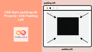
CSS Style paddingLeft Property: CSS Padding Left
CSS padding-left Property: A Comprehensive Guide The padding-left property in CSS is used to set the amount of padding space...
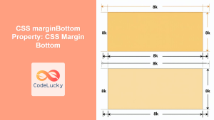
CSS marginBottom Property: CSS Margin Bottom
Understanding the CSS margin-bottom Property The margin-bottom property in CSS defines the space below an element. This margin is added...
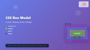
CSS Box Model: Master Content, Padding, Border and Margin for Perfect Layouts
The CSS Box Model is the fundamental concept that governs how elements are sized and spaced in web layouts. Understanding...
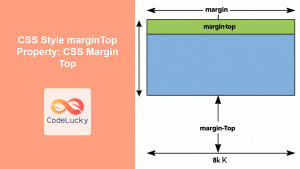
CSS Style marginTop Property: CSS Margin Top
Understanding the CSS marginTop Property: A Comprehensive Guide The marginTop property in CSS is used to set the top margin...

CSS Margin: Mastering Spacing in Web Design
CSS Margin: Mastering Spacing in Web Design In CSS, the margin property is fundamental for controlling the space around HTML...
CSS borderSpacing Property: CSS Border Spacing
Understanding the CSS border-spacing Property The CSS border-spacing property specifies the distance between the borders of adjacent table cells in...
CSS Background-Color: Complete Guide to Setting Element Background Colors
The CSS background-color property is one of the most fundamental styling tools in web development, allowing you to set the...


