
Understanding CSS Margin: The Foundation of Element Spacing
CSS margin is one of the most fundamental properties for controlling spacing between elements in web design. Unlike padding, which creates space inside an element, margin creates space outside an element’s border, pushing other elements away. Understanding margin behavior is crucial for creating professional, well-spaced layouts.
The margin property is part of the CSS box model, which consists of content, padding, border, and margin from inside to outside. Mastering margin control allows you to create visually appealing designs with proper element separation and hierarchy.
CSS Margin Syntax and Basic Usage
The CSS margin property can be applied in several ways, offering flexibility in how you define spacing around elements. Here are the primary syntaxes:
Basic Margin Syntax
/* Single value - applies to all sides */
margin: 20px;

/* Two values - vertical | horizontal */
margin: 10px 20px;

/* Three values - top | horizontal | bottom */
margin: 10px 20px 15px;

/* Four values - top | right | bottom | left */
margin: 10px 20px 15px 5px;

/* Individual sides */
margin-top: 10px;
margin-right: 20px;
margin-bottom: 15px;
margin-left: 5px;
Practical Margin Example
Let’s see how different margin values affect element positioning:
Margin Values and Units
CSS margins accept various types of values, each serving different purposes in responsive design:
Absolute Units
- px (pixels): Fixed spacing, ideal for precise control
- pt (points): Print-friendly unit, rarely used for web
- cm, mm, in: Physical measurements, limited web use
Relative Units
- em: Relative to parent element’s font size
- rem: Relative to root element’s font size
- % (percentage): Relative to parent container’s width
- vw, vh: Relative to viewport dimensions
Special Values
- auto: Browser calculates margin automatically
- inherit: Inherits parent’s margin value
- initial: Resets to default margin value
💡 Pro Tip: Using Relative Units
Use rem for consistent spacing that scales with root font size, and em for spacing that should scale with the element’s context. Percentages work well for responsive horizontal margins.
Interactive Margin Demonstration
Experiment with different margin values using the interactive example below:
Understanding Margin Collapse
Margin collapse is one of the most important and often misunderstood concepts in CSS. It occurs when vertical margins of adjacent elements combine into a single margin equal to the largest of the two margins.
When Margin Collapse Occurs
Margin collapse happens in these specific situations:
- Adjacent Siblings: Vertical margins between consecutive block elements
- Parent-Child Elements: When parent has no padding, border, or content separating it from child
- Empty Elements: Top and bottom margins of empty block elements
Margin Collapse Examples
Adjacent Elements Example
Result: Only 30px spacing between boxes, not 50px (larger margin wins)
Parent-Child Margin Collapse
Notice: The child’s top margin “escapes” the parent container
Preventing Margin Collapse
Sometimes you need to prevent margin collapse to achieve your desired layout. Here are effective techniques:
1. Adding Border or Padding to Parent
2. Using Display Flex or Grid
3. Creating Block Formatting Context
Elements that create a block formatting context prevent margin collapse:
overflow: hiddenoroverflow: autodisplay: flow-rootposition: absoluteorposition: fixedfloat: leftorfloat: right
Negative Margins: Advanced Spacing Control
Negative margins allow elements to overlap or create unique layout effects. They’re powerful but should be used carefully:
Negative Margin Use Cases
- Overlapping Elements: Creating layered designs
- Breaking Container Bounds: Elements extending beyond parent
- Centering with Position: Combined with absolute positioning
- Responsive Adjustments: Fine-tuning spacing at different breakpoints
⚠️ Caution with Negative Margins
Negative margins can cause content to overlap or extend beyond containers, potentially creating accessibility issues or breaking layouts on different screen sizes. Always test thoroughly across devices.
Margin Auto: Centering and Alignment
The margin: auto value is essential for centering block elements horizontally:
Auto Margin Behavior
- Horizontal auto margins: Center block elements
- Vertical auto margins: Usually resolve to 0 in normal flow
- In flexbox: Auto margins absorb extra space
- In grid: Auto margins work for alignment within grid areas
Responsive Margin Strategies
Creating responsive spacing requires thoughtful margin strategies:
1. CSS Custom Properties for Consistent Spacing
:root {
  --spacing-xs: 0.5rem;
  --spacing-sm: 1rem;
  --spacing-md: 1.5rem;
  --spacing-lg: 2rem;
  --spacing-xl: 3rem;
}

.card {
  margin: var(--spacing-md);
}

@media (max-width: 768px) {
  .card {
    margin: var(--spacing-sm);
  }
}
2. Fluid Margins with clamp()
.responsive-spacing {
  margin: clamp(1rem, 4vw, 3rem);
}
Common Margin Pitfalls and Solutions
1. Unwanted Margin Collapse
Problem: Margins collapsing when you need separate spacing
Solution: Use padding, borders, or change display properties
2. Horizontal Scrollbars with Percentage Margins
Problem: Percentage margins on left/right can cause overflow
Solution: Use CSS Grid or Flexbox with gap property
3. Mobile Margin Issues
Problem: Large margins breaking mobile layouts
Solution: Implement responsive margin scaling
Modern Alternatives to Margins
While margins remain essential, modern CSS offers additional spacing solutions:
CSS Gap Property
.flex-container {
  display: flex;
  gap: 1rem; /* Replaces margin between flex items */
}

.grid-container {
  display: grid;
  gap: 1rem 2rem; /* row-gap column-gap */
}
Logical Properties
/* Traditional margins */
margin-top: 1rem;
margin-right: 2rem;
margin-bottom: 1rem;
margin-left: 2rem;

/* Logical margins (language-direction aware) */
margin-block-start: 1rem;
margin-inline-end: 2rem;
margin-block-end: 1rem;
margin-inline-start: 2rem;
Best Practices for CSS Margins
- Establish a Spacing System: Use consistent margin values throughout your project
- Prefer Bottom Margins: Use margin-bottom for vertical spacing to avoid collapse issues
- Use Relative Units: em, rem, or % for better scalability
- Reset Default Margins: Consider using CSS reset or normalize.css
- Test Across Devices: Ensure margins work well on all screen sizes
- Document Your System: Create a style guide for margin usage
Conclusion
CSS margins are fundamental to creating well-spaced, professional web layouts. Understanding margin collapse behavior, knowing when to use different units, and implementing responsive margin strategies will significantly improve your CSS skills. Remember that margins work best as part of a comprehensive spacing system, combined with modern layout techniques like Flexbox and Grid.
Practice with different margin values, experiment with margin collapse scenarios, and always test your layouts across various devices. With these concepts mastered, you’ll be able to create sophisticated, responsive designs that look great on any screen size.
Related Posts
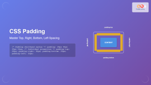
CSS Padding: Complete Guide to Top, Right, Bottom, Left Spacing Properties
CSS padding is one of the most fundamental properties for controlling spacing in web design. It creates space between an...
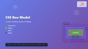
CSS Box Model: Master Content, Padding, Border and Margin for Perfect Layouts
The CSS Box Model is the fundamental concept that governs how elements are sized and spaced in web layouts. Understanding...

CSS Margin: Mastering Spacing in Web Design
CSS Margin: Mastering Spacing in Web Design In CSS, the margin property is fundamental for controlling the space around HTML...
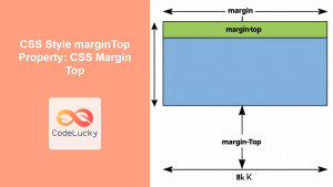
CSS Style marginTop Property: CSS Margin Top
Understanding the CSS marginTop Property: A Comprehensive Guide The marginTop property in CSS is used to set the top margin...
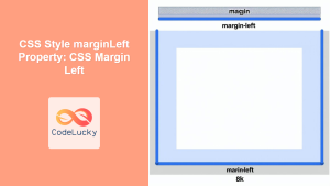
CSS Style marginLeft Property: CSS Margin Left
CSS marginLeft Property: Mastering the Left Margin The CSS marginLeft property is a fundamental tool for controlling the spacing around...
CSS marginBottom Property: CSS Margin Bottom
Understanding the CSS margin-bottom Property The margin-bottom property in CSS defines the space below an element. This margin is added...
CSS Style marginRight Property: CSS Margin Right
Understanding the CSS marginRight Property The marginRight property in CSS is used to set the right margin of an element....
CSS Style padding Property: CSS Padding
CSS Padding Property: A Comprehensive Guide The CSS padding property is a fundamental tool in web development, allowing you to...
CSS Style paddingRight Property: CSS Padding Right
Understanding the CSS padding-right Property The padding-right property in CSS is used to set the amount of space between the...
CSS Style paddingTop Property: CSS Padding Top
Understanding the CSS padding-top Property The padding-top property in CSS defines the amount of space between the top edge of...
CSS Style paddingLeft Property: CSS Padding Left
CSS padding-left Property: A Comprehensive Guide The padding-left property in CSS is used to set the amount of padding space...
CSS Background-Color: Complete Guide to Setting Element Background Colors
The CSS background-color property is one of the most fundamental styling tools in web development, allowing you to set the...


