The CSS overflow property is a fundamental tool for controlling how content behaves when it exceeds the boundaries of its container. Whether you’re dealing with text that’s too long, images that don’t fit, or dynamic content that changes size, understanding overflow is crucial for creating professional, user-friendly web layouts.
What is the CSS Overflow Property?
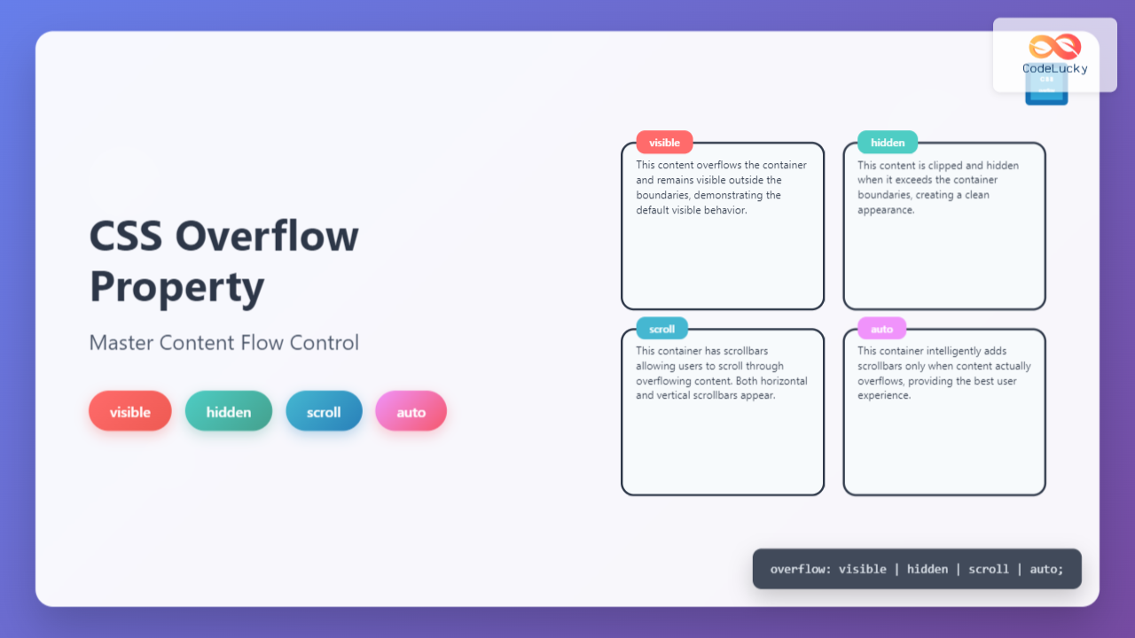
The CSS overflow property determines what happens when content is too large to fit within its containing element. It controls whether the overflowing content should be visible, hidden, or accessible through scrolling mechanisms. This property is essential for maintaining clean layouts and preventing content from breaking your page design.
overflow: visible | hidden | scroll | auto | initial | inherit;
CSS Overflow Values Explained
1. Overflow: Visible (Default Value)
The visible value is the default behavior where content overflows the container and remains visible. This can sometimes cause layout issues but is useful when you want all content to be accessible.
Example: Overflow Visible
This is a long text that will overflow the container boundaries. You can see how the text extends beyond the defined width and height of the container, which is the default visible behavior.
.container {
  width: 200px;
  height: 100px;
  overflow: visible; /* Default value */
  border: 2px solid #333;
}
2. Overflow: Hidden
The hidden value clips the overflowing content, making it completely invisible. This is perfect for creating clean layouts where you want to maintain strict boundaries.
Example: Overflow Hidden
.container {
  width: 200px;
  height: 100px;
  overflow: hidden;
  border: 2px solid #333;
}
3. Overflow: Scroll
The scroll value adds scrollbars to the container, allowing users to scroll through the overflowing content. Scrollbars appear regardless of whether content actually overflows.
Example: Overflow Scroll
This container has scrollbars that allow you to scroll through the overflowing content. Notice that both horizontal and vertical scrollbars are present, giving you full control over viewing the content that extends beyond the container boundaries.
.container {
  width: 200px;
  height: 100px;
  overflow: scroll;
  border: 2px solid #333;
}
4. Overflow: Auto
The auto value is the smartest option – it only adds scrollbars when content actually overflows. This provides the best user experience by avoiding unnecessary scrollbars.
Example: Overflow Auto
This container uses overflow: auto, which means scrollbars only appear when needed. The browser intelligently adds scrollbars only when content exceeds the container dimensions, providing a clean and user-friendly experience.
.container {
  width: 200px;
  height: 100px;
  overflow: auto;
  border: 2px solid #333;
}
Directional Overflow Properties
CSS also provides directional overflow control with overflow-x and overflow-y properties, allowing you to handle horizontal and vertical overflow independently.
Overflow-X and Overflow-Y
Example: Directional Overflow Control
.container {
  width: 250px;
  height: 80px;
  overflow-x: scroll;  /* Horizontal scrollbar */
  overflow-y: hidden;  /* No vertical scrollbar */
  white-space: nowrap; /* Prevents text wrapping */
}
Interactive Overflow Demonstration
Interactive Example: Try Different Overflow Values
This is an interactive demonstration of CSS overflow properties. Change the dropdown above to see how different overflow values affect this container. The content here is long enough to demonstrate overflow behavior in both horizontal and vertical directions when the container cannot accommodate all the text.
Practical Use Cases and Best Practices
1. Navigation Menus
Use overflow: hidden for dropdown menus that should clip content cleanly, or overflow: auto for scrollable navigation on mobile devices.
2. Content Cards
Apply overflow: hidden to maintain consistent card heights in grid layouts, preventing content from breaking the design.
3. Code Blocks
Implement overflow: auto for code snippets to provide horizontal scrolling when lines are too long.
4. Modal Content
Use overflow: auto in modal bodies to allow scrolling through long content while maintaining the modal structure.
Advanced Overflow Techniques
Text Ellipsis with Overflow
Example: Text Truncation with Ellipsis
.truncate-text {
  width: 200px;
  overflow: hidden;
  white-space: nowrap;
  text-overflow: ellipsis;
}
Multiple Line Clipping
Example: Multi-line Text Clipping
.multiline-clamp {
  overflow: hidden;
  display: -webkit-box;
  -webkit-line-clamp: 3;
  -webkit-box-orient: vertical;
}
Browser Support and Compatibility
The CSS overflow property enjoys excellent browser support across all modern browsers. The basic values (visible, hidden, scroll, auto) are supported in:
- Chrome: All versions
- Firefox: All versions
- Safari: All versions
- Edge: All versions
- Internet Explorer: 4.0+
Performance Considerations
When using overflow properties, consider these performance implications:
Overflow: Auto vs Scroll: Use auto instead of scroll when possible to avoid unnecessary scrollbars that can impact performance on mobile devices.
Hardware Acceleration: Scrollable containers can benefit from CSS transforms to enable hardware acceleration: transform: translateZ(0).
Large Content: For containers with large amounts of content, consider implementing virtual scrolling or pagination to maintain smooth performance.
Common Mistakes and Troubleshooting
Mistake 1: Forgetting Container Dimensions
Overflow only works when the container has defined dimensions. Without width or height, overflow behavior may not appear as expected.
Mistake 2: Z-index Issues with Overflow Hidden
Elements with overflow: hidden create a new stacking context, which can affect z-index behavior of child elements.
Mistake 3: Mobile Scrolling Issues
On iOS devices, add -webkit-overflow-scrolling: touch for smooth momentum scrolling in overflow containers.
Mobile-Optimized Scrolling
.mobile-scroll {
  overflow: auto;
  -webkit-overflow-scrolling: touch; /* iOS momentum scrolling */
  scroll-behavior: smooth; /* Smooth scrolling */
}
Conclusion
The CSS overflow property is a powerful tool for controlling content flow and creating polished, professional layouts. By understanding the differences between visible, hidden, scroll, and auto values, you can make informed decisions about how to handle content that exceeds container boundaries.
Remember to choose the appropriate overflow value based on your specific use case: use hidden for clean, clipped layouts; auto for user-friendly scrolling when needed; scroll when you always want scrollbars available; and visible when you need all content accessible regardless of container size.
Mastering the overflow property, along with its directional variants and advanced techniques like text ellipsis, will significantly improve your ability to create responsive, accessible, and visually appealing web interfaces.

