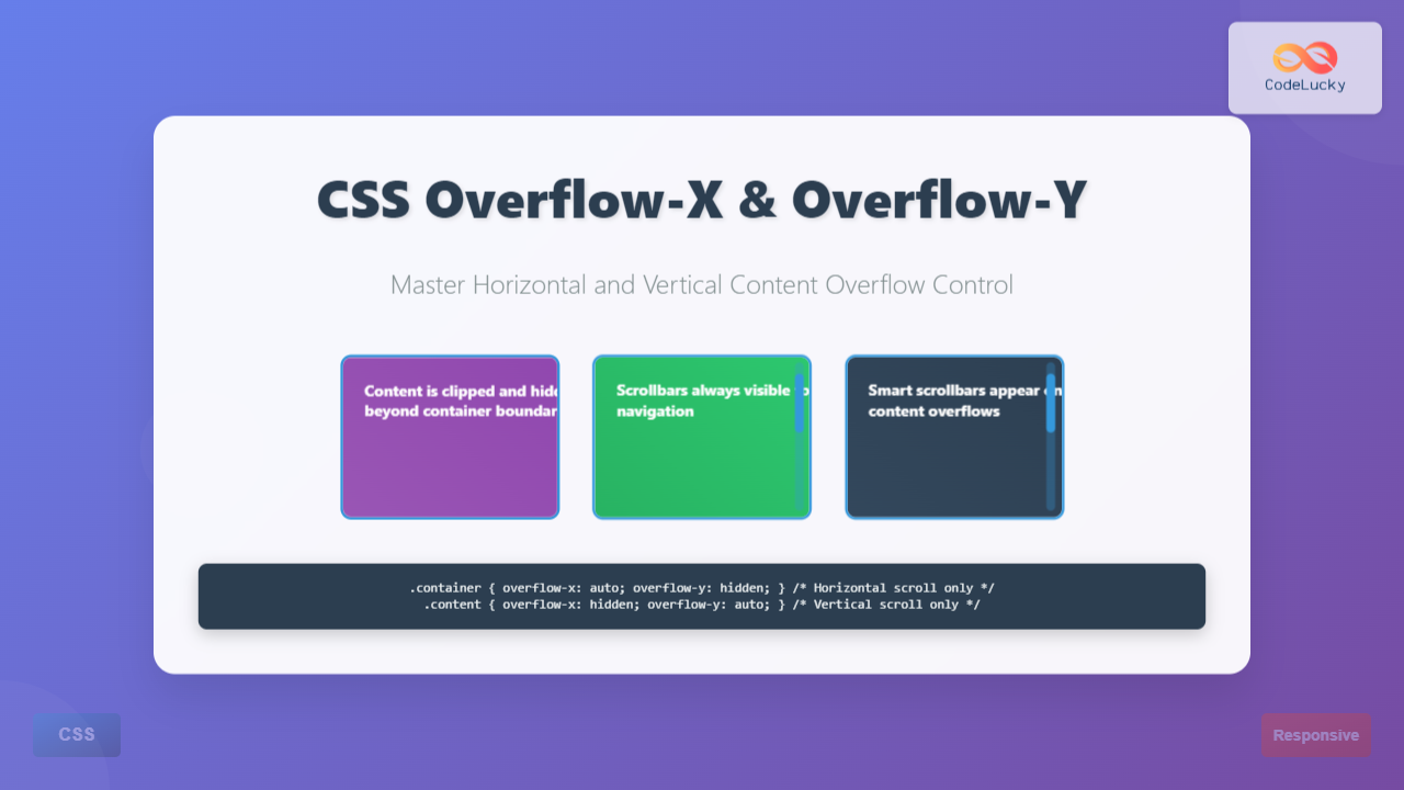
When building web layouts, content doesn’t always fit perfectly within its container. CSS overflow properties provide precise control over how browsers handle content that exceeds container boundaries. While the general overflow property affects both directions, overflow-x and overflow-y give you granular control over horizontal and vertical overflow behavior separately.
Understanding CSS Overflow Properties
The overflow properties determine what happens when content is too large for its container. Instead of using the shorthand overflow property, overflow-x and overflow-y let you control each axis independently:
- overflow-x: Controls horizontal overflow (left-right direction)
- overflow-y: Controls vertical overflow (top-bottom direction)
CSS Overflow Values Explained
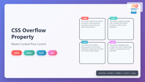
Both overflow-x and overflow-y accept the same set of values:
visible (Default)
Content overflows the container and remains visible outside its boundaries. This is the default behavior for most elements.
overflow-y: visible;
This content exceeds container bounds
hidden
Overflow content is clipped and completely hidden from view. No scrollbars appear, and users cannot access the hidden content.
scroll
Scrollbars are always present, regardless of whether content actually overflows. This ensures consistent layout but may show unnecessary scrollbars.
overflow-y: scroll;
Scrollbars always visible for navigation
auto
Scrollbars appear only when content actually overflows. This is the most commonly used value for creating user-friendly interfaces.
overflow-y: auto;
Scrollbars appear only when needed for overflow content
Practical Examples of Overflow-X and Overflow-Y
Horizontal Scrolling Tables
Data tables often need horizontal scrolling on smaller screens while maintaining vertical scrolling for rows:
| Product Name | Category | Price | Availability | Supplier | Last Updated |
|---|---|---|---|---|---|
| Wireless Bluetooth Headphones | Electronics | $79.99 | In Stock | TechCorp Industries | 2025-06-15 |
| Ergonomic Office Chair | Furniture | $299.99 | Limited | Comfort Solutions Ltd | 2025-06-14 |
.table-container {
  overflow-x: auto;
  overflow-y: visible;
  max-width: 100%;
}

.data-table {
  width: 800px;
  min-width: 600px;
}
Fixed Height Chat Interface
Chat applications typically need vertical scrolling while preventing horizontal overflow:
.chat-messages {
  height: 300px;
  overflow-x: hidden;
  overflow-y: auto;
  padding: 10px;
}
Interactive Overflow Control Demo
Experiment with different overflow combinations to see their effects in real-time:
This content is wider and taller than its container.
Container: 300px × 150px
Content: 400px × 200px
Try different overflow combinations to see how they affect scrolling behavior.
Notice how overflow-x and overflow-y work independently to control horizontal and vertical overflow respectively.
Common Use Cases and Best Practices
Responsive Design Patterns
Card Layouts with Long Content:
Performance Considerations
Different overflow values impact browser performance differently:
- overflow: hidden – Best performance, no scrollbar calculations
- overflow: auto – Good performance, scrollbars only when needed
- overflow: scroll – Moderate performance, always renders scrollbars
- overflow: visible – Can impact layout performance with large overflowing content
Browser Compatibility and Support
The overflow-x and overflow-y properties enjoy excellent browser support:
Browser Support:
- Chrome: Full support since version 1.0
- Firefox: Full support since version 3.5
- Safari: Full support since version 3.0
- Edge: Full support since version 12
- Internet Explorer: Partial support from IE 5.0 (some quirks in older versions)
Advanced Techniques and Tips
Creating Custom Scrollbars
Combine overflow properties with CSS scrollbar styling for enhanced user experience:
This container demonstrates custom scrollbar styling combined with overflow-y: auto.
The content exceeds the container height, triggering the custom-styled scrollbar.
Custom scrollbars improve the visual consistency of your design while maintaining functionality.
This technique works particularly well in modern web applications and dashboards.
Responsive Overflow Patterns
Use media queries to adjust overflow behavior based on screen size:
/* Mobile-first approach */
.content-container {
  overflow-x: auto;
  overflow-y: hidden;
}

/* Tablet and desktop */
@media (min-width: 768px) {
  .content-container {
    overflow-x: visible;
    overflow-y: auto;
  }
}

/* Large screens */
@media (min-width: 1200px) {
  .content-container {
    overflow: visible;
  }
}
Troubleshooting Common Issues
Unwanted Horizontal Scrollbars
The most common issue developers face is unexpected horizontal scrolling. Here’s how to diagnose and fix it:
Problem:
Horizontal scrollbar appears even when content should fit within the container.
Solution:
/* Prevent horizontal overflow globally */
html, body {
  overflow-x: hidden;
}

/* For specific containers */
.container {
  overflow-x: hidden;
  word-wrap: break-word;
  hyphens: auto;
}
Content Clipping Issues
Sometimes important content gets clipped unintentionally:
Problem:
Dropdown menus or tooltips get cut off by overflow: hidden.
Solution:
/* Use overflow: visible for parent containers with dropdowns */
.dropdown-container {
  overflow: visible;
  position: relative;
  z-index: 1000;
}

/* Or use overflow: hidden only on specific axes */
.content-area {
  overflow-x: hidden;
  overflow-y: visible;
}
Conclusion
CSS overflow-x and overflow-y properties provide precise control over content overflow behavior, essential for creating responsive and user-friendly web interfaces. By understanding when to use visible, hidden, scroll, and auto values, you can create layouts that gracefully handle content of varying sizes.
Key takeaways for effective overflow management:
- Use
overflow-x: hiddenandoverflow-y: autofor most vertical scrolling scenarios - Apply
overflow-x: autofor responsive tables and wide content - Combine overflow properties with responsive design techniques for optimal user experience
- Test overflow behavior across different devices and screen sizes
- Consider performance implications when dealing with large amounts of overflowing content
Mastering these properties enables you to create sophisticated layouts that adapt to content while maintaining clean, professional designs. Whether you’re building data tables, chat interfaces, or responsive card layouts, proper overflow management is crucial for modern web development.

