
CSS orientation media queries are essential tools for creating responsive web designs that adapt seamlessly to different device orientations. Whether your users are holding their phones vertically or rotating their tablets horizontally, orientation media queries ensure your content looks perfect in both portrait and landscape modes.
In this comprehensive guide, we’ll explore everything you need to know about CSS orientation media queries, from basic syntax to advanced implementation techniques.
What Are CSS Orientation Media Queries?
CSS orientation media queries are conditional CSS rules that apply styles based on the orientation of the user’s device or viewport. They detect whether the screen is in portrait mode (height greater than width) or landscape mode (width greater than height).
The orientation media feature has two possible values:
- portrait: When the height is greater than or equal to the width
- landscape: When the width is greater than the height
Basic Syntax and Usage
The basic syntax for orientation media queries follows the standard CSS media query format:
@media (orientation: portrait) {
    /* Styles for portrait orientation */
}

@media (orientation: landscape) {
    /* Styles for landscape orientation */
}
You can also combine orientation queries with other media features like screen size:
@media screen and (orientation: landscape) and (max-width: 768px) {
    /* Styles for landscape orientation on smaller screens */
}
Practical Examples
Example 1: Basic Layout Adaptation
Here’s a simple example showing how to adjust layout based on orientation:
This box changes color and padding based on your device orientation!
Try rotating your device or resizing your browser window to see the effect.
/* CSS for the above example */
.orientation-demo {
    padding: 20px;
    text-align: center;
    border-radius: 10px;
    transition: all 0.3s ease;
}

@media (orientation: portrait) {
    .orientation-demo {
        background: linear-gradient(45deg, #e74c3c, #f39c12);
        padding: 30px 15px;
    }
    .orientation-demo::before {
        content: "📱 Portrait Mode";
    }
}

@media (orientation: landscape) {
    .orientation-demo {
        background: linear-gradient(45deg, #3498db, #2ecc71);
        padding: 20px 40px;
    }
    .orientation-demo::before {
        content: "💻 Landscape Mode";
    }
}
Example 2: Navigation Adaptation
This example demonstrates how to adapt navigation menus for different orientations:
Navigation adapts: vertical in portrait, horizontal in landscape
Example 3: Image Gallery Adaptation
Here’s how to create a responsive image gallery that adapts to orientation:
Gallery shows 2 columns in portrait, 4 columns in landscape
Advanced Techniques
Combining with Screen Size Queries
For more precise control, combine orientation queries with screen size breakpoints:
/* Mobile portrait */
@media (orientation: portrait) and (max-width: 768px) {
    .container {
        padding: 10px;
        font-size: 14px;
    }
}

/* Mobile landscape */
@media (orientation: landscape) and (max-width: 768px) {
    .container {
        padding: 5px 20px;
        font-size: 12px;
    }
}

/* Tablet portrait */
@media (orientation: portrait) and (min-width: 769px) and (max-width: 1024px) {
    .container {
        padding: 20px;
        font-size: 16px;
    }
}

/* Tablet landscape */
@media (orientation: landscape) and (min-width: 769px) and (max-width: 1024px) {
    .container {
        padding: 15px 30px;
        font-size: 15px;
    }
}
Aspect Ratio Considerations
Modern CSS also supports aspect-ratio media queries for more precise control:
/* Square or nearly square screens */
@media (aspect-ratio: 1/1) {
    .content {
        display: flex;
        flex-direction: column;
        justify-content: center;
    }
}

/* Wide screens */
@media (min-aspect-ratio: 16/9) {
    .content {
        display: grid;
        grid-template-columns: 1fr 2fr;
    }
}
JavaScript Integration
You can also detect orientation changes using JavaScript to trigger additional functionality:
// Detect orientation change
window.addEventListener('orientationchange', function() {
    setTimeout(function() {
        const orientation = window.innerHeight > window.innerWidth ? 'portrait' : 'landscape';
        document.body.setAttribute('data-orientation', orientation);

        // Trigger custom events or functions
        if (orientation === 'landscape') {
            // Hide certain elements in landscape
            document.querySelector('.portrait-only').style.display = 'none';
        } else {
            // Show elements in portrait
            document.querySelector('.portrait-only').style.display = 'block';
        }
    }, 100); // Small delay to ensure proper detection
});

// Initial orientation detection
window.addEventListener('load', function() {
    const orientation = window.innerHeight > window.innerWidth ? 'portrait' : 'landscape';
    document.body.setAttribute('data-orientation', orientation);
});
Best Practices
1. Consider Touch Interactions
In portrait mode, users typically use one thumb for navigation. Design accordingly:
@media (orientation: portrait) {
    .button {
        min-height: 44px; /* Minimum touch target size */
        margin-bottom: 10px;
    }

    .navigation {
        position: fixed;
        bottom: 0;
        left: 0;
        right: 0;
    }
}
2. Optimize Content Visibility
Landscape mode often has limited vertical space. Adjust accordingly:
@media (orientation: landscape) and (max-height: 500px) {
    .header {
        height: 60px; /* Reduced header height */
    }

    .content {
        padding-top: 10px;
        padding-bottom: 10px;
    }

    .large-image {
        max-height: 200px;
        width: auto;
    }
}
3. Handle Transition Smoothly
Add smooth transitions for orientation changes:
.responsive-element {
    transition: all 0.3s ease-in-out;
}

@media (orientation: portrait) {
    .responsive-element {
        width: 100%;
        height: 200px;
    }
}

@media (orientation: landscape) {
    .responsive-element {
        width: 50%;
        height: 150px;
    }
}
Common Pitfalls and Solutions
1. Viewport Meta Tag
Always include the proper viewport meta tag for orientation queries to work correctly:
<meta name="viewport" content="width=device-width, initial-scale=1.0">2. Desktop Browser Testing
Test orientation queries by resizing your browser window or using browser developer tools’ device emulation:
- Chrome: F12 → Toggle device toolbar → Rotate device icon
- Firefox: F12 → Responsive Design Mode → Rotate icon
- Safari: Develop → Enter Responsive Design Mode
3. iOS Safari Considerations
iOS Safari has specific behaviors with orientation changes. Use CSS environment variables for better control:
@media (orientation: landscape) {
    .content {
        padding-bottom: env(safe-area-inset-bottom);
        padding-left: env(safe-area-inset-left);
        padding-right: env(safe-area-inset-right);
    }
}
Performance Considerations
Orientation media queries are generally lightweight, but consider these optimizations:
- Minimize DOM manipulation: Use CSS transforms instead of changing layout properties when possible
- Debounce orientation events: If using JavaScript, debounce orientation change events to prevent excessive firing
- Optimize images: Use different image sizes for different orientations using the picture element
<picture>
    <source media="(orientation: landscape)" srcset="image-landscape.jpg">
    <source media="(orientation: portrait)" srcset="image-portrait.jpg">
    <img src="image-default.jpg" alt="Responsive image">
</picture>
Browser Support
CSS orientation media queries have excellent browser support:
- Chrome: Full support since version 3
- Firefox: Full support since version 3.5
- Safari: Full support since version 5
- Edge: Full support since version 12
- IE: Supported from IE9+
For legacy browser support, you can use feature detection:
@supports (orientation: portrait) {
    /* Modern orientation-aware styles */
}

/* Fallback styles for older browsers */
.fallback-layout {
    /* Static layout for older browsers */
}
Conclusion
CSS orientation media queries are powerful tools for creating truly responsive web experiences. By understanding how to detect and respond to portrait and landscape orientations, you can ensure your websites look great and function perfectly regardless of how users hold their devices.
Remember to test your orientation-aware designs across different devices and screen sizes, consider the unique interaction patterns of each orientation, and always prioritize user experience in your responsive design decisions.
With these techniques and best practices, you’ll be able to create websites that adapt seamlessly to any orientation, providing optimal experiences for all your users.
Related Posts
CSS Screen Media Queries: Complete Guide to Responsive Monitor and Device Targeting
CSS screen media queries are the cornerstone of responsive web design, enabling developers to create websites that adapt seamlessly across...
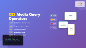
CSS Media Query Operators: Complete Guide to and, or, not, only Keywords
CSS media query operators are essential tools for creating responsive web designs that adapt to different devices and screen conditions....
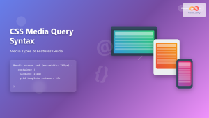
CSS Media Query Syntax: Complete Guide to Media Types and Features
CSS media queries are the cornerstone of responsive web design, allowing developers to apply different styles based on device characteristics...
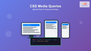
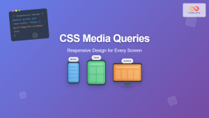
CSS Media Queries: Complete Guide to @media Rule for Responsive Web Design
What Are CSS Media Queries? CSS Media Queries are a fundamental feature of modern web development that allow you to...

HTML Responsive Web Design: Crafting Websites for Every Device
Introduction In today's digital landscape, users access the internet through a plethora of devices, from large desktop monitors to small...
CSS Mobile-First Design: Complete Min-Width Media Query Guide for Responsive Web Development
What is Mobile-First Design? Mobile-first design is a progressive enhancement approach where you start designing and coding for the smallest...
CSS Desktop-First Design: Master Max-Width Media Queries for Responsive Web Development
Desktop-first design is a responsive web development approach where you design for larger screens first, then progressively adapt your layout...
CSS Breakpoints: Complete Guide to Responsive Design Screen Sizes
CSS breakpoints are the foundation of responsive web design, defining specific screen widths where your website's layout adapts to different...
CSS Resolution Media Queries: Complete Guide to High-DPI Display Targeting
Understanding CSS Resolution Media Queries CSS resolution media queries allow developers to target specific display densities and create optimized experiences...
CSS Hover Media Queries: Detecting Touch vs Mouse Input for Better UX
Modern web development requires creating interfaces that work seamlessly across devices with different input methods. While desktop users navigate with...
CSS Future: Complete Guide to Upcoming CSS Features and Specifications 2025
The future of CSS is incredibly exciting, with numerous groundbreaking features and specifications currently in development that promise to revolutionize...
CSS Max-Width and Min-Width: Complete Guide to Responsive Width Constraints
When building responsive websites, controlling element widths is crucial for creating layouts that work across all devices. CSS provides two...


