
The CSS object-fit property is a powerful tool that controls how replaced elements like images and videos are resized to fit their containers. Instead of stretching or distorting media content, object-fit gives you precise control over how content is displayed within its allocated space.
This comprehensive guide will explore every aspect of the object-fit property, from basic usage to advanced responsive design techniques, with practical examples you can implement immediately.
What is the CSS Object-Fit Property?
The object-fit property specifies how an element’s content should be resized to fit its container. It works exclusively with replaced elements – primarily images (<img>) and videos (<video>) – that have intrinsic dimensions.
Before object-fit, developers had limited options for controlling media content sizing, often resulting in distorted images or complex workarounds. This property solves these issues by providing five distinct fitting behaviors.
Browser Support and Compatibility
The object-fit property enjoys excellent modern browser support:
- Chrome: 32+ (2014)
- Firefox: 36+ (2015)
- Safari: 10+ (2016)
- Edge: 16+ (2017)
- Opera: 19+ (2014)
For older browsers, consider using polyfills or fallback techniques, though modern usage statistics show over 95% global support.
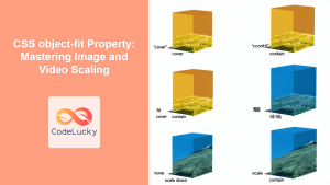
CSS Object-Fit Values Explained
The object-fit property accepts five main values, each providing different sizing behavior:
1. object-fit: fill (Default)
The fill value stretches the content to completely fill the container, potentially distorting the aspect ratio:
Example: object-fit: fill
CSS:
.fill-example {
  width: 300px;
  height: 200px;
  object-fit: fill;
  border: 2px solid #333;
}
Result:

Image stretched to fill 300x200px container
2. object-fit: contain
The contain value scales the content to fit within the container while maintaining aspect ratio. The entire content is visible, but empty space may appear:
Example: object-fit: contain
CSS:
.contain-example {
  width: 300px;
  height: 200px;
  object-fit: contain;
  border: 2px solid #333;
  background: #e0e0e0;
}
Result:
Image scaled to fit completely within container
3. object-fit: cover
The cover value scales the content to cover the entire container while maintaining aspect ratio. Content may be clipped:
Example: object-fit: cover
CSS:
.cover-example {
  width: 300px;
  height: 200px;
  object-fit: cover;
  border: 2px solid #333;
}
Result:
Image scaled to cover entire container
4. object-fit: none
The none value displays the content at its natural size, potentially overflowing or leaving empty space:
Example: object-fit: none
CSS:
.none-example {
  width: 300px;
  height: 200px;
  object-fit: none;
  border: 2px solid #333;
  background: #e0e0e0;
}
Result:

Image displayed at natural size within container
5. object-fit: scale-down
The scale-down value behaves like either none or contain, whichever results in a smaller display size:
Example: object-fit: scale-down
CSS:
.scale-down-example {
  width: 300px;
  height: 200px;
  object-fit: scale-down;
  border: 2px solid #333;
  background: #e0e0e0;
}
Result:

Image scaled down to fit appropriately
Interactive Object-Fit Comparison Tool
Experience the differences between object-fit values with this interactive demonstration:
Interactive Object-Fit Demo
Current CSS:
img {
  width: 300px;
  height: 200px;
  object-fit: cover;
  border: 2px solid #333;
}
Visual Result:

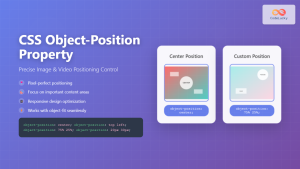
Object-Position: Controlling Content Alignment
The object-position property works alongside object-fit to control how content is positioned within its container. This is particularly useful with object-fit: cover and object-fit: none.
Object-Position Examples
center (default)
object-position: center;
top left
object-position: top left;
bottom right
object-position: bottom right;
25% 75%
object-position: 25% 75%;
Practical Use Cases and Examples
1. Responsive Image Gallery
Create a responsive image gallery where all images maintain consistent dimensions regardless of their original aspect ratios:
Responsive Gallery Example


CSS Code:
.gallery {
  display: grid;
  grid-template-columns: repeat(auto-fit, minmax(200px, 1fr));
  gap: 15px;
}

.gallery img {
  width: 100%;
  height: 200px;
  object-fit: cover;
  border-radius: 8px;
  transition: transform 0.3s ease;
}

.gallery img:hover {
  transform: scale(1.05);
}
2. Video Background with Object-Fit
The object-fit property is particularly powerful for creating full-screen video backgrounds:
Full-Screen Video Background
.video-background {
  position: fixed;
  top: 0;
  left: 0;
  width: 100%;
  height: 100%;
  object-fit: cover;
  z-index: -1;
}

.content-overlay {
  position: relative;
  z-index: 1;
  background: rgba(0, 0, 0, 0.5);
  color: white;
  padding: 20px;
  text-align: center;
}
HTML:
<video class="video-background" autoplay muted loop>
  <source src="background-video.mp4" type="video/mp4">
</video>
<div class="content-overlay">
  <h1>Your Content Here</h1>
</div>
3. Profile Picture with Consistent Sizing
Ensure profile pictures always display consistently, regardless of their original dimensions:
Profile Picture Component


.profile-pic {
  width: 80px;
  height: 80px;
  border-radius: 50%;
  object-fit: cover;
  border: 3px solid #4a90e2;
}
Advanced Techniques and Best Practices
Responsive Object-Fit with Media Queries
Combine object-fit with media queries for responsive design that adapts to different screen sizes:
.responsive-image {
  width: 100%;
  height: 300px;
  object-fit: cover;
}

@media (max-width: 768px) {
  .responsive-image {
    height: 200px;
    object-fit: contain;
    background: #f0f0f0;
  }
}

@media (max-width: 480px) {
  .responsive-image {
    height: 150px;
    object-position: top center;
  }
}
Fallback for Older Browsers
For browsers that don’t support object-fit, implement a fallback using background images:
/* Modern browsers */
.image-container img {
  width: 100%;
  height: 200px;
  object-fit: cover;
}

/* Fallback for older browsers */
.no-objectfit .image-container {
  width: 100%;
  height: 200px;
  background-size: cover;
  background-position: center;
}

.no-objectfit .image-container img {
  display: none;
}
Performance Considerations
When using object-fit, consider these performance optimization tips:
- Image Optimization: Use appropriately sized images to avoid unnecessary scaling
- Lazy Loading: Implement lazy loading for images with
object-fitin galleries - WebP Format: Use modern image formats for better compression
- Responsive Images: Combine with
srcsetfor optimal loading
<img src="image-400.webp"
     srcset="image-200.webp 200w,
             image-400.webp 400w,
             image-800.webp 800w"
     sizes="(max-width: 768px) 100vw,
            (max-width: 1024px) 50vw,
            25vw"
     style="object-fit: cover; width: 100%; height: 300px;"
     loading="lazy"
     alt="Optimized responsive image">
Common Pitfalls and Solutions
Problem: Object-Fit Not Working
Solution: Ensure you’re applying object-fit to replaced elements (img, video) and that they have defined dimensions:
/* ❌ Won't work - no dimensions */
img {
  object-fit: cover;
}

/* ✅ Will work - has dimensions */
img {
  width: 300px;
  height: 200px;
  object-fit: cover;
}
Problem: Unexpected Aspect Ratio Changes
Solution: Use object-fit: contain instead of cover when preserving the entire image is more important than filling the container:
/* For logos or important content */
.logo {
  width: 200px;
  height: 100px;
  object-fit: contain; /* Preserves entire logo */
  background: white; /* Background color for empty space */
}
Accessibility Considerations
When using object-fit, maintain accessibility standards:
- Alt Text: Always provide meaningful alt text for images
- Focus States: Ensure interactive images have proper focus indicators
- Content Visibility: With
object-fit: cover, important content might be cropped - Motion Sensitivity: Be cautious with animated content and
object-fit
<img src="product-image.jpg"
     alt="Blue wireless headphones with noise cancellation feature"
     style="width: 300px; height: 200px; object-fit: cover;"
     tabindex="0">
Testing and Debugging Object-Fit
Use browser developer tools to test and debug object-fit implementations:
- Inspect Element: Check computed styles to verify
object-fitvalues - Device Simulation: Test responsive behavior across different screen sizes
- Network Throttling: Verify image loading performance
- Accessibility Audit: Use tools like Lighthouse to check accessibility
Future of Object-Fit and Related Properties
The CSS Working Group continues to evolve media handling capabilities. Future developments may include:
- Enhanced object-position: More precise positioning controls
- Aspect-ratio property: Better integration with
object-fit - Container queries: Dynamic
object-fitbased on container size - New fit values: Additional fitting algorithms
Conclusion
The CSS object-fit property is an essential tool for modern web development, providing precise control over how images and videos are displayed within their containers. From responsive galleries to video backgrounds, mastering object-fit enables you to create polished, professional layouts that work across all devices and screen sizes.
Remember to combine object-fit with object-position for complete control, consider performance implications, and always maintain accessibility standards. With excellent browser support and versatile applications, object-fit should be part of every frontend developer’s toolkit.
Start implementing these techniques in your projects today, and experience the difference proper media sizing control can make in your web designs.
Related Posts
CSS object-fit Property: Mastering Image and Video Scaling
Understanding the CSS object-fit Property: A Comprehensive Guide The CSS object-fit property specifies how the content of a replaced element,...
CSS Object-Position Property: Complete Guide to Precise Image and Video Positioning
The CSS object-position property is a powerful tool that allows developers to precisely control how images, videos, and other replaced...
CSS object-position Property: CSS Object Position
CSS object-position Property: Mastering Object Positioning The object-position property in CSS provides a way to specify the alignment of a...
CSS Style backgroundSize Property: CSS Background Size
CSS background-size Property: Mastering Background Image Scaling The CSS background-size property specifies the size of background images. Controlling the size...

CSS Resize Property: Complete Guide to User-Resizable Elements
The CSS resize property is a powerful tool that allows users to resize HTML elements by dragging their corners or...
CSS Max-Width and Min-Width: Complete Guide to Responsive Width Constraints
When building responsive websites, controlling element widths is crucial for creating layouts that work across all devices. CSS provides two...
CSS Resize Property: Controlling Element Resizability
Understanding the CSS Resize Property: Controlling Element Resizability The resize property in CSS allows you to control whether (and how)...
CSS Style minWidth Property: CSS Min Width
CSS min-width Property: Controlling Element Size The CSS min-width property sets the minimum width of an element. It prevents the...

CSS Width Property: Mastering Element Width in CSS
CSS Width Property: Mastering Element Width The width property in CSS defines the width of an element's content area. It's...

CSS Screen Media Queries: Complete Guide to Responsive Monitor and Device Targeting
CSS screen media queries are the cornerstone of responsive web design, enabling developers to create websites that adapt seamlessly across...

CSS Width and Height: Complete Guide to Element Dimensions
Understanding how to control element dimensions is fundamental to creating well-structured web layouts. CSS width and height properties give you...
CSS Media Queries: Complete Guide to @media Rule for Responsive Web Design
What Are CSS Media Queries? CSS Media Queries are a fundamental feature of modern web development that allow you to...


