Proper CSS naming conventions are the foundation of maintainable, scalable, and collaborative web development. Whether you’re working on a small personal project or a large enterprise application, consistent naming practices can make the difference between code that’s easy to understand and modify versus a tangled mess that becomes increasingly difficult to manage.
In this comprehensive guide, we’ll explore the most effective CSS naming conventions, examine popular methodologies, and provide practical examples you can implement immediately in your projects.
Why CSS Naming Conventions Matter
Before diving into specific conventions, it’s crucial to understand why naming matters in CSS development:
Maintainability: Well-named classes and IDs make it easier to locate and modify styles months or years after writing them. When you return to your code, descriptive names act as documentation, explaining the purpose and context of each element.
Collaboration: In team environments, consistent naming allows developers to quickly understand each other’s code. This reduces onboarding time for new team members and minimizes confusion during code reviews.
Scalability: As projects grow, proper naming prevents conflicts and reduces the likelihood of accidentally overriding styles. A good naming system provides structure that can accommodate feature additions and design changes.
Performance: While CSS selector performance is rarely a bottleneck in modern browsers, efficient naming can still contribute to faster parsing and rendering, especially in complex applications.
Fundamental CSS Naming Principles
Use Descriptive and Semantic Names
The most important principle is to use names that describe the content or purpose rather than the appearance. This approach ensures your CSS remains flexible when design requirements change.
✅ Good Examples:
.navigation-menu { }
.article-header { }
.user-profile-card { }
.error-message { }
❌ Poor Examples:
.red-text { }
.big-box { }
.left-sidebar { }
.blue-button { }
Maintain Consistency
Establish a naming pattern and stick to it throughout your project. Consistency reduces cognitive load and makes your codebase more predictable.
/* Consistent pattern using hyphens */
.main-navigation { }
.sub-navigation { }
.navigation-item { }
.navigation-link { }

/* Consistent pattern for state classes */
.is-active { }
.is-disabled { }
.is-loading { }
.is-visible { }
Keep Names Readable and Concise
Strike a balance between descriptiveness and brevity. Names should be long enough to be clear but short enough to be practical.
Good Balance
.btn-primary { }
.card-header { }
.modal-overlay { }
Too Verbose
.primary-call-to-action-button { }
.main-content-area-header-section { }
Popular CSS Naming Methodologies
BEM (Block Element Modifier)
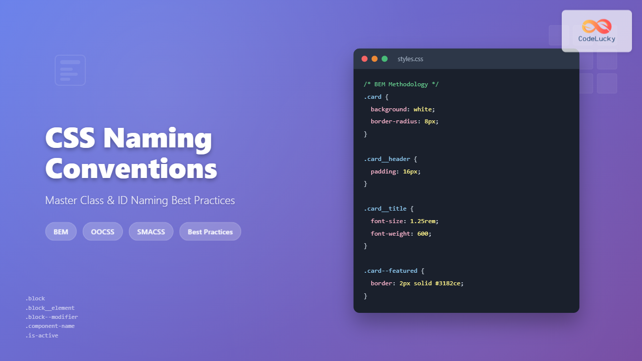
BEM is one of the most widely adopted CSS naming methodologies. It creates a clear hierarchy and relationship between components using a specific syntax:
- Block: A standalone entity that is meaningful on its own (e.g.,
menu,button) - Element: A part of a block that has no standalone meaning (e.g.,
menu__item,button__icon) - Modifier: A flag on a block or element that changes appearance or behavior (e.g.,
menu--vertical,button--large)
BEM Syntax Pattern:
.block { }
.block__element { }
.block--modifier { }
.block__element--modifier { }
Practical BEM Example:
/* Block */
.card {
    background: white;
    border-radius: 8px;
    box-shadow: 0 2px 4px rgba(0,0,0,0.1);
}

/* Elements */
.card__header {
    padding: 16px;
    border-bottom: 1px solid #e2e8f0;
}

.card__title {
    font-size: 1.25rem;
    font-weight: 600;
}

.card__content {
    padding: 16px;
}

/* Modifiers */
.card--featured {
    border: 2px solid #3182ce;
}

.card__title--small {
    font-size: 1rem;
}
OOCSS (Object-Oriented CSS)
OOCSS focuses on creating reusable CSS objects by separating structure from skin and container from content. This methodology emphasizes modularity and reusability.
OOCSS Example:
/* Base button structure */
.btn {
    display: inline-block;
    padding: 8px 16px;
    border-radius: 4px;
    text-decoration: none;
    cursor: pointer;
}

/* Button skins */
.btn-primary { background-color: #3182ce; color: white; }
.btn-secondary { background-color: #718096; color: white; }
.btn-success { background-color: #38a169; color: white; }

/* Button sizes */
.btn-small { padding: 4px 8px; font-size: 0.875rem; }
.btn-large { padding: 12px 24px; font-size: 1.125rem; }
SMACSS (Scalable and Modular Architecture for CSS)
SMACSS categorizes CSS rules into five types: Base, Layout, Module, State, and Theme. Each category has its own naming conventions and purposes.
SMACSS Categories:
/* Base Rules - element selectors */
body, h1, p { margin: 0; }

/* Layout Rules - major page sections */
.l-header { }
.l-main { }
.l-sidebar { }

/* Module Rules - reusable components */
.module-name { }
.module-name-part { }

/* State Rules - describe how modules look in different states */
.is-hidden { }
.is-active { }
.is-disabled { }

/* Theme Rules - color and typography */
.theme-dark { }
.theme-light { }
Class vs ID Naming Best Practices
When to Use Classes
Classes should be your primary tool for styling. They’re reusable, have moderate specificity, and work well with component-based development approaches.
Class Naming Best Practices:
- Use lowercase letters and hyphens
- Be descriptive but concise
- Follow your chosen methodology consistently
- Group related classes with common prefixes
/* Component-based class naming */
.header { }
.header-logo { }
.header-navigation { }
.header-search { }

/* Utility classes */
.text-center { text-align: center; }
.margin-bottom-large { margin-bottom: 2rem; }
.display-none { display: none; }
When to Use IDs
IDs should be reserved for unique page elements, JavaScript hooks, and anchor links. Avoid using IDs for styling when possible due to their high specificity.
ID Naming Best Practices:
- Use for unique page landmarks
- Prefer classes for styling
- Use descriptive names for JavaScript hooks
- Consider data attributes for JavaScript selectors
/* Appropriate ID usage */
#main-content { }
#navigation-menu { }
#contact-form { }

/* Better alternatives for JavaScript */
[data-js="modal-trigger"] { }
[data-component="carousel"] { }
Interactive Examples
Let’s see these naming conventions in action with a practical card component example:
BEM Card Component
Using proper naming conventions
This card demonstrates BEM naming methodology with clear block, element, and modifier structure.
View CSS Code
/* BEM Card Component */
.demo-card {
    background: white;
    border-radius: 8px;
    box-shadow: 0 2px 8px rgba(0,0,0,0.1);
    overflow: hidden;
    max-width: 300px;
    transition: transform 0.2s ease;
}

.demo-card__header {
    padding: 16px;
    border-bottom: 1px solid #e2e8f0;
}

.demo-card__title {
    margin: 0;
    font-size: 1.25rem;
    font-weight: 600;
}

.demo-card__content {
    padding: 16px;
}

.demo-card__footer {
    padding: 16px;
    background: #f7fafc;
    display: flex;
    justify-content: space-between;
}

/* Modifier */
.demo-card--featured {
    border: 2px solid #3182ce;
}
Common Naming Mistakes to Avoid
Overly Generic Names
Avoid names that are too generic and could apply to multiple elements. These names don’t provide enough context and can lead to conflicts.
❌ Too Generic
.content { }
.box { }
.item { }
.wrapper { }
✅ More Specific
.article-content { }
.product-card { }
.menu-item { }
.modal-wrapper { }
Inconsistent Naming Patterns
Mixing different naming conventions within the same project creates confusion and reduces maintainability.
❌ Inconsistent Patterns
.mainNav { }           /* camelCase */
.sidebar-menu { }      /* kebab-case */
.footerLinks { }       /* camelCase */
.header_logo { }       /* snake_case */
Presentation-Based Names
Names that describe appearance rather than purpose become problematic when designs change.
❌ Appearance-Based Names
.red-button { }
.left-column { }
.big-text { }
.rounded-box { }
These become misleading when the button changes to blue, the column moves to the right, or the text size changes.
Tools and Resources for Better CSS Naming
CSS Linting Tools
Use tools like stylelint to enforce naming conventions across your project. Configure rules to match your chosen methodology.
Stylelint Configuration Example:
{
  "rules": {
    "selector-class-pattern": "^[a-z][a-z0-9]*(-[a-z0-9]+)*$",
    "selector-id-pattern": "^[a-z][a-z0-9]*(-[a-z0-9]+)*$",
    "custom-property-pattern": "^[a-z][a-z0-9]*(-[a-z0-9]+)*$"
  }
}
Naming Convention Generators
Several online tools can help generate consistent class names following specific methodologies. These are particularly useful when starting new projects or refactoring existing code.
Documentation and Style Guides
Maintain a living style guide that documents your naming conventions, provides examples, and explains the reasoning behind your choices. This serves as a reference for team members and helps maintain consistency over time.
Advanced Naming Strategies
Namespace Prefixing
For large projects or when integrating third-party code, consider using namespace prefixes to avoid conflicts.
/* Component namespacing */
.c-button { }
.c-card { }
.c-modal { }

/* Utility namespacing */
.u-text-center { }
.u-margin-large { }
.u-display-none { }

/* Layout namespacing */
.l-container { }
.l-grid { }
.l-sidebar { }
Responsive Naming
When dealing with responsive design, establish clear patterns for breakpoint-specific classes.
/* Mobile-first responsive naming */
.grid { }
.grid\@tablet { }
.grid\@desktop { }

/* Or with explicit breakpoints */
.text-center { }
.text-center-sm { }
.text-center-md { }
.text-center-lg { }
Performance Considerations
While naming conventions primarily affect maintainability, they can also impact performance in subtle ways:
Selector Complexity: Simple class selectors are the fastest, while complex descendant selectors can slow down rendering. Keep selectors as simple as possible.
CSS File Size: Consistent, well-planned naming can reduce redundancy and keep your CSS files smaller. Utility-based approaches often result in more concise stylesheets.
Browser Parsing: Modern browsers are extremely efficient at parsing CSS, but clean, consistent naming can still contribute to faster initial rendering.
Team Adoption and Migration Strategies
Gradual Migration
When improving naming conventions in existing projects, adopt a gradual approach:
- Document the new conventions and provide examples
- Apply new naming to new features while leaving existing code unchanged
- Refactor high-traffic areas during regular maintenance
- Use automated tools to help with renaming where possible
Team Training and Buy-in
Successfully implementing naming conventions requires team commitment. Provide training sessions, create documentation, and establish code review processes that enforce the new standards.
Future-Proofing Your CSS Names
As web development continues to evolve, choose naming conventions that can adapt to new technologies and methodologies. Focus on semantic meaning over implementation details, and maintain flexibility in your naming system.
Consider how your naming conventions will work with:
- CSS-in-JS solutions
- Component-based frameworks
- Design system tools
- Automated code generation
Conclusion
CSS naming conventions are more than just coding style preferences—they’re essential tools for creating maintainable, scalable, and collaborative web applications. Whether you choose BEM, OOCSS, SMACSS, or develop your own system, consistency and semantic meaning should be your guiding principles.
Start by implementing these practices in your next project, and gradually refine your approach based on your team’s needs and project requirements. Remember that the best naming convention is the one that your team consistently follows and that serves your project’s long-term maintainability goals.
By investing time in proper CSS naming conventions, you’re not just writing better code today—you’re setting up your future self and your team for success in maintaining and extending your stylesheets for years to come.

