
CSS multiple backgrounds revolutionized web design by allowing developers to layer multiple background images, colors, and gradients on a single element. This powerful feature, introduced in CSS3, opens up endless possibilities for creating rich, visually appealing designs without relying on additional HTML elements or complex image editing.
In this comprehensive guide, we’ll explore everything you need to know about CSS multiple backgrounds, from basic implementation to advanced techniques that will elevate your web designs.
Understanding CSS Multiple Backgrounds
Before CSS3, developers were limited to a single background image per element. Multiple backgrounds change this limitation by allowing you to stack several background layers on top of each other. The key principle is that backgrounds are rendered in a specific order: the first background specified appears on top, with subsequent backgrounds layered beneath it.
Browser Support and Compatibility
CSS multiple backgrounds enjoy excellent browser support across all modern browsers. The feature is supported in:
- Chrome: Version 4+
- Firefox: Version 3.6+
- Safari: Version 3.1+
- Internet Explorer: Version 9+
- Edge: All versions
For older browsers, graceful degradation ensures that at least the last specified background will be displayed.
Basic Syntax and Implementation
The syntax for multiple backgrounds follows a comma-separated pattern. Each background layer can have its own properties including image, position, size, repeat, and attachment values.
Basic Syntax Structure:
background: [background-1], [background-2], [background-3];

/* Or using individual properties */
background-image: url1, url2, url3;
background-position: position1, position2, position3;
background-repeat: repeat1, repeat2, repeat3;
Simple Multiple Background Example
Let’s start with a basic example that demonstrates layering two background images:
HTML:
<div class="multiple-bg-basic">
  <p>Multiple backgrounds in action!</p>
</div>
CSS:
.multiple-bg-basic {
  height: 200px;
  background:
    linear-gradient(45deg, rgba(255,0,0,0.3), rgba(0,0,255,0.3)),
    linear-gradient(135deg, rgba(0,255,0,0.2), rgba(255,255,0,0.2));
  background-size: 50% 50%, 100% 100%;
  background-position: top left, bottom right;
  background-repeat: no-repeat;
  display: flex;
  align-items: center;
  justify-content: center;
  color: white;
  font-weight: bold;
  text-shadow: 1px 1px 2px rgba(0,0,0,0.7);
}
Multiple backgrounds in action!
Working with Background Images and Colors
One of the most common use cases for multiple backgrounds is combining images with solid colors or gradients. This technique allows you to create overlay effects, texture combinations, and complex visual designs.
Layering Images with Color Overlays
Here’s an example that demonstrates how to layer a semi-transparent color overlay on top of a background pattern:
CSS Example:
.image-overlay {
  height: 250px;
  background:
    linear-gradient(rgba(0,0,0,0.6), rgba(0,0,0,0.6)),
    repeating-linear-gradient(
      45deg,
      transparent,
      transparent 10px,
      rgba(255,255,255,0.1) 10px,
      rgba(255,255,255,0.1) 20px
    ),
    linear-gradient(135deg, #667eea 0%, #764ba2 100%);
  display: flex;
  align-items: center;
  justify-content: center;
  color: white;
  font-size: 24px;
  text-align: center;
}Effect
Combining Gradients for Complex Effects
Multiple gradients can be combined to create sophisticated visual effects. Each gradient acts as a separate layer, allowing for intricate color combinations and patterns.
.gradient-combination {
  height: 200px;
  background:
    radial-gradient(circle at 20% 80%, rgba(120,119,198,0.3) 0%, transparent 50%),
    radial-gradient(circle at 80% 20%, rgba(255,119,198,0.3) 0%, transparent 50%),
    radial-gradient(circle at 40% 40%, rgba(120,255,198,0.3) 0%, transparent 50%),
    linear-gradient(135deg, #667eea 0%, #764ba2 100%);
}
Individual Background Properties
When working with multiple backgrounds, you can control each layer individually using comma-separated values for specific background properties.
Background Position Control
Each background layer can have its own position, allowing for precise placement of elements:
.positioned-backgrounds {
  height: 200px;
  background-image:
    radial-gradient(circle, #ff6b6b 20px, transparent 20px),
    radial-gradient(circle, #4ecdc4 15px, transparent 15px),
    radial-gradient(circle, #45b7d1 25px, transparent 25px);
  background-position:
    10% 10%,
    90% 10%,
    50% 90%;
  background-repeat: no-repeat;
  background-color: #f8f9fa;
}
Background Size Variations
Different sizes can be applied to each background layer, creating dynamic scaling effects:
.sized-backgrounds {
  height: 200px;
  background:
    repeating-conic-gradient(from 0deg at 50% 50%, transparent 0deg, rgba(255,255,255,0.1) 15deg, transparent 30deg),
    repeating-linear-gradient(45deg, transparent, transparent 20px, rgba(0,0,0,0.1) 20px, rgba(0,0,0,0.1) 40px),
    linear-gradient(90deg, #ff7e5f, #feb47b);
  background-size:
    100px 100px,
    60px 60px,
    100% 100%;
}
Advanced Techniques and Creative Applications
Creating Texture Effects
Multiple backgrounds excel at creating rich texture effects by layering different patterns and gradients:
.textured-background {
  height: 250px;
  background:
    /* Noise overlay */
    repeating-conic-gradient(transparent 0deg, rgba(255,255,255,0.03) 1deg, transparent 2deg),
    /* Subtle grid */
    repeating-linear-gradient(0deg, transparent 0px, rgba(0,0,0,0.05) 1px, transparent 2px),
    repeating-linear-gradient(90deg, transparent 0px, rgba(0,0,0,0.05) 1px, transparent 2px),
    /* Main gradient */
    linear-gradient(135deg, #2c3e50 0%, #34495e 100%);
  background-size:
    20px 20px,
    50px 50px,
    50px 50px,
    100% 100%;
}
Interactive Background Effects
Combining multiple backgrounds with CSS animations creates engaging interactive effects. Here’s an example of an animated layered background:
@keyframes float {
  0%, 100% { background-position: 0% 0%, 100% 100%, 0% 100%; }
  50% { background-position: 100% 100%, 0% 0%, 100% 0%; }
}

.animated-background {
  height: 200px;
  background:
    radial-gradient(circle, rgba(255,107,107,0.4) 30%, transparent 30%),
    radial-gradient(circle, rgba(78,205,196,0.4) 20%, transparent 20%),
    linear-gradient(135deg, #667eea 0%, #764ba2 100%);
  background-size: 80px 80px, 60px 60px, 100% 100%;
  animation: float 6s ease-in-out infinite;
}
Performance Considerations and Best Practices
Optimization Guidelines
While multiple backgrounds are powerful, they can impact performance if not used wisely. Here are key optimization strategies:
- Limit the number of layers: Use only as many background layers as necessary. More layers mean more processing power required.
- Optimize gradient complexity: Simple gradients perform better than complex multi-stop gradients.
- Consider file sizes: When using background images, ensure they’re optimized for web delivery.
- Use CSS gradients over images: When possible, CSS gradients are more efficient than image files.
Accessibility Considerations
Always ensure sufficient contrast between background elements and text content. Multiple backgrounds can sometimes create complex patterns that reduce readability:
/* Good: High contrast maintained */
.accessible-background {
  background:
    linear-gradient(rgba(0,0,0,0.7), rgba(0,0,0,0.7)),
    url('pattern.png');
  color: white;
}

/* Avoid: Low contrast */
.poor-contrast {
  background:
    linear-gradient(rgba(255,255,255,0.1), rgba(255,255,255,0.1)),
    url('busy-pattern.png');
  color: #ccc;
}
Browser Fallbacks and Progressive Enhancement
For maximum compatibility, always provide fallbacks for older browsers that don’t support multiple backgrounds:
.progressive-background {
  /* Fallback for older browsers */
  background: #667eea;
  background: linear-gradient(135deg, #667eea 0%, #764ba2 100%);

  /* Multiple backgrounds for modern browsers */
  background:
    linear-gradient(rgba(255,255,255,0.1), rgba(255,255,255,0.1)),
    linear-gradient(135deg, #667eea 0%, #764ba2 100%);
}
Common Use Cases and Practical Examples
Hero Section with Overlay
A common design pattern uses multiple backgrounds to create hero sections with text overlays:
.hero-section {
  height: 400px;
  background:
    linear-gradient(135deg, rgba(0,0,0,0.6) 0%, rgba(0,0,0,0.3) 100%),
    repeating-linear-gradient(45deg, transparent, transparent 2px, rgba(255,255,255,0.03) 2px, rgba(255,255,255,0.03) 4px),
    linear-gradient(45deg, #FF6B6B, #4ECDC4);
  display: flex;
  align-items: center;
  justify-content: center;
  text-align: center;
  color: white;
}
Hero Section
Powered by Multiple Backgrounds
Card Designs with Depth
Multiple backgrounds can add visual depth to card components:
.depth-card {
  padding: 30px;
  border-radius: 15px;
  background:
    linear-gradient(145deg, rgba(255,255,255,0.2) 0%, rgba(255,255,255,0.05) 100%),
    linear-gradient(45deg, rgba(0,0,0,0.05) 0%, transparent 100%),
    linear-gradient(135deg, #667eea 0%, #764ba2 100%);
  box-shadow: 0 10px 25px rgba(0,0,0,0.2);
  color: white;
}
Depth Card Example
This card uses multiple background layers to create visual depth and interest through subtle overlays and gradients.
Troubleshooting Common Issues
Layer Order Problems
Remember that the first background specified appears on top. If backgrounds aren’t appearing as expected, check the order:
❌ Incorrect Order:
/* Solid color blocks the gradient */
background:
  linear-gradient(45deg, red, blue),
  #000;
✅ Correct Order:
/* Semi-transparent gradient over solid color */
background:
  linear-gradient(45deg, rgba(255,0,0,0.5), rgba(0,0,255,0.5)),
  #000;
Performance Issues
If you experience performance problems, consider these solutions:
- Reduce the number of background layers
- Simplify complex gradients
- Use CSS transforms instead of changing background positions for animations
- Optimize background images for web delivery
Future of Multiple Backgrounds
CSS multiple backgrounds continue to evolve with new features and capabilities. Modern developments include better support for color spaces, improved gradient functions, and enhanced performance optimizations. Stay updated with the latest CSS specifications to take advantage of new multiple background features as they become available.
Conclusion
CSS multiple backgrounds offer incredible flexibility for creating rich, visually appealing web designs. By mastering the layering concepts, understanding performance implications, and following best practices, you can create stunning visual effects that enhance user experience without compromising accessibility or performance.
Start experimenting with simple combinations and gradually work your way up to more complex layered designs. Remember to always test across different browsers and devices to ensure consistent behavior, and don’t forget to provide appropriate fallbacks for older browsers.
The key to success with multiple backgrounds lies in understanding how layers interact, maintaining good performance practices, and always keeping user experience at the forefront of your design decisions.
Related Posts
CSS Style backgroundImage Property: CSS Background Image
CSS backgroundImage Property: A Comprehensive Guide The backgroundImage property in CSS is used to set one or more background images...
CSS Background-Image: Complete Guide to Adding Images to Element Backgrounds
The CSS background-image property is one of the most powerful tools for creating visually appealing web designs. It allows you...
CSS Style backgroundRepeat Property: CSS Background Repeat
CSS background-repeat: Mastering Background Image Repetition The CSS background-repeat property is a powerful tool for controlling how background images are...
CSS Background-Repeat: Master Image Repetition Patterns and Control
The CSS background-repeat property is a fundamental tool for controlling how background images behave within their containers. Whether you want...
CSS Style background Property: CSS Background
CSS background Property: A Comprehensive Guide to Styling Web Page Backgrounds The CSS background property is a versatile shorthand property...

CSS Style backgroundAttachment Property: CSS Background Attachment
Understanding the background-attachment Property in CSS The background-attachment property in CSS determines whether a background image scrolls with the containing...
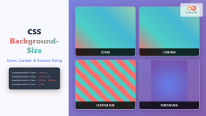
CSS Background-Size: Master Cover, Contain and Custom Sizing Techniques
The CSS background-size property is a powerful tool that controls how background images are sized within their containers. Whether you're...
CSS Style backgroundSize Property: CSS Background Size
CSS background-size Property: Mastering Background Image Scaling The CSS background-size property specifies the size of background images. Controlling the size...

CSS Style backgroundOrigin Property: CSS Background Origin
Understanding the background-origin Property in CSS The background-origin property in CSS specifies where the background image should be positioned within...

CSS Backdrop-Filter: Complete Guide to Background Blur and Visual Effects
What is CSS Backdrop-Filter? The backdrop-filter property in CSS allows you to apply graphical effects like blur, brightness, contrast, and...
CSS Background-Position: Complete Guide to Precise Background Image Positioning
The CSS background-position property is a fundamental tool for controlling exactly where background images appear within their containers. Whether you're...
CSS Style backgroundPosition Property: CSS Background Position
CSS background-position Property: Mastering Background Image Placement The CSS background-position property allows you to precisely control the initial position of...


