
What is Mobile-First Design?
Mobile-first design is a progressive enhancement approach where you start designing and coding for the smallest screen size first, then progressively enhance the experience for larger screens. This methodology has become the industry standard due to the dramatic shift in web usage patterns, with mobile devices now accounting for over 50% of global web traffic.
The core principle revolves around using min-width media queries instead of max-width, which ensures your base styles target mobile devices and additional styles are layered on top for larger viewports.
Why Choose Mobile-First Over Desktop-First?
The mobile-first approach offers several compelling advantages:
Performance Benefits: Mobile devices receive only the essential CSS needed for their viewport, reducing bandwidth usage and improving load times. Desktop users get the full enhanced experience without performance penalties.
Progressive Enhancement: Starting with a solid mobile foundation ensures your website works across all devices, even if CSS fails to load completely on slower connections.
Better User Experience: Designing for constraints first forces you to prioritize content and functionality, resulting in cleaner, more focused designs.
SEO Advantages: Google’s mobile-first indexing means your mobile experience directly impacts search rankings. A well-optimized mobile-first design naturally aligns with these requirements.
Understanding Min-Width Media Queries
Min-width media queries apply styles when the viewport is at least the specified width. This creates an additive effect where styles build upon each other as screen size increases.
@media (min-width: 768px) {
  /* Styles applied when viewport is 768px or wider */
}
Compare this to the desktop-first approach using max-width:
/* Desktop-first (not recommended) */
@media (max-width: 767px) {
  /* Styles applied when viewport is 767px or narrower */
}
Essential Mobile-First Breakpoints
Choosing the right breakpoints is crucial for effective responsive design. Here are the most commonly used breakpoints based on actual device usage:
/* Base styles for mobile (320px and up) */
.container {
  width: 100%;
  padding: 1rem;
}

/* Small tablets and large phones (576px and up) */
@media (min-width: 576px) {
  .container {
    max-width: 540px;
    margin: 0 auto;
  }
}

/* Medium tablets (768px and up) */
@media (min-width: 768px) {
  .container {
    max-width: 720px;
  }
}

/* Large tablets and small desktops (992px and up) */
@media (min-width: 992px) {
  .container {
    max-width: 960px;
  }
}

/* Large desktops (1200px and up) */
@media (min-width: 1200px) {
  .container {
    max-width: 1140px;
  }
}
Practical Implementation: Navigation Menu
Let’s build a responsive navigation menu using mobile-first principles. This example demonstrates how styles progressively enhance from mobile to desktop:
Here’s the complete CSS code for the navigation:
/* Mobile-first navigation styles */
.nav {
  background: #2d3748;
  padding: 1rem;
}

.nav-brand {
  color: #fff;
  font-size: 1.25rem;
  font-weight: bold;
  text-decoration: none;
  display: block;
  margin-bottom: 1rem;
}

.nav-menu {
  list-style: none;
  margin: 0;
  padding: 0;
}

.nav-item {
  margin-bottom: 0.5rem;
}

.nav-link {
  color: #a0aec0;
  text-decoration: none;
  display: block;
  padding: 0.5rem 0;
  border-bottom: 1px solid #4a5568;
  transition: color 0.3s ease;
}

.nav-link:hover {
  color: #fff;
}

/* Tablet and desktop enhancements */
@media (min-width: 768px) {
  .nav {
    display: flex;
    justify-content: space-between;
    align-items: center;
  }

  .nav-brand {
    margin-bottom: 0;
  }

  .nav-menu {
    display: flex;
    gap: 2rem;
  }

  .nav-item {
    margin-bottom: 0;
  }

  .nav-link {
    border-bottom: none;
    padding: 0.5rem 1rem;
    border-radius: 4px;
  }

  .nav-link:hover {
    background: #4a5568;
  }
}
Grid Layout with Mobile-First Approach
Creating responsive grid layouts with mobile-first design ensures content flows naturally on small screens while taking advantage of additional space on larger devices:
The CSS for this responsive grid system:
/* Mobile-first grid - single column by default */
.grid {
  display: grid;
  gap: 1rem;
}

.card {
  background: #f7fafc;
  padding: 1.5rem;
  border-radius: 8px;
  border: 1px solid #e2e8f0;
}

/* Small screens - 2 columns */
@media (min-width: 576px) {
  .grid {
    grid-template-columns: repeat(2, 1fr);
  }
}

/* Medium screens - 3 columns */
@media (min-width: 992px) {
  .grid {
    grid-template-columns: repeat(3, 1fr);
  }
}

/* Large screens - 4 columns */
@media (min-width: 1200px) {
  .grid {
    grid-template-columns: repeat(4, 1fr);
  }
}
Typography Scaling with Min-Width Queries
Typography is crucial for mobile-first design. Font sizes should be readable on small screens while taking advantage of larger displays:
/* Mobile-first typography */
body {
  font-family: -apple-system, BlinkMacSystemFont, "Segoe UI", Roboto, sans-serif;
  font-size: 16px;
  line-height: 1.5;
  color: #2d3748;
}

h1 {
  font-size: 1.875rem; /* 30px */
  line-height: 1.2;
  margin-bottom: 1rem;
}

h2 {
  font-size: 1.5rem; /* 24px */
  line-height: 1.3;
  margin-bottom: 0.875rem;
}

p {
  margin-bottom: 1rem;
}

/* Tablet enhancements */
@media (min-width: 768px) {
  body {
    font-size: 18px;
  }

  h1 {
    font-size: 2.25rem; /* 36px */
  }

  h2 {
    font-size: 1.875rem; /* 30px */
  }
}

/* Desktop enhancements */
@media (min-width: 1200px) {
  h1 {
    font-size: 3rem; /* 48px */
  }

  h2 {
    font-size: 2.25rem; /* 36px */
  }
}
Advanced Techniques: Fluid Typography and Spacing
Modern CSS offers sophisticated tools for creating truly responsive designs. The clamp() function allows for fluid scaling between breakpoints:
/* Fluid typography using clamp() */
h1 {
  font-size: clamp(1.875rem, 4vw, 3rem);
  /* Minimum: 30px, Preferred: 4vw, Maximum: 48px */
}

h2 {
  font-size: clamp(1.5rem, 3vw, 2.25rem);
  /* Minimum: 24px, Preferred: 3vw, Maximum: 36px */
}

/* Fluid spacing */
.section {
  padding: clamp(2rem, 5vw, 4rem) clamp(1rem, 3vw, 2rem);
}

/* Combined with media queries for fine control */
@media (min-width: 768px) {
  .section {
    padding: clamp(3rem, 6vw, 5rem) clamp(1.5rem, 4vw, 3rem);
  }
}
Performance Optimization Strategies
Mobile-first design inherently improves performance, but you can enhance it further with these techniques:
Critical CSS Inlining: Include essential mobile styles in the HTML head to prevent render-blocking:
<style>
/* Critical mobile styles */
body { margin: 0; font-family: sans-serif; }
.container { padding: 1rem; max-width: 100%; }
/* ... other critical styles */
</style>
Conditional Loading: Load additional CSS for larger screens asynchronously:
<link rel="stylesheet" href="mobile.css">
<link rel="stylesheet" href="desktop.css" media="(min-width: 768px)">
Common Pitfalls and Solutions
Avoid Fixed Widths: Never use fixed pixel widths for mobile layouts. Always use relative units:
/* Bad */
.sidebar {
  width: 300px;
}

/* Good */
.sidebar {
  width: 100%;
}

@media (min-width: 992px) {
  .sidebar {
    width: 25%;
  }
}
Touch Target Sizes: Ensure interactive elements are large enough for touch devices (minimum 44px):
button,
.btn {
  min-height: 44px;
  min-width: 44px;
  padding: 0.75rem 1rem;
}
Testing and Debugging Mobile-First Designs
Proper testing is essential for mobile-first development. Use these browser developer tools features:
Device Emulation: Chrome DevTools and Firefox Developer Tools offer comprehensive device emulation. Test your breakpoints by gradually increasing viewport width.
Network Throttling: Simulate slower mobile connections to test performance under realistic conditions.
Lighthouse Audits: Run regular Lighthouse audits focusing on mobile performance and accessibility scores.
Future-Proofing Your Mobile-First Strategy
Container queries represent the future of responsive design, allowing components to respond to their container’s size rather than the viewport:
/* Container queries (modern browsers) */
.card-container {
  container-type: inline-size;
}

@container (min-width: 300px) {
  .card {
    display: flex;
    gap: 1rem;
  }
}
Conclusion
Mobile-first design using min-width media queries is no longer optional—it’s essential for modern web development. This approach ensures optimal performance on mobile devices while providing enhanced experiences on larger screens. By starting with mobile constraints and progressively enhancing, you create websites that work everywhere and perform well for all users.
Remember to always test across real devices, not just browser emulators, and regularly audit your mobile performance. The mobile-first methodology, combined with modern CSS techniques like fluid typography and container queries, provides a robust foundation for creating responsive, accessible, and performant web experiences.
Related Posts
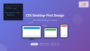
CSS Desktop-First Design: Master Max-Width Media Queries for Responsive Web Development
Desktop-first design is a responsive web development approach where you design for larger screens first, then progressively adapt your layout...

HTML Responsive Web Design: Crafting Websites for Every Device
Introduction In today's digital landscape, users access the internet through a plethora of devices, from large desktop monitors to small...

CSS Screen Media Queries: Complete Guide to Responsive Monitor and Device Targeting
CSS screen media queries are the cornerstone of responsive web design, enabling developers to create websites that adapt seamlessly across...

CSS Media Query Syntax: Complete Guide to Media Types and Features
CSS media queries are the cornerstone of responsive web design, allowing developers to apply different styles based on device characteristics...
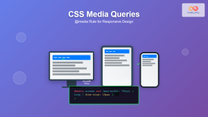
CSS Media Queries: Complete Guide to @media Rule for Responsive Web Design
What Are CSS Media Queries? CSS Media Queries are a fundamental feature of modern web development that allow you to...

CSS Media Query Operators: Complete Guide to and, or, not, only Keywords
CSS media query operators are essential tools for creating responsive web designs that adapt to different devices and screen conditions....

CSS Resolution Media Queries: Complete Guide to High-DPI Display Targeting
Understanding CSS Resolution Media Queries CSS resolution media queries allow developers to target specific display densities and create optimized experiences...

CSS Future: Complete Guide to Upcoming CSS Features and Specifications 2025
The future of CSS is incredibly exciting, with numerous groundbreaking features and specifications currently in development that promise to revolutionize...
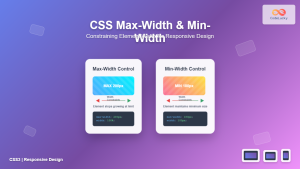
CSS Max-Width and Min-Width: Complete Guide to Responsive Width Constraints
When building responsive websites, controlling element widths is crucial for creating layouts that work across all devices. CSS provides two...

CSS Breakpoints: Complete Guide to Responsive Design Screen Sizes
CSS breakpoints are the foundation of responsive web design, defining specific screen widths where your website's layout adapts to different...
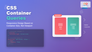
CSS Container Queries: Complete Guide to @container Rule and Containment Context
CSS Container Queries represent a revolutionary approach to responsive web design, allowing elements to respond to their container's size rather...

CSS Orientation Media Queries: Complete Guide to Portrait vs Landscape Detection
CSS orientation media queries are essential tools for creating responsive web designs that adapt seamlessly to different device orientations. Whether...


