
CSS media query operators are essential tools for creating responsive web designs that adapt to different devices and screen conditions. These logical operators—and, or, not, and only—allow you to combine multiple conditions and create sophisticated responsive layouts.
Understanding Media Query Operators
Media query operators enable you to create complex conditions by combining multiple media features. They work as logical connectors that determine when specific CSS rules should be applied based on device characteristics like screen size, orientation, resolution, and more.
The Four Main Operators
- and – Combines multiple conditions (all must be true)
- or – Provides alternative conditions (at least one must be true)
- not – Negates the entire media query
- only – Hides styles from older browsers
The AND Operator
The and operator combines multiple media features, requiring all conditions to be met simultaneously. This is the most commonly used operator in responsive design.
Basic AND Syntax
@media screen and (min-width: 768px) and (max-width: 1024px) {
  /* Styles for tablets */
  .container {
    width: 90%;
    padding: 20px;
  }
}
Multiple Conditions with AND
@media screen and (min-width: 1200px) and (orientation: landscape) and (min-resolution: 2dppx) {
  /* High-resolution desktop displays in landscape */
  .hero-image {
    background-image: url('hero-4k.jpg');
  }
}
Interactive Example: AND Operator
Resize your browser window to see the AND operator in action. This box will change color when the screen width is between 600px and 900px.
The OR Operator (Comma Separator)
The or operator in CSS media queries is represented by commas. It creates alternative conditions where only one needs to be true for the styles to apply.
OR Syntax Using Commas
@media screen and (max-width: 480px), screen and (orientation: portrait) {
  /* Applies to small screens OR portrait orientation */
  .mobile-menu {
    display: block;
  }
  .desktop-menu {
    display: none;
  }
}
Complex OR Conditions
@media
  screen and (max-width: 600px),
  screen and (max-height: 400px),
  print {
  /* Mobile, short screens, or print */
  .content {
    font-size: 14px;
    line-height: 1.4;
  }
}
Interactive Example: OR Operator
Resize your browser window to see the OR operator. This box changes when the width is either very small (≤500px) OR very large (≥1200px).
The NOT Operator
The not operator negates an entire media query, applying styles when the specified conditions are not met. It must be placed at the beginning of the media query.
NOT Operator Syntax
@media not screen and (max-width: 768px) {
  /* Styles for non-mobile devices */
  .desktop-only {
    display: block;
  }
}
Practical NOT Examples
/* Hide elements on touch devices */
@media not (hover: hover) {
  .hover-tooltip {
    display: none;
  }
}

/* Styles for non-print media */
@media not print {
  .no-print {
    display: block;
  }
}
Interactive Example: NOT Operator
Resize your browser window to see the NOT operator. This box changes color when the screen is NOT small (>700px wide).
The ONLY Operator
The only operator is primarily used to hide styles from older browsers that don’t support media queries properly. Modern browsers ignore the only keyword, but legacy browsers will skip the entire rule.
ONLY Operator Usage
@media only screen and (min-width: 768px) {
  /* These styles won't apply in very old browsers */
  .modern-layout {
    display: flex;
    grid-template-columns: 1fr 2fr;
  }
}
When to Use ONLY
/* Without 'only' - old browsers might apply styles incorrectly */
@media screen and (color) {
  .color-styles { color: blue; }
}

/* With 'only' - old browsers ignore the entire rule */
@media only screen and (color) {
  .color-styles { color: blue; }
}
Combining Multiple Operators
You can create sophisticated media queries by combining different operators to handle complex responsive scenarios.
Complex Operator Combinations
/* Desktop OR high-resolution tablets in landscape, but NOT touch devices */
@media
  only screen and (min-width: 1024px),
  only screen and (min-width: 768px) and (orientation: landscape) and (min-resolution: 2dppx),
  not (hover: none) {
  .advanced-ui {
    display: block;
  }
}
Real-World Example: Navigation System
/* Mobile menu for small screens OR portrait tablets */
@media
  screen and (max-width: 768px),
  screen and (max-width: 1024px) and (orientation: portrait) {
  .mobile-nav {
    display: block;
  }
  .desktop-nav {
    display: none;
  }
}

/* Desktop menu for larger screens AND landscape orientation */
@media screen and (min-width: 769px) and (orientation: landscape) {
  .desktop-nav {
    display: flex;
  }
  .mobile-nav {
    display: none;
  }
}

/* Special handling for devices that don't support hover */
@media not (hover: hover) {
  .nav-dropdown {
    position: static;
  }
}
Complete Interactive Demo
Multi-Condition Media Query Demo
This demo combines multiple operators to show different states:
- Yellow: Mobile devices (width ≤ 600px)
- Blue: Tablets (601px – 1024px)
- Green: Desktop (≥ 1025px)
- Pink badge: Portrait orientation on larger screens
Resize your browser and rotate your device (if possible) to see all combinations!
Best Practices for Media Query Operators
1. Use Logical Grouping
Group related conditions together and use clear, descriptive comments:
/* Mobile-first approach with logical AND grouping */
@media screen and (min-width: 768px) and (orientation: landscape) {
  /* Tablet landscape styles */
}

@media
  screen and (min-width: 1024px),
  screen and (min-width: 768px) and (min-resolution: 2dppx) {
  /* Desktop OR high-DPI tablet styles */
}
2. Minimize Complex Conditions
Avoid overly complex media queries that are hard to maintain:
/* Instead of this complex condition */
@media not screen and (max-width: 768px) and not (orientation: portrait) {
  /* Hard to understand */
}

/* Use simpler, clearer conditions */
@media screen and (min-width: 769px) and (orientation: landscape) {
  /* Much clearer intent */
}
3. Test Across Devices
Always test your media query combinations on real devices and browser developer tools to ensure they work as expected.
Common Pitfalls and Solutions
Operator Precedence Issues
Remember that the NOT operator applies to the entire media query:
/* INCORRECT - NOT only applies to screen, not the width condition */
@media not screen and (max-width: 768px) {
  /* This might not work as expected */
}

/* CORRECT - Use parentheses for clarity */
@media not (screen and (max-width: 768px)) {
  /* Clear negation of the entire condition */
}
Browser Compatibility
Some older browsers don’t support all media query features. Use progressive enhancement:
/* Base styles for all browsers */
.navigation {
  display: block;
}

/* Enhanced styles for supporting browsers */
@media only screen and (min-width: 768px) {
  .navigation {
    display: flex;
    justify-content: space-between;
  }
}
Advanced Techniques
Dynamic Media Queries with CSS Custom Properties
:root {
  --mobile-breakpoint: 768px;
  --tablet-breakpoint: 1024px;
}

@media screen and (max-width: 767px) {
  .responsive-container {
    --columns: 1;
    --gap: 10px;
  }
}

@media screen and (min-width: 768px) and (max-width: 1023px) {
  .responsive-container {
    --columns: 2;
    --gap: 20px;
  }
}

@media screen and (min-width: 1024px) {
  .responsive-container {
    --columns: 3;
    --gap: 30px;
  }
}
Container Queries Integration
/* Combining traditional media queries with container queries */
@media screen and (min-width: 768px) {
  .card-container {
    container-type: inline-size;
  }
}

@container (min-width: 300px) {
  .card {
    display: flex;
    gap: 1rem;
  }
}
Performance Considerations
Media query operators can impact performance if used excessively. Follow these guidelines:
- Minimize redundant conditions: Combine similar breakpoints
- Use efficient selectors: Avoid deeply nested selectors within media queries
- Group related styles: Keep related responsive styles together
- Leverage CSS preprocessing: Use mixins for common media query patterns
Future of Media Query Operators
CSS continues to evolve with new media query features and operators. Stay updated with emerging specifications like:
- Range syntax:
(400px <= width <= 800px) - Container queries: Element-based responsive design
- New media features:
prefers-reduced-data,environment-blending
Conclusion
CSS media query operators are powerful tools for creating sophisticated responsive designs. The and operator combines conditions, or (comma) provides alternatives, not negates queries, and only ensures browser compatibility. By mastering these operators and following best practices, you can create flexible, maintainable responsive designs that work across all devices and browsers.
Remember to test thoroughly, keep conditions simple and readable, and always consider performance implications when crafting complex media queries. With these skills, you’ll be well-equipped to handle any responsive design challenge.
Related Posts
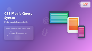
CSS Media Query Syntax: Complete Guide to Media Types and Features
CSS media queries are the cornerstone of responsive web design, allowing developers to apply different styles based on device characteristics...
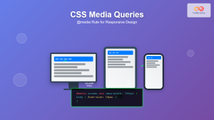
CSS Media Queries: Complete Guide to @media Rule for Responsive Web Design
What Are CSS Media Queries? CSS Media Queries are a fundamental feature of modern web development that allow you to...
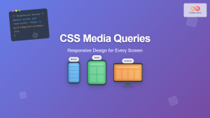
CSS Screen Media Queries: Complete Guide to Responsive Monitor and Device Targeting
CSS screen media queries are the cornerstone of responsive web design, enabling developers to create websites that adapt seamlessly across...
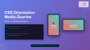
CSS Orientation Media Queries: Complete Guide to Portrait vs Landscape Detection
CSS orientation media queries are essential tools for creating responsive web designs that adapt seamlessly to different device orientations. Whether...
CSS Resolution Media Queries: Complete Guide to High-DPI Display Targeting
Understanding CSS Resolution Media Queries CSS resolution media queries allow developers to target specific display densities and create optimized experiences...
HTML Source media Property: Source Media Query
HTML Source media Property: Source Media Query The HTML <source> element is used within <picture> and <video> elements to provide...
CSS Mobile-First Design: Complete Min-Width Media Query Guide for Responsive Web Development
What is Mobile-First Design? Mobile-first design is a progressive enhancement approach where you start designing and coding for the smallest...
JavaScript Window matchMedia() Method: Matching Media Queries
JavaScript Window matchMedia() Method: Matching Media Queries The window.matchMedia() method in JavaScript is a powerful tool that enables developers to...
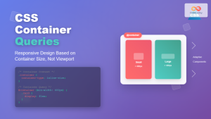
CSS Container Queries: Complete Guide to @container Rule and Containment Context
CSS Container Queries represent a revolutionary approach to responsive web design, allowing elements to respond to their container's size rather...
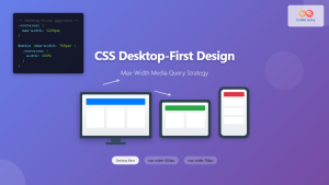
CSS Desktop-First Design: Master Max-Width Media Queries for Responsive Web Development
Desktop-first design is a responsive web development approach where you design for larger screens first, then progressively adapt your layout...

HTML Responsive Web Design: Crafting Websites for Every Device
Introduction In today's digital landscape, users access the internet through a plethora of devices, from large desktop monitors to small...
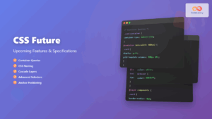
CSS Future: Complete Guide to Upcoming CSS Features and Specifications 2025
The future of CSS is incredibly exciting, with numerous groundbreaking features and specifications currently in development that promise to revolutionize...
- Understanding Media Query Operators
- The AND Operator
- The OR Operator (Comma Separator)
- The NOT Operator
- The ONLY Operator
- Combining Multiple Operators
- Best Practices for Media Query Operators
- Common Pitfalls and Solutions
- Advanced Techniques
- Performance Considerations
- Future of Media Query Operators
- Conclusion


