
CSS linear gradients are one of the most powerful tools for creating visually stunning backgrounds and design elements in modern web development. Unlike solid colors, linear gradients create smooth transitions between multiple colors along a straight line, enabling designers to craft sophisticated visual effects that enhance user experience and create depth in web interfaces.
What is CSS Linear-Gradient?
The linear-gradient() CSS function creates a smooth transition between two or more specified colors along a straight line. This function generates an image that can be used as a background, eliminating the need for external image files and providing better performance and flexibility.
background: linear-gradient(to right, #ff6b6b, #4ecdc4);Linear-Gradient Syntax
The basic syntax for CSS linear-gradient follows this pattern:
linear-gradient([direction], color-stop1, color-stop2, ...)Where:
- direction (optional): Specifies the gradient’s direction using keywords or angles
- color-stop: Defines colors and their positions along the gradient line
Controlling Gradient Direction
Using Directional Keywords
CSS provides intuitive keywords to control gradient direction:
/* Horizontal gradients */
background: linear-gradient(to right, #ff9a9e, #fecfef);
background: linear-gradient(to left, #a8edea, #fed6e3);

/* Vertical gradients */
background: linear-gradient(to bottom, #ffecd2, #fcb69f);
background: linear-gradient(to top, #667eea, #764ba2);
Diagonal Directions
Create diagonal gradients by combining directional keywords:
background: linear-gradient(to bottom right, #fa709a, #fee140);
background: linear-gradient(to top left, #43e97b, #38f9d7);
background: linear-gradient(to bottom left, #fa709a, #fee140);
background: linear-gradient(to top right, #667eea, #764ba2);
Working with Angles
For precise control over gradient direction, use angle values measured in degrees:
- 0deg: Bottom to top (equivalent to “to top”)
- 90deg: Left to right (equivalent to “to right”)
- 180deg: Top to bottom (equivalent to “to bottom”)
- 270deg: Right to left (equivalent to “to left”)
background: linear-gradient(0deg, #ff6b6b, #4ecdc4);
background: linear-gradient(45deg, #ff6b6b, #4ecdc4);
background: linear-gradient(90deg, #ff6b6b, #4ecdc4);
background: linear-gradient(135deg, #ff6b6b, #4ecdc4);
Understanding Color Stops
Color stops define where specific colors appear along the gradient line. You can specify colors using various formats and control their positions.
Basic Color Stops
The simplest form uses just color values:
background: linear-gradient(to right, red, yellow, green, blue);Positioned Color Stops
Control exactly where colors appear by adding position values:
background: linear-gradient(to right,
    #ff6b6b 0%,
    #4ecdc4 25%,
    #45b7d1 50%,
    #f9ca24 75%,
    #eb4d4b 100%
);
Creating Hard Color Transitions
Position multiple colors at the same point to create sharp transitions:
background: linear-gradient(to right,
    #ff6b6b 0%, #ff6b6b 33%,
    #4ecdc4 33%, #4ecdc4 66%,
    #f9ca24 66%, #f9ca24 100%
);
Advanced Gradient Techniques
Transparent Gradients
Use transparent colors to create fade effects:
Transparent Gradient Overlay
background: linear-gradient(to bottom,
    rgba(255, 107, 107, 1),
    rgba(255, 107, 107, 0)
), url('background-image.jpg');
Multiple Gradients
Layer multiple gradients for complex effects:
Multiple Layered Gradients
background:
    linear-gradient(45deg, transparent 40%, rgba(255, 255, 255, 0.1) 50%, transparent 60%),
    linear-gradient(to right, #667eea, #764ba2);
Interactive Gradient Generator
Experiment with different gradient settings using this interactive tool:
Practical Use Cases
Button Hover Effects
.gradient-button {
    background: linear-gradient(45deg, #667eea, #764ba2);
    color: white;
    border: none;
    padding: 12px 24px;
    border-radius: 25px;
    cursor: pointer;
    transition: all 0.3s ease;
}

.gradient-button:hover {
    background: linear-gradient(45deg, #764ba2, #667eea);
    transform: translateY(-2px);
}
Card Backgrounds
Gradient Card
This card uses a diagonal gradient background with a subtle shadow effect.
.gradient-card {
    background: linear-gradient(135deg, #667eea 0%, #764ba2 100%);
    padding: 30px;
    border-radius: 15px;
    color: white;
    box-shadow: 0 10px 30px rgba(0,0,0,0.3);
}
Text Backgrounds
Gradient Text Effect
.gradient-text {
    background: linear-gradient(45deg, #ff6b6b, #4ecdc4, #45b7d1);
    -webkit-background-clip: text;
    -webkit-text-fill-color: transparent;
    background-clip: text;
    font-size: 36px;
    font-weight: bold;
}
Browser Support and Fallbacks
CSS linear gradients have excellent browser support in modern browsers. However, for older browsers, always provide fallback colors:
.gradient-element {
    /* Fallback for older browsers */
    background: #667eea;

    /* Modern gradient */
    background: linear-gradient(45deg, #667eea, #764ba2);
}
Performance Considerations
CSS gradients offer several performance advantages over image-based backgrounds:
- No HTTP requests: Gradients are generated by CSS, eliminating the need for external image files
- Scalable: They look crisp at any resolution without pixelation
- Small file size: CSS gradients add minimal weight to your stylesheet
- Dynamic: Can be easily modified with JavaScript or CSS variables
Common Pitfalls and Solutions
Avoiding Muddy Colors
When using multiple colors, avoid transitions through the color wheel that can create muddy intermediate colors:
/* Avoid */
background: linear-gradient(to right, red, green);

/* Better */
background: linear-gradient(to right, #ff6b6b, #4ecdc4);
Gradient Banding
Smooth gradients can sometimes show visible bands. Add intermediate colors to create smoother transitions:
Conclusion
CSS linear gradients are a powerful tool for creating visually appealing designs without relying on external images. By mastering direction control, color stops, and angles, you can create everything from subtle background effects to bold, eye-catching designs. The key to effective gradient usage lies in understanding color theory, maintaining good contrast for readability, and using gradients purposefully to enhance rather than overwhelm your design.
Remember to always test your gradients across different devices and screen sizes, provide appropriate fallbacks for older browsers, and consider the overall user experience when implementing gradient effects in your web projects.
Related Posts
CSS Gradients: Complete Guide to Linear Gradient Background Creation
CSS gradients have revolutionized web design by allowing developers to create smooth color transitions without relying on images. Linear gradients,...
HTML Canvas createLinearGradient() Method: Creating Linear Gradients
The createLinearGradient() Method: Mastering Linear Gradients on HTML Canvas The createLinearGradient() method in the HTML Canvas API is a powerful...
CSS Repeating Gradients: Master Linear and Radial Pattern Techniques
CSS repeating gradients are powerful tools that allow developers to create beautiful, complex patterns without relying on external images. These...
CSS RGBA Color Function: Complete Guide to RGB with Alpha Transparency
The CSS RGBA color function is a powerful tool that extends the traditional RGB color model by adding an alpha...
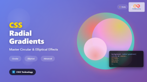
CSS Radial-Gradient: Complete Guide to Circular and Elliptical Gradients
CSS radial gradients create stunning visual effects by transitioning colors in a circular or elliptical pattern radiating from a central...
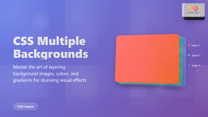
CSS Multiple Backgrounds: Complete Guide to Layering Images and Colors Like a Pro
CSS multiple backgrounds revolutionized web design by allowing developers to layer multiple background images, colors, and gradients on a single...
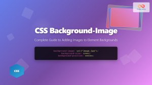
CSS Background-Image: Complete Guide to Adding Images to Element Backgrounds
The CSS background-image property is one of the most powerful tools for creating visually appealing web designs. It allows you...
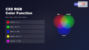
CSS RGB Color Function: Complete Guide to Red, Green, Blue Color Values
The CSS RGB color function is one of the most fundamental and widely-used methods for defining colors in web development....
CSS Contrast Filter: Complete Guide to Adjusting Element Contrast for Better Visual Impact
The CSS contrast() filter function is a powerful tool that allows web developers to dynamically adjust the contrast of HTML...
CSS Hue-Rotate Filter: Complete Guide to Dynamic Color Shifting
The CSS hue-rotate filter is a powerful tool that allows web developers to dynamically shift the hue values of any...
CSS Style backgroundImage Property: CSS Background Image
CSS backgroundImage Property: A Comprehensive Guide The backgroundImage property in CSS is used to set one or more background images...
CSS Background-Color: Complete Guide to Setting Element Background Colors
The CSS background-color property is one of the most fundamental styling tools in web development, allowing you to set the...


