
The justify-items property is a powerful CSS Grid feature that controls how grid items are aligned along the inline axis (horizontally in left-to-right languages) within their grid areas. This property provides precise control over item positioning and is essential for creating well-structured, visually appealing grid layouts.
Understanding CSS Justify-Items
The justify-items property is applied to grid containers and affects all direct child grid items simultaneously. It determines how items are positioned horizontally within their assigned grid cells when the items are smaller than their grid areas.
Syntax and Values
The basic syntax for justify-items is straightforward:
.grid-container {
  display: grid;
  justify-items: value;
}
The property accepts several values, each creating different alignment behaviors:
- start – Aligns items to the start of their grid areas
- end – Aligns items to the end of their grid areas
- center – Centers items within their grid areas
- stretch – Stretches items to fill their grid areas (default)
Interactive Examples
Let’s explore each value with interactive examples to see the differences in action:
Basic Justify-Items Values
Detailed Value Explanations
1. justify-items: stretch
The stretch value is the default behavior. Grid items expand to fill the entire width of their grid areas, unless they have an explicit width set.
.grid-container {
  display: grid;
  grid-template-columns: repeat(3, 1fr);
  justify-items: stretch;
}2. justify-items: start
The start value aligns grid items to the beginning of their grid areas. In left-to-right languages, this means items align to the left edge.
.grid-container {
  display: grid;
  grid-template-columns: repeat(3, 1fr);
  justify-items: start;
}3. justify-items: end
The end value aligns grid items to the end of their grid areas. In left-to-right languages, this positions items at the right edge of their cells.
.grid-container {
  display: grid;
  grid-template-columns: repeat(3, 1fr);
  justify-items: end;
}4. justify-items: center
The center value positions grid items in the horizontal center of their grid areas, creating balanced layouts.
.grid-container {
  display: grid;
  grid-template-columns: repeat(3, 1fr);
  justify-items: center;
}Overriding with justify-self
Individual grid items can override the container’s justify-items setting using the justify-self property. This allows for mixed alignment patterns within a single grid.
.grid-container {
  display: grid;
  grid-template-columns: repeat(3, 1fr);
  justify-items: center;
}

.special-item {
  justify-self: start;
}Practical Use Cases
Card Layout with Mixed Alignment
Create a responsive card grid where different elements have different alignment needs:
Product Card
Description text that varies in length and needs proper alignment.
Another Product
Short description.
Third Product
This is a much longer description that demonstrates how justify-items works with varying content lengths.
Navigation Menu Alignment
Use justify-items to create perfectly aligned navigation elements:
Browser Support and Compatibility
The justify-items property has excellent browser support across modern browsers:
- Chrome: 57+
- Firefox: 45+
- Safari: 10.1+
- Edge: 16+
For older browser support, consider using feature queries:
@supports (display: grid) {
  .grid-container {
    display: grid;
    justify-items: center;
  }
}

/* Fallback for older browsers */
.grid-container {
  display: flex;
  flex-wrap: wrap;
  justify-content: center;
}
Common Mistakes and Solutions
Mistake 1: Applying to Grid Items
Wrong:
.grid-item {
  justify-items: center; /* This won't work */
}
Correct:
.grid-container {
  justify-items: center; /* Apply to container */
}

/* Or use justify-self on individual items */
.grid-item {
  justify-self: center;
}
Mistake 2: Confusing with Flexbox Properties
Don’t confuse justify-items with flexbox’s justify-content. They serve different purposes in different layout systems.
Performance Considerations
The justify-items property doesn’t significantly impact rendering performance, but consider these best practices:
- Use
stretchwhen possible to avoid additional calculations - Minimize frequent changes to alignment properties
- Test performance on lower-end devices when using complex grid layouts
Conclusion
The justify-items property is an essential tool for creating professional, well-aligned grid layouts. By understanding how each value works and when to use them, you can create more flexible and visually appealing web designs. Remember to combine it with align-items for complete grid item positioning control, and use justify-self when individual items need different alignment behavior.
Practice with the interactive examples above to get comfortable with the different values, and experiment with combining justify-items with other CSS Grid properties to create sophisticated layouts that respond beautifully across different screen sizes and content variations.
Related Posts

CSS Justify-Self: Master Individual Item Inline Axis Alignment
The justify-self property in CSS is a powerful alignment tool that allows you to control how individual items align themselves...

CSS Justify-Content: Master Grid Container Inline Axis Alignment with Examples
The justify-content property is a powerful CSS tool for controlling how grid items are aligned along the inline axis (horizontal...
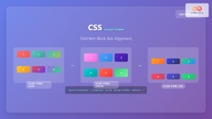
CSS Align-Items: Complete Guide to Grid Item Block Axis Alignment
Understanding CSS Align-Items in Grid Context The CSS align-items property is a powerful tool for controlling how grid items align...
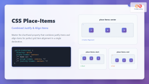
CSS Place-Items: Master Combined Justify and Align Items in One Property
The CSS place-items property is a powerful shorthand that combines justify-items and align-items into a single declaration. This property revolutionizes...

CSS Align-Content: Master Grid Container Block Axis Alignment
The CSS align-content property is a powerful tool for controlling how grid items are distributed along the block axis (typically...
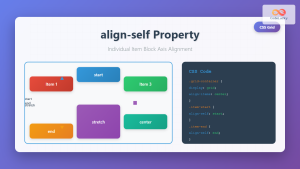
CSS Align-Self: Master Individual Grid Item Block Axis Alignment
The CSS align-self property provides granular control over individual grid items' alignment along the block axis (vertical direction in horizontal...

CSS Style justifyContent Property: CSS Justify Content
CSS justifyContent Property: Mastering Content Alignment The CSS justifyContent property defines how the browser distributes space between and around content...
CSS Style alignItems Property: CSS Align Items
Understanding the CSS align-items Property The align-items property in CSS is a powerful tool that defines how items are aligned...
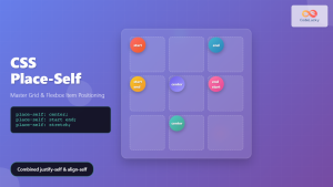
CSS Place-Self: Master Grid and Flexbox Item Positioning with One Property
The CSS place-self property is a powerful shorthand that combines justify-self and align-self into a single declaration, making it easier...
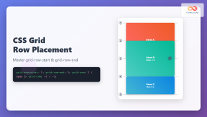
CSS Grid-Row-Start and Grid-Row-End: Complete Guide to Item Row Placement
Understanding CSS Grid Row Placement CSS Grid provides powerful tools for controlling the placement of grid items within your layout....
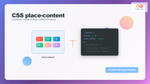
CSS Place-Content: Complete Guide to Combined Justify and Align Content Properties
The place-content property in CSS is a powerful shorthand that combines both justify-content and align-content properties into a single declaration....

CSS Align-Items: Master Cross-Axis Alignment in Flexbox and Grid
The CSS align-items property is a fundamental tool for controlling cross-axis alignment in both flexbox and CSS Grid layouts. Understanding...


