
The place-content property in CSS is a powerful shorthand that combines both justify-content and align-content properties into a single declaration. This property is essential for modern web layouts, particularly when working with CSS Grid and Flexbox, allowing developers to control content alignment in both axes simultaneously.
Understanding CSS Place-Content
The place-content property is part of the CSS Box Alignment Module and provides a concise way to set both the block axis (vertical) and inline axis (horizontal) alignment of content within a container. It works with both CSS Grid and Flexbox layouts, making it a versatile tool for modern web development.
Syntax and Values
The basic syntax for place-content follows this pattern:
place-content: <align-content> <justify-content>;When only one value is provided, it applies to both axes:
place-content: center; /* Same as: align-content: center; justify-content: center; */The property accepts the following values:
- start – Aligns content to the start of the container
- end – Aligns content to the end of the container
- center – Centers content within the container
- stretch – Stretches content to fill the container (default)
- space-around – Distributes content with equal space around each item
- space-between – Distributes content with space between items
- space-evenly – Distributes content with equal space between and around items
CSS Grid Implementation
CSS Grid is where place-content truly shines, allowing you to position the entire grid within its container when the grid is smaller than the container itself.
Basic Grid Centering
Example: Center Grid Content
.grid-container {
  display: grid;
  grid-template-columns: repeat(3, 80px);
  grid-gap: 10px;
  height: 200px;
  place-content: center;
  border: 2px dashed #007acc;
}
Different Alignment Combinations
Example: Start-End Alignment
.grid-start-end {
  display: grid;
  grid-template-columns: repeat(2, 60px);
  grid-gap: 8px;
  height: 150px;
  place-content: start end; /* align-content: start; justify-content: end; */
}
Flexbox Implementation
While place-content works with Flexbox, it’s important to note that it only affects the cross-axis alignment when dealing with flex containers that have multiple lines (flex-wrap enabled).
Multi-line Flex Container
Example: Flexbox with Wrapped Content
.flex-container {
  display: flex;
  flex-wrap: wrap;
  height: 200px;
  width: 200px;
  place-content: space-around;
}

.flex-item {
  flex: 0 0 45%;
  margin: 2px;
}
Interactive Demo
Try Different Place-Content Values
Browser Support and Fallbacks
The place-content property enjoys excellent modern browser support, but it’s important to provide fallbacks for older browsers:
/* Fallback for older browsers */
.container {
  align-content: center;
  justify-content: center;
}

/* Modern browsers */
.container {
  place-content: center;
}
Feature Detection
You can use CSS feature queries to detect support:
@supports (place-content: center) {
  .modern-container {
    place-content: center;
  }
}

@supports not (place-content: center) {
  .legacy-container {
    align-content: center;
    justify-content: center;
  }
}
Advanced Use Cases
Responsive Design Applications
The place-content property works excellently with responsive design patterns:
Example: Responsive Card Layout
.responsive-cards {
  display: grid;
  grid-template-columns: repeat(auto-fit, minmax(120px, 1fr));
  grid-gap: 15px;
  height: 250px;
  place-content: center start;
}

@media (max-width: 768px) {
  .responsive-cards {
    place-content: stretch;
  }
}
Layout Patterns
Example: Holy Grail Layout Component
Common Mistakes and Solutions
Mistake 1: Confusing with Place-Items
Don’t confuse place-content with place-items. The former aligns the entire content area, while the latter aligns individual items within their grid areas.
❌ Common Mistake
/* This affects individual items, not the entire grid */
.container {
  place-items: center; /* Wrong for centering entire grid */
}
✅ Correct Approach
/* This centers the entire grid content */
.container {
  place-content: center; /* Correct for centering entire grid */
}
Mistake 2: Using with Single-Line Flex
Remember that place-content has limited effect on single-line flex containers.
Performance Considerations
The place-content property is a layout property that can trigger reflows. Consider these optimization tips:
- Use CSS containment when possible:
contain: layout; - Avoid animating
place-contentvalues - Combine with
will-changeproperty when necessary for transitions
Accessibility Considerations
When using place-content, ensure your layouts remain accessible:
- Maintain logical reading order despite visual positioning
- Ensure adequate color contrast for centered content
- Test with screen readers to verify content flow
- Use semantic HTML structure regardless of visual layout
Conclusion
The CSS place-content property is an essential tool for modern web layouts, offering a clean and efficient way to control content alignment in both CSS Grid and Flexbox contexts. By combining justify-content and align-content into a single declaration, it reduces code complexity while providing powerful layout capabilities.
Understanding when and how to use place-content effectively will significantly improve your CSS layout skills and help you create more maintainable, responsive designs. Remember to always consider browser support requirements and provide appropriate fallbacks for your target audience.
Practice with the interactive examples above and experiment with different value combinations to master this powerful CSS property. The key to effective use is understanding the difference between content alignment and item alignment, and choosing the right property for your specific layout needs.
Related Posts
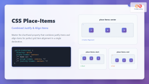
CSS Place-Items: Master Combined Justify and Align Items in One Property
The CSS place-items property is a powerful shorthand that combines justify-items and align-items into a single declaration. This property revolutionizes...
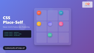
CSS Place-Self: Master Grid and Flexbox Item Positioning with One Property
The CSS place-self property is a powerful shorthand that combines justify-self and align-self into a single declaration, making it easier...
CSS align-content Property: CSS Align Content
CSS align-content Property: Mastering Content Alignment in Flexbox and Grid Layouts The CSS align-content property is a powerful tool for...
CSS Justify-Self: Master Individual Item Inline Axis Alignment
The justify-self property in CSS is a powerful alignment tool that allows you to control how individual items align themselves...
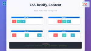
CSS Justify-Content: Complete Guide to Flexbox Main Axis Alignment
The justify-content property is one of the most powerful tools in CSS Flexbox for controlling how flex items are distributed...
CSS Style justifyContent Property: CSS Justify Content
CSS justifyContent Property: Mastering Content Alignment The CSS justifyContent property defines how the browser distributes space between and around content...

CSS Align-Content: Master Grid Container Block Axis Alignment
The CSS align-content property is a powerful tool for controlling how grid items are distributed along the block axis (typically...
CSS Align-Items: Complete Guide to Grid Item Block Axis Alignment
Understanding CSS Align-Items in Grid Context The CSS align-items property is a powerful tool for controlling how grid items align...
CSS Align-Content: Complete Guide to Cross-Axis Multi-Line Alignment
The align-content property is a powerful CSS tool that controls how multiple lines of content are distributed along the cross-axis...

CSS Align-Items: Master Cross-Axis Alignment in Flexbox and Grid
The CSS align-items property is a fundamental tool for controlling cross-axis alignment in both flexbox and CSS Grid layouts. Understanding...
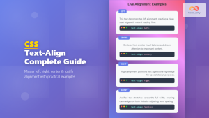
CSS Text-Align: Complete Guide to Left, Right, Center and Justify Text Alignment
Text alignment is a fundamental aspect of web design that significantly impacts readability and visual hierarchy. The CSS text-align property...
CSS Style alignItems Property: CSS Align Items
Understanding the CSS align-items Property The align-items property in CSS is a powerful tool that defines how items are aligned...


