
Understanding CSS Grid Row Placement
CSS Grid provides powerful tools for controlling the placement of grid items within your layout. The grid-row-start and grid-row-end properties are essential for precise row positioning, allowing you to specify exactly where an item should begin and end within the grid’s row structure.
These properties work together to define the row span of grid items, giving you complete control over vertical positioning and sizing within your grid container.
Basic Syntax and Usage
The grid-row-start and grid-row-end properties accept various value types:
- Line numbers: Positive integers referring to grid lines
- Line names: Custom names assigned to grid lines
- Span keyword: Used with numbers to span multiple rows
- Auto: Default value for automatic placement
Basic Example
.grid-container {
  display: grid;
  grid-template-rows: repeat(4, 60px);
  gap: 10px;
}

.item-a {
  grid-row-start: 1;
  grid-row-end: 3;
}

.item-b {
  grid-row-start: 2;
  grid-row-end: 4;
}

.item-c {
  grid-row-start: 4;
  grid-row-end: 5;
}
Grid Line Numbering System
Understanding how CSS Grid numbers its lines is crucial for effective row placement. Grid lines are numbered starting from 1, with both positive and negative numbering systems available.
Line Numbering Visualization
Using Negative Line Numbers
Negative line numbers count from the end of the grid, with -1 representing the last line. This approach is particularly useful for responsive designs where the total number of rows might vary.
Negative Line Numbers Example
.full-height-item {
  grid-row-start: 1;
  grid-row-end: -1; /* Spans from first to last line */
}

.last-row-item {
  grid-row-start: -2;
  grid-row-end: -1; /* Occupies the last row */
}
The Span Keyword
The span keyword provides an intuitive way to specify how many rows an item should occupy, rather than defining explicit start and end lines.
Span Keyword Examples
.span-two-rows {
  grid-row: span 2;
}

.span-three-rows {
  grid-row: span 3;
}

/* You can also use span with start position */
.item-with-span {
  grid-row-start: 2;
  grid-row-end: span 2; /* Starts at row 2, spans 2 rows */
}
Named Grid Lines
Named grid lines provide semantic meaning to your grid structure, making your CSS more readable and maintainable. You can reference these names in your row placement properties.
Named Lines Example
.grid-container {
  display: grid;
  grid-template-rows:
    [header-start] 60px [header-end main-start]
    1fr [main-end footer-start]
    50px [footer-end];
}

.header {
  grid-row: header-start / header-end;
}

.main {
  grid-row: main-start / main-end;
}

.footer {
  grid-row: footer-start / footer-end;
}
Shorthand Property: grid-row
The grid-row shorthand property combines grid-row-start and grid-row-end into a single declaration, separated by a forward slash.
Grid-Row Shorthand
/* These are equivalent */
.item-1 {
  grid-row-start: 1;
  grid-row-end: 3;
}

.item-1 {
  grid-row: 1 / 3;
}

/* Using span in shorthand */
.item-2 {
  grid-row: 2 / span 2;
}

/* Single row placement */
.item-3 {
  grid-row: 4; /* Same as grid-row: 4 / 5 */
}
Interactive Example: Row Placement Playground
Interactive Grid Row Placement
Click the buttons below to see different row placement configurations:
.item-1 { grid-row: 1; }
.item-2 { grid-row: 2; }
.item-3 { grid-row: 3; }
Common Use Cases and Patterns
Creating a Sidebar Layout
.layout-container {
  display: grid;
  grid-template-columns: 200px 1fr;
  grid-template-rows: 60px 1fr 50px;
}

.header {
  grid-row: 1;
  grid-column: 1 / -1;
}

.sidebar {
  grid-row: 2;
}

.main {
  grid-row: 2;
}

.footer {
  grid-row: 3;
  grid-column: 1 / -1;
}
Card Layout with Varying Heights
Best Practices and Tips
Performance and Maintainability
- Use named lines for complex layouts to improve code readability
- Prefer shorthand syntax when possible to reduce CSS verbosity
- Consider negative line numbers for responsive designs
- Use span keyword for items that need to occupy multiple rows
- Test across browsers as some older versions may have limited support
Browser Support and Fallbacks
CSS Grid enjoys excellent modern browser support, but you may need fallbacks for older browsers. Here’s how to implement progressive enhancement:
/* Fallback for older browsers */
.grid-item {
  display: block;
  margin-bottom: 1rem;
}

/* Grid enhancement */
@supports (display: grid) {
  .grid-container {
    display: grid;
    grid-template-rows: repeat(4, 1fr);
  }

  .grid-item {
    margin-bottom: 0;
    grid-row: span 2;
  }
}
Troubleshooting Common Issues
Overlapping Items
When items overlap unintentionally, check your row line numbers and ensure they don’t conflict. Use browser developer tools to visualize grid lines.
Items Not Spanning as Expected
Remember that grid-row-end is exclusive – if you want an item to occupy rows 1 and 2, use grid-row: 1 / 3.
Auto-Placement Issues
When mixing explicit and auto-placed items, CSS Grid may create unexpected rows. Use grid-auto-rows to control the size of implicitly created rows.
Advanced Techniques
Dynamic Row Sizing with minmax()
.flexible-grid {
  display: grid;
  grid-template-rows:
    minmax(60px, auto)  /* Header: minimum 60px, grows as needed */
    1fr                 /* Main: takes remaining space */
    minmax(40px, auto); /* Footer: minimum 40px, grows as needed */
}
Conclusion
The grid-row-start and grid-row-end properties provide precise control over item placement within CSS Grid layouts. By mastering these properties along with their shorthand grid-row, you can create sophisticated, responsive layouts that adapt to different content requirements.
Whether you’re building simple card layouts or complex dashboard interfaces, understanding row placement is essential for effective CSS Grid implementation. Practice with different value types, experiment with named lines, and always consider the user experience across different screen sizes.
Remember to test your implementations across different browsers and devices to ensure consistent behavior and optimal performance for all users.
Related Posts
CSS Grid-Column-Start and Grid-Column-End: Complete Guide to Precise Item Column Placement
CSS Grid revolutionized web layout by providing precise control over both rows and columns. Among its most powerful features are...
CSS Grid-Column Shorthand: Master Start and End Line Positioning
The CSS grid-column shorthand property is a powerful tool that allows you to position grid items across multiple columns in...
CSS Grid-Area: Master Item Placement in Named Grid Areas
What is CSS Grid-Area? The grid-area property in CSS is a powerful shorthand that allows you to place grid items...
CSS Grid-Row Shorthand: Master Start and End Line Positioning in One Property
The CSS grid-row shorthand property is a powerful tool that allows you to define both the starting and ending positions...
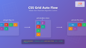
CSS Grid Auto Flow: Master Item Placement Algorithm Control for Responsive Layouts
Understanding CSS Grid Auto Flow The grid-auto-flow property is a powerful CSS Grid feature that controls how auto-placed items are...
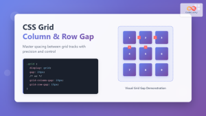
CSS Grid-Column-Gap and Grid-Row-Gap: Complete Guide to Track Spacing
CSS Grid has revolutionized how we create layouts on the web, and one of its most powerful features is the...

CSS Align-Content: Master Grid Container Block Axis Alignment
The CSS align-content property is a powerful tool for controlling how grid items are distributed along the block axis (typically...
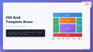
CSS Grid Template Areas: Master Named Grid Layouts with Visual Examples
CSS Grid revolutionized web layout design, and one of its most powerful features is grid-template-areas. This property allows you to...
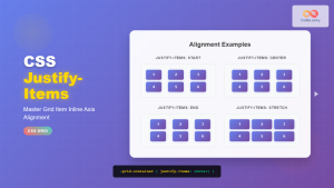
CSS Justify-Items: Complete Guide to Grid Item Inline Axis Alignment
The justify-items property is a powerful CSS Grid feature that controls how grid items are aligned along the inline axis...
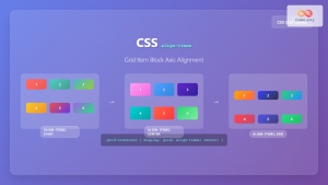
CSS Align-Items: Complete Guide to Grid Item Block Axis Alignment
Understanding CSS Align-Items in Grid Context The CSS align-items property is a powerful tool for controlling how grid items align...
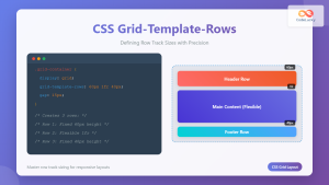
CSS Grid-Template-Rows: Master Row Track Sizing with Complete Examples
The grid-template-rows property is a fundamental building block of CSS Grid Layout that allows you to define the size of...
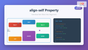
CSS Align-Self: Master Individual Grid Item Block Axis Alignment
The CSS align-self property provides granular control over individual grid items' alignment along the block axis (vertical direction in horizontal...


