
The CSS hue-rotate filter is a powerful tool that allows web developers to dynamically shift the hue values of any HTML element, creating stunning color transformations without modifying the original image or element. This comprehensive guide will teach you everything you need to know about implementing and mastering the hue-rotate filter in your web projects.
Understanding Hue-Rotate Filter Fundamentals
The hue-rotate() function is part of CSS filter effects that manipulates the hue channel of colors using the HSL color model. It rotates colors around the color wheel by a specified degree value, effectively shifting all colors in an element while maintaining their saturation and lightness values.
Basic Syntax and Values
The hue-rotate filter accepts angle values in degrees, with the following syntax:
/* Basic syntax */
filter: hue-rotate(angle);

/* Examples */
filter: hue-rotate(0deg);    /* No change */
filter: hue-rotate(90deg);   /* Quarter rotation */
filter: hue-rotate(180deg);  /* Half rotation */
filter: hue-rotate(270deg);  /* Three-quarter rotation */
filter: hue-rotate(360deg);  /* Full rotation (same as 0deg) */
Practical Implementation Examples
Basic Hue Rotation Demonstration
Let’s start with a simple example showing how hue-rotate affects different colored elements:
Originalhue-rotate(0deg)
90° Rotationhue-rotate(90deg)
180° Rotationhue-rotate(180deg)
270° Rotationhue-rotate(270deg)
Interactive Hue Rotation Controller
Experience real-time hue rotation with this interactive demonstration:
Advanced Techniques and Use Cases
Combining Hue-Rotate with Other Filters
The hue-rotate filter becomes even more powerful when combined with other CSS filters. Here’s how to create complex visual effects:
/* Combining multiple filters */
.enhanced-image {
    filter:
        hue-rotate(45deg)
        brightness(1.2)
        contrast(1.1)
        saturate(1.3);
}
Original
Enhanced with Multiple Filters
Creating Smooth Color Animations
One of the most exciting applications of hue-rotate is creating smooth color transitions and animations:
/* Continuous hue rotation animation */
@keyframes hue-rotation {
    0% { filter: hue-rotate(0deg); }
    100% { filter: hue-rotate(360deg); }
}

.animated-hue {
    animation: hue-rotation 4s linear infinite;
}
Continuous Hue Animation
Browser Support and Performance
Compatibility Information
The hue-rotate filter enjoys excellent browser support across modern browsers:
- Chrome: Supported since version 53
- Firefox: Supported since version 35
- Safari: Supported since version 9.1
- Edge: Supported since version 12
Performance Considerations
While hue-rotate is hardware-accelerated in most modern browsers, consider these optimization tips:
- Use transform3d hack: Add
transform: translateZ(0)to force hardware acceleration - Avoid animating too many elements: Limit simultaneous hue animations to maintain smooth performance
- Consider will-change property: Use
will-change: filterfor elements that will be animated
Practical Applications and Design Patterns
Dynamic Theme Switching
Create adaptive color schemes by using hue-rotate to shift your entire interface:
/* Theme switching with hue-rotate */
.theme-blue { filter: hue-rotate(0deg); }
.theme-green { filter: hue-rotate(60deg); }
.theme-purple { filter: hue-rotate(270deg); }
.theme-red { filter: hue-rotate(330deg); }
Hover Effects and Interactions
Enhance user experience with subtle hue shifts on interaction:
Common Pitfalls and Troubleshooting
Understanding Color Behavior
Remember that hue-rotate affects all colors, including:
Negative Values and Overflow
Hue-rotate accepts negative values and values beyond 360 degrees:
/* These are equivalent */
filter: hue-rotate(-90deg);
filter: hue-rotate(270deg);

/* These are also equivalent */
filter: hue-rotate(450deg);
filter: hue-rotate(90deg);
Advanced Animation Techniques
Keyframe-Based Color Transitions
Create sophisticated color animations with precise control:
@keyframes color-journey {
    0% { filter: hue-rotate(0deg); }
    25% { filter: hue-rotate(90deg); }
    50% { filter: hue-rotate(180deg); }
    75% { filter: hue-rotate(270deg); }
    100% { filter: hue-rotate(360deg); }
}

.color-journey {
    animation: color-journey 6s ease-in-out infinite;
}
Smooth Color Journey Animation
Accessibility and Best Practices
Respecting User Preferences
Always consider accessibility when using color animations:
/* Respect user's motion preferences */
@media (prefers-reduced-motion: reduce) {
    .animated-hue {
        animation: none;
        filter: hue-rotate(0deg);
    }
}
Maintaining Contrast Ratios
Ensure text remains readable when applying hue-rotate to elements containing text. Test color combinations thoroughly to maintain WCAG compliance.
Conclusion
The CSS hue-rotate filter opens up endless possibilities for creating dynamic, engaging visual experiences on the web. From subtle hover effects to dramatic color transformations, mastering this powerful tool will significantly enhance your web design capabilities. Remember to always test across different browsers, consider performance implications, and prioritize accessibility in your implementations.
Start experimenting with hue-rotate in your next project and discover how this simple yet powerful filter can transform your web designs with stunning color effects that captivate your users.
Related Posts
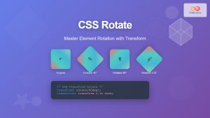
CSS Rotate: Complete Guide to Rotating Elements with Transform
CSS rotation is one of the most powerful and visually striking transformation effects available to web developers. The transform: rotate()...

CSS HSL Color Function: Complete Guide to Hue, Saturation, and Lightness
The HSL color function in CSS provides an intuitive way to define colors using Hue, Saturation, and Lightness values. Unlike...
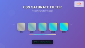
CSS Saturate Filter: Complete Guide to Color Saturation Control
The CSS saturate() filter function is a powerful tool that allows you to control the color saturation of HTML elements....
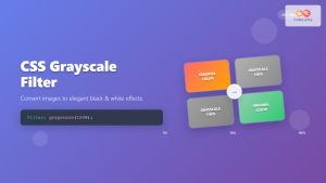
CSS Grayscale Filter: Master Black and White Image Effects with Complete Guide
The CSS grayscale filter is a powerful tool that transforms colorful images into elegant black and white versions. This filter...

CSS Invert Filter: Complete Guide to Inverting Element Colors and Visual Effects
The CSS invert() filter is a powerful visual effect that reverses the colors of HTML elements, creating striking contrast and...
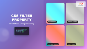
CSS Filter Property: Complete Guide to Visual Effects and Image Processing
The CSS filter property is a powerful tool that allows developers to apply visual effects and image processing techniques directly...
CSS Style transformOrigin Property: CSS Transform Origin
CSS transformOrigin Property: Mastering Element Transformation Origins The transformOrigin property in CSS is a fundamental tool for controlling how transformations...

CSS HSLA Color Function: Complete Guide to HSL with Alpha Transparency
What is CSS HSLA Color Function? The HSLA color function in CSS is an extended version of the HSL color...
CSS Color Values: Complete Guide to Named Colors, Hex, RGB, HSL, RGBA, HSLA
Colors are fundamental to web design, breathing life into otherwise plain HTML elements. CSS provides multiple ways to define colors,...

CSS Linear-Gradient: Master Direction, Color Stops and Angles for Stunning Web Designs
CSS linear gradients are one of the most powerful tools for creating visually stunning backgrounds and design elements in modern...
CSS Contrast Filter: Complete Guide to Adjusting Element Contrast for Better Visual Impact
The CSS contrast() filter function is a powerful tool that allows web developers to dynamically adjust the contrast of HTML...
CSS Color Property: Complete Guide to Text Colors with Hex, RGB, HSL Values
The CSS color property is one of the most fundamental styling properties in web development, allowing you to control the...


