
The HSL color function in CSS provides an intuitive way to define colors using Hue, Saturation, and Lightness values. Unlike RGB or hexadecimal colors, HSL aligns with how humans naturally perceive and describe colors, making it easier to create color schemes and adjust colors programmatically.
What is HSL Color Function?
HSL stands for Hue, Saturation, and Lightness. This color model represents colors in a cylindrical coordinate system that mimics human color perception:
- Hue (H): The color type on the color wheel (0-360 degrees)
- Saturation (S): Color intensity or purity (0-100%)
- Lightness (L): How light or dark the color appears (0-100%)
Visual representation of hue values from 0° to 360°
HSL Syntax and Values
The basic HSL syntax follows this pattern:
hsl(hue, saturation%, lightness%)Hue Values (0-360)
Hue represents the color’s position on the color wheel measured in degrees:
hsl(0, 100%, 50%)
hsl(60, 100%, 50%)
hsl(120, 100%, 50%)
hsl(180, 100%, 50%)
hsl(240, 100%, 50%)
hsl(300, 100%, 50%)
Saturation Values (0-100%)
Saturation controls color intensity. Higher values produce more vivid colors, while lower values create more muted, grayish tones:
Gray
Muted
Medium
Vibrant
Pure
Lightness Values (0-100%)
Lightness determines how light or dark the color appears:
Black
Dark
Normal
Light
White
HSL vs Other Color Formats
Understanding the differences between color formats helps you choose the right one for your project:
Same Color, Different Formats:
hsl(204, 70%, 53%)
rgb(52, 152, 219)
#3498db
Practical HSL Examples
Creating Color Variations
HSL excels at creating color variations by adjusting individual values:
.primary-color { background: hsl(220, 80%, 50%); }
.lighter-variant { background: hsl(220, 80%, 70%); }
.darker-variant { background: hsl(220, 80%, 30%); }
.muted-variant { background: hsl(220, 40%, 50%); }hsl(220, 80%, 50%)
hsl(220, 80%, 70%)
hsl(220, 80%, 30%)
hsl(220, 40%, 50%)
Building Color Schemes
HSL makes it easy to create harmonious color schemes:
Complementary Colors (180° apart)
hsl(30, 100%, 50%)
hsl(210, 100%, 50%)
Triadic Colors (120° apart)
hsl(0, 100%, 50%)
hsl(120, 100%, 50%)
hsl(240, 100%, 50%)
Interactive HSL Color Explorer
Try It Yourself:
hsl(180, 70%, 50%)
Advanced HSL Techniques
HSL with Alpha Transparency
Modern browsers support hsla() for transparency control:
.transparent-overlay {
    background: hsla(240, 100%, 50%, 0.5); /* 50% transparent blue */
}CSS Custom Properties with HSL
Combine HSL with CSS variables for maintainable color systems:
:root {
    --primary-hue: 220;
    --primary-saturation: 80%;
    --primary-lightness: 50%;

    --primary: hsl(var(--primary-hue), var(--primary-saturation), var(--primary-lightness));
    --primary-light: hsl(var(--primary-hue), var(--primary-saturation), 70%);
    --primary-dark: hsl(var(--primary-hue), var(--primary-saturation), 30%);
}
Dynamic Color Manipulation
HSL enables easy programmatic color adjustments:
Color Manipulation Example:
Click me!
Click me!
Click me!
Click me!
Click me!
Click any color box to see it highlighted!
Browser Support and Fallbacks
HSL enjoys excellent browser support across all modern browsers. For legacy support, consider providing fallbacks:
.button {
    background: #3498db;              /* Fallback for older browsers */
    background: hsl(204, 70%, 53%);   /* HSL for modern browsers */
}
Common HSL Use Cases
Theme Systems
HSL simplifies creating consistent theme variations:
Light Theme
Background: hsl(220, 15%, 95%)
Text: hsl(220, 15%, 20%)
Dark Theme
Background: hsl(220, 15%, 15%)
Text: hsl(220, 15%, 95%)
Accessibility and Contrast
HSL lightness values help ensure proper contrast ratios:
⚠️ Accessibility Tip:
For text on colored backgrounds, ensure lightness difference of at least 40% between text and background colors to meet WCAG contrast requirements.
Performance Considerations
HSL colors have minimal performance impact compared to other color formats. However, for optimal performance in animations:
- Use CSS custom properties for frequently changing colors
- Prefer
transformandopacityover color changes in animations - Consider using HSL calculations in JavaScript for complex color manipulations
Best Practices
✅ Do:
- Use HSL for color variations and theme systems
- Leverage hue values for color harmony
- Combine with CSS custom properties for maintainable color systems
- Use consistent saturation and lightness values across your color palette
❌ Don’t:
- Use HSL for performance-critical animations without testing
- Forget about accessibility when choosing lightness values
- Mix different saturation levels randomly in your design
- Ignore browser support if targeting very old browsers
Conclusion
The CSS HSL color function provides an intuitive and powerful way to work with colors in web development. Its human-friendly approach to color definition makes it easier to create consistent color schemes, build theme systems, and maintain accessible designs. By understanding hue, saturation, and lightness values, you can leverage HSL to create more maintainable and visually appealing websites.
Whether you’re building a simple website or a complex web application, HSL colors offer the flexibility and control needed for modern web design. Start incorporating HSL into your CSS workflow today and experience the benefits of this powerful color model.
Related Posts

CSS HSLA Color Function: Complete Guide to HSL with Alpha Transparency
What is CSS HSLA Color Function? The HSLA color function in CSS is an extended version of the HSL color...
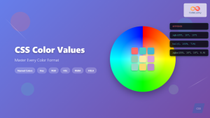
CSS Color Values: Complete Guide to Named Colors, Hex, RGB, HSL, RGBA, HSLA
Colors are fundamental to web design, breathing life into otherwise plain HTML elements. CSS provides multiple ways to define colors,...
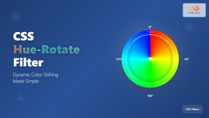
CSS Hue-Rotate Filter: Complete Guide to Dynamic Color Shifting
The CSS hue-rotate filter is a powerful tool that allows web developers to dynamically shift the hue values of any...
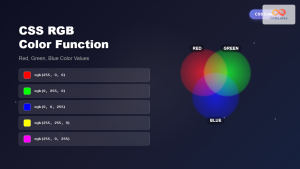
CSS RGB Color Function: Complete Guide to Red, Green, Blue Color Values
The CSS RGB color function is one of the most fundamental and widely-used methods for defining colors in web development....
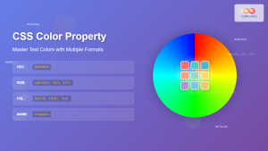
CSS Color Property: Complete Guide to Text Colors with Hex, RGB, HSL Values
The CSS color property is one of the most fundamental styling properties in web development, allowing you to control the...
CSS Hex Color Codes: Complete Guide to 3-Digit and 6-Digit Hexadecimal Values
What Are CSS Hex Color Codes? CSS hex color codes are hexadecimal representations of colors used in web development to...
CSS Style color Property: CSS Color
Understanding the CSS color Property: A Comprehensive Guide The CSS color property is fundamental for styling web pages. It specifies...

HTML Color type Property: Color Input Type
HTML Color type Property: Understanding the Color Input Type The HTML color input type, denoted by <input type="color">, allows users...
HTML Colors: A Comprehensive Guide to Using Colors in Web Development
Introduction Colors are the soul of web design. They evoke emotions, guide user attention, and establish brand identity. In web...
HTML Color value Property: Color Input Value
HTML Color value Property: Defining the Initial Color for Input The value attribute for the <input type="color"> element in HTML...
CSS Saturate Filter: Complete Guide to Color Saturation Control
The CSS saturate() filter function is a powerful tool that allows you to control the color saturation of HTML elements....
JavaScript Screen colorDepth Property: Color Depth
JavaScript Screen colorDepth Property: Understanding Color Depth The colorDepth property of the JavaScript screen object returns the color depth of...


