
What is CSS HSLA Color Function?
The HSLA color function in CSS is an extended version of the HSL color model that includes an alpha channel for transparency control. HSLA stands for Hue, Saturation, Lightness, and Alpha, where the alpha channel determines the opacity of the color from completely transparent to fully opaque.
Unlike traditional RGB or HEX colors, HSLA provides an intuitive way to work with colors while maintaining precise control over transparency levels. This makes it particularly valuable for creating layered designs, hover effects, and sophisticated color schemes in modern web development.
HSLA Syntax and Parameters
The HSLA function follows a specific syntax pattern that accepts four parameters:
hsla(hue, saturation, lightness, alpha)Understanding Each Parameter
Hue (H): Represents the color type on the color wheel, specified as a degree value from 0 to 360. Red is 0°, green is 120°, and blue is 240°. You can also use turn units (0.5turn = 180°) or radians.
Saturation (S): Controls the intensity or purity of the color, expressed as a percentage from 0% (gray) to 100% (fully saturated color).
Lightness (L): Determines how light or dark the color appears, ranging from 0% (black) to 100% (white), with 50% representing the pure color.
Alpha (A): Controls transparency, accepting values from 0 (completely transparent) to 1 (fully opaque). You can also use percentages from 0% to 100%.
Interactive HSLA Color Picker
hsla(180, 50%, 50%, 0.7)
Practical HSLA Examples
Basic HSLA Color Declarations
hsla(0, 100%, 50%, 0.8)
hsla(120, 100%, 50%, 0.6)
hsla(240, 100%, 50%, 0.4)
Creating Color Variations
One of HSLA’s greatest strengths is creating consistent color variations by adjusting individual parameters:
Lightness Variations
/* Same hue and saturation, different lightness */
hsla(210, 80%, 20%, 0.9)  /* Dark */
hsla(210, 80%, 40%, 0.9)  /* Medium-dark */
hsla(210, 80%, 60%, 0.9)  /* Medium-light */
hsla(210, 80%, 80%, 0.9)  /* Light */
Advanced HSLA Techniques
Layered Transparency Effects
HSLA excels at creating sophisticated layered designs. Here’s an example of overlapping transparent elements:
.red-layer {
  background: hsla(0, 70%, 50%, 0.7);
}

.green-layer {
  background: hsla(120, 70%, 50%, 0.7);
}

.blue-layer {
  background: hsla(240, 70%, 50%, 0.7);
}
Hover Effects with HSLA
HSLA makes creating smooth hover transitions incredibly intuitive:
.button {
  background: hsla(280, 60%, 50%, 0.8);
  transition: background 0.3s ease;
}

.button:hover {
  background: hsla(280, 80%, 40%, 1);
}
Browser Support and Compatibility
HSLA enjoys excellent browser support across all modern browsers. It has been supported since:
- Chrome: Version 1.0+ (2008)
- Firefox: Version 3.0+ (2008)
- Safari: Version 3.1+ (2008)
- Internet Explorer: Version 9.0+ (2011)
- Edge: All versions
For legacy browser support, you can provide fallbacks using traditional color formats:
.element {
  background-color: red; /* Fallback for older browsers */
  background-color: hsla(0, 100%, 50%, 0.8); /* Modern browsers */
}
HSLA vs Other Color Functions
Best Practices for HSLA
Performance Considerations
While HSLA is well-supported, consider these performance tips:
- Avoid excessive transparency: Multiple layered transparent elements can impact rendering performance
- Use CSS custom properties: Define HSLA values as variables for consistency and maintainability
- Consider will-change property: For animated HSLA properties, use
will-change: background-color
Accessibility Guidelines
When using HSLA with transparency, ensure adequate contrast ratios:
CSS Custom Properties with HSLA
Leverage CSS custom properties for maintainable HSLA color systems:
:root {
  --primary-hue: 210;
  --primary-saturation: 80%;
  --primary-lightness: 50%;

  --primary-color: hsla(var(--primary-hue), var(--primary-saturation), var(--primary-lightness), 1);
  --primary-transparent: hsla(var(--primary-hue), var(--primary-saturation), var(--primary-lightness), 0.2);
  --primary-hover: hsla(var(--primary-hue), var(--primary-saturation), 40%, 1);
}
Real-World Applications
Card Overlays
Card Title
This overlay uses HSLA for perfect readability over any background image.
Loading States
Content behind the loading overlay…
This demonstrates how HSLA creates effective loading states.
Common Pitfalls and Solutions
Alpha Channel Misconceptions
Remember that alpha affects the entire element, not just the background. Use pseudo-elements for background-only transparency:
/* Wrong: Text becomes transparent too */
.card {
  background: hsla(210, 80%, 50%, 0.5);
}

/* Right: Only background is transparent */
.card {
  position: relative;
}

.card::before {
  content: '';
  position: absolute;
  inset: 0;
  background: hsla(210, 80%, 50%, 0.5);
  z-index: -1;
}
Color Perception Issues
Colors can appear different when layered due to color blending. Always test your transparent colors in context:
Conclusion
The HSLA color function is a powerful tool for modern web development, offering intuitive color manipulation combined with precise transparency control. Its human-friendly approach to color definition makes it ideal for creating consistent color schemes, smooth animations, and sophisticated visual effects.
By understanding the relationship between hue, saturation, lightness, and alpha, you can create more maintainable and visually appealing designs. Whether you’re building hover effects, creating layered interfaces, or developing comprehensive design systems, HSLA provides the flexibility and control needed for professional web development.
Start incorporating HSLA into your CSS workflow today, and experience the difference that intuitive color control can make in your web projects. Remember to consider accessibility, test across different backgrounds, and leverage CSS custom properties for the most maintainable approach to color management.
Related Posts

CSS HSL Color Function: Complete Guide to Hue, Saturation, and Lightness
The HSL color function in CSS provides an intuitive way to define colors using Hue, Saturation, and Lightness values. Unlike...
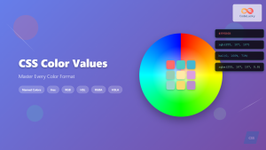
CSS Color Values: Complete Guide to Named Colors, Hex, RGB, HSL, RGBA, HSLA
Colors are fundamental to web design, breathing life into otherwise plain HTML elements. CSS provides multiple ways to define colors,...
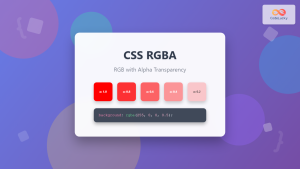
CSS RGBA Color Function: Complete Guide to RGB with Alpha Transparency
The CSS RGBA color function is a powerful tool that extends the traditional RGB color model by adding an alpha...
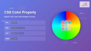
CSS Color Property: Complete Guide to Text Colors with Hex, RGB, HSL Values
The CSS color property is one of the most fundamental styling properties in web development, allowing you to control the...

CSS Style opacity Property: CSS Opacity
CSS Opacity Property: A Comprehensive Guide The CSS opacity property is a fundamental tool for controlling the transparency of elements...

CSS Opacity: Complete Guide to Controlling Element Transparency Levels
Understanding CSS Opacity Property The CSS opacity property is a fundamental styling tool that controls the transparency level of HTML...
CSS Style color Property: CSS Color
Understanding the CSS color Property: A Comprehensive Guide The CSS color property is fundamental for styling web pages. It specifies...
CSS RGB Color Function: Complete Guide to Red, Green, Blue Color Values
The CSS RGB color function is one of the most fundamental and widely-used methods for defining colors in web development....
CSS Hex Color Codes: Complete Guide to 3-Digit and 6-Digit Hexadecimal Values
What Are CSS Hex Color Codes? CSS hex color codes are hexadecimal representations of colors used in web development to...
CSS Style backgroundColor Property: CSS Background Color
CSS backgroundColor Property: Mastering Background Colors The backgroundColor property in CSS allows you to define the background color of an...
CSS Hue-Rotate Filter: Complete Guide to Dynamic Color Shifting
The CSS hue-rotate filter is a powerful tool that allows web developers to dynamically shift the hue values of any...
HTML Colors: A Comprehensive Guide to Using Colors in Web Development
Introduction Colors are the soul of web design. They evoke emotions, guide user attention, and establish brand identity. In web...


