
HTML Color type Property: Understanding the Color Input Type
The HTML color input type, denoted by <input type="color">, allows users to select a color from a color picker interface. This input type provides a user-friendly way to specify colors in web forms, enhancing the overall user experience and simplifying color selection. This article explores the color type property, its syntax, attributes, and practical examples to help you effectively implement color inputs in your web projects.
What is the Color type Property?
The type attribute specifies the type of input field. When set to “color”, it creates an input field that displays a color picker. Users can then choose a color, and the selected color’s hexadecimal value (e.g., #RRGGBB) is submitted with the form. This is far more intuitive than having users manually enter color codes.
Purpose of the Color type Property
The main purpose of the color type property is to:
- Provide a visual and intuitive way for users to select colors.
- Ensure color values are submitted in a standardized format.
- Enhance the user experience by simplifying color selection in forms.
- Enable web applications to easily capture and use color preferences.
Syntax of the Color Input Type
The basic syntax for using the color input type is:
<input type="color" id="colorPicker">
Attributes of the Color Input Type
The color input type supports various standard HTML attributes, including:
| Attribute | Description |
|---|---|
| `type` | Specifies the type of the input field. For color inputs, it is set to `”color”`. |
| `id` | A unique identifier for the input element, used to reference it in JavaScript or CSS. |
| `name` | Specifies the name of the input element, used when submitting the form data. |
| `value` | Specifies the initial color value in hexadecimal format (e.g., `#000000` for black). |
| `disabled` | A boolean attribute that, when present, prevents the user from interacting with the input. |
| `form` | Specifies the form to which the input element belongs. |
| `defaultValue` | Specifies the default value for the color input. |
Practical Examples of the Color type Property
Let’s explore several practical examples to understand how to use the color type property effectively.
Basic Color Picker
This example demonstrates a simple color picker input that allows users to select a color.
<label for="basicColorPicker">Choose a color:</label>
<input type="color" id="basicColorPicker" name="basicColor">
This code creates a basic color picker. When the user selects a color, the selected color’s hexadecimal value is submitted with the form.
Setting a Default Color
You can set a default color for the color picker using the value attribute.
<label for="defaultColorPicker">Choose a color:</label>
<input
  type="color"
  id="defaultColorPicker"
  name="defaultColor"
  value="#ff0000"
/>
In this example, the default color is set to red (#ff0000). The color picker will initially display red until the user selects a different color.
Using JavaScript to Get the Color Value
You can use JavaScript to access the selected color value and use it dynamically in your web application.
<label for="jsColorPicker">Choose a color:</label>
<input type="color" id="jsColorPicker" name="jsColor" value="#00ff00" /><br /><br />
<div
  id="colorPreview"
  style="width: 50px; height: 50px; border: 1px solid black;"
></div>

<script>
  const jsColorPickerInput = document.getElementById("jsColorPicker");
  const colorPreviewDiv = document.getElementById("colorPreview");

  jsColorPickerInput.addEventListener("input", function () {
    const selectedColor = jsColorPickerInput.value;
    colorPreviewDiv.style.backgroundColor = selectedColor;
  });
</script>
In this example, the selected color is used to change the background color of a div element, providing a visual preview of the selected color.
Disabling the Color Picker
You can disable the color picker using the disabled attribute to prevent users from selecting a color.
<label for="disabledColorPicker">Choose a color:</label>
<input
  type="color"
  id="disabledColorPicker"
  name="disabledColor"
  value="#0000ff"
  disabled
/>
The disabled color picker is grayed out and cannot be interacted with.
Integrating with a Form
The color input type can be easily integrated into an HTML form. When the form is submitted, the selected color value is sent to the server.
<form id="colorForm">
  <label for="formColorPicker">Choose a color:</label>
  <input type="color" id="formColorPicker" name="formColor" value="#ffff00" /><br /><br />
  <button type="submit">Submit</button>
</form>

<script>
  const colorFormElement = document.getElementById("colorForm");
  colorFormElement.addEventListener("submit", function (event) {
    event.preventDefault();
    const colorValue = document.getElementById("formColorPicker").value;
    alert("Selected color: " + colorValue);
  });
</script>
When the form is submitted, the script prevents the default submission and displays an alert with the selected color value.
Real-World Application: Theme Customization
A real-world application of the color input type is allowing users to customize the theme of a website or application.
<label for="themeColorPicker">Choose a theme color:</label>
<input
  type="color"
  id="themeColorPicker"
  name="themeColor"
  value="#ffffff"
/><br /><br />
<div id="themePreview" style="padding: 20px; border: 1px solid black;">
  This is a theme preview.
</div>

<script>
  const themeColorPickerInput = document.getElementById("themeColorPicker");
  const themePreviewDiv = document.getElementById("themePreview");

  themeColorPickerInput.addEventListener("input", function () {
    const selectedColor = themeColorPickerInput.value;
    themePreviewDiv.style.backgroundColor = selectedColor;
  });
</script>
In this example, the selected color is used to change the background color of a div element, providing a live preview of the theme color.
Browser Support
The <input type="color"> is supported by all modern browsers:
- Chrome
- Edge
- Firefox
- Safari
- Opera
Note: Browser support is generally good, but it’s always best to test your implementation across different browsers to ensure consistent behavior. 🧐
Conclusion
The HTML color type property provides a simple and intuitive way to allow users to select colors in web forms. By understanding its syntax, attributes, and practical applications, you can effectively integrate color inputs into your web projects, enhancing the user experience and enabling powerful customization features. Whether you’re building a theme customizer or a simple form, the color input type is a valuable tool for any web developer.
Related Posts
HTML Color value Property: Color Input Value
HTML Color value Property: Defining the Initial Color for Input The value attribute for the <input type="color"> element in HTML...
HTML Color form Property: Color Input Form
HTML Color form Property: Connecting Color Inputs to Forms 🎨 The HTML color input type, represented by <input type="color">, allows...
HTML Color name Property: Color Input Name
HTML Color Input name Property: A Comprehensive Guide The HTML color input's name property is crucial for identifying the color...
HTML DOM Color Object: Accessing Color Input Elements
HTML DOM Color Object: A Guide to Accessing Color Input Elements The HTML DOM color object provides an interface to...

HTML Color defaultValue Property: Color Input Default Value
HTML Color defaultValue Property: Setting the Default Color The HTML Color defaultValue property is used to set or return the...
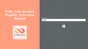
HTML Color disabled Property: Color Input Disabled
HTML Color disabled Property: Making Color Inputs Inactive The HTML color input, represented by <input type="color">, allows users to select...
CSS Style color Property: CSS Color
Understanding the CSS color Property: A Comprehensive Guide The CSS color property is fundamental for styling web pages. It specifies...
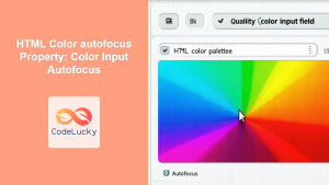
HTML Color autofocus Property: Color Input Autofocus
HTML Color autofocus Property: Color Input Autofocus The autofocus attribute in HTML is a boolean attribute that specifies that an...
CSS Color Values: Complete Guide to Named Colors, Hex, RGB, HSL, RGBA, HSLA
Colors are fundamental to web design, breathing life into otherwise plain HTML elements. CSS provides multiple ways to define colors,...
CSS Style backgroundColor Property: CSS Background Color
CSS backgroundColor Property: Mastering Background Colors The backgroundColor property in CSS allows you to define the background color of an...
CSS Color Property: Complete Guide to Text Colors with Hex, RGB, HSL Values
The CSS color property is one of the most fundamental styling properties in web development, allowing you to control the...

JavaScript InputEvent inputType Property: Type of Input
JavaScript InputEvent inputType Property: Understanding Input Types The inputType property of the JavaScript InputEvent interface provides valuable information about the...


