The CSS Grid fr unit (fractional unit) is a powerful tool that revolutionizes how we create flexible and responsive web layouts. Unlike fixed units like pixels or percentages, the fr unit distributes available space proportionally among grid tracks, making it essential for modern web design.
What is the CSS Grid fr Unit?
The fr unit represents a fraction of the available space in a grid container. When you use 1fr, it means “take up 1 fraction of the remaining space.” If you have multiple tracks with fr units, the space is distributed proportionally based on their values.
Key Benefits:
- Automatic space distribution
- Responsive design without media queries
- Proportional sizing
- Flexible content accommodation
Basic fr Unit Syntax
The fr unit is used within the grid-template-columns and grid-template-rows properties:
.grid-container {
  display: grid;
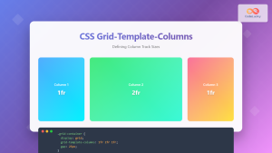
  grid-template-columns: 1fr 2fr 1fr;
  /* Creates 3 columns: 1st column gets 1/4, 2nd gets 2/4, 3rd gets 1/4 */
}
Simple fr Unit Example
Let’s start with a basic three-column layout using fr units:
Code:
.basic-grid {
  display: grid;
  grid-template-columns: 1fr 2fr 1fr;
  gap: 10px;
}

.basic-grid > div {
  background: linear-gradient(135deg, #667eea 0%, #764ba2 100%);
  color: white;
  padding: 20px;
  text-align: center;
  border-radius: 6px;
}
In this example, the middle column takes up twice the space of the outer columns. The total fraction is 4 (1+2+1), so the first column gets 1/4, the middle gets 2/4 (50%), and the last gets 1/4 of the available space.
Combining fr Units with Fixed Units
One of the most powerful features of fr units is their ability to work alongside fixed units like pixels, percentages, or other CSS units:
Code:
.mixed-grid {
  display: grid;
  grid-template-columns: 200px 1fr 100px;
  gap: 15px;
}

/* The middle column expands to fill remaining space */
Here, the first column is fixed at 200px, the last at 100px, and the middle column with 1fr takes up all the remaining space, making it fully responsive.
Multiple fr Units in Action
When using multiple fr units, the space is distributed proportionally. Here’s a practical example showing different proportions:
Code:
.proportional-grid {
  display: grid;
  grid-template-columns: 1fr 3fr 2fr 1fr;
  gap: 12px;
}

/* Total fractions: 1+3+2+1 = 7
   Column 1: 1/7 of available space
   Column 2: 3/7 of available space
   Column 3: 2/7 of available space
   Column 4: 1/7 of available space */
Interactive fr Unit Demo
Here’s an interactive example where you can see how fr units respond to container size changes:
Code:
.interactive-grid {
  display: grid;
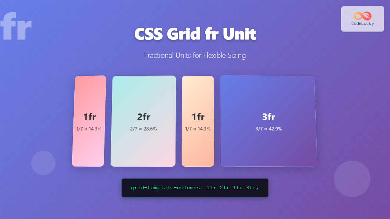
  grid-template-columns: 1fr 2fr 1fr 3fr;
  gap: 10px;
  transition: width 0.3s ease;
}

/* Notice how proportions remain constant regardless of container width */
Advanced fr Unit Patterns
Creating Responsive Layouts Without Media Queries
The fr unit combined with minmax() creates incredibly flexible layouts:
min: 200px
3fr
min: 150px
Code:
.advanced-grid {
  display: grid;
  grid-template-columns: minmax(200px, 1fr) 3fr minmax(150px, 1fr);
  gap: 15px;
}

/* Columns have minimum widths but can grow with fr units */
Auto-Fit and Auto-Fill with fr Units
Combine fr units with repeat(), auto-fit, and auto-fill for ultimate flexibility:
Code:
.auto-grid {
  display: grid;
  grid-template-columns: repeat(auto-fit, minmax(250px, 1fr));
  gap: 15px;
}

/* Cards automatically wrap and expand to fill available space */
Fr Units vs Other Units Comparison
Understanding when to use fr units versus other CSS units is crucial for effective grid layouts:
| Unit Type | Use Case | Example |
|---|---|---|
| fr | Flexible, proportional sizing | 1fr 2fr 1fr |
| px | Fixed-width columns | 200px 1fr 150px |
| % | Percentage of container | 25% 50% 25% |
| auto | Content-based sizing | auto 1fr auto |
Common fr Unit Mistakes and Solutions
Mistake 1: Confusing fr with Percentages
❌ Wrong: Thinking 1fr 1fr is the same as 50% 50%
✅ Correct: fr units distribute remaining space after fixed units are allocated
Mistake 2: Not Considering Content Overflow
❌ Wrong: Using fr without considering minimum content requirements
✅ Correct: Use minmax(min-content, 1fr) or set explicit minimums
Real-World fr Unit Applications
Dashboard Layout
Here’s a practical dashboard layout using fr units:
2fr
Code:
.dashboard {
  display: grid;
  grid-template-columns: 250px 2fr 1fr;
  grid-template-rows: 60px 1fr 50px;
  gap: 15px;
  height: 400px;
}

.header, .footer {
  grid-column: 1 / -1; /* Span all columns */
}
Browser Support and Compatibility
The CSS Grid fr unit enjoys excellent browser support across all modern browsers:
✅ Supported in:
- Chrome 57+
- Firefox 52+
- Safari 10.1+
- Edge 16+
- iOS Safari 10.3+
- Android Browser 81+
Performance Considerations
The fr unit is highly performant because:
- Native browser calculation: No JavaScript required for layout calculations
- Efficient reflows: Browser optimizes grid calculations
- Reduced CSS complexity: Less code means faster parsing
- No float clearfix issues: Eliminates common layout bugs
Best Practices for fr Units
✅ Do:
- Use
frunits for flexible, proportional layouts - Combine with fixed units for hybrid layouts
- Leverage
minmax()for responsive constraints - Use
autofor content-based sizing - Test across different screen sizes
❌ Don’t:
- Use
frunits when you need exact pixel control - Forget to consider content overflow scenarios
- Mix too many different unit types unnecessarily
- Ignore accessibility implications of flexible layouts
Conclusion
The CSS Grid fr unit is a game-changer for creating flexible, responsive web layouts. By understanding how fractional units distribute space proportionally, you can build sophisticated grid systems that adapt seamlessly to different screen sizes and content requirements.
Key takeaways:
frunits distribute available space proportionally- They work excellently with fixed units for hybrid layouts
- Combined with
minmax(), they create truly responsive designs - They eliminate the need for complex media queries in many cases
- Browser support is excellent across all modern browsers
Start incorporating fr units into your CSS Grid layouts today, and experience the power of truly flexible web design. The examples and patterns shown here provide a solid foundation for creating professional, responsive layouts with minimal code.

