
The future of CSS is incredibly exciting, with numerous groundbreaking features and specifications currently in development that promise to revolutionize how we approach web styling and layout. From container queries that will transform responsive design to advanced selectors that provide unprecedented control, these upcoming CSS features represent the next evolution of web development.
In this comprehensive guide, we’ll explore the most significant upcoming CSS features, their current browser support status, and how they’ll impact your development workflow. Whether you’re a seasoned developer or just starting your CSS journey, understanding these future capabilities will help you prepare for the next generation of web styling.
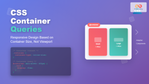
Container Queries: The Game Changer for Responsive Design
Container queries represent one of the most anticipated CSS features, allowing elements to respond to their container’s size rather than the viewport. This addresses a fundamental limitation of media queries and opens up new possibilities for truly modular, responsive components.
Understanding Container Queries
Traditional media queries respond to the viewport size, but container queries enable elements to adapt based on their parent container’s dimensions. This creates more flexible and reusable components that can work in various contexts without relying on global viewport information.
/* Define a containment context */
.card-container {
container-type: inline-size;
container-name: card;
}
/* Apply styles based on container width */
@container card (min-width: 400px) {
.card {
display: grid;
grid-template-columns: 200px 1fr;
gap: 1rem;
}
.card-image {
grid-row: span 2;
}
}
@container card (max-width: 399px) {
.card {
display: flex;
flex-direction: column;
}
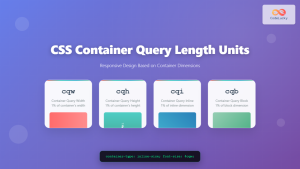
}Container Query Units
Along with container queries come new units that reference the container’s dimensions:
- cqw – 1% of the container’s width
- cqh – 1% of the container’s height
- cqi – 1% of the container’s inline size
- cqb – 1% of the container’s block size
- cqmin – The smaller of cqi or cqb
- cqmax – The larger of cqi or cqb
.responsive-text {
  font-size: clamp(1rem, 4cqw, 2rem);
  padding: 2cqh 3cqw;
}
CSS Nesting: Cleaner, More Organized Stylesheets
CSS nesting brings the organizational benefits of preprocessors like Sass directly to native CSS. This feature allows you to write more maintainable and logically structured stylesheets by nesting selectors within their parent rules.
Basic Nesting Syntax
Native CSS nesting follows a syntax similar to Sass, making it familiar for developers who have used preprocessors:
.navigation {
  background: #333;
  padding: 1rem;

  & ul {
    list-style: none;
    margin: 0;

    & li {
      display: inline-block;
      margin-right: 1rem;

      & a {
        color: white;
        text-decoration: none;

        &:hover {
          color: #007bff;
        }
      }
    }
  }
}
Advanced Nesting Features
CSS nesting supports complex selectors and pseudo-classes, providing powerful organizational capabilities:
.button {
  padding: 0.5rem 1rem;
  border: 2px solid #007bff;
  background: transparent;

  &.primary {
    background: #007bff;
    color: white;
  }

  &:not(.disabled) {
    cursor: pointer;

    &:hover {
      transform: translateY(-2px);
    }
  }

  &.large {
    padding: 1rem 2rem;
    font-size: 1.125rem;
  }
}
Cascade Layers: Precise Control Over CSS Specificity
Cascade layers introduce a new level of control over CSS specificity, allowing developers to organize their stylesheets into distinct layers with predictable cascade behavior. This feature addresses common specificity conflicts and makes CSS more maintainable at scale.
Defining and Using Layers
Layers are declared at the beginning of your stylesheet and provide a structured approach to organizing CSS rules:
/* Declare layers in order of priority (lowest to highest) */
@layer reset, base, components, utilities;

@layer reset {
  * {
    margin: 0;
    padding: 0;
    box-sizing: border-box;
  }
}

@layer base {
  body {
    font-family: system-ui, sans-serif;
    line-height: 1.6;
  }

  h1, h2, h3 {
    margin-bottom: 0.5em;
  }
}

@layer components {
  .card {
    border: 1px solid #ddd;
    border-radius: 8px;
    padding: 1rem;
  }

  .button {
    padding: 0.5rem 1rem;
    border: none;
    border-radius: 4px;
    cursor: pointer;
  }
}

@layer utilities {
  .text-center { text-align: center !important; }
  .hidden { display: none !important; }
}
Layer Benefits and Use Cases
Cascade layers solve several common CSS challenges:
- Predictable specificity – Rules in higher layers always override lower layers, regardless of selector specificity
- Framework integration – Easily integrate third-party CSS without specificity conflicts
- Component isolation – Organize styles into logical groups with clear precedence
- Utility-first architecture – Support modern CSS architectures like Tailwind CSS
Advanced Selectors and Pseudo-Classes
The future of CSS includes several new selectors and pseudo-classes that provide more precise targeting and improved developer experience. These additions expand the toolkit for creating sophisticated styling logic without JavaScript.
The :has() Selector
Often called the “parent selector,” :has() allows you to style elements based on their descendants:
/* Style cards that contain images */
.card:has(img) {
  display: grid;
  grid-template-columns: 200px 1fr;
}

/* Style form groups with errors */
.form-group:has(.error) {
  border-color: red;
}

/* Style navigation with active items */
.nav:has(.nav-item.active) {
  background: rgba(0, 123, 255, 0.1);
}
New Pseudo-Classes
Several new pseudo-classes are being introduced to provide more nuanced element targeting:
/* :is() - matches any of the selectors in the list */
:is(h1, h2, h3):hover {
  color: #007bff;
}

/* :where() - same as :is() but with zero specificity */
:where(article, section) h2 {
  margin-top: 2rem;
}

/* :not() with complex selectors */
button:not(.primary, .secondary) {
  background: transparent;
}

/* :focus-visible - only when keyboard focused */
button:focus-visible {
  outline: 2px solid #007bff;
  outline-offset: 2px;
}
CSS Subgrid: Enhanced Grid Layouts
CSS Subgrid extends CSS Grid by allowing grid items to participate in their parent’s grid structure. This solves alignment challenges in nested grid layouts and enables more sophisticated design patterns.
Subgrid Basics
.main-grid {
  display: grid;
  grid-template-columns: repeat(4, 1fr);
  grid-template-rows: repeat(3, auto);
  gap: 1rem;
}

.card {
  display: grid;
  grid-column: span 2;
  /* Inherit parent's column tracks */
  grid-template-columns: subgrid;
  /* Inherit parent's row tracks */
  grid-template-rows: subgrid;
}

.card-content {
  grid-column: 1 / -1;
  grid-row: 2;
}
Practical Subgrid Applications
Subgrid excels in scenarios requiring alignment across multiple grid items:
- Card layouts – Align headers and footers across variable-height cards
- Form layouts – Maintain consistent label and input alignment
- Data tables – Create complex table structures with merged cells
- Magazine layouts – Achieve print-style multi-column designs
CSS Color Functions and Spaces
The future of CSS includes expanded color capabilities with new color spaces, improved color functions, and better color manipulation tools. These features provide designers with more precise control over color and better support for modern displays.
New Color Spaces
/* Display P3 color space for wide gamut displays */
.vibrant-red {
  color: color(display-p3 1 0 0);
}

/* LCH color space for perceptual uniformity */
.consistent-blues {
  --blue-light: lch(80% 50 250);
  --blue-medium: lch(60% 50 250);
  --blue-dark: lch(40% 50 250);
}

/* LAB color space */
.warm-color {
  background: lab(70% 20 30);
}

/* Relative color syntax */
.lighter-version {
  background: color-mix(in lch, var(--primary-color) 80%, white);
}
Advanced Color Functions
New color functions provide powerful color manipulation capabilities:
/* color-mix() function */
.mixed-color {
  background: color-mix(in srgb, red 30%, blue);
}

/* Relative color modifications */
.button {
  --primary: oklch(60% 0.15 250);
  background: var(--primary);

  &:hover {
    background: oklch(from var(--primary) calc(l + 0.1) c h);
  }

  &:active {
    background: oklch(from var(--primary) calc(l - 0.1) c h);
  }
}
CSS Anchor Positioning
CSS Anchor Positioning introduces a new way to position elements relative to other elements, solving common problems with tooltips, popovers, and dropdown menus without requiring JavaScript calculations.
Basic Anchor Positioning
/* Define an anchor */
.trigger-button {
  anchor-name: --button-anchor;
}

/* Position relative to the anchor */
.tooltip {
  position: absolute;
  position-anchor: --button-anchor;
  top: anchor(bottom);
  left: anchor(center);
  translate: -50% 0.5rem;

  /* Fallback positioning */
  position-fallback: --tooltip-fallbacks;
}

/* Define fallback positions */
@position-fallback --tooltip-fallbacks {
  @try {
    top: anchor(top);
    translate: -50% calc(-100% - 0.5rem);
  }

  @try {
    left: anchor(right);
    top: anchor(center);
    translate: 0.5rem -50%;
  }
}
CSS Scroll-Driven Animations
Scroll-driven animations allow CSS animations to be controlled by scroll position, creating engaging scroll-based effects without JavaScript. This feature opens up new possibilities for storytelling and user interaction.
Scroll Timeline
/* Create a scroll-driven animation */
.parallax-element {
  animation: parallax-move linear;
  animation-timeline: scroll();
  animation-range: entry exit;
}

@keyframes parallax-move {
  from {
    transform: translateY(-50px);
  }
  to {
    transform: translateY(50px);
  }
}

/* View timeline for element-specific scroll tracking */
.fade-in-section {
  animation: fade-in linear;
  animation-timeline: view();
  animation-range: entry 0% cover 40%;
}

@keyframes fade-in {
  from {
    opacity: 0;
    transform: translateY(30px);
  }
  to {
    opacity: 1;
    transform: translateY(0);
  }
}
CSS Functions and Math
Future CSS includes enhanced mathematical capabilities and new functions that provide more precise control over styling calculations and responsive behavior.
Trigonometric Functions
/* Trigonometric functions for complex layouts */
.circular-menu-item {
  --angle: calc(360deg / var(--total-items) * var(--index));
  --radius: 100px;

  transform:
    rotate(var(--angle))
    translateY(calc(-1 * var(--radius)))
    rotate(calc(-1 * var(--angle)));

  /* Using sin() and cos() for precise positioning */
  left: calc(50% + cos(var(--angle)) * var(--radius));
  top: calc(50% + sin(var(--angle)) * var(--radius));
}

/* Round function for pixel-perfect layouts */
.grid-item {
  width: round(down, calc(100% / var(--columns)), 1px);
}

/* Mod function for repeating patterns */
.striped-row:nth-child(n) {
  background: hsl(calc(mod(var(--index), 3) * 120), 50%, 90%);
}
CSS Scoping and Encapsulation
Future CSS specifications include improved scoping mechanisms that provide better component encapsulation and style isolation, addressing common issues in large applications.
@scope Rule
/* Scope styles to a specific context */
@scope (.card) to (.card-footer) {
  h2 {
    font-size: 1.25rem;
    color: #333;
  }

  p {
    margin-bottom: 0.5rem;
  }

  /* Styles don't apply to nested cards */
  .nested-component {
    /* Inherits from outer scope */
  }
}

/* Multiple scope boundaries */
@scope (.sidebar) to (.widget) {
  a {
    color: var(--sidebar-link-color);
  }
}
Browser Support and Implementation Status
Understanding browser support is crucial when planning to use these upcoming CSS features. Here’s the current status of major features:
Current Browser Support
| Feature | Chrome | Firefox | Safari | Edge |
|---|---|---|---|---|
| Container Queries | ✅ Stable | ✅ Stable | ✅ Stable | ✅ Stable |
| CSS Nesting | ✅ Stable | ✅ Stable | ✅ Stable | ✅ Stable |
| Cascade Layers | ✅ Stable | ✅ Stable | ✅ Stable | ✅ Stable |
| :has() Selector | ✅ Stable | 🟡 Experimental | ✅ Stable | ✅ Stable |
| Subgrid | ✅ Stable | ✅ Stable | ✅ Stable | ✅ Stable |
| Anchor Positioning | 🟡 Experimental | ❌ Not supported | ❌ Not supported | 🟡 Experimental |
| Scroll Animations | ✅ Stable | 🟡 Experimental | ❌ Not supported | ✅ Stable |
Preparing for the Future
As these CSS features become more widely supported, it’s important to prepare your development workflow and consider how they’ll impact your projects. Here are strategies for adopting upcoming CSS features responsibly:
Progressive Enhancement Strategy
/* Start with basic styles */
.component {
  display: flex;
  flex-wrap: wrap;
  gap: 1rem;
}

/* Enhance with container queries where supported */
@supports (container-type: inline-size) {
  .container {
    container-type: inline-size;
  }

  @container (min-width: 400px) {
    .component {
      display: grid;
      grid-template-columns: repeat(auto-fit, minmax(200px, 1fr));
    }
  }
}

/* Feature detection for :has() */
@supports selector(:has(img)) {
  .card:has(img) {
    display: grid;
    grid-template-columns: 200px 1fr;
  }
}
Polyfills and Fallbacks
While waiting for full browser support, consider using polyfills and fallback strategies:
- PostCSS plugins – Transform future CSS syntax to current browser support
- Feature detection – Use
@supportsqueries to provide fallbacks - Progressive enhancement – Build a solid foundation that works everywhere, then enhance
- Graceful degradation – Ensure your site functions without advanced features
Performance Considerations
These new CSS features bring performance implications that developers should consider:
Container Queries Performance
Container queries can impact layout performance since they require the browser to track container dimensions. Use them judiciously and avoid deeply nested container query contexts.
Complex Selectors
Advanced selectors like :has() can be computationally expensive. Use them strategically and avoid overly complex selector chains that could impact rendering performance.
Real-World Applications
Understanding how these features solve real development challenges helps demonstrate their practical value. Let’s examine some common use cases where upcoming CSS features provide elegant solutions.
Responsive Component Design
Container queries enable truly modular responsive components that adapt to their container rather than the viewport:
/* A card component that works anywhere */
.product-card {
  container-type: inline-size;
  border: 1px solid #ddd;
  border-radius: 8px;
  overflow: hidden;
}

/* Adapt layout based on available space */
@container (min-width: 300px) {
  .product-card {
    display: grid;
    grid-template-columns: 120px 1fr;
    grid-template-rows: auto 1fr auto;
  }

  .product-image {
    grid-row: 1 / -1;
  }

  .product-title {
    grid-column: 2;
    margin: 1rem;
  }

  .product-price {
    grid-column: 2;
    grid-row: 3;
    margin: 1rem;
    margin-top: 0;
  }
}

@container (max-width: 299px) {
  .product-card {
    display: flex;
    flex-direction: column;
  }

  .product-image {
    aspect-ratio: 16 / 9;
    object-fit: cover;
  }
}
Conclusion
The future of CSS is incredibly promising, with features that address long-standing limitations and open up new possibilities for web design and development. Container queries revolutionize responsive design, CSS nesting improves code organization, cascade layers provide better specificity control, and advanced selectors enable more sophisticated styling logic.
While browser support for some features is still evolving, many of these capabilities are already available in modern browsers. By understanding these upcoming features and preparing your development workflow accordingly, you’ll be ready to leverage the full power of future CSS.
The key to successfully adopting these features lies in progressive enhancement, careful feature detection, and understanding the performance implications. Start experimenting with the features that have good browser support today, and prepare fallback strategies for those still in development.
As web standards continue to evolve, CSS becomes an increasingly powerful tool for creating sophisticated, maintainable, and performant web interfaces. The future of CSS promises to make web development more intuitive, efficient, and creative than ever before.
Related Posts
CSS Container Queries: Complete Guide to @container Rule and Containment Context
CSS Container Queries represent a revolutionary approach to responsive web design, allowing elements to respond to their container's size rather...

CSS Screen Media Queries: Complete Guide to Responsive Monitor and Device Targeting
CSS screen media queries are the cornerstone of responsive web design, enabling developers to create websites that adapt seamlessly across...

CSS Media Query Syntax: Complete Guide to Media Types and Features
CSS media queries are the cornerstone of responsive web design, allowing developers to apply different styles based on device characteristics...
CSS Media Queries: Complete Guide to @media Rule for Responsive Web Design
What Are CSS Media Queries? CSS Media Queries are a fundamental feature of modern web development that allow you to...

CSS Mobile-First Design: Complete Min-Width Media Query Guide for Responsive Web Development
What is Mobile-First Design? Mobile-first design is a progressive enhancement approach where you start designing and coding for the smallest...

CSS Media Query Operators: Complete Guide to and, or, not, only Keywords
CSS media query operators are essential tools for creating responsive web designs that adapt to different devices and screen conditions....

HTML CSS: Styling Your Web Pages with Selectors, Properties, and the Cascade
Introduction Ever wondered how websites go from plain text to visually stunning experiences? The magic lies in CSS (Cascading Style...

CSS Resolution Media Queries: Complete Guide to High-DPI Display Targeting
Understanding CSS Resolution Media Queries CSS resolution media queries allow developers to target specific display densities and create optimized experiences...

HTML Responsive Web Design: Crafting Websites for Every Device
Introduction In today's digital landscape, users access the internet through a plethora of devices, from large desktop monitors to small...

CSS Progressive Enhancement: Build Resilient Web Experiences Layer by Layer
Progressive enhancement in CSS is a fundamental approach that ensures your web applications remain functional and accessible across all devices,...
CSS Desktop-First Design: Master Max-Width Media Queries for Responsive Web Development
Desktop-first design is a responsive web development approach where you design for larger screens first, then progressively adapt your layout...
CSS Container Query Length Units: Complete Guide to cqw, cqh, cqi, cqb for Responsive Design
CSS Container Query Length Units represent a revolutionary approach to responsive web design, allowing developers to create components that adapt...


