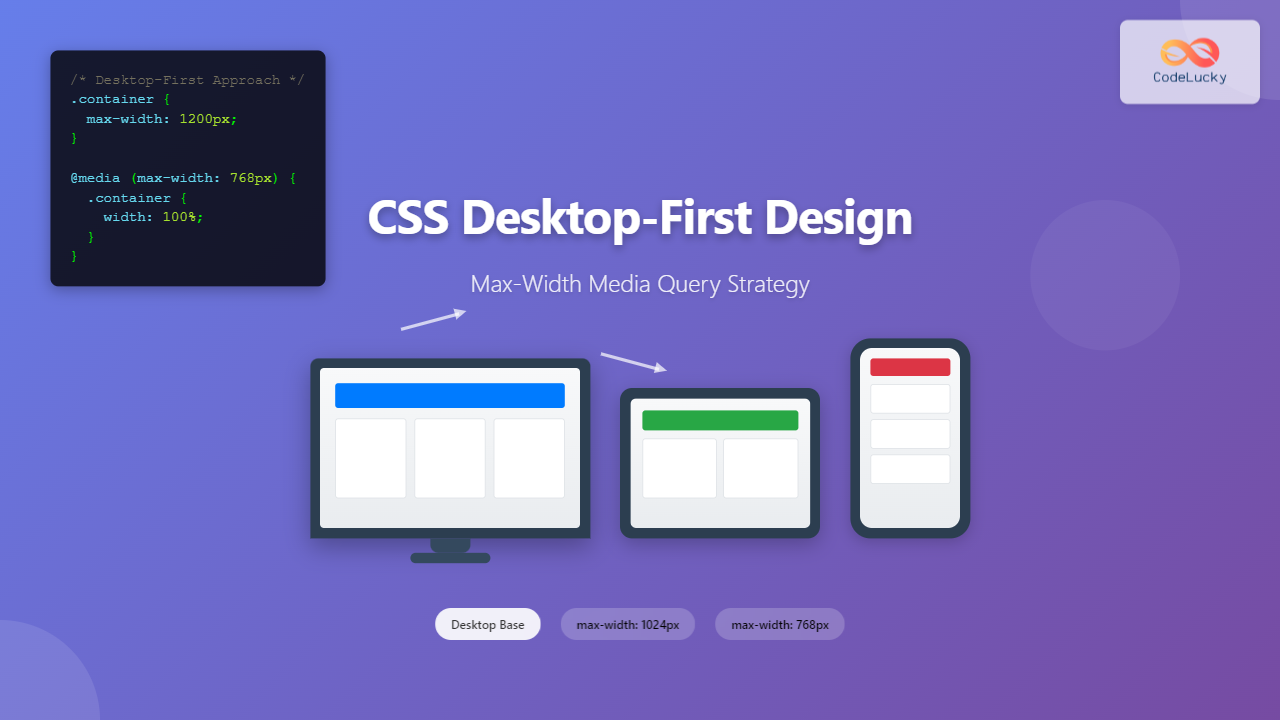
Desktop-first design is a responsive web development approach where you design for larger screens first, then progressively adapt your layout for smaller devices using max-width media queries. This methodology contrasts with the more popular mobile-first approach but remains valuable in specific scenarios where desktop users are your primary audience.
Understanding Desktop-First vs Mobile-First Design
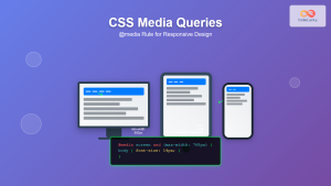
In desktop-first design, you start with the full-featured desktop layout and then use CSS media queries to modify or simplify the design as screen sizes decrease. This approach uses max-width media queries to apply styles when the viewport is smaller than a specified breakpoint.
Key Characteristics of Desktop-First:
- Base styles target desktop screens (typically 1200px and above)
- Uses
max-widthmedia queries for smaller screens - Progressive enhancement from large to small screens
- Ideal for desktop-heavy applications or enterprise software
Max-Width Media Query Syntax and Structure
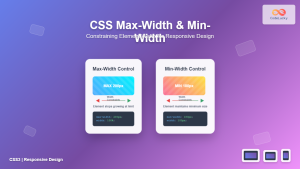
The foundation of desktop-first design lies in understanding max-width media queries. Here’s the basic syntax:
/* Base styles for desktop */
.container {
  width: 1200px;
  margin: 0 auto;
  padding: 20px;
}

/* Tablet styles */
@media screen and (max-width: 1024px) {
  .container {
    width: 100%;
    padding: 15px;
  }
}

/* Mobile styles */
@media screen and (max-width: 768px) {
  .container {
    padding: 10px;
  }
}
Common Desktop-First Breakpoints
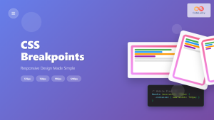
Establishing consistent breakpoints is crucial for effective responsive design. Here are the most commonly used breakpoints in desktop-first approach:
| Device Category | Max-Width Breakpoint | Typical Screen Sizes |
|---|---|---|
| Large Desktop | Base styles (no media query) | 1200px and above |
| Desktop | max-width: 1199px | 992px – 1199px |
| Tablet | max-width: 991px | 768px – 991px |
| Mobile | max-width: 767px | 320px – 767px |
Practical Example: Building a Desktop-First Navigation
Let’s create a comprehensive navigation system that demonstrates desktop-first principles:
Interactive Desktop-First Layout Example
Here’s a fully functional example demonstrating desktop-first responsive design principles:
Advanced Max-Width Media Query Techniques
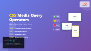
1. Combining Multiple Conditions
You can create more specific targeting by combining multiple media query conditions:
/* Target only landscape tablets */
@media screen and (max-width: 1024px) and (orientation: landscape) {
  .container {
    padding: 20px 40px;
  }
}

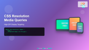
/* Target high-resolution displays */
@media screen and (max-width: 768px) and (-webkit-min-device-pixel-ratio: 2) {
  .logo {
    background-image: url('[email protected]');
    background-size: contain;
  }
}
2. Using Range Syntax (Modern Approach)
Modern browsers support range syntax for cleaner media queries:
/* Traditional approach */
@media screen and (max-width: 1024px) and (min-width: 768px) {
  /* Tablet-specific styles */
}

/* Modern range syntax */
@media screen and (width <= 1024px) and (width >= 768px) {
  /* Tablet-specific styles */
}
Desktop-First Grid Systems
Creating a flexible grid system is essential for desktop-first design. Here’s a robust example:
/* Desktop-first grid system */
.row {
  display: flex;
  flex-wrap: wrap;
  margin: 0 -15px;
}

.col {
  flex: 1;
  padding: 0 15px;
}

/* Column width classes for desktop */
.col-1 { flex: 0 0 8.333333%; }
.col-2 { flex: 0 0 16.666667%; }
.col-3 { flex: 0 0 25%; }
.col-4 { flex: 0 0 33.333333%; }
.col-6 { flex: 0 0 50%; }
.col-8 { flex: 0 0 66.666667%; }
.col-12 { flex: 0 0 100%; }

/* Tablet adjustments */
@media screen and (max-width: 991px) {
  .col-md-6 { flex: 0 0 50%; }
  .col-md-12 { flex: 0 0 100%; }
}

/* Mobile adjustments */
@media screen and (max-width: 767px) {
  .col-sm-12 { flex: 0 0 100%; }

  .row {
    margin: 0 -10px;
  }

  .col {
    padding: 0 10px;
  }
}
Performance Considerations in Desktop-First Design
⚠️ Important Performance Notes
- CSS Parsing: Browsers parse CSS from top to bottom, so base desktop styles load first
- Image Loading: Consider using different image sizes for different breakpoints
- JavaScript: Conditionally load desktop-specific JavaScript features
- Critical CSS: Inline critical desktop CSS for faster rendering
Optimized Image Loading Example
/* Desktop-first image handling */
.hero-image {
  background-image: url('hero-desktop-large.jpg');
  height: 500px;
  background-size: cover;
  background-position: center;
}

@media screen and (max-width: 1024px) {
  .hero-image {
    background-image: url('hero-tablet.jpg');
    height: 400px;
  }
}

@media screen and (max-width: 768px) {
  .hero-image {
    background-image: url('hero-mobile.jpg');
    height: 300px;
  }
}
Common Desktop-First Design Patterns
1. Collapsible Sidebar Pattern
.layout {
  display: flex;
  max-width: 1200px;
  margin: 0 auto;
}

.sidebar {
  flex: 0 0 300px;
  background: #f8f9fa;
  padding: 20px;
}

.main-content {
  flex: 1;
  padding: 20px;
}

/* Tablet: Reduce sidebar width */
@media screen and (max-width: 1024px) {
  .sidebar {
    flex: 0 0 250px;
  }
}

/* Mobile: Stack sidebar below content */
@media screen and (max-width: 768px) {
  .layout {
    flex-direction: column;
  }

  .sidebar {
    order: 2;
    flex: none;
  }
}
2. Dropdown to Accordion Pattern
/* Desktop dropdown menu */
.dropdown {
  position: relative;
  display: inline-block;
}

.dropdown-content {
  position: absolute;
  background: white;
  min-width: 200px;
  box-shadow: 0 8px 16px rgba(0,0,0,0.2);
  opacity: 0;
  visibility: hidden;
  transition: all 0.3s ease;
}

.dropdown:hover .dropdown-content {
  opacity: 1;
  visibility: visible;
}

/* Mobile: Convert to accordion */
@media screen and (max-width: 768px) {
  .dropdown-content {
    position: static;
    box-shadow: none;
    border: 1px solid #ddd;
    max-height: 0;
    overflow: hidden;
    transition: max-height 0.3s ease;
  }

  .dropdown.active .dropdown-content {
    max-height: 300px;
    opacity: 1;
    visibility: visible;
  }
}
Testing and Debugging Desktop-First Designs
Effective testing is crucial for desktop-first responsive design. Here are key strategies:
Testing Checklist
- Browser DevTools: Use responsive design mode to test breakpoints
- Real Devices: Test on actual tablets and mobile devices
- Cross-Browser Testing: Ensure compatibility across different browsers
- Performance Testing: Check loading times on slower connections
- Accessibility Testing: Verify keyboard navigation and screen reader compatibility
Debug CSS for Media Queries
/* Add visual debugging for breakpoints */
body::before {
  content: "Desktop";
  position: fixed;
  top: 10px;
  right: 10px;
  background: #007bff;
  color: white;
  padding: 5px 10px;
  border-radius: 4px;
  font-size: 12px;
  z-index: 9999;
}

@media screen and (max-width: 1024px) {
  body::before {
    content: "Tablet";
    background: #28a745;
  }
}

@media screen and (max-width: 768px) {
  body::before {
    content: "Mobile";
    background: #dc3545;
  }
}
When to Choose Desktop-First Over Mobile-First
Desktop-first design is most appropriate in these scenarios:
✅ Use Desktop-First When:
- Primary audience uses desktop devices
- Building enterprise or business applications
- Complex data visualization interfaces
- Desktop-specific features are core to functionality
- Retrofitting existing desktop-only sites
⚠️ Consider Mobile-First When:
- Mobile traffic exceeds desktop usage
- Building consumer-facing applications
- Performance on mobile is critical
- Progressive enhancement is priority
- Following modern development practices
Best Practices for Desktop-First Development
1. Organize Your CSS Structure
/* Recommended CSS organization */

/* 1. Base styles (desktop) */
/* Typography, colors, layout foundations */

/* 2. Component styles (desktop) */
/* Individual component styling */

/* 3. Layout styles (desktop) */
/* Grid systems, positioning */

/* 4. Tablet breakpoint */
@media screen and (max-width: 1024px) {
  /* Tablet-specific overrides */
}

/* 5. Mobile breakpoint */
@media screen and (max-width: 768px) {
  /* Mobile-specific overrides */
}

/* 6. Print styles */
@media print {
  /* Print-specific styles */
}
2. Progressive Enhancement Strategy
/* Start with robust desktop functionality */
.interactive-element {
  /* Full desktop interaction */
  cursor: pointer;
  transition: all 0.3s ease;
}

.interactive-element:hover {
  transform: scale(1.05);
}

/* Simplify for touch devices */
@media screen and (max-width: 768px) {
  .interactive-element:hover {
    transform: none; /* Remove hover effects */
  }

  .interactive-element {
    /* Larger touch targets */
    min-height: 44px;
    min-width: 44px;
  }
}
Conclusion
Desktop-first design using max-width media queries remains a valuable approach for specific use cases, particularly when your primary audience consists of desktop users or when building complex applications that benefit from progressive simplification. While mobile-first has become the standard for most web projects, understanding desktop-first principles allows you to choose the right approach for your specific project requirements.
The key to successful desktop-first implementation lies in thoughtful planning of your breakpoints, maintaining performance across all devices, and ensuring that the user experience remains optimal as you scale down from desktop to mobile. By following the techniques and best practices outlined in this guide, you can create responsive designs that work beautifully across all screen sizes while prioritizing your desktop users’ experience.
Remember to always test your desktop-first designs thoroughly across different devices and browsers, and consider the performance implications of your approach. Whether you choose desktop-first or mobile-first, the goal remains the same: creating accessible, performant, and user-friendly web experiences for all your visitors.

