
CSS conic-gradient is a powerful function that creates gradients that sweep around a center point, forming angular patterns similar to pie charts or color wheels. Unlike linear or radial gradients, conic gradients rotate around a central axis, making them perfect for creating unique visual effects and geometric patterns.
Understanding Conic Gradients
A conic gradient starts from a center point and radiates outward in a circular motion, with colors transitioning along the circumference. This creates a cone-like effect when viewed from above, hence the name “conic gradient.”
Basic Syntax
The basic syntax for conic-gradient is straightforward:
background: conic-gradient(color1, color2, color3, ...);Here’s a simple example:
.conic-basic {
  width: 200px;
  height: 200px;
  background: conic-gradient(red, yellow, green, blue, red);
  border-radius: 50%;
}
Conic-Gradient Properties and Parameters
Center Position
You can specify where the gradient’s center point should be located using the at keyword:
/* Center at top-left */
background: conic-gradient(at 25% 25%, red, blue, green, red);

/* Center at bottom-right */
background: conic-gradient(at 75% 75%, red, blue, green, red);
Starting Angle
Control where the gradient begins by specifying a starting angle:
/* Start from top (0deg) */
background: conic-gradient(from 0deg, red, yellow, green, blue, red);

/* Start from right (90deg) */
background: conic-gradient(from 90deg, red, yellow, green, blue, red);

/* Start from bottom (180deg) */
background: conic-gradient(from 180deg, red, yellow, green, blue, red);
Color Stops
Define precise positions for colors using percentages or degrees:
.pie-chart {
  background: conic-gradient(
    red 0deg,
    red 90deg,
    blue 90deg,
    blue 180deg,
    green 180deg,
    green 270deg,
    yellow 270deg,
    yellow 360deg
  );
}
Practical Applications
Creating Pie Charts
Conic gradients are perfect for creating CSS-only pie charts:
.pie-chart {
  width: 200px;
  height: 200px;
  background: conic-gradient(
    #ff6b6b 0deg 108deg,    /* 30% */
    #4ecdc4 108deg 180deg,  /* 20% */
    #45b7d1 180deg 252deg,  /* 20% */
    #96ceb4 252deg 360deg   /* 30% */
  );
  border-radius: 50%;
}
Loading Spinners
Create animated loading indicators using conic gradients:
.loading-spinner {
  width: 60px;
  height: 60px;
  background: conic-gradient(from 0deg, transparent, #007acc);
  border-radius: 50%;
  animation: spin 1s linear infinite;
}

@keyframes spin {
  to { transform: rotate(360deg); }
}
Progress Indicators
Build circular progress bars with precise control:
.progress-ring {
  width: 120px;
  height: 120px;
  background: conic-gradient(
    #4caf50 0deg 216deg,  /* 60% complete */
    #e0e0e0 216deg 360deg /* Remaining */
  );
  border-radius: 50%;
}
Advanced Techniques
Multiple Conic Gradients
Layer multiple conic gradients for complex patterns:
.layered-conic {
  background:
    conic-gradient(from 0deg, red, transparent 50%, red),
    conic-gradient(from 90deg, blue, transparent 50%, blue);
}
Repeating Conic Gradients
Create repeating patterns with repeating-conic-gradient:
.repeating-pattern {
  background: repeating-conic-gradient(
    from 0deg,
    #ff6b6b 0deg 15deg,
    #4ecdc4 15deg 30deg
  );
}
Combining with Other CSS Properties
Enhance conic gradients with masks, filters, and transforms:
.enhanced-conic {
  background: conic-gradient(from 45deg, #ff6b6b, #4ecdc4, #45b7d1, #96ceb4, #ff6b6b);
  border-radius: 50%;
  filter: blur(2px) contrast(1.2);
  transform: rotate(45deg);
}
Browser Support and Fallbacks
Conic gradients are well-supported in modern browsers but may need fallbacks for older versions:
.conic-with-fallback {
  /* Fallback for unsupported browsers */
  background: linear-gradient(45deg, red, blue);

  /* Modern browsers */
  background: conic-gradient(red, blue, green, red);
}
Feature Detection
Use CSS feature queries to provide appropriate fallbacks:
@supports (background: conic-gradient(red, blue)) {
  .modern-gradient {
    background: conic-gradient(from 90deg, #ff6b6b, #4ecdc4, #ff6b6b);
  }
}

@supports not (background: conic-gradient(red, blue)) {
  .modern-gradient {
    background: radial-gradient(circle, #ff6b6b, #4ecdc4);
  }
}
Performance Considerations
Conic gradients are hardware-accelerated in modern browsers, making them performant for animations and complex patterns. However, consider these optimization tips:
- Limit complexity: Too many color stops can impact performance
- Use transform for animations: Prefer CSS transforms over changing gradient properties
- Optimize for mobile: Test on lower-powered devices
Real-World Examples
Color Wheel Picker
.color-wheel {
  background: conic-gradient(
    from 0deg,
    hsl(0, 100%, 50%),
    hsl(60, 100%, 50%),
    hsl(120, 100%, 50%),
    hsl(180, 100%, 50%),
    hsl(240, 100%, 50%),
    hsl(300, 100%, 50%),
    hsl(360, 100%, 50%)
  );
}
Clock Face
.clock-face {
  background:
    conic-gradient(
      from 0deg,
      transparent 0deg 3deg,
      #333 3deg 6deg,
      transparent 6deg 30deg,
      /* Repeat pattern for all 12 hours */
    ),
    radial-gradient(circle, white 70%, transparent 71%);
  border: 3px solid #333;
}
Interactive Demo
Here’s an interactive example where you can experiment with different conic gradient properties:
0°
Common Pitfalls and Solutions
Jagged Edges
Use enough color stops to ensure smooth transitions:
/* Avoid: Too few color stops */
background: conic-gradient(red, blue);

/* Better: More color stops for smoother transitions */
background: conic-gradient(red, orange, yellow, green, blue, purple, red);
Performance Issues
Avoid animating gradient properties directly. Instead, use transforms:
/* Avoid: Animating gradient properties */
@keyframes rotate-gradient {
  to { background: conic-gradient(from 360deg, red, blue, red); }
}

/* Better: Use transform */
@keyframes rotate-element {
  to { transform: rotate(360deg); }
}
Conclusion
CSS conic-gradient opens up exciting possibilities for creating unique visual effects without requiring images or complex SVG graphics. From simple color wheels to complex data visualizations, conic gradients provide the flexibility and performance needed for modern web design.
The key to mastering conic gradients lies in understanding their angular nature and experimenting with different combinations of colors, positions, and starting angles. As browser support continues to improve, conic gradients will become an increasingly valuable tool in every web developer’s toolkit.
Start incorporating conic gradients into your projects today, and discover the creative possibilities they unlock for your web designs.
Related Posts
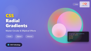
CSS Radial-Gradient: Complete Guide to Circular and Elliptical Gradients
CSS radial gradients create stunning visual effects by transitioning colors in a circular or elliptical pattern radiating from a central...
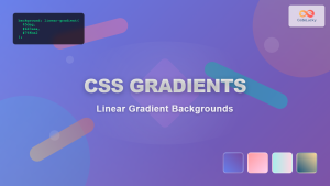
CSS Gradients: Complete Guide to Linear Gradient Background Creation
CSS gradients have revolutionized web design by allowing developers to create smooth color transitions without relying on images. Linear gradients,...

HTML Canvas createRadialGradient() Method: Creating Radial Gradients
HTML Canvas createRadialGradient() Method: Creating Radial Gradients The HTML Canvas createRadialGradient() method is a powerful tool for creating visually appealing...
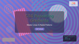
CSS Repeating Gradients: Master Linear and Radial Pattern Techniques
CSS repeating gradients are powerful tools that allow developers to create beautiful, complex patterns without relying on external images. These...

CSS Linear-Gradient: Master Direction, Color Stops and Angles for Stunning Web Designs
CSS linear gradients are one of the most powerful tools for creating visually stunning backgrounds and design elements in modern...

CSS Rotate: Complete Guide to Rotating Elements with Transform
CSS rotation is one of the most powerful and visually striking transformation effects available to web developers. The transform: rotate()...
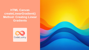
HTML Canvas createLinearGradient() Method: Creating Linear Gradients
The createLinearGradient() Method: Mastering Linear Gradients on HTML Canvas The createLinearGradient() method in the HTML Canvas API is a powerful...
CSS Hue-Rotate Filter: Complete Guide to Dynamic Color Shifting
The CSS hue-rotate filter is a powerful tool that allows web developers to dynamically shift the hue values of any...
CSS Border-Radius: Complete Guide to Rounded Corners and Perfect Circles
The CSS border-radius property is one of the most versatile and widely-used styling features in modern web development. It allows...
CSS Skew: Distorting Elements Along Axes for Dynamic Visual Effects
CSS skew transforms allow you to distort elements by slanting them along the X and Y axes, creating dynamic visual...

CSS Animation Timing Function: Complete Guide to Animation Easing Functions
The animation-timing-function property in CSS controls how an animation progresses through its duration, determining the acceleration and deceleration patterns that...
CSS Style transformOrigin Property: CSS Transform Origin
CSS transformOrigin Property: Mastering Element Transformation Origins The transformOrigin property in CSS is a fundamental tool for controlling how transformations...


