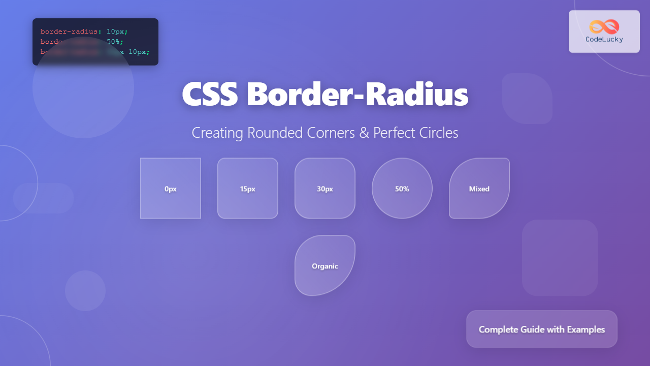
The CSS border-radius property is one of the most versatile and widely-used styling features in modern web development. It allows developers to create rounded corners, perfect circles, and even complex elliptical shapes that transform sharp, angular designs into smooth, visually appealing interfaces.
Whether you’re designing modern cards, creating circular profile pictures, or building sophisticated UI components, understanding border-radius is essential for contemporary web design.
Understanding CSS Border-Radius Fundamentals
The border-radius property defines the radius of an element’s corners, effectively “rounding” them by creating a curved edge instead of a sharp 90-degree angle. This property works by conceptually placing a circle (or ellipse) at each corner and using that curve to define the rounded edge.
Basic Syntax and Values
The basic syntax for border-radius accepts various types of values:
/* Single value - applies to all corners */
border-radius: 10px;

/* Two values - horizontal and vertical radius */
border-radius: 10px 15px;

/* Four values - each corner individually */
border-radius: 10px 15px 20px 25px;

/* Percentage values */
border-radius: 50%;

/* Mixed units */
border-radius: 1em 10px 2rem 5px;
Value Types Explained
Length Values: Pixels (px), ems (em), rems (rem), and other CSS length units define the exact radius measurement.
Percentage Values: Percentages are calculated relative to the element’s dimensions, making them responsive and perfect for creating circles and ovals.
Zero Values: Setting border-radius: 0 removes any rounding, returning corners to their default sharp angles.
Creating Basic Rounded Corners
Let’s start with simple rounded corners and progressively build complexity:
Example 1: Basic Rounded Corners
.subtle-rounded {
    border-radius: 5px;
}

.medium-rounded {
    border-radius: 15px;
}

.heavy-rounded {
    border-radius: 25px;
}
Individual Corner Control
For precise control, you can target individual corners using specific properties or the shorthand with multiple values:
Longhand Properties
border-top-left-radius: 10px;
border-top-right-radius: 20px;
border-bottom-right-radius: 15px;
border-bottom-left-radius: 5px;
Shorthand Order
When using multiple values in the shorthand, they follow this clockwise pattern: top-left, top-right, bottom-right, bottom-left.
Example 2: Individual Corner Styling
Creating Perfect Circles
Creating circles with CSS is straightforward when you understand the relationship between border-radius and element dimensions:
The 50% Rule
Setting border-radius: 50% on a square element creates a perfect circle. The percentage is calculated based on the element’s width and height.
Example 3: Perfect Circles
.circle {
    width: 100px;
    height: 100px;
    border-radius: 50%;
    background: #667eea;
}

/* Responsive circle */
.responsive-circle {
    width: 20vw;
    height: 20vw;
    border-radius: 50%;
    max-width: 200px;
    max-height: 200px;
}
Advanced Border-Radius Techniques
Elliptical Borders
You can create elliptical corners by specifying different horizontal and vertical radii using the slash (/) notation:
/* Horizontal radius / Vertical radius */
border-radius: 50px / 25px;

/* Different values for each corner */
border-radius: 10px 20px 30px 40px / 5px 10px 15px 20px;
Example 4: Elliptical Shapes
Creating Complex Organic Shapes
By combining different radius values, you can create unique, organic-looking shapes:
Example 5: Organic Shapes
Interactive Border-Radius Demo
Interactive Demo: Adjust Border-Radius Values
Browser Support and Compatibility
The border-radius property enjoys excellent browser support across all modern browsers. However, for legacy support, vendor prefixes were once required:
/* Legacy support (no longer needed) */
-webkit-border-radius: 10px;
-moz-border-radius: 10px;
border-radius: 10px;

/* Modern approach (current standard) */
border-radius: 10px;
Current browser support includes Chrome 4+, Firefox 4+, Safari 5+, Opera 10.5+, and Internet Explorer 9+. For production websites targeting modern browsers, vendor prefixes are no longer necessary.
Best Practices and Performance
Optimization Tips
Use Consistent Values: Establish a design system with consistent border-radius values (e.g., 4px, 8px, 16px) for visual harmony.
Avoid Excessive Rounding: Overly large border-radius values can negatively impact performance and readability.
Consider Responsive Design: Use relative units (rem, em, %) for border-radius values that should scale with your layout.
Performance Considerations
Border-radius can trigger repaints in some browsers, especially when animated. For smooth animations, consider using CSS transforms or opacity changes instead of constantly modifying border-radius values.
/* Good for performance */
.card {
    border-radius: 8px;
    transition: transform 0.3s ease;
}

.card:hover {
    transform: scale(1.05);
}

/* Avoid excessive radius animations */
.avoid {
    transition: border-radius 0.3s ease;
}
Common Use Cases and Design Patterns
Modern Card Designs
Example 6: Card Components
Standard Card
Clean, modern card with subtle rounded corners for professional interfaces.
Rounded Card
Friendly, approachable design with more pronounced rounded corners.
Profile Pictures and Avatars
Example 7: Avatar Styles
Rounded Square
Circle
Soft Square
Troubleshooting Common Issues
Overflow Problems
When content overflows rounded containers, it can break the visual effect. Use overflow: hidden to maintain clean edges:
.rounded-container {
    border-radius: 15px;
    overflow: hidden; /* Ensures content respects rounded corners */
}

.rounded-container img {
    width: 100%;
    height: auto;
    display: block; /* Removes bottom margin/gap */
}
Border and Border-Radius Interaction
Borders and border-radius work together, but understanding their relationship is crucial for predictable results:
Example 8: Borders with Border-Radius
Advanced Animations and Transitions
Border-radius can be smoothly animated to create engaging hover effects and interactive elements:
Example 9: Animated Border-Radius
.morph-shape {
    width: 100px;
    height: 100px;
    background: linear-gradient(135deg, #667eea, #764ba2);
    border-radius: 10px;
    transition: border-radius 0.3s ease;
}

.morph-shape:hover {
    border-radius: 50%;
}

/* Smooth morphing animation */
@keyframes morph {
    0% { border-radius: 10px; }
    50% { border-radius: 50%; }
    100% { border-radius: 10px; }
}

.animated-morph {
    animation: morph 3s infinite ease-in-out;
}
Accessibility Considerations
While border-radius is primarily a visual enhancement, consider these accessibility factors:
Focus Indicators: Ensure that focus states remain visible on rounded elements, especially buttons and interactive components.
Content Readability: Avoid excessive rounding that might crop important content or make text harder to read near curved edges.
Color Contrast: Maintain proper color contrast ratios when using border-radius with background colors and gradients.
/* Good focus state for rounded button */
.rounded-button {
    border-radius: 8px;
    padding: 12px 24px;
    background: #667eea;
    color: white;
    border: none;
}

.rounded-button:focus {
    outline: 2px solid #333;
    outline-offset: 2px;
}
Future of Border-Radius
CSS continues to evolve, and future specifications may introduce new features related to border styling. The CSS Working Group has discussed proposals for more advanced corner shaping, including non-circular curves and path-based corner definitions.
Stay updated with browser support and new CSS features by regularly checking resources like MDN Web Docs and Can I Use, as the landscape of CSS continues to advance with new possibilities for creative design.
Conclusion
The CSS border-radius property is a fundamental tool for modern web design, enabling developers to create everything from subtle rounded corners to perfect circles and complex organic shapes. By understanding its syntax, browser support, and best practices, you can leverage this property to create more polished, professional, and visually appealing web interfaces.
Whether you’re building simple cards, complex UI components, or experimental designs, border-radius provides the flexibility and control needed to bring your creative vision to life while maintaining excellent performance and accessibility standards.

