
The CSS brightness() filter function is a powerful tool that allows developers to adjust the brightness of HTML elements dynamically. This filter can make elements appear brighter or darker without modifying the original image or content, providing flexible control over visual presentation.
Understanding CSS Brightness Filter
The brightness() function is part of the CSS filter property, which applies graphical effects to elements. It multiplies the brightness of an element by the specified value, allowing you to create various visual effects from subtle adjustments to dramatic lighting changes.
Basic Syntax
filter: brightness(value);

/* Examples */
filter: brightness(0.5);    /* 50% brightness (darker) */
filter: brightness(1);      /* 100% brightness (normal) */
filter: brightness(1.5);    /* 150% brightness (brighter) */
filter: brightness(200%);   /* 200% brightness (very bright) */
How Brightness Values Work
The brightness function accepts values in different formats:
- Decimal numbers: 0 to infinity (1 is normal brightness)
- Percentages: 0% to infinity (100% is normal brightness)
- Zero (0): Creates a completely black element
- Values less than 1: Make elements darker
- Values greater than 1: Make elements brighter
Visual Examples
Let’s explore different brightness levels with practical examples:
brightness(0.3)
Very Dark
brightness(0.7)
Darker
brightness(1)
Normal
brightness(1.5)
Brighter
brightness(2)
Very Bright
Interactive Brightness Control
Experience real-time brightness adjustment with this interactive example:
' rx='10'/%3E%3Ctext x='150' y='100' text-anchor='middle' dominant-baseline='middle' fill='white' font-size='24' font-weight='bold'%3ECSS Filter%3C/text%3E%3C/svg%3E)
Combining Brightness with Other Filters
The brightness filter works exceptionally well when combined with other CSS filters. Here are some powerful combinations:
Bright + Saturated
filter: brightness(1.3) saturate(1.2);
Dark + Blurred
filter: brightness(0.7) blur(2px);
Bright + Hue Shift
filter: brightness(1.4) hue-rotate(45deg);
Practical Use Cases
1. Image Hover Effects
Create engaging hover effects that brighten images on interaction:
.image-hover {
  filter: brightness(0.8);
  transition: filter 0.3s ease;
}

.image-hover:hover {
  filter: brightness(1.2);
}
2. Dark Mode Implementation
Use brightness to create dark mode effects for images and elements:
.dark-mode img {
  filter: brightness(0.8) contrast(1.2);
}

.dark-mode .hero-section {
  filter: brightness(0.6);
}
3. Loading State Effects
Dim content while loading to draw attention to loading indicators:
.loading-state {
  filter: brightness(0.5);
  pointer-events: none;
}
Animation and Transitions
Brightness filters can be smoothly animated using CSS transitions or keyframe animations:
/* Pulsing brightness effect */
@keyframes brightness-pulse {
  0%, 100% { filter: brightness(1); }
  50% { filter: brightness(1.3); }
}

.pulse-bright {
  animation: brightness-pulse 2s infinite;
}

/* Smooth brightness transition */
.smooth-brightness {
  filter: brightness(0.7);
  transition: filter 0.5s cubic-bezier(0.4, 0, 0.2, 1);
}

.smooth-brightness:hover {
  filter: brightness(1.1);
}Browser Support and Compatibility
The CSS brightness filter has excellent browser support across modern browsers:
- Chrome: Full support since version 18
- Firefox: Full support since version 35
- Safari: Full support since version 6
- Edge: Full support since version 12
- Opera: Full support since version 15
For older browsers, consider providing fallbacks or using feature detection:
/* Feature detection with CSS */
@supports (filter: brightness(1)) {
  .modern-brightness {
    filter: brightness(1.2);
  }
}

/* JavaScript feature detection */
if (CSS.supports('filter', 'brightness(1)')) {
  element.style.filter = 'brightness(1.2)';
}
Performance Considerations
While brightness filters are hardware-accelerated in most modern browsers, consider these performance tips:
- Use transforms together: Combine with
transform: translateZ(0)orwill-change: filterfor better performance - Avoid excessive animations: Limit the number of simultaneously animated filters
- Test on mobile: Mobile devices may have different performance characteristics
- Consider alternatives: For simple effects, CSS properties like
opacitymight be more performant
/* Performance optimization */
.optimized-filter {
  filter: brightness(1.2);
  will-change: filter;
  transform: translateZ(0); /* Force hardware acceleration */
}
Common Pitfalls and Solutions
1. Text Readability
High brightness values can make text difficult to read. Always test readability:
/* Problem */
.too-bright {
  filter: brightness(3); /* Text becomes unreadable */
}

/* Solution */
.balanced-brightness {
  filter: brightness(1.3);
}

.balanced-brightness h2 {
  text-shadow: 2px 2px 4px rgba(0,0,0,0.5); /* Improve text contrast */
}
2. Color Accuracy
Extreme brightness values can wash out colors. Use moderate adjustments:
/* Recommended brightness ranges */
.subtle-dark { filter: brightness(0.8); }    /* Subtle darkening */
.normal { filter: brightness(1); }           /* Original brightness */
.subtle-bright { filter: brightness(1.2); } /* Subtle brightening */
Advanced Techniques
Context-Aware Brightness
Adjust brightness based on the user’s system preferences:
/* Respect user's dark mode preference */
@media (prefers-color-scheme: dark) {
  .adaptive-brightness {
    filter: brightness(0.8);
  }
}

@media (prefers-color-scheme: light) {
  .adaptive-brightness {
    filter: brightness(1.1);
  }
}
Dynamic Brightness with CSS Custom Properties
Create flexible brightness systems using CSS variables:
:root {
  --brightness-level: 1;
  --brightness-hover: 1.2;
}

.dynamic-brightness {
  filter: brightness(var(--brightness-level));
  transition: filter 0.3s ease;
}

.dynamic-brightness:hover {
  filter: brightness(var(--brightness-hover));
}

/* JavaScript can modify these values */
document.documentElement.style.setProperty('--brightness-level', '0.8');
Accessibility Considerations
When using brightness filters, consider accessibility implications:
- Motion sensitivity: Use
prefers-reduced-motionfor users sensitive to motion - Color contrast: Ensure sufficient contrast ratios are maintained
- User preferences: Respect system-level accessibility settings
@media (prefers-reduced-motion: reduce) {
  .brightness-animation {
    animation: none;
    transition: none;
  }
}

/* Maintain accessibility */
@media (prefers-contrast: high) {
  .brightness-effect {
    filter: brightness(1) contrast(1.2);
  }
}
Debugging Brightness Issues
Common debugging techniques for brightness filter problems:
/* Debug with CSS */
.debug-brightness {
  border: 2px solid red; /* Visual boundary */
  filter: brightness(1.5);
}

/* Reset filters for debugging */
.reset-filters {
  filter: none !important;
}
Conclusion
The CSS brightness filter is a versatile tool for creating dynamic visual effects and improving user experience. By understanding its syntax, browser support, and performance implications, you can effectively use brightness adjustments to enhance your web designs. Remember to test across different devices and consider accessibility when implementing brightness effects.
Whether you’re creating subtle hover effects, implementing dark mode features, or building complex visual interactions, the brightness filter provides the flexibility and performance needed for modern web development. Experiment with different values and combinations to discover the perfect brightness effects for your projects.
Related Posts
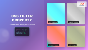
CSS Filter Property: Complete Guide to Visual Effects and Image Processing
The CSS filter property is a powerful tool that allows developers to apply visual effects and image processing techniques directly...
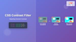
CSS Contrast Filter: Complete Guide to Adjusting Element Contrast for Better Visual Impact
The CSS contrast() filter function is a powerful tool that allows web developers to dynamically adjust the contrast of HTML...
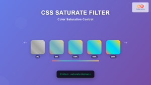
CSS Saturate Filter: Complete Guide to Color Saturation Control
The CSS saturate() filter function is a powerful tool that allows you to control the color saturation of HTML elements....

CSS Invert Filter: Complete Guide to Inverting Element Colors and Visual Effects
The CSS invert() filter is a powerful visual effect that reverses the colors of HTML elements, creating striking contrast and...
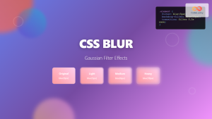
CSS Blur Filter: Complete Guide to Gaussian Blur Effects and Visual Applications
The CSS blur filter is one of the most versatile and visually appealing effects in modern web design. This powerful...

CSS Style filter Property: CSS Filter
CSS filter Property: Enhance Your Web Graphics The CSS filter property provides powerful visual effects to elements like images, backgrounds,...
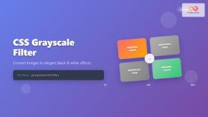
CSS Grayscale Filter: Master Black and White Image Effects with Complete Guide
The CSS grayscale filter is a powerful tool that transforms colorful images into elegant black and white versions. This filter...

CSS Backdrop-Filter: Complete Guide to Background Blur and Visual Effects
What is CSS Backdrop-Filter? The backdrop-filter property in CSS allows you to apply graphical effects like blur, brightness, contrast, and...
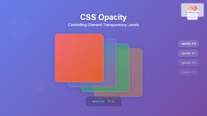
CSS Opacity: Complete Guide to Controlling Element Transparency Levels
Understanding CSS Opacity Property The CSS opacity property is a fundamental styling tool that controls the transparency level of HTML...

CSS Style textShadow Property: CSS Text Shadow
CSS text-shadow Property: Comprehensive Guide The text-shadow property in CSS adds shadows to text, creating depth, emphasis, or visually appealing...
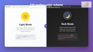
CSS Prefers-Color-Scheme: Complete Guide to Dark Mode and Light Mode Detection
The CSS prefers-color-scheme media query has revolutionized how we implement dark mode and light mode themes on websites. This powerful...

JavaScript jQuery CSS: Styling Elements with jQuery
jQuery, the popular JavaScript library, offers a powerful and intuitive way to manipulate CSS styles of HTML elements. This article...


