
CSS breakpoints are the foundation of responsive web design, defining specific screen widths where your website’s layout adapts to different devices. Understanding and implementing the right breakpoints ensures your site looks perfect on everything from smartphones to ultra-wide monitors.
What Are CSS Breakpoints?
CSS breakpoints are specific pixel values used in media queries to apply different styles based on the viewport width. They act as triggers that tell your CSS when to switch between different layouts, ensuring optimal user experience across all devices.
Common CSS Breakpoint Values
While there’s no universal standard, these breakpoint ranges are widely adopted across the industry:
Mobile First Approach (Recommended)
/* Extra Small devices (phones) */
/* Base styles - no media query needed */

/* Small devices (large phones, 576px and up) */
@media (min-width: 576px) {
  .container { max-width: 540px; }
}

/* Medium devices (tablets, 768px and up) */
@media (min-width: 768px) {
  .container { max-width: 720px; }
}

/* Large devices (desktops, 992px and up) */
@media (min-width: 992px) {
  .container { max-width: 960px; }
}

/* Extra large devices (large desktops, 1200px and up) */
@media (min-width: 1200px) {
  .container { max-width: 1140px; }
}
Desktop First Approach
/* Large devices (desktops, less than 1200px) */
@media (max-width: 1199.98px) {
  .container { max-width: 960px; }
}

/* Medium devices (tablets, less than 992px) */
@media (max-width: 991.98px) {
  .container { max-width: 720px; }
}

/* Small devices (landscape phones, less than 768px) */
@media (max-width: 767.98px) {
  .container { max-width: 540px; }
}

/* Extra small devices (portrait phones, less than 576px) */
@media (max-width: 575.98px) {
  .container { max-width: 100%; }
}
Popular Framework Breakpoints
Bootstrap 5 Breakpoints
| Breakpoint | Class infix | Dimensions |
|---|---|---|
| X-Small | None | <576px |
| Small | sm | ≥576px |
| Medium | md | ≥768px |
| Large | lg | ≥992px |
| Extra large | xl | ≥1200px |
| Extra extra large | xxl | ≥1400px |
Tailwind CSS Breakpoints
sm: '640px'   // Small devices
md: '768px'   // Medium devices
lg: '1024px'  // Large devices
xl: '1280px'  // Extra large devices
2xl: '1536px' // 2X Extra large devices
Interactive Breakpoint Demonstration
Resize your browser window to see how different breakpoints affect the layout:
Best Practices for CSS Breakpoints
1. Use Mobile-First Approach
Start with mobile styles as your base and progressively enhance for larger screens using min-width media queries. This approach ensures better performance and user experience on mobile devices.
/* Mobile-first approach */
.navigation {
  flex-direction: column;
  padding: 10px;
}

@media (min-width: 768px) {
  .navigation {
    flex-direction: row;
    padding: 15px 30px;
  }
}
2. Choose Content-Based Breakpoints
Instead of targeting specific devices, choose breakpoints based on when your content starts to look awkward or becomes hard to read.
3. Use Relative Units
Consider using em or rem units in media queries to ensure breakpoints scale with user font size preferences:
/* Using em units (1em = 16px by default) */
@media (min-width: 48em) { /* 768px */
  .container { max-width: 45em; }
}

@media (min-width: 62em) { /* 992px */
  .container { max-width: 60em; }
}
4. Test on Real Devices
Always test your breakpoints on actual devices, not just browser developer tools. Real devices can behave differently due to various factors like pixel density and browser variations.
Advanced Breakpoint Techniques
Orientation-Based Breakpoints
/* Landscape orientation */
@media (orientation: landscape) and (max-height: 480px) {
  .header { height: 60px; }
}

/* Portrait orientation */
@media (orientation: portrait) {
  .sidebar { width: 100%; }
}
High-DPI Display Breakpoints
/* High-resolution displays */
@media (-webkit-min-device-pixel-ratio: 2),
       (min-resolution: 192dpi) {
  .logo {
    background-image: url('[email protected]');
    background-size: 200px 100px;
  }
}
Container Queries (Modern Approach)
Container queries allow you to apply styles based on the size of a container rather than the viewport:
/* Container query example */
.card-container {
  container-type: inline-size;
}

@container (min-width: 400px) {
  .card {
    display: flex;
    flex-direction: row;
  }
}

@container (max-width: 399px) {
  .card {
    display: block;
  }
}
Common Breakpoint Mistakes to Avoid
⚠️ Common Pitfalls
- Too many breakpoints: Stick to 3-5 major breakpoints to avoid complexity
- Pixel-perfect targeting: Don’t target specific device dimensions
- Ignoring content: Always consider how content flows at different sizes
- Forgetting touch targets: Ensure buttons and links are large enough on mobile
Testing Your Breakpoints
Use these tools and techniques to test your responsive breakpoints effectively:
Browser Developer Tools
- Chrome DevTools responsive mode
- Firefox Responsive Design Mode
- Safari Web Inspector
Online Testing Tools
- Responsinator
- BrowserStack
- Sauce Labs
Physical Device Testing
Test on actual devices whenever possible, including older devices with different screen densities and browser capabilities.
Breakpoint Cheat Sheet
Quick Reference
< 576px
@media (max-width: 575.98px)
576px – 991px
@media (min-width: 576px)
992px – 1199px
@media (min-width: 992px)
≥ 1200px
@media (min-width: 1200px)
Conclusion
CSS breakpoints are essential for creating responsive websites that work across all devices. By following mobile-first principles, choosing content-based breakpoints, and testing thoroughly, you can create layouts that provide excellent user experiences regardless of screen size.
Remember that breakpoints are not about targeting specific devices but about ensuring your content remains readable and accessible at all viewport sizes. Start with the common breakpoint values discussed in this guide, then adjust based on your specific content needs.
Related Posts
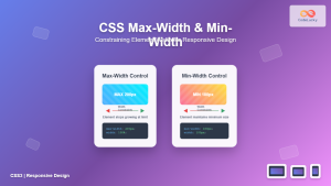
CSS Max-Width and Min-Width: Complete Guide to Responsive Width Constraints
When building responsive websites, controlling element widths is crucial for creating layouts that work across all devices. CSS provides two...
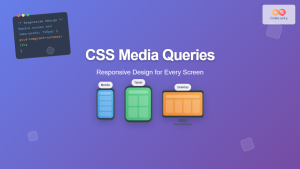
CSS Screen Media Queries: Complete Guide to Responsive Monitor and Device Targeting
CSS screen media queries are the cornerstone of responsive web design, enabling developers to create websites that adapt seamlessly across...
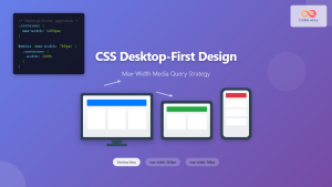
CSS Desktop-First Design: Master Max-Width Media Queries for Responsive Web Development
Desktop-first design is a responsive web development approach where you design for larger screens first, then progressively adapt your layout...
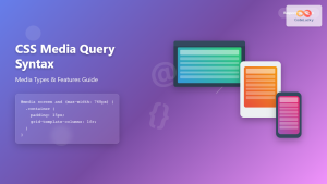
CSS Media Query Syntax: Complete Guide to Media Types and Features
CSS media queries are the cornerstone of responsive web design, allowing developers to apply different styles based on device characteristics...
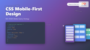
CSS Mobile-First Design: Complete Min-Width Media Query Guide for Responsive Web Development
What is Mobile-First Design? Mobile-first design is a progressive enhancement approach where you start designing and coding for the smallest...
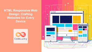
HTML Responsive Web Design: Crafting Websites for Every Device
Introduction In today's digital landscape, users access the internet through a plethora of devices, from large desktop monitors to small...
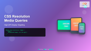
CSS Resolution Media Queries: Complete Guide to High-DPI Display Targeting
Understanding CSS Resolution Media Queries CSS resolution media queries allow developers to target specific display densities and create optimized experiences...

CSS Style maxWidth Property: CSS Max Width
Understanding the CSS maxWidth Property The CSS maxWidth property is a fundamental tool in web development for controlling the maximum...
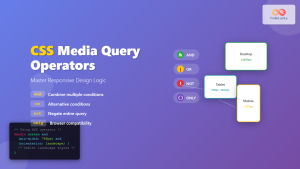
CSS Media Query Operators: Complete Guide to and, or, not, only Keywords
CSS media query operators are essential tools for creating responsive web designs that adapt to different devices and screen conditions....
CSS Media Queries: Complete Guide to @media Rule for Responsive Web Design
What Are CSS Media Queries? CSS Media Queries are a fundamental feature of modern web development that allow you to...

CSS Width Property: Mastering Element Width in CSS
CSS Width Property: Mastering Element Width The width property in CSS defines the width of an element's content area. It's...
CSS Orientation Media Queries: Complete Guide to Portrait vs Landscape Detection
CSS orientation media queries are essential tools for creating responsive web designs that adapt seamlessly to different device orientations. Whether...


