
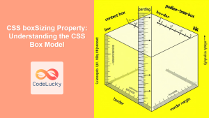
The CSS box-sizing property is one of the most crucial yet often misunderstood concepts in web development. It determines how the total width and height of elements are calculated, directly impacting your layout precision and responsive design capabilities.
Understanding the difference between content-box and border-box models can save you countless hours of debugging layout issues and help you create more predictable, maintainable CSS code.
What is the CSS Box-Sizing Property?
The box-sizing property controls how the CSS box model calculates the total size of an element. It determines whether padding and borders are included within the specified width and height values or added to them.
Syntax
box-sizing: content-box | border-box | inherit | initial;The Two Main Box-Sizing Models
1. Content-Box (Default Behavior)
The content-box is the default value for the box-sizing property. In this model, the width and height properties apply only to the content area of the element. Padding and borders are added to the outside of the content box.
Total Width = width + padding-left + padding-right + border-left + border-right
Total Height = height + padding-top + padding-bottom + border-top + border-bottom
Content-Box Example
Actual rendered size: 250px × 150px
(200px + 20px padding × 2 + 5px border × 2) × (100px + 20px padding × 2 + 5px border × 2)
.content-box-example {
  box-sizing: content-box; /* Default value */
  width: 200px;
  height: 100px;
  padding: 20px;
  border: 5px solid #007acc;
  background: #e6f3ff;
}
2. Border-Box Model
With border-box, the width and height properties include the content, padding, and borders. The content area shrinks to accommodate the padding and borders within the specified dimensions.
Total Width = width (includes content + padding + border)
Total Height = height (includes content + padding + border)
Content Width = width – padding-left – padding-right – border-left – border-right
Border-Box Example
Actual rendered size: 200px × 100px
Content adjusts to: (200px – 20px padding × 2 – 5px border × 2) × (100px – 20px padding × 2 – 5px border × 2)
.border-box-example {
  box-sizing: border-box;
  width: 200px;
  height: 100px;
  padding: 20px;
  border: 5px solid #28a745;
  background: #e8f5e8;
}
Interactive Comparison Demo
Side-by-Side Comparison
Content-Box
Border-Box
Why Border-Box is Often Preferred
Most modern developers prefer the border-box model for several compelling reasons:
1. Intuitive Sizing
When you set width: 300px on an element, you expect it to be exactly 300px wide, regardless of padding or borders. Border-box delivers this intuitive behavior.
2. Easier Responsive Design
Percentage-based layouts work more predictably with border-box, especially when elements have padding or borders.
Responsive Layout Example
flex: 1 with border-box
flex: 1 with border-box
flex: 1 with border-box
3. Consistent Calculations
Mathematical calculations for layouts become simpler and more predictable when using border-box, reducing the likelihood of layout bugs.
The Universal Border-Box Reset
Many developers apply border-box globally to all elements using this popular CSS reset:
/* Universal box-sizing reset */
*,
*::before,
*::after {
  box-sizing: border-box;
}

/* Alternative inheritance method */
html {
  box-sizing: border-box;
}

*,
*::before,
*::after {
  box-sizing: inherit;
}Common Use Cases and Scenarios
Form Elements
Form elements particularly benefit from border-box sizing for consistent alignment:
.form-element {
  box-sizing: border-box;
  width: 100%;
  padding: 10px;
  border: 2px solid #ddd;
  margin-bottom: 10px;
}
Grid and Flexbox Layouts
Modern layout systems work seamlessly with border-box sizing:
Performance Considerations
The box-sizing property has minimal performance impact, but it’s worth noting:
- Rendering: Border-box may require slightly more calculation, but the difference is negligible in modern browsers.
- Layout stability: Border-box can actually improve performance by reducing layout shifts and recalculations.
- CSS complexity: Simpler CSS calculations can lead to smaller stylesheets and faster parsing.
Browser Support
The box-sizing property enjoys excellent browser support:
- Chrome: 10+ (4+ with -webkit-)
- Firefox: 29+ (2+ with -moz-)
- Safari: 5.1+ (3+ with -webkit-)
- Edge: 12+
- Internet Explorer: 8+
For older browser support, use vendor prefixes:
.element {
  -webkit-box-sizing: border-box;
  -moz-box-sizing: border-box;
  box-sizing: border-box;
}
Common Pitfalls and Solutions
1. Mixing Box-Sizing Models
Solution: Apply a consistent box-sizing model across your entire project using a CSS reset.
2. Percentage Widths with Padding
Solution: Use border-box for elements with percentage-based sizing and padding/borders.
3. Third-party Component Integration
Best Practices
- Use border-box by default: Apply it globally unless you have specific reasons not to.
- Be consistent: Don’t mix box-sizing models within the same layout system.
- Document exceptions: If you must use content-box for specific elements, comment your CSS clearly.
- Test responsive behavior: Always verify that your layouts work correctly across different screen sizes.
- Consider component isolation: Use the inheritance method for more flexible component-based development.
Conclusion
The CSS box-sizing property is fundamental to creating predictable, maintainable layouts. While content-box is the default, border-box offers a more intuitive approach that aligns with how most developers think about element sizing.
By understanding both models and applying border-box strategically, you’ll write more robust CSS that’s easier to debug and maintain. The universal border-box reset has become standard practice for good reason—it simplifies calculations, improves responsive design, and reduces layout-related bugs.
Remember that the choice between content-box and border-box isn’t just about personal preference; it’s about creating consistent, predictable layouts that work reliably across different browsers and screen sizes. Master both models, but leverage border-box as your default approach for modern web development.
Related Posts
CSS boxSizing Property: Understanding the CSS Box Model
Understanding the CSS boxSizing Property The boxSizing property in CSS is a fundamental tool for controlling how the total width...
CSS Box Model: Master Content, Padding, Border and Margin for Perfect Layouts
The CSS Box Model is the fundamental concept that governs how elements are sized and spaced in web layouts. Understanding...

CSS Width and Height: Complete Guide to Element Dimensions
Understanding how to control element dimensions is fundamental to creating well-structured web layouts. CSS width and height properties give you...

CSS Aspect-Ratio Property: Complete Guide to Maintaining Perfect Width/Height Ratios
The CSS aspect-ratio property revolutionizes how we maintain consistent width-to-height ratios in responsive web design. Instead of relying on complex...

CSS Margin: Complete Guide to Element Spacing and Margin Collapse
Understanding CSS Margin: The Foundation of Element Spacing CSS margin is one of the most fundamental properties for controlling spacing...
CSS Border: Complete Guide to Width, Style and Color Properties
CSS borders are fundamental styling elements that define the visual boundaries of HTML elements. Understanding how to effectively use border-width,...
CSS Max-Width and Min-Width: Complete Guide to Responsive Width Constraints
When building responsive websites, controlling element widths is crucial for creating layouts that work across all devices. CSS provides two...
CSS Style borderWidth Property: CSS Border Width
CSS borderWidth Property: A Comprehensive Guide The borderWidth property in CSS is used to set the width of an element's...
CSS Style paddingRight Property: CSS Padding Right
Understanding the CSS padding-right Property The padding-right property in CSS is used to set the amount of space between the...
CSS Style padding Property: CSS Padding
CSS Padding Property: A Comprehensive Guide The CSS padding property is a fundamental tool in web development, allowing you to...
CSS Style height Property: CSS Height
Understanding the CSS height Property: A Comprehensive Guide The height property in CSS specifies the height of an element's content...

CSS Width Property: Mastering Element Width in CSS
CSS Width Property: Mastering Element Width The width property in CSS defines the width of an element's content area. It's...


