
The CSS aspect-ratio property revolutionizes how we maintain consistent width-to-height ratios in responsive web design. Instead of relying on complex padding tricks or JavaScript calculations, this modern CSS property provides a clean, intuitive solution for creating elements that scale proportionally across different screen sizes.
What is the CSS Aspect-Ratio Property?
The aspect-ratio property defines the preferred aspect ratio for an element’s box. It establishes a relationship between the width and height, ensuring that when one dimension changes, the other adjusts proportionally to maintain the specified ratio.
aspect-ratio: width / height;
aspect-ratio: ratio;
aspect-ratio: auto;
Basic Usage and Examples
Simple Aspect Ratio Declaration
Here’s how to create a perfect square using the aspect-ratio property:
CSS Code:
.square {
  width: 200px;
  aspect-ratio: 1 / 1;
  background: linear-gradient(45deg, #ff6b6b, #4ecdc4);
  display: flex;
  align-items: center;
  justify-content: center;
  color: white;
  font-weight: bold;
}
Visual Result:
Common Aspect Ratios
Different aspect ratios serve various purposes in web design. Here are the most commonly used ratios:
aspect-ratio: 16 / 9;
aspect-ratio: 4 / 3;
aspect-ratio: 1 / 1;
aspect-ratio: 3 / 4;
Interactive Aspect Ratio Demo
Experiment with different aspect ratios using the interactive demo below:
Current ratio: 1:1
Practical Use Cases
1. Responsive Video Containers
Creating responsive video containers that maintain their aspect ratio across all devices:
.video-container {
  width: 100%;
  max-width: 800px;
  aspect-ratio: 16 / 9;
  background: #000;
  position: relative;
  overflow: hidden;
  border-radius: 8px;
}

.video-container iframe,
.video-container video {
  position: absolute;
  top: 0;
  left: 0;
  width: 100%;
  height: 100%;
}2. Image Gallery with Consistent Sizing
Create a clean image gallery where all thumbnails maintain the same aspect ratio:
.gallery {
  display: grid;
  grid-template-columns: repeat(auto-fit, minmax(200px, 1fr));
  gap: 15px;
}

.gallery-item {
  aspect-ratio: 1 / 1;
  overflow: hidden;
  border-radius: 8px;
  background: #f0f0f0;
}

.gallery-item img {
  width: 100%;
  height: 100%;
  object-fit: cover;
}3. Card Components
Design consistent card layouts for product listings or content cards:
.card {
  background: white;
  border-radius: 12px;
  box-shadow: 0 4px 6px rgba(0, 0, 0, 0.1);
  overflow: hidden;
  transition: transform 0.2s ease;
}

.card:hover {
  transform: translateY(-5px);
}

.card-image {
  aspect-ratio: 16 / 9;
  background: #e2e8f0;
  overflow: hidden;
}

.card-content {
  padding: 20px;
}Advanced Techniques
Using aspect-ratio with auto
The auto value allows elements to use their natural aspect ratio when available:
.flexible-image {
  width: 100%;
  max-width: 400px;
  aspect-ratio: auto 16 / 9;
  object-fit: cover;
}
This approach uses the image’s natural aspect ratio if available, falling back to 16:9 if not.
Combining with CSS Grid and Flexbox
The aspect-ratio property works seamlessly with modern layout methods:
.grid-container {
  display: grid;
  grid-template-columns: repeat(auto-fill, minmax(200px, 1fr));
  gap: 20px;
}

.grid-item {
  aspect-ratio: 4 / 3;
  background: linear-gradient(45deg, #667eea, #764ba2);
  border-radius: 8px;
  display: flex;
  align-items: center;
  justify-content: center;
  color: white;
  font-weight: bold;
}Browser Support and Fallbacks
The CSS aspect-ratio property has excellent modern browser support, but it’s important to provide fallbacks for older browsers:
- Chrome/Edge: 88+
- Firefox: 89+
- Safari: 15+
Fallback Strategy
For older browsers, you can use the traditional padding-bottom technique as a fallback:
.aspect-ratio-container {
  position: relative;
  width: 100%;
}

/* Fallback for older browsers */
.aspect-ratio-container::before {
  content: '';
  display: block;
  padding-bottom: 56.25%; /* 16:9 ratio */
}

/* Modern browsers with aspect-ratio support */
@supports (aspect-ratio: 16 / 9) {
  .aspect-ratio-container {
    aspect-ratio: 16 / 9;
  }

  .aspect-ratio-container::before {
    display: none;
  }
}
Performance Considerations
The aspect-ratio property offers several performance benefits:
- Reduced Layout Shifts: Elements maintain their dimensions during loading, preventing cumulative layout shift (CLS)
- Cleaner Code: Eliminates the need for complex padding calculations and pseudo-elements
- Better Responsive Behavior: Automatically adjusts to container changes without JavaScript
- Improved Accessibility: More predictable layouts help screen readers and other assistive technologies
Common Pitfalls and Solutions
Issue: Content Overflow
When content doesn’t fit within the defined aspect ratio:
/* Problem: Content might overflow */
.container {
  aspect-ratio: 16 / 9;
  background: #f0f0f0;
}

/* Solution: Use appropriate overflow handling */
.container {
  aspect-ratio: 16 / 9;
  background: #f0f0f0;
  overflow: hidden; /* or auto, scroll */
  display: flex;
  align-items: center;
  justify-content: center;
}
Issue: Images Not Filling Container
Images might not properly fill aspect-ratio containers:
/* Solution: Use object-fit property */
.image-container {
  aspect-ratio: 16 / 9;
  overflow: hidden;
}

.image-container img {
  width: 100%;
  height: 100%;
  object-fit: cover; /* or contain, fill */
}
Best Practices
- Choose Appropriate Ratios: Select aspect ratios that match your content and design requirements
- Test Across Devices: Ensure your aspect ratios work well on different screen sizes
- Consider Content: Make sure your content fits well within the chosen aspect ratio
- Use with Modern Layout: Combine aspect-ratio with CSS Grid and Flexbox for optimal results
- Provide Fallbacks: Always include fallbacks for older browsers when necessary
- Monitor Performance: Use aspect-ratio to improve layout stability and reduce CLS
Conclusion
The CSS aspect-ratio property is a powerful tool that simplifies responsive design by providing a clean, intuitive way to maintain consistent width-to-height ratios. By replacing complex workarounds with a single property, it makes code more maintainable while improving performance and user experience.
Whether you’re creating responsive images, video containers, or card layouts, the aspect-ratio property offers a modern solution that works seamlessly with existing CSS layout methods. As browser support continues to improve, it’s becoming an essential part of every frontend developer’s toolkit.
Start incorporating aspect-ratio into your projects today to create more predictable, performant, and visually consistent layouts across all devices and screen sizes.
Related Posts

CSS Percentage Units: Complete Guide to Parent-Relative Sizing
CSS percentage units are fundamental building blocks for creating responsive, flexible layouts that adapt to different screen sizes and container...
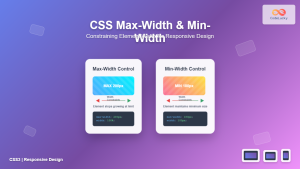
CSS Max-Width and Min-Width: Complete Guide to Responsive Width Constraints
When building responsive websites, controlling element widths is crucial for creating layouts that work across all devices. CSS provides two...
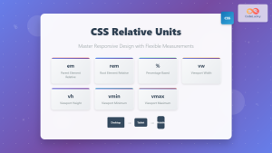
CSS Units: Complete Guide to Relative Units – em, rem, %, vw, vh, vmin, vmax
CSS relative units are the foundation of responsive web design, enabling websites to adapt seamlessly across different devices and screen...
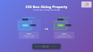
CSS Box-Sizing Property: Master Content-Box vs Border-Box for Perfect Layouts
The CSS box-sizing property is one of the most crucial yet often misunderstood concepts in web development. It determines how...

CSS Width and Height: Complete Guide to Element Dimensions
Understanding how to control element dimensions is fundamental to creating well-structured web layouts. CSS width and height properties give you...
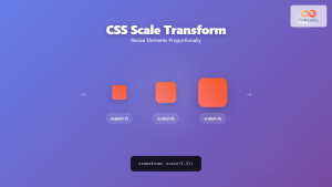
CSS Scale: Master Element Resizing with Transform Property
The CSS scale() function is a powerful transformation tool that allows you to resize elements proportionally without affecting the document...

CSS Style maxWidth Property: CSS Max Width
Understanding the CSS maxWidth Property The CSS maxWidth property is a fundamental tool in web development for controlling the maximum...
CSS minHeight Property: CSS Min Height
Understanding the CSS minHeight Property The CSS minHeight property sets the minimum height of an element. It prevents the element's...

CSS Viewport Units: Complete Guide to vw, vh, vmin, vmax for Modern Responsive Design
CSS viewport units revolutionize how we approach responsive web design by providing a direct relationship between element sizes and the...
CSS boxSizing Property: Understanding the CSS Box Model
Understanding the CSS boxSizing Property The boxSizing property in CSS is a fundamental tool for controlling how the total width...
CSS Style maxHeight Property: CSS Max Height
Understanding the CSS max-height Property The CSS max-height property is a fundamental tool for controlling the maximum height of an...
CSS Style backgroundSize Property: CSS Background Size
CSS background-size Property: Mastering Background Image Scaling The CSS background-size property specifies the size of background images. Controlling the size...


