CSS em Units: Complete Guide to Font-Size Relative Length Units
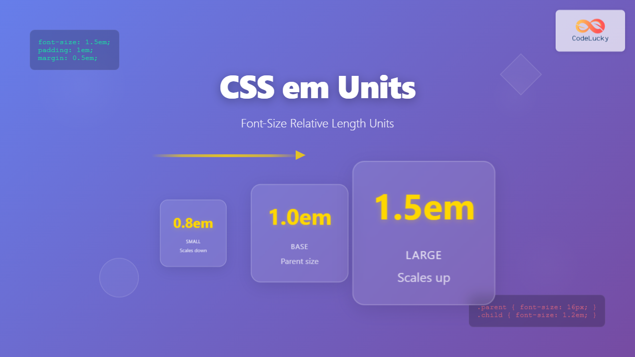
Master CSS em units with our comprehensive guide. Learn how font-size relative length units work, best practices, and practical examples for responsive web design.
Master CSS em units with our comprehensive guide. Learn how font-size relative length units work, best practices, and practical examples for responsive web design.
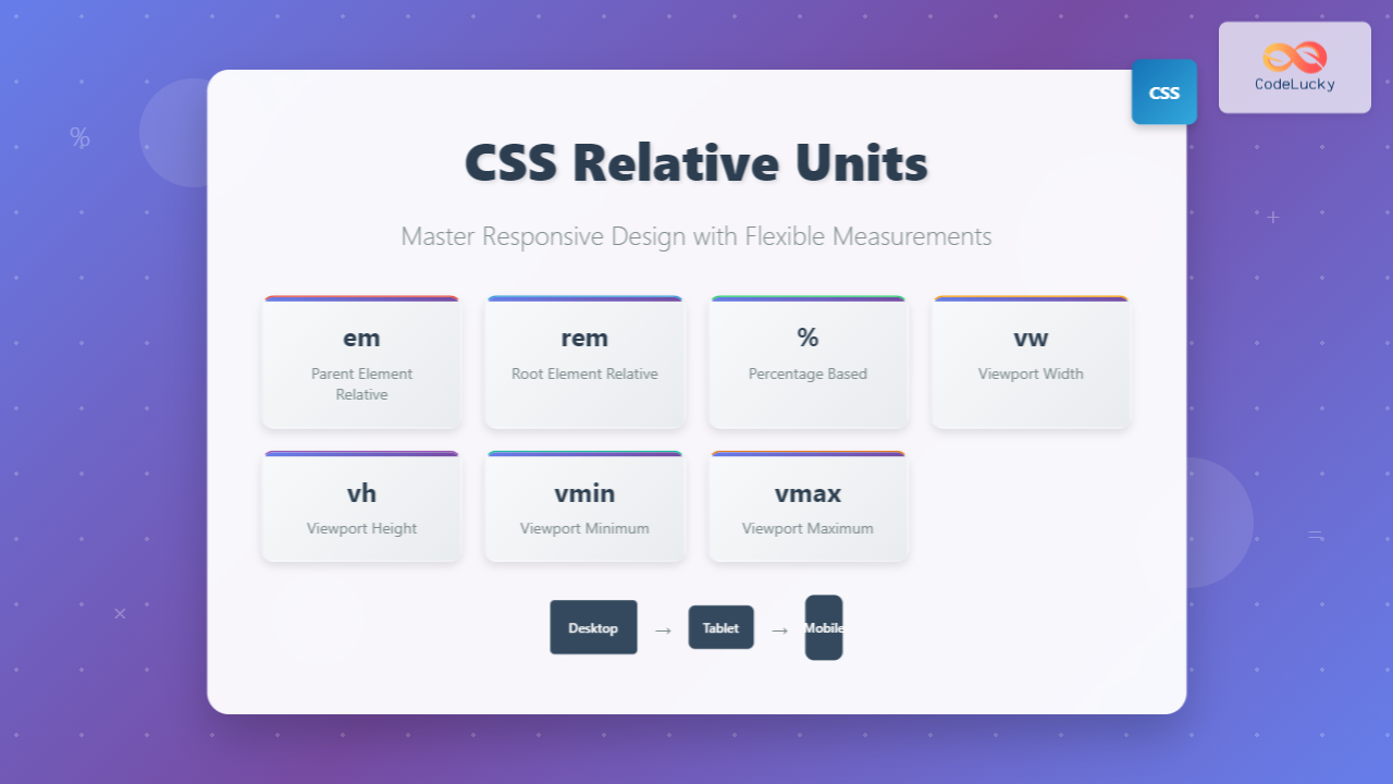
Master CSS relative units with this comprehensive guide covering em, rem, percentages, viewport units (vw, vh, vmin, vmax) with practical examples and interactive demos.
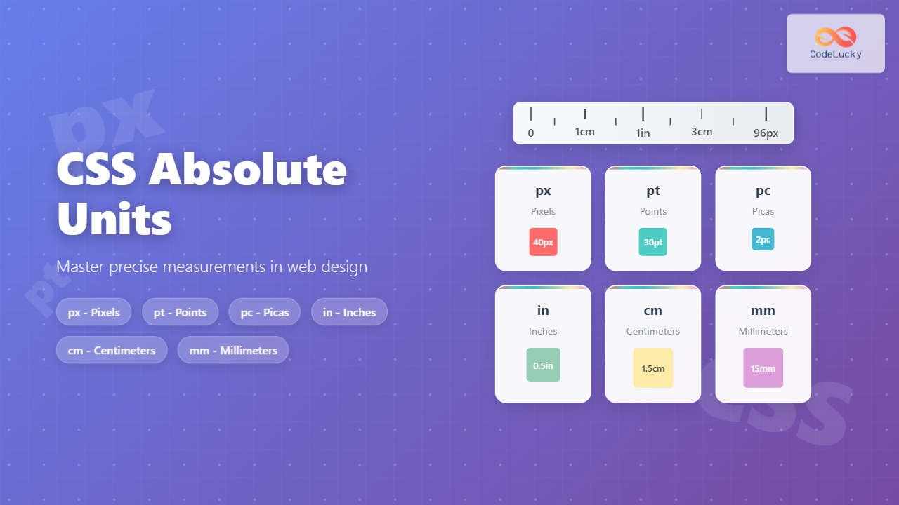
Master CSS absolute units including px, pt, pc, in, cm, and mm. Learn when to use each unit type with practical examples and best practices for web development.
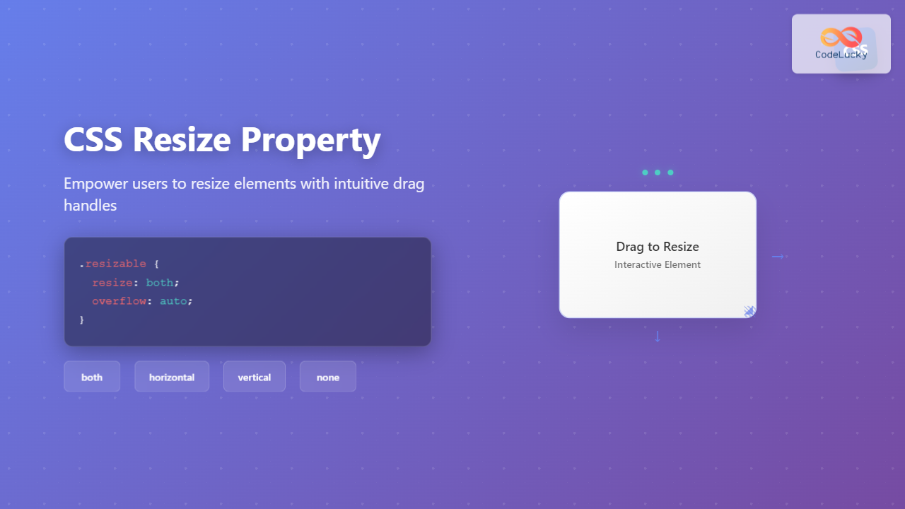
Master the CSS resize property to create user-resizable elements. Learn syntax, values, browser support, and practical examples with interactive demos.
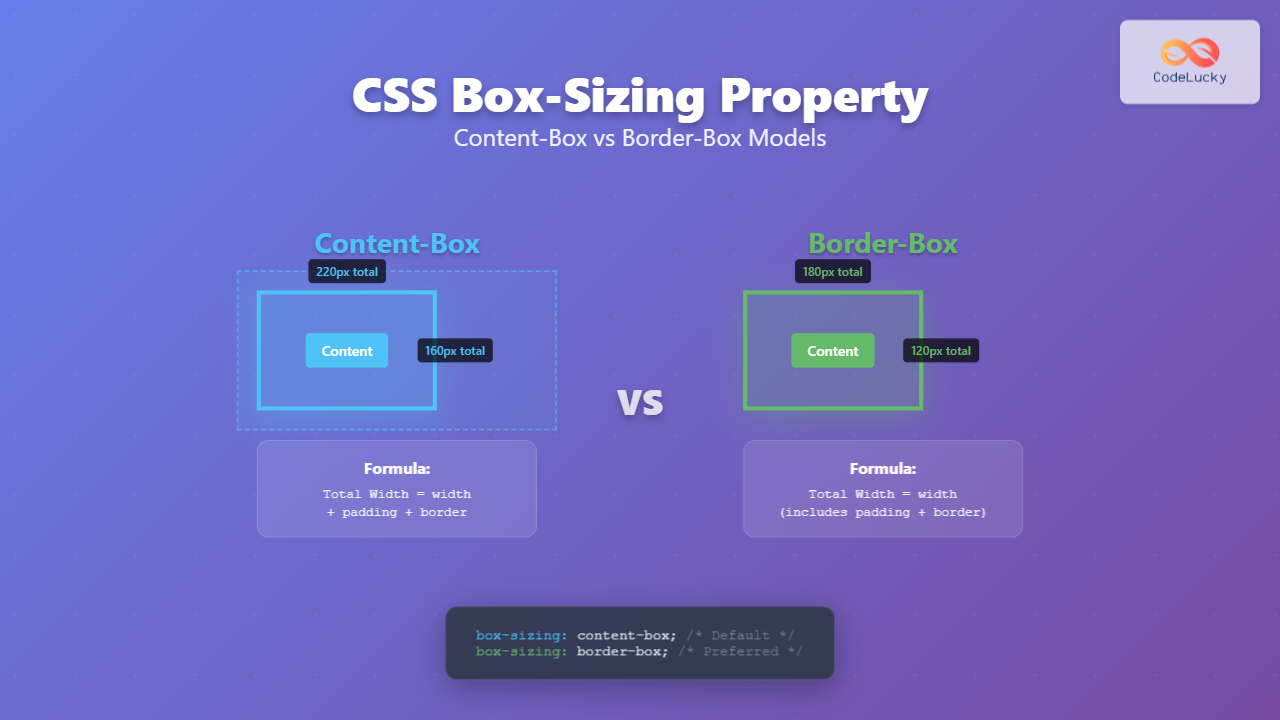
Master CSS box-sizing property with comprehensive examples. Learn the difference between content-box and border-box models to create pixel-perfect layouts and avoid common sizing issues.
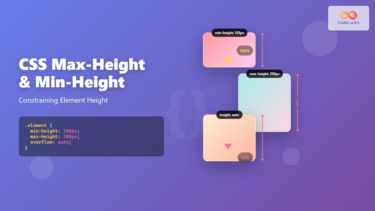
Master CSS max-height and min-height properties to control element dimensions. Learn practical techniques with examples for responsive layouts and dynamic content.
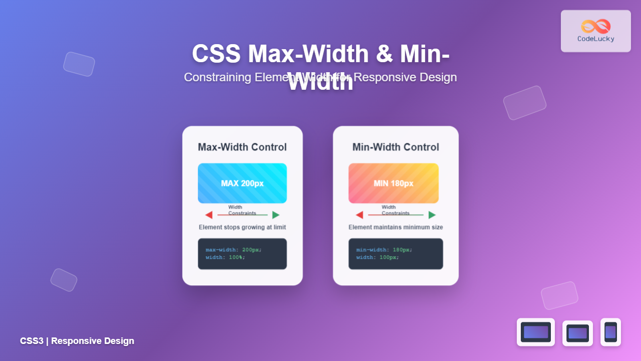
Master CSS max-width and min-width properties to create flexible, responsive layouts. Learn practical examples, best practices, and common use cases for controlling element dimensions.
Master CSS float property with comprehensive examples. Learn left, right, and none float values, clearing floats, and modern layout alternatives in this complete guide.
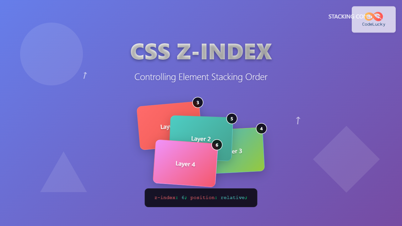
Master CSS z-index property to control element stacking order. Learn stacking contexts, common pitfalls, and practical examples with interactive demos.
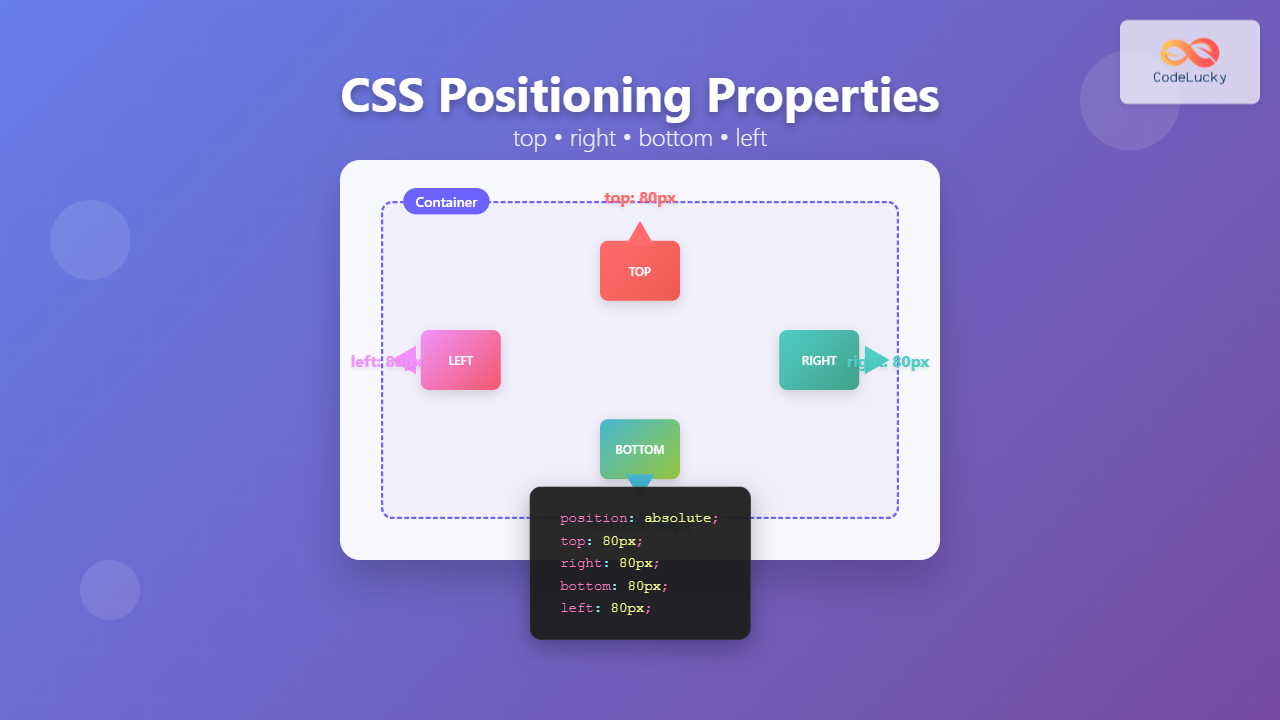
Master CSS positioning offset properties top, right, bottom, and left. Learn how these properties work with different position values, complete with interactive examples and best practices.