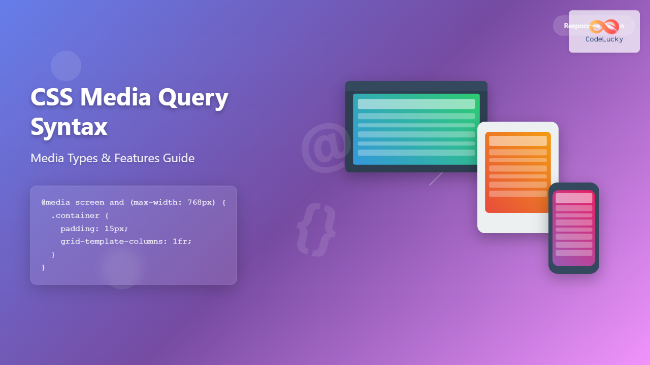
CSS Media Query Syntax: Complete Guide to Media Types and Features
Master CSS media query syntax with comprehensive examples of media types, features, and operators. Learn to create responsive designs that adapt perfectly to any device.
Master CSS media query syntax with comprehensive examples of media types, features, and operators. Learn to create responsive designs that adapt perfectly to any device.
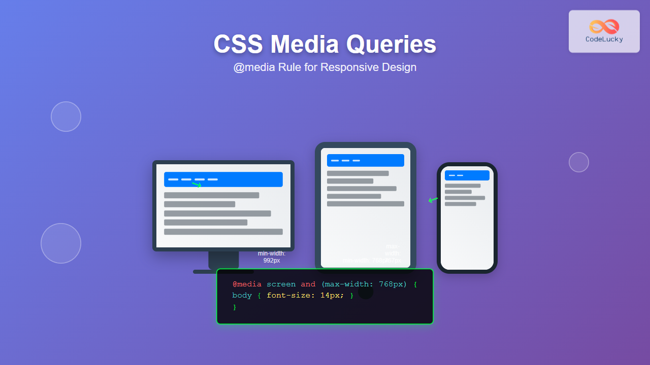
Master CSS media queries and @media rule to create responsive websites. Learn syntax, breakpoints, common patterns, and advanced techniques with practical examples.
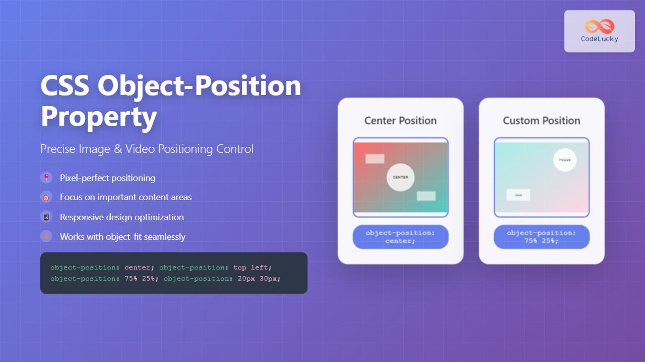
Master CSS object-position property to precisely control image and video positioning within containers. Learn syntax, values, and practical examples for responsive web design.
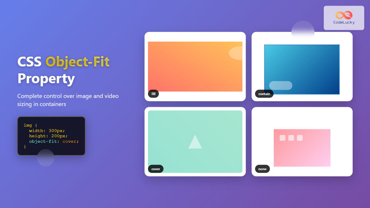
Master CSS object-fit property to control how images and videos are sized within containers. Learn all values, practical examples, and responsive design techniques.
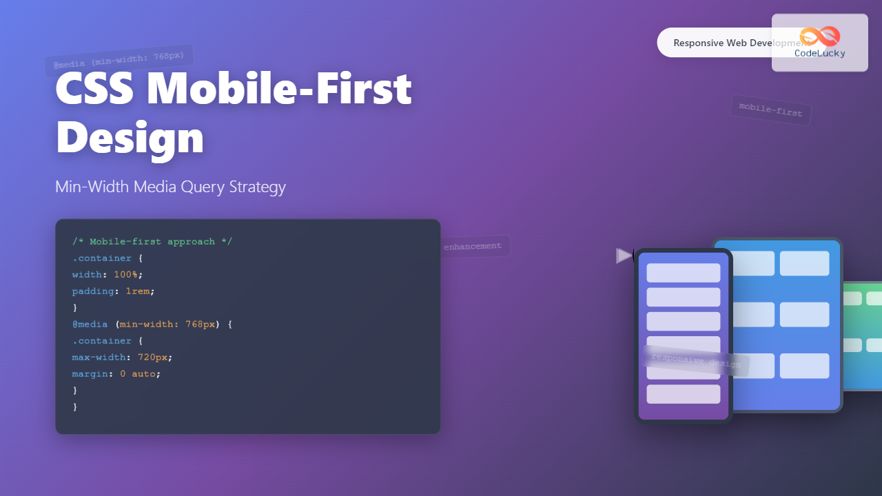
Master CSS mobile-first design with min-width media queries. Learn progressive enhancement, breakpoint strategies, and practical implementation techniques for modern responsive web development.
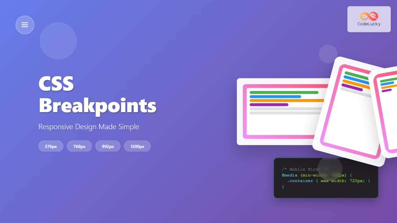
Master CSS breakpoints with our comprehensive guide covering common screen sizes, best practices, and interactive examples for creating responsive websites.
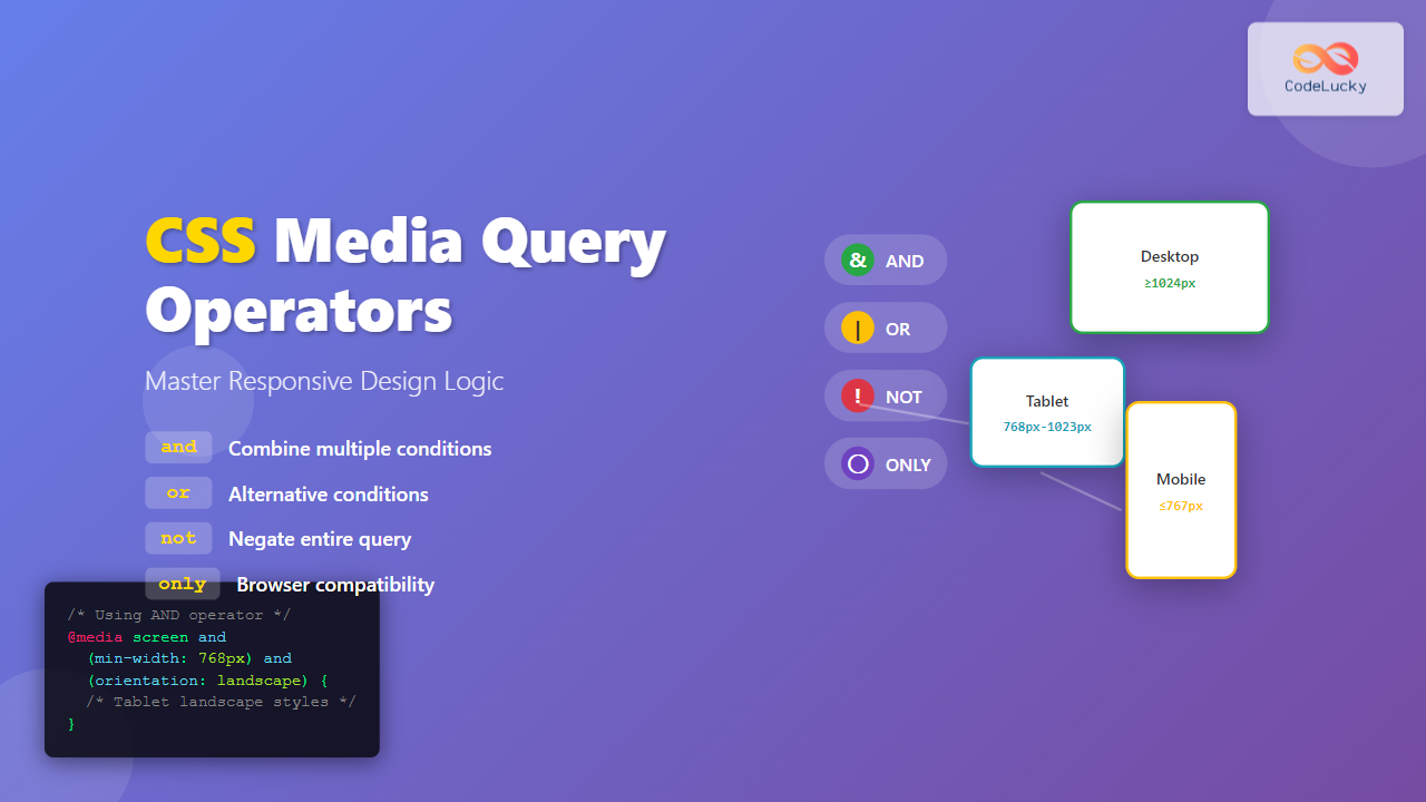
Master CSS media query operators with practical examples. Learn how to use and, or, not, and only keywords to create powerful responsive designs.
A comprehensive guide to the CSS user-select property, covering its syntax, values, and practical examples for controlling text selection on web pages.
A comprehensive guide to the CSS vertical-align property, covering its syntax, values, and usage with practical examples.
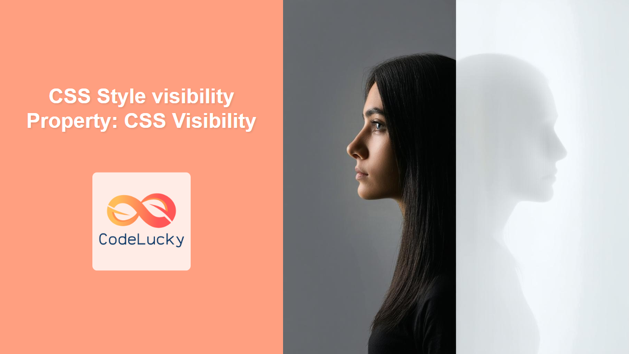
A comprehensive guide to the CSS visibility property, covering its values, usage, and differences between 'hidden' and 'display: none'.