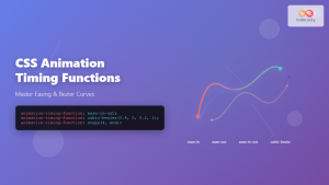
The transition-timing-function property in CSS is a powerful tool that controls how intermediate values are calculated during a transition. It defines the acceleration curve of your animations, determining whether they start slow and speed up, begin fast and slow down, or maintain a constant pace throughout the duration.
Understanding timing functions is crucial for creating polished, professional animations that feel natural and engaging to users. This comprehensive guide will explore every aspect of CSS transition timing functions, from basic predefined values to advanced custom curves.
What is CSS Transition-Timing-Function?
The transition-timing-function property specifies the speed curve of the transition effect. It accepts various predefined keywords and custom functions that define how the intermediate property values are calculated during the transition period.
Basic Syntax
transition-timing-function: ease | linear | ease-in | ease-out | ease-in-out | cubic-bezier(n,n,n,n) | steps(n, direction);Predefined Timing Functions
CSS provides several built-in timing functions that cover the most common animation patterns. Let’s explore each one with interactive examples.
1. Linear
The linear timing function creates a constant speed throughout the entire transition. The animation progresses at the same rate from start to finish, creating a mechanical, uniform motion.
.linear-example {
  transition: transform 2s linear;
}

.linear-example:hover {
  transform: translateX(300px);
}Hover to see the linear animation
2. Ease (Default)
The ease function is the default timing function. It starts slowly, accelerates in the middle, and then slows down at the end. This creates a natural, organic feeling that mimics real-world motion.
.ease-example {
  transition: transform 2s ease;
}

.ease-example:hover {
  transform: translateX(300px);
}Hover to see the ease animation
3. Ease-In
The ease-in function starts slowly and gradually accelerates. This creates an animation that builds momentum over time, perfect for elements entering the viewport or beginning an action.
.ease-in-example {
  transition: transform 2s ease-in;
}

.ease-in-example:hover {
  transform: translateX(300px);
}Hover to see the ease-in animation
4. Ease-Out
The ease-out function starts quickly and then slows down toward the end. This timing function is excellent for elements that need to settle into place or when you want to emphasize the arrival at the final state.
.ease-out-example {
  transition: transform 2s ease-out;
}

.ease-out-example:hover {
  transform: translateX(300px);
}Hover to see the ease-out animation
5. Ease-In-Out
The ease-in-out function combines both ease-in and ease-out behaviors. It starts slowly, accelerates in the middle, and then slows down again at the end. This creates a very smooth, balanced transition.
.ease-in-out-example {
  transition: transform 2s ease-in-out;
}

.ease-in-out-example:hover {
  transform: translateX(300px);
}Hover to see the ease-in-out animation
Cubic-Bezier Function
The cubic-bezier() function allows you to create custom timing functions by defining your own cubic Bézier curve. This function takes four parameters that represent the coordinates of two control points on the curve.
Syntax
cubic-bezier(x1, y1, x2, y2)Where x1, y1, x2, y2 are numbers between 0 and 1 (x values must be between 0 and 1, y values can exceed this range for bounce effects).
Popular Custom Cubic-Bezier Curves
Here are some popular custom cubic-bezier functions that create distinctive animation effects:
/* Bounce effect */
.bounce {
  transition-timing-function: cubic-bezier(0.68, -0.55, 0.265, 1.55);
}

/* Back ease-in */
.back-in {
  transition-timing-function: cubic-bezier(0.6, -0.28, 0.735, 0.045);
}

/* Elastic ease-out */
.elastic-out {
  transition-timing-function: cubic-bezier(0.19, 1, 0.22, 1);
}
Bounce Effect
Back Ease-In
Elastic Out
Hover over each box to see different cubic-bezier effects
Steps Function
The steps() function creates stepped animations instead of smooth transitions. This is perfect for creating sprite animations, typewriter effects, or any animation that should progress in discrete steps rather than continuous motion.
Syntax
steps(number, direction)- number: The number of steps in the animation
- direction: Either “start” or “end” (default is “end”)
.steps-example {
  transition: transform 2s steps(8, end);
}

.steps-example:hover {
  transform: translateX(320px);
}Hover to see the stepped animation (8 discrete steps)
Practical Applications and Best Practices
Button Hover Effects
Different timing functions can dramatically change the feel of button interactions. Here’s a comparison of various approaches for button hover effects:
.btn-smooth {
  background: #007bff;
  color: white;
  padding: 12px 24px;
  border: none;
  border-radius: 6px;
  cursor: pointer;
  transition: all 0.3s ease-out;
}

.btn-smooth:hover {
  background: #0056b3;
  transform: translateY(-2px);
  box-shadow: 0 4px 8px rgba(0,0,0,0.2);
}Loading Animations
Timing functions are crucial for creating effective loading animations. Here’s an example of a spinner that uses different timing functions:
.spinner {
  width: 40px;
  height: 40px;
  border: 4px solid #f3f3f3;
  border-top: 4px solid #007bff;
  border-radius: 50%;
  animation: spin 1s linear infinite;
}

@keyframes spin {
  0% { transform: rotate(0deg); }
  100% { transform: rotate(360deg); }
}
Performance Considerations
When working with transition timing functions, keep these performance tips in mind:
Performance Tips
- Use hardware acceleration: Animate properties like
transformandopacityinstead of properties that trigger layout or paint operations - Avoid complex cubic-bezier curves: Overly complex curves can cause performance issues on slower devices
- Test on various devices: What feels smooth on desktop might feel choppy on mobile devices
- Consider reduced motion: Respect user preferences for reduced motion using CSS media queries
/* Respect user's motion preferences */
@media (prefers-reduced-motion: reduce) {
  * {
    transition-duration: 0.01ms !important;
    animation-duration: 0.01ms !important;
    animation-iteration-count: 1 !important;
  }
}
Advanced Techniques and Tips
Chaining Multiple Transitions
You can apply different timing functions to different properties within the same element:
.multi-transition {
  transition:
    transform 0.3s cubic-bezier(0.68, -0.55, 0.265, 1.55),
    background-color 0.2s ease-out,
    box-shadow 0.4s ease-in-out;
}Hover to see multiple properties with different timing functions
Creating Natural Motion
To create animations that feel natural and physically plausible, consider these principles:
Natural Motion Principles
- Ease-out for entrances: Elements entering the screen should slow down as they settle
- Ease-in for exits: Elements leaving should gradually accelerate away
- Ease-in-out for movements: Elements moving from one position to another should ease both ways
- Linear for continuous actions: Use linear timing for loading bars or continuous rotations
Browser Support and Fallbacks
CSS transition timing functions have excellent browser support across all modern browsers. However, it’s good practice to provide fallbacks for older browsers:
/* Fallback for older browsers */
.element {
  transition: transform 0.3s ease; /* Fallback */
  transition: transform 0.3s cubic-bezier(0.25, 0.46, 0.45, 0.94); /* Modern browsers */
}
Common Mistakes to Avoid
Avoid These Common Pitfalls
- Overusing bounce effects: Too many bouncy animations can make your site feel unprofessional
- Making transitions too long: Users expect quick feedback; avoid transitions longer than 0.5 seconds for UI interactions
- Inconsistent timing: Use consistent timing functions throughout your site for a cohesive experience
- Ignoring accessibility: Always consider users with vestibular disorders and provide reduced motion options
Conclusion
Mastering CSS transition timing functions is essential for creating polished, professional web animations. From the simple linear function to complex custom cubic-bezier curves, each timing function serves a specific purpose in creating natural, engaging user experiences.
Remember that the best animations are often the ones users don’t consciously notice—they simply make the interface feel more responsive and delightful to use. Start with the predefined timing functions like ease, ease-in, ease-out, and ease-in-out, then experiment with custom cubic-bezier curves as you develop your animation skills.
The key to effective animation timing is understanding the context and purpose of each transition. Whether you’re creating subtle hover effects, loading animations, or complex interface transitions, choosing the right timing function will make your animations feel natural and purposeful.
As you continue developing your CSS animation skills, remember to always test your animations across different devices and respect user preferences for reduced motion. With practice and attention to detail, you’ll be able to create smooth, professional animations that enhance rather than distract from your content.
Related Posts
CSS Animation Timing Function: Complete Guide to Animation Easing Functions
The animation-timing-function property in CSS controls how an animation progresses through its duration, determining the acceleration and deceleration patterns that...
CSS Transition-Duration: Complete Guide to Animation Timing Control
What is CSS Transition-Duration? The transition-duration property in CSS defines how long a transition animation should take to complete. It's...
CSS Style animationTimingFunction Property: CSS Animation Timing Function
CSS Style animationTimingFunction Property: A Comprehensive Guide The animation-timing-function property in CSS is a crucial component for controlling the pace...
CSS Transition-Delay: Master Animation Timing and Sequencing
The transition-delay property in CSS is a powerful tool that allows you to control when a transition animation begins. Unlike...
CSS Animation-Delay: Master Timing Control for Perfect Web Animations
What is CSS Animation-Delay? The animation-delay property in CSS controls when an animation starts after it's been applied to an...
CSS Animation-Duration: Complete Guide to Controlling Animation Timing and Speed
The animation-duration property is a fundamental CSS animation property that controls how long an animation takes to complete one full...

CSS Style animationDuration Property: CSS Animation Duration
Understanding the animationDuration Property in CSS The animationDuration property in CSS specifies the length of time that an animation should...
CSS Style transition Property: CSS Transition
CSS transition Property: A Comprehensive Guide The CSS transition property is a powerful tool for creating smooth animations when CSS...

CSS Animation Property: Complete Guide to Keyframe-Based Animations
CSS animations bring life to web pages by allowing elements to transition smoothly between different states over time. The animation...

CSS Style animationDelay Property: CSS Animation Delay
Understanding the CSS animationDelay Property The CSS animationDelay property specifies the amount of time to wait from when the element...
CSS Transition Property: Complete Guide to Smooth Animation Effects
CSS transitions enable smooth, visually appealing animations when element properties change, transforming abrupt state changes into fluid motion. This powerful...
JavaScript TransitionEvent elapsedTime Property: Transition Duration
JavaScript TransitionEvent elapsedTime Property: Understanding Transition Durations The elapsedTime property of the JavaScript TransitionEvent interface is a crucial element for...


