
CSS animations bring life to web pages by allowing elements to transition smoothly between different states over time. The animation property, combined with @keyframes rules, provides developers with powerful tools to create engaging user experiences without relying on JavaScript libraries.
Understanding CSS Animation Fundamentals
CSS animations work by gradually changing element properties from one value to another over a specified duration. Unlike CSS transitions that only animate between two states, animations can define multiple intermediate steps using keyframes, offering greater control over the animation sequence.
The animation process involves two key components:
- @keyframes rule: Defines the animation sequence and intermediate steps
- animation property: Applies the keyframe animation to specific elements
The @keyframes Rule Syntax
The @keyframes rule specifies the animation code by defining styles for specific points during the animation sequence. You can specify keyframes using percentages (0% to 100%) or the keywords from and to.
Basic Syntax:
@keyframes animation-name {
  0% {
    /* Starting styles */
  }
  50% {
    /* Midpoint styles */
  }
  100% {
    /* Ending styles */
  }
}
Simple Keyframe Example
@keyframes slideIn {
  from {
    transform: translateX(-100%);
    opacity: 0;
  }
  to {
    transform: translateX(0);
    opacity: 1;
  }
}
CSS Animation Properties
The animation property is actually a shorthand for eight individual animation properties that control different aspects of the animation behavior.
Individual Animation Properties
| Property | Description | Default Value |
|---|---|---|
animation-name |
Specifies the name of the @keyframes rule | none |
animation-duration |
Duration of the animation | 0s |
animation-timing-function |
Speed curve of the animation | ease |
animation-delay |
Delay before animation starts | 0s |
animation-iteration-count |
Number of times animation repeats | 1 |
animation-direction |
Direction of animation playback | normal |
animation-fill-mode |
Styles applied before/after animation | none |
animation-play-state |
Whether animation is running or paused | running |
Animation Shorthand Syntax
.element {
  animation: name duration timing-function delay iteration-count direction fill-mode play-state;
}

/* Example */
.slide {
  animation: slideIn 2s ease-in-out 0.5s infinite alternate both running;
}
Practical Animation Examples
1. Fade In Animation
A simple fade-in effect that gradually increases opacity from 0 to 1:
@keyframes fadeIn {
  from {
    opacity: 0;
  }
  to {
    opacity: 1;
  }
}

.fade-element {
  animation: fadeIn 1.5s ease-in;
}
Visual Output:
2. Bounce Animation
Create a bouncing effect with multiple keyframe stops:
@keyframes bounce {
  0%, 20%, 50%, 80%, 100% {
    transform: translateY(0);
  }
  40% {
    transform: translateY(-20px);
  }
  60% {
    transform: translateY(-10px);
  }
}

.bounce-ball {
  animation: bounce 2s infinite;
}
Visual Output:
3. Rotation Animation
Continuous rotation effect using transform property:
@keyframes rotate {
  from {
    transform: rotate(0deg);
  }
  to {
    transform: rotate(360deg);
  }
}

.spinning-element {
  animation: rotate 3s linear infinite;
}
Visual Output:
Advanced Animation Techniques
Multiple Animations
You can apply multiple animations to a single element by separating them with commas:
@keyframes slideUp {
  from { transform: translateY(20px); }
  to { transform: translateY(0); }
}

@keyframes colorChange {
  0% { background-color: #ff6b6b; }
  50% { background-color: #4ecdc4; }
  100% { background-color: #45b7d1; }
}

.multi-animation {
  animation: slideUp 1s ease-out, colorChange 3s infinite;
}
Animation Fill Mode
The animation-fill-mode property specifies how styles are applied before and after the animation:
- none: Default behavior, no styles applied outside animation
- forwards: Retains final keyframe styles after animation ends
- backwards: Applies first keyframe styles during delay period
- both: Applies both forwards and backwards behaviors
.fill-forwards {
animation: slideIn 2s ease-out forwards;
/* Element retains final animation state */
}
.fill-both {
animation: fadeIn 1s ease-in 0.5s both;
/* Applies first keyframe during delay, retains final state */
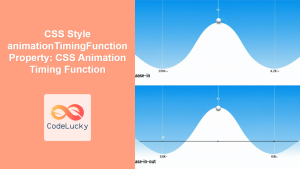
}Animation Timing Functions
Timing functions control the speed of animation progression. CSS provides several built-in timing functions and support for custom cubic-bezier curves:
| Function | Description | Cubic-bezier Equivalent |
|---|---|---|
ease |
Slow start, fast middle, slow end | cubic-bezier(0.25, 0.1, 0.25, 1) |
linear |
Constant speed throughout | cubic-bezier(0, 0, 1, 1) |
ease-in |
Slow start, accelerating | cubic-bezier(0.42, 0, 1, 1) |
ease-out |
Fast start, decelerating | cubic-bezier(0, 0, 0.58, 1) |
ease-in-out |
Slow start and end | cubic-bezier(0.42, 0, 0.58, 1) |
Custom Timing Functions
/* Bounce effect using cubic-bezier */
.custom-bounce {
  animation: slideIn 1s cubic-bezier(0.68, -0.55, 0.265, 1.55);
}

/* Step function for frame-by-frame animation */
.step-animation {
  animation: frameSequence 1s steps(8, end) infinite;
}
Interactive Animation Example
Here’s a comprehensive example combining multiple animation techniques:
Interactive Animation Demo
@keyframes pulse {
  0%, 100% { transform: scale(1); }
  50% { transform: scale(1.2); }
}

@keyframes spin {
  0% { transform: rotate(0deg); }
  100% { transform: rotate(360deg); }
}

@keyframes slideInOut {
  0%, 100% { transform: translateX(-20px); opacity: 0.7; }
  50% { transform: translateX(20px); opacity: 1; }
}

@keyframes float {
  0%, 100% { transform: translateY(0px); }
  50% { transform: translateY(-15px); }
}
Performance Optimization Tips
Creating smooth animations requires consideration of browser performance and rendering optimization:
Prefer Transform and Opacity
Animate properties that don’t trigger layout recalculation for better performance:
✅ Good for Performance:
transform(translate, rotate, scale)opacityfilter
❌ Avoid for Smooth Animations:
width,heighttop,left,right,bottommargin,padding
Use will-change Property
Inform the browser about upcoming animations to optimize rendering:
.animated-element {
  will-change: transform, opacity;
  animation: complexAnimation 2s ease-in-out;
}

/* Remove will-change after animation completes */
.animated-element.animation-complete {
  will-change: auto;
}
Browser Compatibility and Fallbacks
CSS animations are well-supported across modern browsers, but consider fallbacks for older versions:
/* Vendor prefixes for older browsers */
@-webkit-keyframes slideIn {
  from { transform: translateX(-100%); }
  to { transform: translateX(0); }
}

@keyframes slideIn {
  from { transform: translateX(-100%); }
  to { transform: translateX(0); }
}

.slide-element {
  -webkit-animation: slideIn 1s ease-out;
  animation: slideIn 1s ease-out;
}
Feature Detection
Use CSS feature queries to provide fallbacks:
/* Fallback for browsers without animation support */
.element {
  opacity: 1;
  transform: translateX(0);
}

/* Apply animation only if supported */
@supports (animation: none) {
  .element {
    opacity: 0;
    animation: fadeInSlide 1s ease-out forwards;
  }
}
Common Animation Patterns
Loading Animations
/* Dot loading animation */
@keyframes dotPulse {
  0%, 80%, 100% { opacity: 0.3; }
  40% { opacity: 1; }
}

.loading-dots span {
  animation: dotPulse 1.4s infinite ease-in-out;
}

.loading-dots span:nth-child(1) { animation-delay: -0.32s; }
.loading-dots span:nth-child(2) { animation-delay: -0.16s; }
Hover Animations
/* Button hover effect */
.btn-animated {
  transition: transform 0.3s ease;
}

.btn-animated:hover {
  animation: buttonBounce 0.6s ease;
}

@keyframes buttonBounce {
  0%, 100% { transform: scale(1); }
  50% { transform: scale(1.05); }
}
Accessibility Considerations
Respect user preferences for reduced motion to ensure accessibility:
/* Respect prefers-reduced-motion */
@media (prefers-reduced-motion: reduce) {
  .animated-element {
    animation: none;
  }

  /* Provide alternative static styling */
  .slide-in-element {
    transform: translateX(0);
    opacity: 1;
  }
}
Debugging Animation Issues
Use browser developer tools to debug animation problems:
- Chrome DevTools: Use the Animations panel to visualize timing and inspect keyframes
- Firefox DevTools: The Animations inspector shows animation details and allows playback control
- Performance tab: Monitor frame rates and identify performance bottlenecks
Conclusion
CSS animations with keyframes provide a powerful, performance-efficient way to create engaging web experiences. By understanding the animation properties, timing functions, and best practices covered in this guide, you can create smooth, professional animations that enhance user interaction without compromising performance.
Remember to always consider accessibility, browser compatibility, and performance when implementing animations. Start with simple effects and gradually build complexity as you become more comfortable with the animation syntax and timing concepts.
The key to mastering CSS animations lies in experimentation and understanding how different properties work together. Use the examples provided as starting points for your own creative animations, and don’t hesitate to combine multiple techniques to achieve unique visual effects.
Related Posts
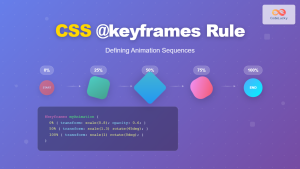
CSS @keyframes Rule: Complete Guide to Creating Smooth Animation Sequences
CSS animations bring life to web interfaces, and the @keyframes rule is the foundation that makes complex animation sequences possible....
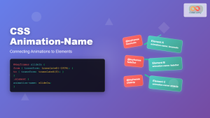
CSS Animation-Name: Complete Guide to Connecting Animations to Elements
The animation-name property is the bridge that connects your carefully crafted keyframe animations to HTML elements. Without this crucial CSS...
CSS Style animationDuration Property: CSS Animation Duration
Understanding the animationDuration Property in CSS The animationDuration property in CSS specifies the length of time that an animation should...
CSS Style transition Property: CSS Transition
CSS transition Property: A Comprehensive Guide The CSS transition property is a powerful tool for creating smooth animations when CSS...
CSS Style animationName Property: CSS Animation Name
CSS animationName Property: A Comprehensive Guide The CSS animationName property specifies the name of the @keyframes at-rule that defines the...
CSS Transition-Duration: Complete Guide to Animation Timing Control
What is CSS Transition-Duration? The transition-duration property in CSS defines how long a transition animation should take to complete. It's...
CSS Transition Property: Complete Guide to Smooth Animation Effects
CSS transitions enable smooth, visually appealing animations when element properties change, transforming abrupt state changes into fluid motion. This powerful...
CSS Animation-Delay: Master Timing Control for Perfect Web Animations
What is CSS Animation-Delay? The animation-delay property in CSS controls when an animation starts after it's been applied to an...
CSS Style animation Property: CSS Animation
CSS animation Property: A Comprehensive Guide to CSS Animations The animation property in CSS is a shorthand property used to...
JavaScript DOM Animations: Creating Dynamic Visual Effects
In the world of web development, animations play a crucial role in enhancing user experience and bringing life to static...

CSS Style animationDelay Property: CSS Animation Delay
Understanding the CSS animationDelay Property The CSS animationDelay property specifies the amount of time to wait from when the element...
CSS Style animationTimingFunction Property: CSS Animation Timing Function
CSS Style animationTimingFunction Property: A Comprehensive Guide The animation-timing-function property in CSS is a crucial component for controlling the pace...


