Understanding CSS Transition-Property
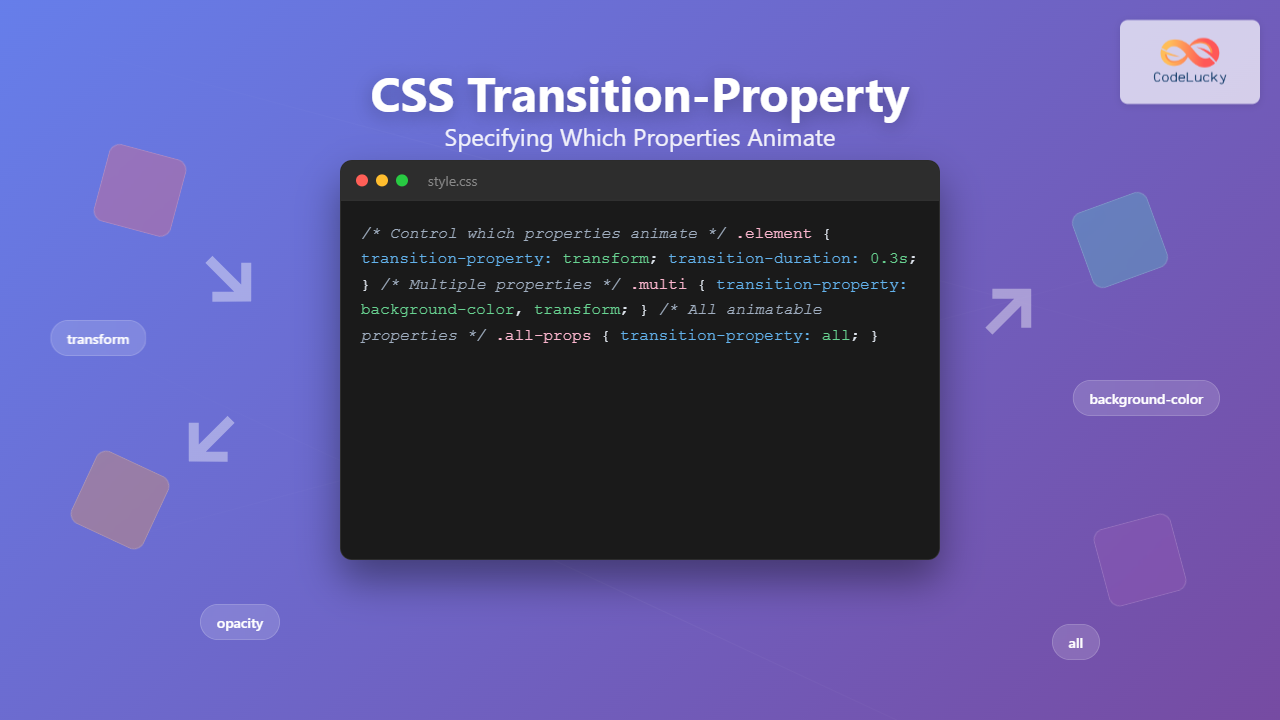
The CSS transition-property is a fundamental property that controls which CSS properties will animate when their values change. It’s the gatekeeper that determines exactly what transforms smoothly and what changes instantly, giving you precise control over your web animations.
When you hover over elements or trigger state changes, transition-property decides which properties participate in the smooth transformation. This level of control is essential for creating polished, professional animations that enhance user experience without overwhelming performance.
background only
Syntax and Basic Usage
The transition-property syntax is straightforward, accepting either specific property names or special keywords:
/* Examples */
transition-property: background-color;
transition-property: transform, opacity;
transition-property: all;
transition-property: none;
Available Values
| Value | Description | Example |
|---|---|---|
property-name |
Specific CSS property to animate | background-color, transform |
all |
Animates all animatable properties | Default behavior for most transitions |
none |
No properties will animate | Disables all transitions |
initial |
Resets to default value | Same as all |
inherit |
Inherits from parent element | Copies parent’s transition-property |
Single Property Transitions
Targeting specific properties gives you granular control over animations. This approach is perfect when you want to animate only certain aspects of an element while keeping others unchanged.
transform only
transition-property: transform;
transition-duration: 0.4s;
}
.element:hover {
transform: scale(1.2) rotate(15deg);
background-color: #4ecdc4; /* Won’t animate */
}
Multiple Property Transitions
You can specify multiple properties by separating them with commas. This gives you the flexibility to animate several properties simultaneously while excluding others.
background + transform
transition-property: background-color, transform;
transition-duration: 0.3s;
}
.multi-transition:hover {
background-color: #45b7d1;
transform: translateY(-10px);
box-shadow: 0 8px 25px rgba(0,0,0,0.3); /* Won’t animate */
}
The ‘all’ Keyword
Using all as the value makes every animatable property participate in transitions. This is the most common approach and often the default behavior you want.
all properties
transition-property: all;
transition-duration: 0.6s;
}
.all-transition:hover {
background-color: #f39c12;
transform: scale(1.1);
border-radius: 50%;
box-shadow: 0 8px 25px rgba(243, 156, 18, 0.4);
}
The ‘none’ Value
Setting transition-property to none completely disables transitions for an element, causing all property changes to happen instantly.
no transitions
transition-property: none;
transition-duration: 0.5s; /* Duration is ignored */
}
.no-transition:hover {
background-color: #e74c3c; /* Changes instantly */
transform: scale(1.3); /* Changes instantly */
}
Animatable Properties
Not all CSS properties can be animated. Only properties with interpolatable values (numerical, color, length, percentage) can transition smoothly between states.
Commonly Animated Properties
| Category | Properties | Performance Impact |
|---|---|---|
| Transform | transform, rotate, scale, translate | ✅ Excellent (GPU accelerated) |
| Opacity | opacity | ✅ Excellent (GPU accelerated) |
| Colors | background-color, color, border-color | ⚠️ Good (CPU intensive) |
| Dimensions | width, height, padding, margin | ❌ Poor (causes layout recalculation) |
| Position | top, left, right, bottom | ❌ Poor (causes layout recalculation) |
| Border | border-width, border-radius | ⚠️ Moderate |
Performance Considerations
Choosing the right properties to animate is crucial for smooth performance. Some properties trigger expensive layout recalculations, while others are optimized for smooth animation.
transform + opacity
width + height
transform and opacity properties whenever possible. These properties are GPU-accelerated and won’t trigger layout recalculations, resulting in smooth 60fps animations.
Interactive Playground
Experiment with different transition-property values to see how they affect animations:
0.5s
Common Patterns and Best Practices
1. Selective Animation Strategy
Instead of using all, specify only the properties you need to animate. This improves performance and prevents unintended animations.
.button {
transition-property: background-color, transform;
transition-duration: 0.2s;
}
/* Avoid – May animate unwanted properties */
.button {
transition-property: all;
transition-duration: 0.2s;
}
2. Combining with Different Durations
You can specify different durations for different properties using the shorthand or individual properties:
.element {
transition: background-color 0.3s, transform 0.5s;
}
/* Method 2: Individual properties */
.element {
transition-property: background-color, transform;
transition-duration: 0.3s, 0.5s;
}
3. Responsive Transition Control
Disable transitions on smaller screens to improve performance and reduce motion for users who prefer reduced motion:
transition-property: transform, opacity;
transition-duration: 0.3s;
}
/* Respect user preferences */
@media (prefers-reduced-motion: reduce) {
.element {
transition-property: none;
}
}
/* Disable on small screens */
@media (max-width: 768px) {
.element {
transition-property: none;
}
}
Troubleshooting Common Issues
Transitions Not Working
• Property is not animatable (e.g.,
display, visibility)• Missing transition-duration (defaults to 0s)
• Property name is misspelled
• Initial and final values are not interpolatable
Performance Problems
.slow-element {
transition-property: width, height, top, left;
}
/* Prefer – GPU accelerated */
.fast-element {
transition-property: transform, opacity;
}
Browser Support and Fallbacks
CSS transition-property has excellent browser support across all modern browsers. For older browsers, you can provide fallbacks using feature detection:
.element {
background-color: #3498db;
}
/* Enhanced experience with transitions */
@supports (transition-property: background-color) {
.element {
transition-property: background-color;
transition-duration: 0.3s;
}
}
Conclusion
Mastering CSS transition-property is essential for creating smooth, performant animations that enhance user experience. By understanding which properties to animate and when to use specific values versus all, you can create polished interfaces that feel responsive and professional.
Remember to prioritize performance by animating GPU-accelerated properties like transform and opacity, and always consider your users’ preferences for reduced motion. With these techniques, you’ll be able to create engaging animations that improve rather than hinder the user experience.
• Use specific property names for better performance and control
• Stick to GPU-accelerated properties when possible
• Consider user preferences and device capabilities
• Test your animations across different devices and browsers


