CSS transitions enable smooth, visually appealing animations when element properties change, transforming abrupt state changes into fluid motion. This powerful CSS3 feature enhances user experience by providing visual feedback and creating polished, professional interfaces.
What is the CSS Transition Property?
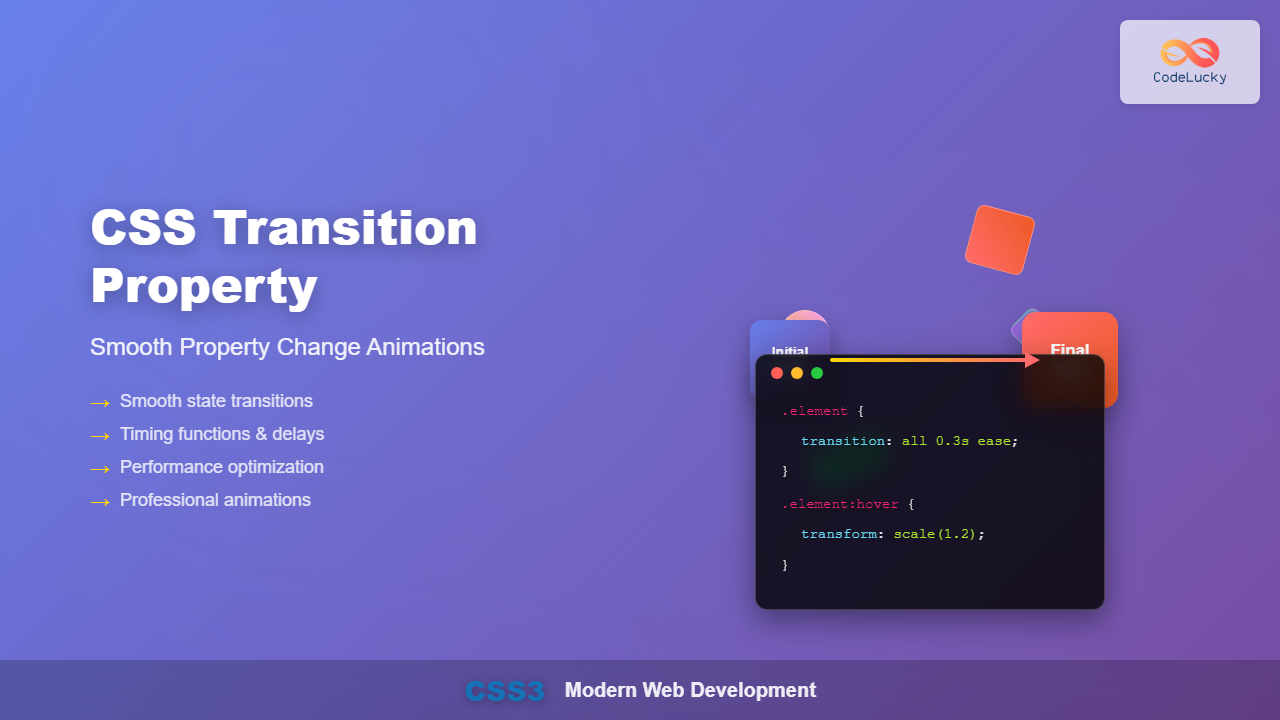
The CSS transition property is a shorthand that controls how CSS properties change over time when an element’s state changes. Instead of instant property changes, transitions create smooth animations between different states, such as hover effects, focus states, or JavaScript-triggered changes.
Key Benefits:
- Enhanced user experience with smooth visual feedback
- Improved interface polish and professionalism
- Better accessibility through gradual state changes
- Performance-optimized animations using CSS instead of JavaScript
CSS Transition Syntax and Properties
The transition property consists of four individual properties that can be set separately or combined using the shorthand syntax:
transition: property duration timing-function delay;Individual Transition Properties
- transition-property: Specifies which CSS properties to transition
- transition-duration: Sets how long the transition takes
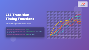
- transition-timing-function: Controls the animation’s acceleration curve
- transition-delay: Defines when the transition starts
Basic CSS Transition Examples
Simple Hover Transition
Here’s a basic example demonstrating a color transition on hover:
.button {
  background-color: #3498db;
  color: white;
  padding: 15px 30px;
  border: none;
  border-radius: 5px;
  cursor: pointer;
  transition: background-color 0.3s ease;
}

.button:hover {
  background-color: #e74c3c;
}
Multiple Property Transitions
You can transition multiple properties simultaneously by separating them with commas:
.multi-button {
  background-color: #2ecc71;
  color: white;
  padding: 12px 24px;
  border: 2px solid transparent;
  border-radius: 5px;
  transition: background-color 0.3s ease,
              transform 0.3s ease,
              border-color 0.3s ease;
}

.multi-button:hover {
  background-color: #f39c12;
  transform: translateY(-3px);
  border-color: #e67e22;
}
Transition Timing Functions
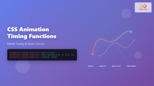
Timing functions control the acceleration and deceleration of transitions, creating different animation feels:
Built-in Timing Functions
Hover over each box to see different timing functions in action
- linear: Constant speed throughout
- ease: Slow start, fast middle, slow end (default)
- ease-in: Slow start, accelerating finish
- ease-out: Fast start, decelerating finish
- ease-in-out: Slow start and end, fast middle
Custom Cubic Bezier Functions
Create custom timing functions using cubic-bezier() for precise control:
/* Bounce effect */
.bounce {
  transition: transform 0.8s cubic-bezier(0.68, -0.55, 0.265, 1.55);
}

/* Ultra smooth */
.smooth {
  transition: transform 0.6s cubic-bezier(0.25, 0.46, 0.45, 0.94);
}
Transition Delays and Duration
Control when transitions start and how long they last for sophisticated animation sequences:
Hover over the container to see staggered animation delays
.stagger-1 { transition: transform 0.5s ease 0s; }
.stagger-2 { transition: transform 0.5s ease 0.1s; }
.stagger-3 { transition: transform 0.5s ease 0.2s; }
.stagger-4 { transition: transform 0.5s ease 0.3s; }
Advanced Transition Techniques
Transitioning All Properties
Use transition: all to animate all animatable properties:
.magic-box {
  background-color: #1abc9c;
  color: white;
  padding: 20px;
  border-radius: 8px;
  transition: all 0.4s ease;
}

.magic-box:hover {
  background-color: #e67e22;
  transform: scale(1.1) rotate(5deg);
  border-radius: 20px;
  box-shadow: 0 10px 20px rgba(0,0,0,0.2);
}
Card Flip Transition
Create engaging 3D flip effects using transitions and transforms:
Front Side
Back Side
.flip-card {
  background-color: transparent;
  width: 250px;
  height: 200px;
  perspective: 1000px;
}

.flip-card-inner {
  position: relative;
  width: 100%;
  height: 100%;
  transition: transform 0.6s;
  transform-style: preserve-3d;
}

.flip-card:hover .flip-card-inner {
  transform: rotateY(180deg);
}

.flip-card-front, .flip-card-back {
  position: absolute;
  width: 100%;
  height: 100%;
  backface-visibility: hidden;
}
Performance Optimization
Optimize CSS transitions for smooth animations and better performance:
GPU-Accelerated Properties
Best Properties for Smooth Transitions:
transform(translate, rotate, scale)opacityfilter
These properties are GPU-accelerated and provide the smoothest animations.
Avoid Heavy Properties
Properties to Use Sparingly:
width,height(cause reflow)top,left(usetransforminstead)box-shadowwith large blur values
Accessibility Considerations
Ensure transitions are accessible to all users:
/* Respect user preferences for reduced motion */
@media (prefers-reduced-motion: reduce) {
  * {
    transition-duration: 0.01ms !important;
    animation-duration: 0.01ms !important;
  }
}
Common Transition Patterns
Navigation Menu Transitions
.nav-item {
  transition: background-color 0.3s ease, transform 0.2s ease;
}

.nav-item:hover {
  background-color: #3498db;
  transform: translateY(-2px);
}

.nav-item::after {
  content: '';
  position: absolute;
  bottom: 0;
  left: 50%;
  width: 0;
  height: 3px;
  background-color: #e74c3c;
  transition: width 0.3s ease, left 0.3s ease;
}

.nav-item:hover::after {
  width: 100%;
  left: 0;
}
Form Input Transitions
.form-input {
  width: 100%;
  padding: 12px 16px;
  border: 2px solid #ddd;
  border-radius: 6px;
  transition: border-color 0.3s ease,
              box-shadow 0.3s ease,
              transform 0.2s ease;
}

.form-input:focus {
  border-color: #3498db;
  box-shadow: 0 0 0 3px rgba(52, 152, 219, 0.2);
  transform: translateY(-2px);
}
Troubleshooting Common Issues
Transitions Not Working
- Property not animatable: Some CSS properties can’t be animated (e.g.,
display) - Missing initial state: Ensure both starting and ending values are defined
- Specificity issues: Check if other CSS rules are overriding your transitions
- Vendor prefixes: Older browsers may require
-webkit-transition
Performance Issues
- Use
transformandopacityinstead of layout properties - Add
will-changeproperty for complex animations - Avoid animating too many elements simultaneously
- Use shorter durations for frequently triggered transitions
Browser Support and Fallbacks
CSS transitions enjoy excellent browser support across modern browsers. For older browsers, provide graceful fallbacks:
/* Fallback for older browsers */
.button {
  background-color: #3498db;
}

.button:hover {
  background-color: #2980b9;
}

/* Enhanced with transitions for modern browsers */
@supports (transition: background-color 0.3s) {
  .button {
    transition: background-color 0.3s ease;
  }
}
Conclusion
CSS transitions are essential for creating polished, user-friendly web interfaces. By understanding the transition property’s components—duration, timing functions, delays, and animatable properties—you can craft smooth, performant animations that enhance user experience. Remember to prioritize accessibility, optimize for performance, and test across different devices to ensure your transitions work flawlessly for all users.
Start with simple hover effects and gradually explore more complex transition patterns. With practice, you’ll develop an intuitive sense for timing and motion that will elevate your web development skills and create more engaging user interfaces.

