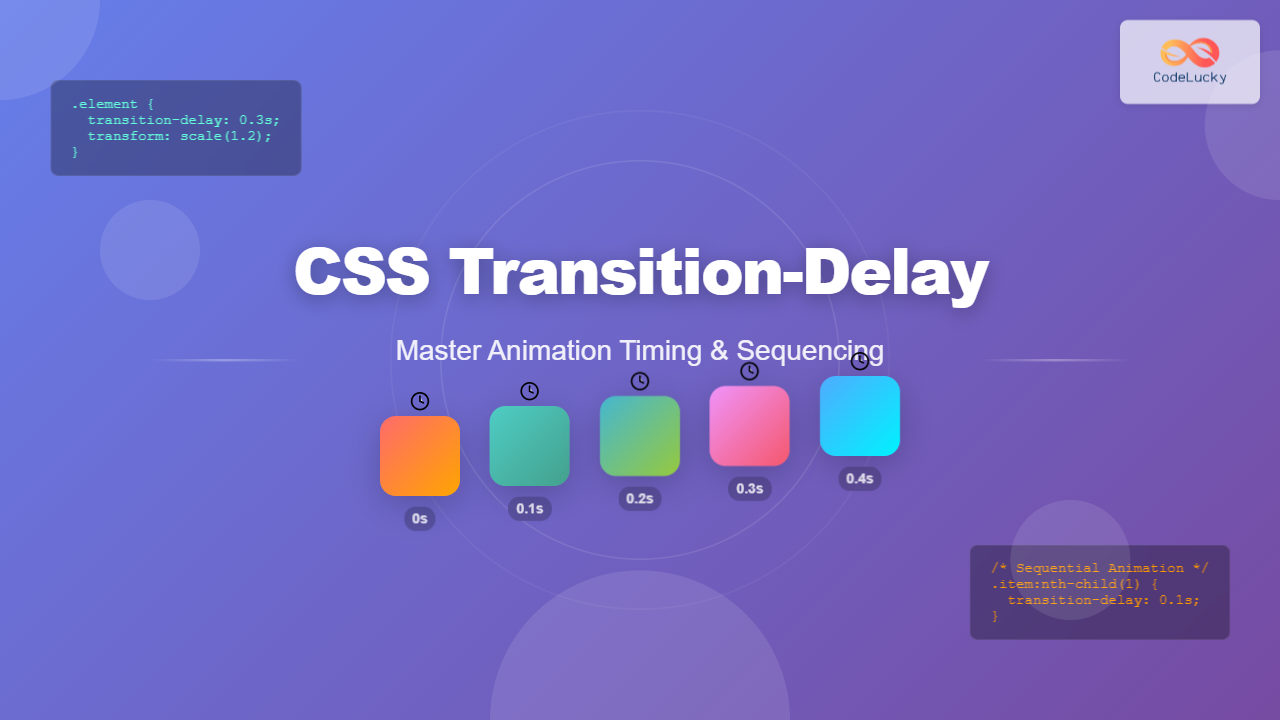
The transition-delay property in CSS is a powerful tool that allows you to control when a transition animation begins. Unlike the immediate start of standard transitions, this property introduces a pause before the animation kicks in, enabling you to create sophisticated timing sequences and more polished user interfaces.
Understanding CSS Transition-Delay
The transition-delay property specifies the amount of time to wait before starting a transition effect. It’s part of the CSS transition module and works in conjunction with other transition properties to create smooth, timed animations.
Basic Syntax
transition-delay: time;
/* or as part of the shorthand */
transition: property duration timing-function delay;
The value can be specified in seconds (s) or milliseconds (ms). Positive values delay the start, while negative values can make transitions appear to start partway through their duration.
Practical Examples and Visual Demonstrations
Basic Delayed Transition
Let’s start with a simple example that demonstrates the core concept:
Hover over the square to see the delayed transition
.delayed-element {
  width: 100px;
  height: 100px;
  background-color: #3498db;
  transition: transform 0.5s ease, background-color 0.5s ease;
  transition-delay: 0.3s;
}

.delayed-element:hover {
  transform: scale(1.2) rotate(15deg);
  background-color: #e74c3c;
}
Sequential Card Animation
One of the most practical applications of transition-delay is creating staggered animations. Here’s an example of cards that animate in sequence:
.card {
  transform: translateY(20px);
  opacity: 0;
  transition: all 0.6s cubic-bezier(0.4, 0, 0.2, 1);
}

.animate .card:nth-child(1) { transition-delay: 0.1s; }
.animate .card:nth-child(2) { transition-delay: 0.2s; }
.animate .card:nth-child(3) { transition-delay: 0.3s; }
.animate .card:nth-child(4) { transition-delay: 0.4s; }
.animate .card:nth-child(5) { transition-delay: 0.5s; }

.animate .card {
  transform: translateY(0);
  opacity: 1;
}
Advanced Timing Techniques
Negative Delay Values
Negative delay values make transitions appear to start partway through their duration. This technique is useful for creating complex timing effects:
Hover over the container to see negative delay effects
.item:nth-child(1) { transition-delay: 0s; }
.item:nth-child(2) { transition-delay: -0.5s; }
.item:nth-child(3) { transition-delay: -1s; }
.item:nth-child(4) { transition-delay: -1.5s; }

.container:hover .item {
  transform: rotate(360deg) scale(1.2);
}
Multiple Property Delays
You can apply different delays to different properties for more sophisticated effects:
Hover to see multiple properties with different delays
.element {
  transition:
    transform 0.5s ease 0s,
    border-radius 0.3s ease 0.2s,
    background 0.4s ease 0.4s;
}

.element::before {
  transition: all 0.6s ease 0.1s;
}
Real-World Applications
Navigation Menu Animation
Here’s a practical example of how transition-delay can enhance navigation menus:
.nav-link::after {
  width: 0;
  transition: width 0.4s ease;
  transition-delay: 0.1s;
}

.dropdown {
  opacity: 0;
  visibility: hidden;
  transition: all 0.3s ease;
  transition-delay: 0s;
}

.nav-item:hover .dropdown {
  opacity: 1;
  visibility: visible;
  transition-delay: 0.2s;
}
Best Practices and Performance Tips
Optimal Timing Values
When working with transition-delay, consider these guidelines for the best user experience:
- Keep delays short: Most delays should be between 0.1s and 0.5s to maintain responsiveness
- Stagger incrementally: Use consistent increments (0.1s, 0.2s, 0.3s) for sequential animations
- Consider user expectations: Immediate feedback (0s-0.1s delay) for interactive elements
- Use negative delays sparingly: They can be confusing if overused
Browser Performance
To ensure smooth animations across all devices:
Pro Tip: Use transform and opacity properties for the best performance, as they don’t trigger layout recalculations. Avoid animating properties like width, height, or top when possible.
Shorthand Syntax
The transition-delay can be included in the shorthand transition property:
/* Longhand */
transition-property: transform;
transition-duration: 0.5s;
transition-timing-function: ease;
transition-delay: 0.2s;

/* Shorthand */
transition: transform 0.5s ease 0.2s;

/* Multiple properties with different delays */
transition:
  transform 0.5s ease 0.2s,
  opacity 0.3s ease 0.1s,
  background-color 0.4s ease 0.3s;
Browser Support and Fallbacks
The transition-delay property enjoys excellent browser support across all modern browsers. For older browsers, consider providing fallbacks:
/* Fallback for older browsers */
.element {
  /* Immediate transition for older browsers */
  transition: transform 0.5s ease;
}

/* Enhanced experience for modern browsers */
@supports (transition-delay: 0s) {
  .element {
    transition: transform 0.5s ease;
    transition-delay: 0.2s;
  }
}
Accessibility Considerations
Always respect user preferences for reduced motion:
@media (prefers-reduced-motion: reduce) {
  .element {
    transition-delay: 0s;
    transition-duration: 0.01ms;
  }
}
Conclusion
The transition-delay property is an essential tool for creating polished, professional animations in CSS. By controlling when transitions begin, you can craft sophisticated timing sequences that enhance user experience without overwhelming performance. Whether you’re building subtle hover effects, complex sequential animations, or responsive interface elements, mastering transition delays will elevate your web development skills.
Remember to test your animations across different devices and connection speeds, and always prioritize user experience over visual complexity. With these techniques and best practices, you’ll be able to create engaging, accessible animations that delight users while maintaining excellent performance.


