
The CSS sepia filter is a powerful visual effect that transforms images and elements into vintage, sepia-toned appearances reminiscent of old photographs. This comprehensive guide explores everything you need to know about implementing sepia effects in your web projects.
What is CSS Sepia Filter?
The CSS sepia() filter function applies a sepia tone effect to elements, converting colors to warm brown and yellow tones. It’s part of the CSS filter property family and accepts values from 0 to 1 (or 0% to 100%), where 0 means no effect and 1 creates a fully sepia-toned result.
filter: sepia(amount);Where amount is a number between 0-1 or percentage between 0%-100%
Basic Sepia Filter Implementation
Let’s start with a simple example showing how to apply sepia filter to an image:
.sepia-image {
  filter: sepia(1);
  /* Equivalent to filter: sepia(100%); */
}
Interactive Sepia Filter Demo

0%
100%
Sepia Filter Values and Effects
Understanding different sepia values helps you achieve the desired vintage effect:
sepia(0)
Original colors
sepia(0.3)
Subtle warmth
sepia(0.7)
Vintage tone
sepia(1)
Full sepia effect
Advanced Sepia Filter Techniques
Combining Sepia with Other Filters
Sepia filter works exceptionally well when combined with other CSS filters to create more sophisticated effects:
/* Vintage photo effect */
.vintage-photo {
  filter: sepia(0.8) contrast(1.2) brightness(0.9);
}

/* Old newspaper effect */
.newspaper-style {
  filter: sepia(1) contrast(1.5) brightness(0.8) saturate(0);
}

/* Warm sepia with blur */
.dreamy-sepia {
  filter: sepia(0.6) blur(1px) brightness(1.1);
}
Filter Combination Examples
Vintage Photo
sepia(0.8) contrast(1.2) brightness(0.9)
Newspaper Style
sepia(1) contrast(1.5) brightness(0.8)
Responsive Sepia Effects
Create responsive sepia effects that adapt to different screen sizes and user preferences:
/* Base sepia effect */
.responsive-sepia {
  transition: filter 0.3s ease;
  filter: sepia(0.3);
}

/* Hover effect */
.responsive-sepia:hover {
  filter: sepia(0.8) scale(1.05);
}

/* Mobile optimization */
@media (max-width: 768px) {
  .responsive-sepia {
    filter: sepia(0.5); /* Slightly more pronounced on mobile */
  }
}

/* Reduced motion preference */
@media (prefers-reduced-motion: reduce) {
  .responsive-sepia {
    transition: none;
  }
}
Performance Considerations
When implementing sepia filters, consider these performance optimization techniques:
Best Practices:
- Use CSS transforms efficiently: Combine filters to minimize repaints
- Optimize for mobile: Consider performance impact on lower-end devices
- Use will-change property: For elements with frequent filter changes
- Leverage GPU acceleration: Combine with transform3d for better performance
/* Performance optimized sepia */
.optimized-sepia {
  filter: sepia(0.7);
  will-change: filter;
  transform: translateZ(0); /* Force GPU acceleration */
  backface-visibility: hidden;
}
Browser Support and Fallbacks
CSS sepia filter enjoys excellent browser support, but it’s important to provide fallbacks for older browsers:
/* Progressive enhancement approach */
.sepia-with-fallback {
  /* Fallback for older browsers */
  opacity: 0.8;

  /* Modern browsers */
  filter: sepia(0.7);
}

/* Feature detection with CSS */
@supports (filter: sepia(1)) {
  .sepia-enhanced {
    filter: sepia(0.8) contrast(1.1);
  }
}

@supports not (filter: sepia(1)) {
  .sepia-enhanced {
    /* SVG filter fallback */
    filter: url(#sepia-svg);
  }
}
Creative Sepia Applications
Image Galleries
Sepia filters work excellently in photo galleries to create cohesive vintage aesthetics:
Hover over images to see the sepia effect change
Text and Background Effects
Sepia isn’t limited to images – apply it to text containers and backgrounds for unique design effects:
/* Sepia background with content */
.vintage-card {
  background: linear-gradient(135deg, #667eea 0%, #764ba2 100%);
  filter: sepia(0.4);
  padding: 2rem;
  border-radius: 12px;
  color: white;
}

/* Text shadow with sepia tones */
.sepia-text {
  color: #8b4513;
  text-shadow: 2px 2px 4px rgba(139, 69, 19, 0.3);
  filter: sepia(0.2);
}
Accessibility and User Experience
When implementing sepia effects, consider accessibility and user preferences:
Accessibility Considerations:
- Ensure sufficient contrast ratios when applying sepia to text containers
- Provide alternatives for users who prefer high contrast
- Respect reduced motion preferences in filter transitions
- Test readability with color vision deficiencies
/* Accessible sepia implementation */
.accessible-sepia {
  filter: sepia(0.5);
}

/* High contrast mode support */
@media (prefers-contrast: high) {
  .accessible-sepia {
    filter: none;
    border: 2px solid currentColor;
  }
}

/* Reduced motion support */
@media (prefers-reduced-motion: reduce) {
  .accessible-sepia {
    transition: none;
  }
}
Common Issues and Solutions
Troubleshooting Tips:
Issue: Sepia effect appears too subtle
Solution: Increase the sepia value or combine with contrast adjustment
Issue: Performance problems on mobile
Solution: Use will-change property and reduce filter complexity
Issue: Inconsistent rendering across browsers
Solution: Test extensively and provide fallbacks for older browsers
Issue: Text becomes unreadable with sepia background
Solution: Adjust text color and add appropriate shadows or outlines
Advanced Animation Techniques
Create smooth transitions and animations with sepia filters:
/* Animated sepia reveal */
@keyframes sepiaReveal {
  0% { filter: sepia(0) brightness(1); }
  50% { filter: sepia(0.5) brightness(0.9); }
  100% { filter: sepia(1) brightness(0.8); }
}

.animated-sepia {
  animation: sepiaReveal 3s ease-in-out infinite alternate;
}

/* Scroll-triggered sepia */
.scroll-sepia {
  transition: filter 0.6s cubic-bezier(0.4, 0, 0.2, 1);
}

.scroll-sepia.in-view {
  filter: sepia(0.7) contrast(1.1);
}
Conclusion
CSS sepia filter is a versatile tool for creating vintage and warm-toned visual effects in web design. From subtle color warming to full vintage photo transformations, mastering sepia filter opens up numerous creative possibilities for your projects.
Remember to consider performance implications, provide appropriate fallbacks, and maintain accessibility standards when implementing sepia effects. With proper implementation, sepia filters can significantly enhance the visual appeal and emotional impact of your web content.
Experiment with different values, combine sepia with other filters, and don’t forget to test across various devices and browsers to ensure a consistent user experience. The examples and techniques covered in this guide provide a solid foundation for incorporating professional-quality sepia effects into your web development toolkit.
Related Posts
CSS Grayscale Filter: Master Black and White Image Effects with Complete Guide
The CSS grayscale filter is a powerful tool that transforms colorful images into elegant black and white versions. This filter...
CSS Style filter Property: CSS Filter
CSS filter Property: Enhance Your Web Graphics The CSS filter property provides powerful visual effects to elements like images, backgrounds,...
CSS Saturate Filter: Complete Guide to Color Saturation Control
The CSS saturate() filter function is a powerful tool that allows you to control the color saturation of HTML elements....
CSS Filter Property: Complete Guide to Visual Effects and Image Processing
The CSS filter property is a powerful tool that allows developers to apply visual effects and image processing techniques directly...
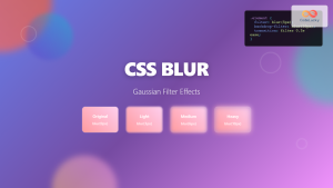
CSS Blur Filter: Complete Guide to Gaussian Blur Effects and Visual Applications
The CSS blur filter is one of the most versatile and visually appealing effects in modern web design. This powerful...

CSS Backdrop-Filter: Complete Guide to Background Blur and Visual Effects
What is CSS Backdrop-Filter? The backdrop-filter property in CSS allows you to apply graphical effects like blur, brightness, contrast, and...
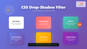
CSS Drop-Shadow Filter: Complete Guide to Creating Professional Shadow Effects
The CSS drop-shadow() filter function is a powerful tool that allows developers to create realistic shadow effects for any HTML...
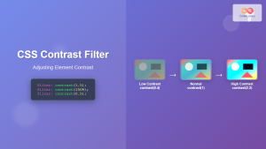
CSS Contrast Filter: Complete Guide to Adjusting Element Contrast for Better Visual Impact
The CSS contrast() filter function is a powerful tool that allows web developers to dynamically adjust the contrast of HTML...
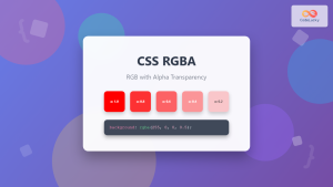
CSS RGBA Color Function: Complete Guide to RGB with Alpha Transparency
The CSS RGBA color function is a powerful tool that extends the traditional RGB color model by adding an alpha...

CSS Linear-Gradient: Master Direction, Color Stops and Angles for Stunning Web Designs
CSS linear gradients are one of the most powerful tools for creating visually stunning backgrounds and design elements in modern...

CSS Invert Filter: Complete Guide to Inverting Element Colors and Visual Effects
The CSS invert() filter is a powerful visual effect that reverses the colors of HTML elements, creating striking contrast and...
CSS Brightness Filter: Complete Guide to Adjusting Element Brightness
The CSS brightness() filter function is a powerful tool that allows developers to adjust the brightness of HTML elements dynamically....


