
The CSS saturate() filter function is a powerful tool that allows you to control the color saturation of HTML elements. By adjusting saturation levels, you can create stunning visual effects, enhance user interfaces, and bring your web designs to life with vibrant colors or subtle desaturated tones.
What is CSS Saturate Filter?
The saturate() filter adjusts the color saturation of an element by manipulating the intensity of colors while preserving their hue and lightness. This CSS function is part of the filter property and accepts values that determine how saturated or desaturated the colors appear.
CSS Saturate Syntax
The basic syntax for the saturate filter is straightforward:
filter: saturate(value);

/* Examples */
filter: saturate(0);      /* Completely desaturated (grayscale) */
filter: saturate(0.5);    /* 50% saturation */
filter: saturate(1);      /* Original saturation (100%) */
filter: saturate(1.5);    /* 150% saturation */
filter: saturate(200%);   /* 200% saturation */
Accepted Values
- Number values: 0 to infinite (e.g., 0, 0.5, 1, 2)
- Percentage values: 0% to infinite% (e.g., 0%, 50%, 100%, 200%)
- Default value: 1 or 100% (original saturation)
Visual Examples
Let’s explore how different saturation values affect the appearance of elements:
saturate(0)
Completely desaturated
saturate(0.5)
50% saturation
saturate(1)
Original colors
saturate(1.5)
150% saturation
saturate(2)
200% saturation
Interactive Saturation Control
Try adjusting the saturation level of the image below using the slider:
' /%3E%3Ctext x='150' y='100' text-anchor='middle' fill='white' font-size='24' font-weight='bold'%3EColorful Scene%3C/text%3E%3C/svg%3E)
Move the slider to see how saturation affects the image colors in real-time.
Practical Use Cases
1. Image Hover Effects
Create engaging hover effects by changing saturation on mouse interaction:
.hover-saturate {
  filter: saturate(0.7);
  transition: filter 0.3s ease;
}

.hover-saturate:hover {
  filter: saturate(1.2);
}
' /%3E%3Ctext x='100' y='80' text-anchor='middle' fill='white' font-size='16' font-weight='bold'%3EHover Me!%3C/text%3E%3C/svg%3E)
Hover over the image to see the saturation effect.
2. Disabled State Styling
Use desaturation to indicate disabled or inactive elements:
.button {
  background: linear-gradient(45deg, #667eea, #764ba2);
  color: white;
  padding: 12px 24px;
  border: none;
  border-radius: 6px;
  cursor: pointer;
  filter: saturate(1);
  transition: filter 0.2s ease;
}

.button:disabled {
  filter: saturate(0.3);
  cursor: not-allowed;
}
3. Photo Gallery Effects
Create artistic photo gallery layouts with varying saturation levels:
.gallery-item {
  filter: saturate(0.8);
  transition: all 0.3s ease;
}

.gallery-item:nth-child(odd) {
  filter: saturate(0.5);
}

.gallery-item:hover {
  filter: saturate(1.3);
  transform: scale(1.05);
}
Combining with Other Filters
The saturate filter works excellently when combined with other CSS filters:
/* Vintage effect */
.vintage {
  filter: saturate(0.7) sepia(0.3) contrast(1.2);
}

/* High contrast and vibrant */
.vibrant {
  filter: saturate(1.5) contrast(1.3) brightness(1.1);
}

/* Subtle desaturation with blur */
.subtle {
  filter: saturate(0.8) blur(0.5px) brightness(0.95);
}
Vintage Effect
Vibrant Effect
Subtle Effect
Browser Support and Performance
The CSS saturate filter enjoys excellent browser support across modern browsers:
- Chrome: 18+ (with -webkit- prefix), 53+ (unprefixed)
- Firefox: 35+
- Safari: 6+ (with -webkit- prefix), 9.1+ (unprefixed)
- Edge: 12+
- Internet Explorer: Not supported
will-change: filter on elements that will frequently change their filter values.
Advanced Techniques
CSS Custom Properties with Saturate
Create reusable saturation levels using CSS custom properties:
:root {
  --sat-low: 0.5;
  --sat-normal: 1;
  --sat-high: 1.5;
  --sat-extreme: 2;
}

.low-saturation {
  filter: saturate(var(--sat-low));
}

.high-saturation {
  filter: saturate(var(--sat-high));
}
Responsive Saturation
Adjust saturation based on screen size for optimal viewing experience:
@media (max-width: 768px) {
  .responsive-saturate {
    filter: saturate(0.9);
  }
}

@media (min-width: 1200px) {
  .responsive-saturate {
    filter: saturate(1.2);
  }
}
Common Pitfalls and Solutions
1. Over-saturation
Avoid using extremely high saturation values (above 300%) as they can cause eye strain and appear unnatural.
2. Performance Issues
Applying filters to many elements simultaneously can impact performance. Consider using CSS transforms or pre-processed images for better performance in heavy animations.
3. Accessibility Considerations
Some users may have visual sensitivities to highly saturated colors. Always provide options to reduce saturation or test with accessibility tools.
Conclusion
The CSS saturate filter is a versatile tool for controlling color intensity in web design. Whether you’re creating subtle hover effects, artistic photo galleries, or dynamic user interfaces, understanding how to manipulate saturation can significantly enhance your designs.
Remember to use saturation thoughtfully, considering both aesthetic appeal and user experience. Combine it with other CSS filters for even more creative possibilities, and always test across different devices and browsers to ensure consistent results.
Related Posts
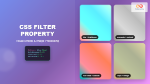
CSS Filter Property: Complete Guide to Visual Effects and Image Processing
The CSS filter property is a powerful tool that allows developers to apply visual effects and image processing techniques directly...
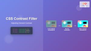
CSS Contrast Filter: Complete Guide to Adjusting Element Contrast for Better Visual Impact
The CSS contrast() filter function is a powerful tool that allows web developers to dynamically adjust the contrast of HTML...
CSS Style filter Property: CSS Filter
CSS filter Property: Enhance Your Web Graphics The CSS filter property provides powerful visual effects to elements like images, backgrounds,...

CSS Invert Filter: Complete Guide to Inverting Element Colors and Visual Effects
The CSS invert() filter is a powerful visual effect that reverses the colors of HTML elements, creating striking contrast and...
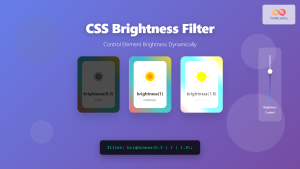
CSS Brightness Filter: Complete Guide to Adjusting Element Brightness
The CSS brightness() filter function is a powerful tool that allows developers to adjust the brightness of HTML elements dynamically....
CSS Grayscale Filter: Master Black and White Image Effects with Complete Guide
The CSS grayscale filter is a powerful tool that transforms colorful images into elegant black and white versions. This filter...
CSS Style color Property: CSS Color
Understanding the CSS color Property: A Comprehensive Guide The CSS color property is fundamental for styling web pages. It specifies...
CSS Blur Filter: Complete Guide to Gaussian Blur Effects and Visual Applications
The CSS blur filter is one of the most versatile and visually appealing effects in modern web design. This powerful...
CSS Color Property: Complete Guide to Text Colors with Hex, RGB, HSL Values
The CSS color property is one of the most fundamental styling properties in web development, allowing you to control the...
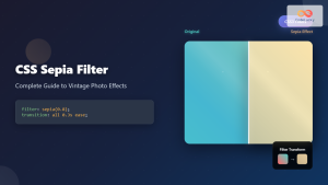
CSS Sepia Filter: Complete Guide to Vintage Photo Effects
The CSS sepia filter is a powerful visual effect that transforms images and elements into vintage, sepia-toned appearances reminiscent of...
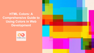
HTML Colors: A Comprehensive Guide to Using Colors in Web Development
Introduction Colors are the soul of web design. They evoke emotions, guide user attention, and establish brand identity. In web...
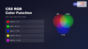
CSS RGB Color Function: Complete Guide to Red, Green, Blue Color Values
The CSS RGB color function is one of the most fundamental and widely-used methods for defining colors in web development....


