
CSS repeating gradients are powerful tools that allow developers to create beautiful, complex patterns without relying on external images. These gradients automatically repeat color transitions across an element, creating seamless patterns that can enhance any web design.
Understanding CSS Repeating Gradients
Repeating gradients extend the functionality of regular CSS gradients by automatically repeating the color pattern when it reaches the end of the defined gradient line. This creates continuous, seamless patterns that are perfect for backgrounds, borders, and decorative elements.
There are two main types of repeating gradients:
- Repeating Linear Gradients – Create patterns that repeat along a straight line
- Repeating Radial Gradients – Create patterns that repeat from a central point outward
Repeating Linear Gradients
The repeating-linear-gradient() function creates a pattern of repeating linear gradients. The basic syntax follows this structure:
background: repeating-linear-gradient(
  direction,
  color-stop1 position1,
  color-stop2 position2,
  ...
);
Basic Repeating Linear Gradient Example
Let’s start with a simple striped pattern:
.striped-pattern {
  background: repeating-linear-gradient(
    45deg,
    #ff6b6b 0px,
    #ff6b6b 20px,
    #4ecdc4 20px,
    #4ecdc4 40px
  );
  height: 200px;
  width: 100%;
}
In this example, we create diagonal stripes that repeat every 40 pixels, alternating between coral (#ff6b6b) and teal (#4ecdc4) colors.
Controlling Direction and Angle
You can control the direction of repeating linear gradients using keywords or specific angles:
/* Horizontal stripes */
.horizontal-stripes {
  background: repeating-linear-gradient(
    to right,
    #667eea 0px,
    #667eea 30px,
    #764ba2 30px,
    #764ba2 60px
  );
}

/* Vertical stripes */
.vertical-stripes {
  background: repeating-linear-gradient(
    to bottom,
    #f093fb 0px,
    #f093fb 25px,
    #f5576c 25px,
    #f5576c 50px
  );
}

/* Custom angle */
.angled-stripes {
  background: repeating-linear-gradient(
    120deg,
    #a8edea 0px,
    #a8edea 15px,
    #fed6e3 15px,
    #fed6e3 30px
  );
}
Advanced Linear Gradient Patterns
You can create more complex patterns by using multiple color stops and varying the spacing:
.complex-pattern {
  background: repeating-linear-gradient(
    45deg,
    #ff9a9e 0px,
    #ff9a9e 5px,
    #fecfef 5px,
    #fecfef 10px,
    #fecfef 10px,
    #fecfef 15px,
    #ff9a9e 15px,
    #ff9a9e 20px
  );
}
Repeating Radial Gradients
The repeating-radial-gradient() function creates patterns that radiate outward from a central point. The basic syntax is:
background: repeating-radial-gradient(
  shape size at position,
  color-stop1 position1,
  color-stop2 position2,
  ...
);
Basic Repeating Radial Gradient
Here’s a simple circular pattern:
.radial-circles {
  background: repeating-radial-gradient(
    circle,
    #ff6b6b 0px,
    #ff6b6b 20px,
    #4ecdc4 20px,
    #4ecdc4 40px
  );
  height: 200px;
  width: 100%;
}
Controlling Shape and Size
Radial gradients offer various shape and size options:
/* Elliptical pattern */
.elliptical-pattern {
  background: repeating-radial-gradient(
    ellipse,
    #667eea 0px,
    #667eea 25px,
    #764ba2 25px,
    #764ba2 50px
  );
}

/* Closest-side sizing */
.closest-side {
  background: repeating-radial-gradient(
    circle closest-side,
    #f093fb 0px,
    #f093fb 15px,
    #f5576c 15px,
    #f5576c 30px
  );
}

/* Farthest-corner sizing */
.farthest-corner {
  background: repeating-radial-gradient(
    circle farthest-corner,
    #a8edea 0px,
    #a8edea 20px,
    #fed6e3 20px,
    #fed6e3 40px
  );
}
Positioning Radial Gradients
You can control where the radial gradient originates using position keywords or specific coordinates:
.positioned-radial {
  background: repeating-radial-gradient(
    circle at top left,
    #ff9a9e 0px,
    #ff9a9e 30px,
    #fecfef 30px,
    #fecfef 60px
  );
}
Interactive Gradient Generator
Experiment with different gradient settings using this interactive tool:
Gradient Controls
45°
40px
Practical Applications
Striped Backgrounds
Create subtle striped backgrounds for sections or cards:
.subtle-stripes {
  background: repeating-linear-gradient(
    45deg,
    rgba(255, 255, 255, 0.1) 0px,
    rgba(255, 255, 255, 0.1) 1px,
    transparent 1px,
    transparent 20px
  );
  background-color: #667eea;
  padding: 20px;
  color: white;
}
Card with Subtle Stripes
This card uses a subtle repeating gradient overlay to create texture without overwhelming the content.
Progress Bars and Loading Animations
Repeating gradients can create animated progress indicators:
.animated-progress {
  background: repeating-linear-gradient(
    45deg,
    #4ecdc4 0px,
    #4ecdc4 20px,
    #44a08d 20px,
    #44a08d 40px
  );
  height: 20px;
  border-radius: 10px;
  animation: slide 2s linear infinite;
}

@keyframes slide {
  0% { background-position: 0 0; }
  100% { background-position: 40px 0; }
}
Decorative Borders
Use repeating gradients to create unique border effects:
.gradient-border {
  background: repeating-linear-gradient(
    45deg,
    #ff6b6b,
    #ff6b6b 5px,
    #4ecdc4 5px,
    #4ecdc4 10px
  );
  padding: 3px;
}

.gradient-border-content {
  background: white;
  padding: 20px;
}
Content with Gradient Border
This technique creates a colorful border effect using repeating gradients.
Browser Support and Fallbacks
Repeating gradients have excellent browser support across modern browsers. However, it’s good practice to provide fallbacks for older browsers:
.with-fallback {
  /* Fallback for older browsers */
  background-color: #ff6b6b;

  /* Modern browsers */
  background: repeating-linear-gradient(
    45deg,
    #ff6b6b 0px,
    #ff6b6b 20px,
    #4ecdc4 20px,
    #4ecdc4 40px
  );
}
Performance Considerations
When using repeating gradients, keep these performance tips in mind:
- Limit complexity – Avoid too many color stops as they can impact rendering performance
- Use appropriate repeat sizes – Very small repeat patterns may cause performance issues
- Consider caching – Complex gradients can benefit from being cached as CSS custom properties
- Test on mobile devices – Ensure smooth performance across different screen sizes and devices
Advanced Techniques
Combining Multiple Gradients
Layer multiple repeating gradients for complex effects:
.layered-gradients {
  background:
    repeating-linear-gradient(
      45deg,
      rgba(255, 107, 107, 0.8) 0px,
      rgba(255, 107, 107, 0.8) 10px,
      transparent 10px,
      transparent 20px
    ),
    repeating-linear-gradient(
      -45deg,
      rgba(78, 205, 196, 0.8) 0px,
      rgba(78, 205, 196, 0.8) 10px,
      transparent 10px,
      transparent 20px
    );
}
Using CSS Custom Properties
Make your gradients more maintainable with CSS custom properties:
:root {
  --primary-color: #ff6b6b;
  --secondary-color: #4ecdc4;
  --stripe-size: 20px;
}

.customizable-gradient {
  background: repeating-linear-gradient(
    45deg,
    var(--primary-color) 0px,
    var(--primary-color) var(--stripe-size),
    var(--secondary-color) var(--stripe-size),
    var(--secondary-color) calc(var(--stripe-size) * 2)
  );
}
Accessibility Considerations
When using repeating gradients in your designs, consider accessibility:
- Contrast ratios – Ensure text remains readable over gradient backgrounds
- Motion sensitivity – Be cautious with animated gradients that might trigger vestibular disorders
- Color blindness – Test your gradients with color blindness simulators
- Reduced motion preferences – Respect user preferences for reduced motion
Conclusion
CSS repeating gradients offer a powerful way to create engaging visual patterns without external images. Whether you’re building subtle background textures, eye-catching decorative elements, or functional UI components like progress bars, mastering repeating gradients will significantly enhance your CSS toolkit.
The key to effective use of repeating gradients lies in understanding how color stops, positioning, and sizing work together to create the desired visual effect. With practice and experimentation, you’ll be able to create stunning patterns that enhance your web designs while maintaining excellent performance and accessibility.
Remember to always test your gradients across different browsers and devices, provide appropriate fallbacks, and consider the overall user experience when implementing these techniques in your projects.
Related Posts
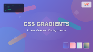
CSS Gradients: Complete Guide to Linear Gradient Background Creation
CSS gradients have revolutionized web design by allowing developers to create smooth color transitions without relying on images. Linear gradients,...

CSS Linear-Gradient: Master Direction, Color Stops and Angles for Stunning Web Designs
CSS linear gradients are one of the most powerful tools for creating visually stunning backgrounds and design elements in modern...
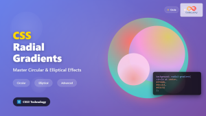
CSS Radial-Gradient: Complete Guide to Circular and Elliptical Gradients
CSS radial gradients create stunning visual effects by transitioning colors in a circular or elliptical pattern radiating from a central...
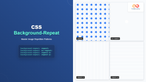
CSS Background-Repeat: Master Image Repetition Patterns and Control
The CSS background-repeat property is a fundamental tool for controlling how background images behave within their containers. Whether you want...
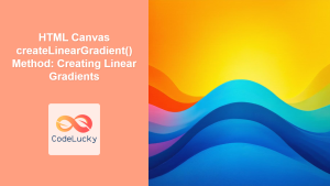
HTML Canvas createLinearGradient() Method: Creating Linear Gradients
The createLinearGradient() Method: Mastering Linear Gradients on HTML Canvas The createLinearGradient() method in the HTML Canvas API is a powerful...
CSS Style backgroundRepeat Property: CSS Background Repeat
CSS background-repeat: Mastering Background Image Repetition The CSS background-repeat property is a powerful tool for controlling how background images are...
HTML Canvas createPattern() Method: Creating Repeating Patterns
HTML Canvas createPattern() Method: Creating Repeating Patterns The HTML Canvas createPattern() method is a powerful feature that allows you to...
CSS Conic-Gradient: Complete Guide to Angular Gradient Patterns
CSS conic-gradient is a powerful function that creates gradients that sweep around a center point, forming angular patterns similar to...
CSS Grid Functions: Complete Guide to repeat(), minmax(), and fit-content()
CSS Grid has revolutionized web layout design, offering developers unprecedented control over two-dimensional layouts. Among its most powerful features are...

CSS Animation-Iteration-Count: Master Infinite Loops and Repeat Control
The animation-iteration-count property is a fundamental CSS animation control that determines how many times an animation cycle should repeat. Whether...
CSS Multiple Backgrounds: Complete Guide to Layering Images and Colors Like a Pro
CSS multiple backgrounds revolutionized web design by allowing developers to layer multiple background images, colors, and gradients on a single...
HTML Canvas createRadialGradient() Method: Creating Radial Gradients
HTML Canvas createRadialGradient() Method: Creating Radial Gradients The HTML Canvas createRadialGradient() method is a powerful tool for creating visually appealing...


